EPANDING THE CONTENT OF AN OUTLINE using notes.pptx
Textual Analysis Of Various Albums
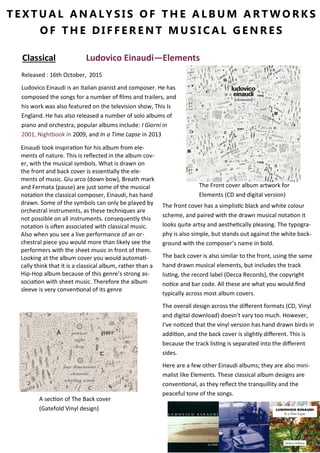
1. The Front cover album artwork for
Elements (CD and digital version)
T E X T U A L A N A L Y S I S O F T H E A L B U M A R T W O R K S
O F T H E D I F F E R E N T M U S I C A L G E N R E S
A section of The Back cover
(Gatefold Vinyl design)
Classical Ludovico Einaudi—Elements
Einaudi took inspiration for his album from ele-
ments of nature. This is reflected in the album cov-
er, with the musical symbols. What is drawn on
the front and back cover is essentially the ele-
ments of music. Giu arco (down bow), Breath mark
and Fermata (pause) are just some of the musical
notation the classical composer, Einaudi, has hand
drawn. Some of the symbols can only be played by
orchestral instruments, as these techniques are
not possible on all instruments. consequently this
notation is often associated with classical music.
Also when you see a live performance of an or-
chestral piece you would more than likely see the
performers with the sheet music in front of them.
Looking at the album cover you would automati-
cally think that it is a classical album, rather than a
Hip-Hop album because of this genre’s strong as-
sociation with sheet music. Therefore the album
sleeve is very conventional of its genre
Released : 16th October, 2015
Ludovico Einaudi is an Italian pianist and composer. He has
composed the songs for a number of films and trailers, and
his work was also featured on the television show, This Is
England. He has also released a number of solo albums of
piano and orchestra, popular albums include: I Giorni in
2001, Nightbook in 2009, and In a Time Lapse in 2013
The front cover has a simplistic black and white colour
scheme, and paired with the drawn musical notation it
looks quite artsy and aesthetically pleasing. The typogra-
phy is also simple, but stands out against the white back-
ground with the composer’s name in bold.
The back cover is also similar to the front, using the same
hand drawn musical elements, but includes the track
listing, the record label (Decca Records), the copyright
notice and bar code. All these are what you would find
typically across most album covers.
The overall design across the different formats (CD, Vinyl
and digital download) doesn't vary too much. However,
I’ve noticed that the vinyl version has hand drawn birds in
addition, and the back cover is slightly different. This is
because the track listing is separated into the different
sides.
Here are a few other Einaudi albums; they are also mini-
malist like Elements. These classical album designs are
conventional, as they reflect the tranquillity and the
peaceful tone of the songs.
2. The Front cover
T E X T U A L A N A L Y S I S O F T H E A L B U M A R T W O R K S
O F T H E D I F F E R E N T M U S I C A L G E N R E S
The back cover (CD)
EDM/Dance—Drum and Bass Sub Focus—Torus
A white san serif font is used on the front cover so
that it contrasts with the darker background. The
artist’s stage name is in bold and in a larger font
size to draw the audience’s attention to it. People
may recognise the name and be interested in pur-
chasing the album. The font used through the de-
sign of the album is the same one used in the
artist’s first album. The use of the same unique
font is used in any commercial product, helping to
market it further by creating a brand around it.
This a fairly typical cover for its genre, as you
would often not see a picture of the artist in this
genre. However if it was a pop album, there would
be more than likely be a photo of the artist(s) on
the front.
The back cover is also similar to the front, using a
zoomed in section of the front. It includes the con-
ventional track listing, the record label (Virgin and
RAM), the copyright notice and bar code. Ram rec-
ords are know for their output in the dance genre,
as they are the world’s leading Drum and Bass la-
bel; founded by Andy C (another EDM artist). Fans
of Drum and Bass or of the record label by choose
to listen to the album due to the record label’s
logo being included on the back cover.
Released: 30th September 2013
Torus is the second studio album by Sub Focus, an
English music producer/DJ.
The overall design across the different formats (CD,
Vinyl and digital download) doesn't vary too much.
Again there is the variation in the track listing design
on the vinyl edition.
Sub Focus’ first album also had the torus shape as the
centrepiece, a motif that you can see runs through all
his work. On the Torus album cover you can see that
the typograph is a lot smaller. This because his audi-
ence may recognise the artist by the geometric shape,
as he uses it in live shows, promotional material and
singles.
Sub Focus’s first album
3. The Front cover
T E X T U A L A N A L Y S I S O F T H E A L B U M A R T W O R K S
O F T H E D I F F E R E N T M U S I C A L G E N R E S
The back cover (CD)
Indie The Smiths—Meat Is Murder
The front cover’s original photograph is of Marine
Corporal Michael Wynn, 20, during Operation Bal-
listic in Da Nang, South Vietnam, which was taken
during the Vietnam War. The photo is taken from
Emile de Antonio’s ‘In The Year Of The Pig’ (1969).
The image has been adjusted slightly with high
contrast and the ‘Make War Not Love’ on the hel-
met replaced with the album title, ‘Meat Is Mur-
der’. There are two variations of the cover, one
with four images of the soldier and one with a sin-
gle image. The sleeve was decided by Morrissey,
this showing that bands/band members were not
only creating the music, and in fact they produced
most this album by themselves (expect How Soon
Is Now?). The insert that comes with the album
has the typical conventions, a picture of the band
and the lyrics to the songs on the album.
It was released at a time where vegetarianism and
animal rights weren't in the mainstream of west-
ern society. From the choice of album artwork and
the title the audience can tell that it is quite a po-
litical album that raises issues.
Released: 11th February 1985
The second studio album by The Smiths. It became the
band's sole number one album in the UK charts during
the band's lifetime.
The below back cover is the version after warn-
er purchased the rights to the Smiths cata-
logue. Initially after they did that, Warner re-
leased two best ofs and then in 1993 proceeded
with the reissue of all the albums over the terri-
tories they controlled. The first release of the
album had the rough trade logo and the rights
reserved to the record label.
The Smiths are known for their interesting choice of
album/single sleeves and album titles. Here’s anoth-
er example. The band’s working title for ‘The Queen
IS Dead’ was ‘Margret on the Guillotine’. For the art-
work they used the French thesp, Alain Delon. The
picture is taken from the 1964 noir film, The Unvan-
quished.