
Recommended
More Related Content
What's hot
What's hot (15)
Viewers also liked
Viewers also liked (18)
Similar to Conventions
Similar to Conventions (20)
More from Akshata Mishra
More from Akshata Mishra (20)
Recently uploaded
Recently uploaded (20)
Conventions
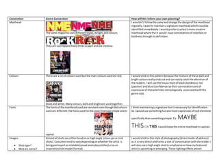
- 1. Convention Genre Convention How will this inform your own planning? Masthead The same magazine usesdifferentstyles,designsandcolours. Theyare overlappedmanytimesaswell andare creative. I wouldn’t followthe same andchange the designof the masthead regularly,Iwantto maintainasignature mastheadwhichcouldbe identifiedimmediately.Iwouldprefertoselectamore creative mastheadwhere the it would have connotationsof rebellionor boldnessthroughitsdefinition. Colours There are a lotof coloursusedbutthe main coloursusedare red, blackand white.Manycolours,dark and brightare usedtogether. I wouldstickto thispatternbecause the mixture of these darkand brightcoloursreallystickoutand can easilycatchthe attentionof the readers. I will use the house style of black(boldness),red (passion) andblue (confidence)astheirconnotationsare all expressive of characteristicsstereotypically associatedwiththe genre rock. Fonts The fontsof the mastheadusedare constanteventhoughthe colours usedare different.The fontsusedforthe coverlinesare simple andin capital. I thinkmaintainingasignature fontisnecessaryforidentification. So I woulduse somethingfunand more expressive of rockelements specificallythansomethingsimple. Ex-MAYBE THISOR THIS. Iwouldkeepthe entire mastheadincapitals. Images- Shottype? Mise en scene? Almostall shotsare eitherheadonor highangle (close upsor mid shots).Costumestendtovarydependingonwhetherthe artist is beingportrayed asrelatable(casual-everydayclothes) orasan inspiration/rolemodel(formal). I wouldstickto thisstyle of photography (directmode of address) as it isverydirectand formsa sort of conversationwiththe reader.I will alsouse a highangle shotto emphasiseonhowmyfeatured artistis upcomingoremerging. These lightingeffectsattract
- 2. (Whatis inthe shot) Lighting The lightingisalwaysfrontlitortop lit.These indicate spirituality, openness,agelessnessandblandness. youngeraudience butthe musicisforall ageshence evenolder people wouldstill be able torelate tothe magazine.The coverwill alsobe able toallowpersonal interpretationbecauseof the use of frontlight. My artistwill wearcasual clothestobe more relatable to the readers. Sell lines The sell linesare majorlyinthe Leftthird.Thisisso that the more attractive articlescanbe seenimmediatelywhilebeingsold Ina store. Theyare writtenincapital andhave the same font. I wouldfollowthosasitisnecessarytomaintainan orderfor itto still lookneat/clearandnotrandom.The majorityof sell lineswill still be inthe leftthirdas thisisa marketingstrategy. Model The cover page modelsare a mixture of menandwomen.Theymostly consistof bandsor a membersymbolisingthatband. I woulddothe same and maintainthe focuson the face of the band. Clothing The men or womenneitherare sexualized.Theywearclothesof their personal style orthose thatsymbolise theirstyle of rock. I thinkthisisa goodideabecause the readercanunderstandthe musicianormusicianson a more personal orintimate level through personal style.Theymightevenfeel closertothese popularstars. I will alsonotconformto the popularconventionof sexualising featuredartistsbecause Iwantthe focusto be onthe artist’smusic and storyrather thansexual appeal. Copy(topicof content) The contentmostlygivesinsightintothe livesof these popular musicians.Theymighttalkaboutthe newreleasesordebate surroundingmanysongsor the band.Most are abouttheirrecent publicappearancesorrumoursaboutthe band(the featuredband). There are alsoarticlesonotherbandson similarissues. I thinkI mightstickmore to the musicand differentaspectsof it rather thanthe band's personal situations.Thoughthere will definitelybe afairshare of gossiparticlesonthese bandspurely or amusement. The detailedandfeatured(double page)article will be of a recountof an interviewwiththe bandabouttheirsuccessstory and struggle tothe top. It wouldbe appealingtoreadersastheycan feel closertothe artistsand itcouldserve as an inspiration.
- 3. DesignandLayout Most layoutsare slightymessy (crowded)andthere isalotof over lappinginvolved.Thereisalsoahousestyle maintained.The basicidea isto give an impressionof excitmentandunorganisationwhile atthe same time beingneatandreaderfriendly.Eitherthe masthead overlapsthe picture orvisaversain a majorityof magazines. Whenmakingmyown magazine,Iwouldtryto Depicta similarmoodandsettingbecause it Alsosimbolisesrockmusic. Contentspage column structure There'salwaysone large picture of the feature article andthenone to three smallerpicturesof otherpotentiallyattractive articles.The contentsare writtenina small fonton a small areaof the page.The contentscan occupy onlyone page. One change I mightmake is withthe fontsused.The fontswill be differentforthe mainarticle andfor the restof the articles respectively. Iwill alsomaintainthe focusonthe featuredbandby onlyusingpicturesof themratherthan addingotherpicturesfor alternative attractive articles. How manyarticles? A magazine cancontainupto 30-40 articlesor differenttypes (gossip,news,newreleases,etc).These articlesdifferalotinsize. I wouldprobablysticktoa maximum of 30 articlesof similarsizes. There wouldbe 10 of 100-200 words,15 of 200-400, 4 of around 500 andone feature article.
- 4. Feature story These are alwayson a particularpopularbandor one particular member.Theyare mostlytheirbiographyor onan on going controversyrelatedtothem. In mymagazine I woulddothe same because articleslike these allowthe readerstogainpersonal insightintothe livesof these popularmusicians. Myfeaturedarticle wouldbe onthe struggles that the band hadto face andconqueron theirwayto success.This can serve as an inspirationtothe readers.