HMCS Max Bernays Pre-Deployment Brief (May 2024).pptx
Question 2 newest
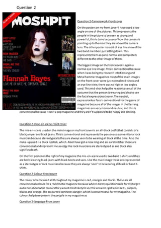
1. Question2-Camerawork-Frontcover
On the postersonmy frontcover I have useda low
angle onone of the pictures.Thisrepresentsthe
people inthe picture tobe seenasstrong and
powerful,thisisdone becauseof how the camerais
pointinguptothemso theyare above the camera
lens.The otherposterisa sort of eye line viewof the
twoband membersjustsittingdown.This
representsthemasquite normal andcompletely
differenttothe otherimage of them.
The biggestimage onthe front coverisagain a
normal eye line image.Thisis conventionalbecause
whenI wasdoingmy researchintoKerrangand
Metal hammermagazinesmostof the mainimages
on the frontcover were justnormal mid-shotsand
an eye line view,there wasnohighor low angles
used.Thismid-shothelpsthe readertosee all of the
costume that the personiswearingandalsoto see
the facial expressionsclearer.The neutral,
expressionlessface isconventional forthe genre of
magazine because all of the imagesinthe Kerrang
magazinesare verysternand neutral,andthisis
conventional because itisn’tapopmagazine andtheyaren’tsupposedtobe happyand smiling.
Question2-mise-en-scene-Frontcover
The mis-en-scene usedonthe mainimage onmyfrontcoveris an all-blackoutfitthatconsistsof a
blackjumperand black jeans.Thisisconventional andrepresentsthe personasa conventional rock
musicianbecause stereotypicallytheyare alwaysseentobe wearingall blackall the time.Alsothe
make-upusedisablack lipstick,which.AlsoIhave gota nose ring and an earstretcherthese are
conventional andrepresentme asedgylike rockmusiciansare stereotyped asandblackalso
signifiesdeath.
On the firstposteron the rightof mymagazine the mis-en-sceneusedistwobandt-shirtsandthey
are bothwearingblackjeanswithblackbootsandvans.Like the mainimage these are represented
as a stereotype of rockmusiciansbecause theyare always‘seen’tobe wearingall blackorband t-
shirts.
Question2-Colour-Frontcover
The colour scheme usedall throughoutmy magazine isred,orangesandblacks.These are all
conventional coloursfora rock/metal magazine becausewhenIdidmyquestionnaire formytarget
audience aboutwhatcolourstheywouldmostlikelytosee the answersIgotwere:reds,purples,
blacksand orange.The colourred connotesdanger,whichisconventional formymagazine.The
colourshelptorepresentthe people inmymagazine as
Question2-language-Frontcover
Question 2
2. There isn’tmuchtextusedon the frontcoverapart fromthe pull quotes.The language usedisquite
conventional because theyuse wordslike:comebacksingle,comebacktour,the maidenboysare
back and what’syourfavourite rockstargotto hide.These are all conventional because theyrelate
to the psychographicsIfoundoutabout inmy questionnaire,like concertsandmusicingeneral.
Question2-Typography-Frontcover
The mastheadisin the biggestfontonthe front cover,andis inwhite tocontrast on the white
backgroundso that itstandsout more.AlsoI have usedthe mastheadoneverysingle one of my
pageson mymagazine to create a brand identity. The typographyusedall throughoutthe magazine
issans serif.Thisisconventionalbecause the boldfontsconnotemasculinityandisconventionalfor
my male leaningaudience.These sansserif fontsrepresents masculinity.
Question2-Camerawork-contentpage
The camera anglesusedbothof the imagesof the people
are normal shots.The lastimage is one froma festival that
I wentto,thisis quite a longshotand isn’tclose up,thisis
to show the ‘vibes’thatfestivals/concertsgiveoff.Also
havingthisimage onmy contentpage isrelatingtomy
targetshobbies.
Question2-mise-en-scene-contentpage
The mis-en-scene ismostlythe same asmyfrontcover.
Theyare bothwearingdarkclothingandthe male has
longerhairand pushedoverhisface whichrepresentshim
as a stereotype of arock musician.Alsothe female hasa
dark eye shadow,whichisconventional andalsoshe has
ear stretchersanda brightlycolouredhairwhichfitsin
withthe stereotype of womanrockmusicians.
Question2-Colour-contentpage
The coloursusedare like the coloursinKerrang’smagazine
and I knew thatthese where conventionalbecause when
askingmyaudience aboutwhattheythoughtwouldlook
the bestthe main answerswere reds,blacksanda bitof a
colourto contrast withthe dark to make themstandout
and to do thisI usedyellow.All of the coloursare conventional formygenre because theyare dark
colours.
Question2-language-contentpage
The language usedinthe message fromthe editorisconventionalformygenre of magazine,Iknow
thisbecause whenwritingthisIlookedat3 differentKerrang’smessagefromthe editorandall of
the startedwithsomethingaboutthe magazine beingreallyepicandbecause itisaimedmore for
malesIusedthe word‘kick-ass’.AlsoImade the message quite chattyasIusedfillerslike‘um’ and
‘y’know’tomake itsoundmore like a personal chatwiththe reader.
3. Like the frontcover I didsome researchintoKerrangand Metal hammerto see whatstoriestheyuse
intheircontentpages.The mainone I lookedintowasKerrangand thisiswhere Igot the ideasfor
the differentsections.The languageusedinthese are conventionalbecause theylinkinwiththeir
psychographics,suchas:Concertand CD reviewstoarticlesaboutthe artist’slives.
Question2-Typography-Contentpage
The hand writtenname fromthe editor isconventionalbecause itmakesthe magazine abitmore
personal forthe readersandrepresentsthe editorasa kindpersonbecause she ishavingtime to
‘sign’these magazines.
All of the typographyapart fromthe hand writtenpartis sansserif.This representsthe magazineto
be verymasculine andfitsinthe with the male
niche audience.
Question2-Camerawork-DPS
The image is an eye line shot,thisistoshow there
firmfacesand helpsthemtobe representedas
moodyand emotionless.Alsothe image isalong
shot,thisis soall of the mis-en-scene usedcanbe
clearlyseenbythe readers.
Question2-mise-en-scene-DPS
The mis-en-scene usedonmydouble page spread
ismostlythe same as my frontcover andcontentpage.Three of the people are wearing all black,
whichisconventional.The fourthpersoniswearingadenimjacketadark greentop,thisis
conventional because whenlookingatKerrang’sdouble page spreadsIfoundoutthatthe drummer
isalwaysput to the back of the groupbut mostly,not all the time,wearsdifferentthingstothe
otherband members.Alsothe male iswearingabandanaoverthe top of hishead,isconventional
as it stereotypical forarock musicianandit alsosignifiesrebellion.There wasinstrumentsusedin
the image,thisisto showwhichbandmemberplayswhichinstrument.
Question2-Colour- DPS
The colours,again,are the same as the frontcoverand contentpage. These are alsoconventional
because the colourredconnotesdangerandblack connotesdeath,whichrelates tomytarget
audience because itisarock genre.Alsobecause Ihave usedthe same three coloursall throughout
my 3 piecesfrommymagazine issort of createsa brandidentityaswell asthe mastheadonevery
page.
Question2-language-DPS
The language of the article isconventionalbecause itusessome swearworkdinthe article andthis
iswhat ‘rock people’are stereotypicallyseentotalklike.Alsowiththe sadwordsandtalkingabout
there pastit gripsthe readerin andalso talkingabouttheirpastlivesare conventional,Iknow this
because of my researchintoKerrang’sdouble page spread.Alsowiththe sadwordsitrelatestothe
mainimage of thembeingmoodyandbeingstern.Inthe article there issome jokesputintothe
article thisisfor audience pleasure andsoeverythingisn’tall sad.
4. Question2-Typography- DPS
The typographyisbasicallythe same as everythingon mymagazine,which issansserif,thisis
conventional because itconnotesmasculinityandrelatestomyniche male targetaudience.Alsothe
massive lettersatthe startof 2 paragraphscalled,Kicker.These are conventionalbecause whenIdid
my researchitwas oneverysingle doublepage spreadthatIlookedat,and alsoit makesthe article
lookmore funand alsoby putting the lettersinthe colourredinrelatestothe targetaudience.