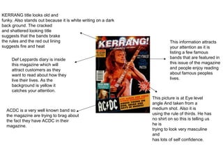
1. KERRANG title looks old and
funky. Also stands out because it is white writing on a dark
back ground. The cracked
and shattered looking title
suggests that the bands brake
the rules and the red out lining This information attracts
suggests fire and heat your attention as it is
listing a few famous
Def Leppards diary is inside bands that are featured in
this magazine which will this issue of the magazine
attract customers as they and people enjoy reading
want to read about how they about famous peoples
live their lives. As the lives.
background is yellow it
catches your attention.
This picture is at Eye level
angle And taken from a
ACDC is a very well known band so medium shot. Also it is
the magazine are trying to brag about using the rule of thirds. He has
the fact they have ACDC in their no shirt on so this is telling us
magazine. he is
trying to look very masculine
and
has lots of self confidence.
2. This attracts customers because
sometimes magazines give a way
a free gift but this magazine is
giving away four free gifts to
make them selves look better and
more generous than other
The title is in very big magazines. Also it is the only bit
writing and in a clear on the front page with bright
font which stands colours to give a more modern
out. Part of the title is look because people want
covered up by a modern gifts.
mans head which
shows the company
is very confident and
makes the magazine “30 greatest songs”
look very confident. makes you want to know
what they are so you can
listen to them and enjoy.
“special edition”
makes you want to
read inside as there
is only one 10th
The picture is in black and white to give a older affect. It matches the birthday so people
title, classic rock. The man at the front is pulling a funny face to make don’t want to miss
him seem lots more confident and gives the impression he wants to it.
have fun whereas the others look serious to maybe give the impression
they are serious about their music or that they are trying to look tough.
3. He is using glasses and a
bandanna to make him
look cool. This also gives
The title is in very big writing and in a a sort off rock look as well.
clear font which stands out. Part of the Most of his body is
title is covered up by a mans head covered up but he looks
which shows the company is very confident and doing a
confident and makes the magazine pose to make him look
look very confident. cool. He has a denim
sleeveless jacket on to
also give him the rock
look.
A free CD draws customers in
because if people enjoy classic
rock music e.g. Guns N Roses,
they will want to listen to the free
CD. “led zeppelin are over.”
fans of led zeppelin
would want to read
about this because they
wouldn’t want him to
stop making music and
Guns N Roses In bright orange stands out. The magazine is would want to know why
showing off that Guns N Roses are in their magazine and will he is stopping. The white
attract most fans of theirs to buy this magazine. writing stands out from
the black background.
4. What I learnt
By analysing rock magazines I learnt to:
• To use colours in my magazine front cover. Especially
red.
• To use one big picture instead of lots of little ones on the
front cover.
• The main picture has to be of someone who is very
confident.