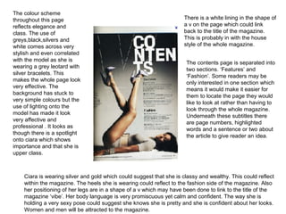
1. The colour scheme
throughout this page There is a white lining in the shape of
reflects elegance and a v on the page which could link
class. The use of back to the title of the magazine.
greys,black,silvers and This is probably in with the house
white comes across very style of the whole magazine.
stylish and even correlated
with the model as she is
The contents page is separated into
wearing a grey leotard with
two sections. ‘Features’ and
silver bracelets. This
‘Fashion’. Some readers may be
makes the whole page look
only interested in one section which
very effective. The
means it would make it easier for
background has stuck to
them to locate the page they would
very simple colours but the
like to look at rather than having to
use of lighting onto the
look through the whole magazine.
model has made it look
Underneath these subtitles there
very affective and
are page numbers, highlighted
professional . It looks as
words and a sentence or two about
though there is a spotlight
the article to give reader an idea.
onto ciara which shows
importance and that she is
upper class.
Ciara is wearing silver and gold which could suggest that she is classy and wealthy. This could reflect
within the magazine. The heels she is wearing could reflect to the fashion side of the magazine. Also
her positioning of her legs are in a shape of a v which may have been done to link to the title of the
magazine ‘vibe’. Her body language is very promiscuous yet calm and confident. The way she is
holding a very sexy pose could suggest she knows she is pretty and she is confident about her looks.
Women and men will be attracted to the magazine.
2. Incorporating the masthead into the The text has been split up
background of the contents page into sections for ease of
looks effective and is also reading. The subtitles are
promoting the brand identity and written in a different font
also covers a large amount of the than the normal text and
page without it looking too busy also are slightly larger
and crazy. It would be classed as which helps them to
part of the house style which brings stand out. Also, The text
the whole magazine together. does continue with the
colour scheme of the
The usual layout of the title shows page which looks striking
individuality from other music as a whole page.
magazines and also the music within
it.
The background colouring is
The shot of this model topless quite aggressive, putting
showing off his tattoos and images in the readers head
wearing lots of bling with a hat to do with violence.
placed backwards. This all However, in another way it
illustrates wealth and young looks nice against the
culture. This also portrays power models skin tone. This
and importance as he takes up colouring of the text has
the most amount of space on been chosen very well and
this page. The tattoo saying stands out nicely against the
‘respect’ stands out majorly on background.
his body which shows that he
could show that he should be
respected just as much as
everyone else.
3. The clothing that the artists are wearing are very indie and informal
which contrasts with the layout of the page. They are all wearing very
dark colours which could link with the music included with the
magazine. Also, it could reflect on the target audience being attracted
to dark colours.
They have put the information of
the magazine at the top of the
The layout of this contents page is very page clearly because it will be
formal and can be easily read. This one of the first things the reader
means its easy to navigate around the looks at. Another reason they
page. It is unusual that the contents done this could be the fact that it
page is predominately writing but in may help them advertise better
this instance the text is what covers as well.
most of the page. Most of the time the
images take over the page because
the artists face will appeal to the target
audience and that is what attract them They also have a section called
to carry on reader. Because this ‘Every Month’ This gives the
contents page is very different to buyers something else to read and
others it makes it just as interesting as tells them what is included each
its not seen so much. The format of month and any offers for the
the text is also very formal and has readers. This is in every Q
been kept to the left hand side in a list. magazine which creates the house
style which lures the audience into
reading it month after month.
The review section would definitely
help buyers with second opinions of
album’s or songs they may want to
buy.