
Recommended
More Related Content
What's hot
What's hot (19)
Similar to Overview
Similar to Overview (20)
More from AmyKilbride2
More from AmyKilbride2 (20)
Recently uploaded
Recently uploaded (20)
Overview
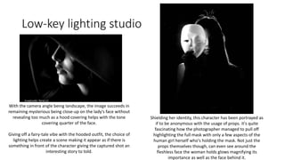
- 1. Low-key lighting studio With the camera angle being landscape, the image succeeds in remaining mysterious being close-up on the lady's face without revealing too much as a hood covering helps with the tone covering quarter of the face. Giving off a fairy-tale vibe with the hooded outfit, the choice of lighting helps create a scene making it appear as if there is something in front of the character giving the captured shot an interesting story to told. Shielding her identity, this character has been portrayed as if to be anonymous with the usage of props. it's quite fascinating how the photographer managed to pull off highlighting the full mask with only a few aspects of the human girl herself who's holding the mask. Not just the props themselves though, can even see around the fleshless face the woman holds glows magnifying its importance as well as the face behind it.
- 2. Seeing this shot, you can’t help but feel both intrigued and worrisome. At least I can’t. Wondering whether this character is the victim or the enemy. Is he hiding from someone or something? Maybe he’s being nosey, eavesdropping on a conversation. Or possibly he’s stalking countless victims, planning on unspeakable acts. So many possibilities and questions raised by a simple image. With the light highlighting her posture, outlining the prop she holds between her fingers with sight of the smoke leaving the girls mouth as she exhales. A wave of emotion impacts this photoshoot allowing the audience to see and feel how relieved this character clearly is thanks to the puff. All her stress has gone away in that one action, all helped by the choice of light showing only what's important, all that goes towards revealing the message.
- 3. My attempt: Inspired by the low-key lighting studio, I worked alongside friend, Emily Smith to produce these images presented at the right of the page. Owning a prototype of the Ring of Mordor, I went with basing the images of a Lord of The Rings set theme with my talking prop acting as if to be a Gollum creature fascinated by the golden item. Not really producing the best images, the second photograph you can see along the right is definitely my favourite of all. The outlining of the characters glasses, a little of her temple, the curve of her shoulder with highlighted fingertips revealing to be holding and examining a piece of jewellery. Unable to make out the many features, the humans anonymous, but the image is still clear.
- 4. Photoshop First selecting this photograph to photoshop, I guess it doesn't look that different to the original, but the edits are there. Toning the colours down, to me the picture makes me think it has something to do with books, reading, I don’t understand why or how.. But it does. Leaning more on the bad side, this outcome was a little rushed without much time to think into the use of edits. I wouldn't really say it's that bad, but definitely could have done better.
- 5. Half term Homework zip files
- 6. Montage PS Although I should have, I never thought to screenshot the process for this outcome but will keep in mind to do so for the next. Originally, the kite wasn't going to be a part of the montage as there was to find placement with the photograph above. Failing as that image just couldn't fit in with the rest, the kite photo was picked out to replace adding more to the setting.
- 7. Illustration pop art PS When it came to photoshopping my selected image, I decided to line out the sky along with every shaped object to fill with flat different colours making all individual to its own. But keeping it a little real leaving the beach and ocean untouched. Making a change for the best, more was added to the scene changing the layout from landscape to portrait by doubling up the sky. The second change goes towards the kite changing the shape, location and having a few extra detail added. Although this screenshot doesn’t look much different to the last, but a little change was in fact made. Looking at the line connecting to the kite, the further up it is the thicker the wire is. Then further down the wire gets thinner giving the illusion of the kite being closer to the audience. Now officially being my final piece for this small project.
- 8. Canon brand edit Using this very logo, a small poster has been produced getting the title to stand out with its slogan. Starting off, an image was found becoming the background for this mini poster. Straight away, I knew what I wanted to do with this piece.. Only hope was it went how I wanted it. Adding the company's title, I purposely placed it on the pavement under the lamppost hoping to create the illusion of the light behind found itself reflecting off the texted image.
- 9. Finding in filter, a 3D option was explored in minds to help the Canon title stand out more looking to be more a part of the picture rather than stuck on a picture. I don't understand how really, but with this option the colours changed along with it. Messing with the layer style, the colour of the text was luckily changed back to red staying somewhat original. Shadows and highlights were also manipulated giving more of what I'm after, only thing I dislike is I couldn't find a way to change the direction of the shadows making the whole piece look off.
- 10. Using adjustments, rather than keeping the whole image the original colours, a tone of red was added and to be honest, I believe it helps the image look more fitting. Before finishing up, the very same slogan the company uses was added to the image giving the edit more reason to exist. As well as it looking less empty with the extra text being added above.
- 11. Final Outcome Having the text smaller compared to the last screenshot, the edit is finished. And honestly? I am quite happy with the results even if it's not the best outcome to surface. Only thing that really bugs me is what's already been mentioned previously, this being about the shadows that are reflecting from the light and how they look odd with the wrong angle in place to make the image. Unable to figure out a way to solve this issue though, will just have to make do.
- 12. UPDATED* Editing the logo once again, a shadow was created and successfully placed under the letters allowing the illusion of the light bouncing off as I was after the whole time. Colours on the word was edited a bit as well with it being moved along to the right slightly making the top brighter with the bottom of the letters darker.
- 13. Going with an image taken whilst waiting on the coach to Newcastle from Leeds, it came together being a perfect shot as it suggests the theme I'm going for with the campaign 'Journeys' for Canon. Starting off, a filter titled 'poster edges' was placed outlining the details as if all that's featured in the image resemble drawings. Adding colour to the main image, the main aim was to have the poster achieve a poster look with colours being differently random but having them be fitting for the image.
- 14. A lot of play around with the colours carried out being a little difficult. The tone was also lightened up compared to the last screenshot which didn’t really work so well on its own. An edit on the title 'Canon' began adding a slight shadow with the letters popping out only it appears they pop out a little too much looking as if they aren't really apart of the poster. Adjusting the colours more, shadow tones were added giving the picture extra detail rather than blocks of colour stuck on each prop. Even for the logo making the insides of the letters darker with lighter highlights surrounding each letter. Now adding a slogan for the poster, 'Ready When You Are', this also came from my Canon campaign as I believed it fitted claiming to be ready when you are having all the suitcases and bags backed ready to adventure out.
- 15. Once again, a little change was made to the image itself giving the colours a more... flat appeal? Cloudier seems more appropriate to describe the picture. Movement of the logo also took place as you can see, experimenting with its placement to find a better location. Trying above the slogan, it kinda worked I guess but looked as if to be too much in one area and honestly, I didn’t like how it covered the suitcase which was my main focus for the poster. With the placement being alongside the slogan this time, I didn't really know what to think of it not even knowing whether I liked it or not. As you can probably tell aswell, more change went into the colours of the image adding a darker tone to every shadow found giving the poster more characteristics... giving more to the image itself.
- 16. Finally finding a spot I found to like, I did attempt making the logo smaller to fit between the poles holding the sign, but the size did need to be bigger and clearer... so that still works where the logo is now. Trying to experiment now with the slogan, I really liked its placement so had no reason to attempt different spots, and there wasn't many text styles I wanted to go with so found one I preferred and stuck with it. I also fixed the colours as the last 'e' was, unintentionally, different to the rest of the work. Finishing off, an addition of purple was placed on top of the whole image toning the atmosphere down leading to a positive insight making the smallest of details more noticeable including for example each brick layer in the path and walls being clearer with the shadows being more visibly in place.