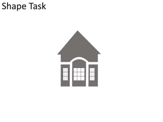
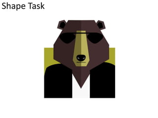
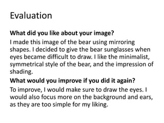
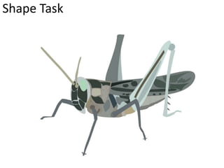
Digital Graphic Narrative
Development
Jack Head
Shape Task
Evaluation
What did you like about your image?
I made this house using very basic shapes and
very few colours. I liked the simplistic style of
the house, as well as the symmetrical nature.
What would you improve if you did it again?
If I were to do it again, I would make sure that
the houses roof is completely centred. I would
also add more detailing and pay more attention
to textures.
Shape Task
Evaluation
What did you like about your image?
I made this image of the bear using mirroring
shapes. I decided to give the bear sunglasses when
eyes became difficult to draw. I like the minimalist,
symmetrical style of the bear, and the impression of
shading.
What would you improve if you did it again?
To improve, I would make sure to draw the eyes. I
would also focus more on the background and ears,
as they are too simple for my liking.
Shape Task
Evaluation
What did you like about your image?
I made this image using lots of different shapes
layered on top of each other. I like the amount
of detail within the image, and the small shapes
within its wings and legs. I also like the
perspective effect the image gives.
What would you improve if you did it again?
I would make the shapes within the image more
precise and follow the original image more. I
would also add more detail to the legs.
Rotoscope
Evaluation
What did you like about your image?
This image took a very long time to make. I
focused on individual highlights in the hair,
which gives the image a very detailed, minimal
style and makes the image very recognisable.
What would you improve if you did it again?
If I were to do this again, I would attempt to
texture the hair highlights to make the image
more realistic, as well as focusing on the edges
of the shapes to make them smoother.
Rotoscope
Evaluation
What did you like about your image?
I like the level of detail on this image. I focused
on the shading on his clothing, making the
image look a lot more realistic.
What would you improve if you did it again?
If I were to do this again, I would attempt to
focus more on the background so it wasn’t a
block colour. I would make the audience
rotoscoped ideally.
Text Based
Evaluation
What did you like about your image?
This image of the first line from Fahrenheit 451,
imposed over a burning book. I like the way that
the positioning of the text relates to the book
subject, and the way that the fire effect also
carries onto the text.
What would you improve if you did it again?
If I was to remake the image, I would make it
look as if the text was more part of the books,
and that the text was also on fire.
Comic Book
Evaluation
What did you like about your image?
I like the cartoon style of this image, and the
way that the image has been made so that the
style is not overused. I also like the colours that
the style has highlighted.
What would you improve if you did it again?
I would possibly adjust the threshold so
elements such as his beard were slightly lighter,
and change the background colour perhaps.
Photography
Evaluation
What did you like about your image?
I like that the image tells a basic story with no
need for text or explanation.
What would you improve if you did it again?
If I was to do this again, I would use a larger
range of shots, so not as high amount of shots
were close ups. This would give the image a
much more interesting feel.
Photography
Evaluation
What did you like about your image?
I prefer this image to the original as it has the
artistic feature of the key and the phone being a
cartoon style.
What would you improve if you did it again?
If I was to do this again, I would possibly make
more of the elements a cartoon style.
Background
Evaluation
What did you like about your image?
I like that there are two different elements
within the image, with the background being
filtered and the two taxis in the foreground
being rotoscoped, which makes certain
elements stand out.
What would you improve if you did it again?
I would possibly focus on making more of the
foreground rotoscoped, to make the image even
more 3 dimensional.
Illustration
Evaluation
What did you like about your image?
I like that the image follows a similar style to
that of the animation that I’ve done, and the
thick, black lines that are present.
What would you improve if you did it again?
If I was to do it again, I would improve the
quality of the character in the background. I
would also improve the colouring, and add
shading.
Initial Ideas
The Boy who cried wolf- classic
English tale. Most well known, very
easy to tell.
The flea- originally an Italian tale.
Would be quite hard to tell due to
length and unusual content.
The ridiculous wishes- French story.
Quite short with no moral, so unlikely
to be told. Hard to draw illustrations
for this.
The fish and the ring- British story.
Fairly well known, but very long
and complex, as well as being
hard to stray from anything but
the classic version.
Choosing a story
Choosing a story 2
Choosing a story 3
Choosing a story 4
Style type idea generation
Visual and language elements
generation
Colour schemes
Existing cartoon settings of
villages/sheep fields
Proposal
Dimensions
13x16.9cm, 8 pages
Story Overview
A boy is left to tend over some sheep. He becomes very bored, and decides to call
someone in the village and tell them that a wolf is attacking. The village rushes to save
the sheep, only to find that the boy tricked them, which he films, and puts on YouTube,
becoming viral overnight. Since it works so well, he does it again the next day. The
village comes rushing to save the sheep again, to find that he has tricked them again,
posting the sequel on YouTube. The next day, before he can pull the trick again, an
actual wolf comes. He rings to alert the village, but they don’t believe him, and he has
to try and save the sheep himself. This doesn’t work, and the sheep are eaten. The
village make the boy use the money that he makes through the YouTube prank videos
to pay for more sheep.
Export Format
JPEG
Advantages: Universal, small file size, good for use across different applications.
Disadvantages: Loss of quality can occur through recompression. This can alter the
entire books quality.
Deadline
6th November
Audience
My target audience will be 6-9 year olds of both genders, as there are good morals
for the younger end of the scale, and references to technology for the older
children. It will aim at classes ABC1, as the references to technology such as
YouTube and mobile phones will be mostly understood by these classes-lower
classes than this are not exposed to this technology as much from a young age.
Within the UK, the book would mostly be aimed at children from areas with
surrounding countryside due to the countryside setting. The book will contain a
large amount of both
Production Methods
I will use mostly rotoscoping to make the images for the book. I will acquire the
images for the base of rotoscoping through either royalty-free images or my own
photography. I have chosen rotoscoping because, as my target audience are not too
young, a strictly basic, cartoon style would not be appropriate-but a fully realistic
image would not be attractive to my target audiences age group. The font will have
stylistic element of classic gothic fonts, but also a fairly modern feel to it, to make it
easier to read for the audience.
What are the strengths of the proposal? What areas of the proposal need further work?
There is a lot of detail and everything is very
specific and clear.
There aren’t really any improvements to make on
the work itself, but as a suggestion I think you could
widen your target audience a bit ore in order to get
more sales, for example the book could be aimed
not just at children who are good at reading, but for
those who struggle they could get help from
parents or teachers at school if they did want to
read your story despite not being a very good
reader.
What are the strengths of the idea generation? What areas of idea generation could have been
further developed?
Detailed and very well-annotated mood boards.
Clear enough to imagine in your head vaguely what
the characters will look like and how the story will
go.
What are the strengths of the proposal? What areas of the proposal need further work?
Huge amounts of thorough detail. Really good
planning, you considered every aspect of the story,
audience and production.
You could possibly give more advantages or
disadvantages for your export format. For example
how does recompression affect the overall quality
of the book?
What are the strengths of the idea generation? What areas of idea generation could have been
further developed?
Clear mind mapping really shows the entire thought
process in development. You’ve given multiple story
ideas and where they come from. Each story
example is backed up with facts and their
advantages or disadvantages.
Maybe some more detailed character design.
What are the strengths of the proposal? What areas of the proposal need further work?
I think the technologic additions to a classic tale
work very well with our current generation as most
children are introduced to technology at a very
young age.
I think that the story could be changed slightly
more, maybe the boy is looking after something
slightly different so that when the boy is not listened
to, the outcome is slightly less dark and violent.
What are the strengths of the idea generation? What areas of idea generation could have been
further developed?
I think that the art style and font usage will work
nicely along with the story as the cartoon aspect
will help lower the darkness as the wolf can be
shown as quite fluffy and almost friendly.
I think that the whole story should be slightly
brought into the future. This would help modernise
the story and help he reader relate to it to make the
story easier to read.
Feedback Summary
Sum up your feedback.
My feedback mostly focused on the proposed style elements of the book, as well as
some of the target audience work. Many of the positive comments referred to the
extensive work within the mind maps and mood boards, as well as the idea generation
of looking at alternative stories to be done.
Which parts of your feedback do you agree with and why?
I agree with the comments about target audience, as the book should be made to be
accessed by children of all reading abilities. I also agree with the comment about making
the book less dark, as a darker adaptation of the story could put some children off the
book.
Which parts of your feedback do you disagree with and why?
I disagree with comments such as modernising my plot, as I have already modernised
the tale by incorporating technology such as YouTube and phones. I also disagree with
the comment about giving more disadvantages (such as quality) for the file type, as I
have already spoken about the loss of quality through recompression.
Storyboards
Storyboards
Storyboards
Original Script
Original Script goes here with link to where it came from
Original Script
Original Script goes here with link to where it came from
Final Script
Final script goes here.
Digital Flat Plans

Development pro forma

  • 1.
  • 2.
  • 3.
    Evaluation What did youlike about your image? I made this house using very basic shapes and very few colours. I liked the simplistic style of the house, as well as the symmetrical nature. What would you improve if you did it again? If I were to do it again, I would make sure that the houses roof is completely centred. I would also add more detailing and pay more attention to textures.
  • 4.
  • 5.
    Evaluation What did youlike about your image? I made this image of the bear using mirroring shapes. I decided to give the bear sunglasses when eyes became difficult to draw. I like the minimalist, symmetrical style of the bear, and the impression of shading. What would you improve if you did it again? To improve, I would make sure to draw the eyes. I would also focus more on the background and ears, as they are too simple for my liking.
  • 6.
  • 7.
    Evaluation What did youlike about your image? I made this image using lots of different shapes layered on top of each other. I like the amount of detail within the image, and the small shapes within its wings and legs. I also like the perspective effect the image gives. What would you improve if you did it again? I would make the shapes within the image more precise and follow the original image more. I would also add more detail to the legs.
  • 8.
  • 9.
    Evaluation What did youlike about your image? This image took a very long time to make. I focused on individual highlights in the hair, which gives the image a very detailed, minimal style and makes the image very recognisable. What would you improve if you did it again? If I were to do this again, I would attempt to texture the hair highlights to make the image more realistic, as well as focusing on the edges of the shapes to make them smoother.
  • 10.
  • 11.
    Evaluation What did youlike about your image? I like the level of detail on this image. I focused on the shading on his clothing, making the image look a lot more realistic. What would you improve if you did it again? If I were to do this again, I would attempt to focus more on the background so it wasn’t a block colour. I would make the audience rotoscoped ideally.
  • 12.
  • 13.
    Evaluation What did youlike about your image? This image of the first line from Fahrenheit 451, imposed over a burning book. I like the way that the positioning of the text relates to the book subject, and the way that the fire effect also carries onto the text. What would you improve if you did it again? If I was to remake the image, I would make it look as if the text was more part of the books, and that the text was also on fire.
  • 14.
  • 15.
    Evaluation What did youlike about your image? I like the cartoon style of this image, and the way that the image has been made so that the style is not overused. I also like the colours that the style has highlighted. What would you improve if you did it again? I would possibly adjust the threshold so elements such as his beard were slightly lighter, and change the background colour perhaps.
  • 16.
  • 17.
    Evaluation What did youlike about your image? I like that the image tells a basic story with no need for text or explanation. What would you improve if you did it again? If I was to do this again, I would use a larger range of shots, so not as high amount of shots were close ups. This would give the image a much more interesting feel.
  • 18.
  • 19.
    Evaluation What did youlike about your image? I prefer this image to the original as it has the artistic feature of the key and the phone being a cartoon style. What would you improve if you did it again? If I was to do this again, I would possibly make more of the elements a cartoon style.
  • 20.
  • 21.
    Evaluation What did youlike about your image? I like that there are two different elements within the image, with the background being filtered and the two taxis in the foreground being rotoscoped, which makes certain elements stand out. What would you improve if you did it again? I would possibly focus on making more of the foreground rotoscoped, to make the image even more 3 dimensional.
  • 22.
  • 23.
    Evaluation What did youlike about your image? I like that the image follows a similar style to that of the animation that I’ve done, and the thick, black lines that are present. What would you improve if you did it again? If I was to do it again, I would improve the quality of the character in the background. I would also improve the colouring, and add shading.
  • 24.
  • 25.
    The Boy whocried wolf- classic English tale. Most well known, very easy to tell. The flea- originally an Italian tale. Would be quite hard to tell due to length and unusual content. The ridiculous wishes- French story. Quite short with no moral, so unlikely to be told. Hard to draw illustrations for this. The fish and the ring- British story. Fairly well known, but very long and complex, as well as being hard to stray from anything but the classic version.
  • 26.
  • 27.
  • 28.
  • 29.
  • 30.
    Style type ideageneration
  • 31.
    Visual and languageelements generation
  • 32.
    Colour schemes Existing cartoonsettings of villages/sheep fields
  • 33.
    Proposal Dimensions 13x16.9cm, 8 pages StoryOverview A boy is left to tend over some sheep. He becomes very bored, and decides to call someone in the village and tell them that a wolf is attacking. The village rushes to save the sheep, only to find that the boy tricked them, which he films, and puts on YouTube, becoming viral overnight. Since it works so well, he does it again the next day. The village comes rushing to save the sheep again, to find that he has tricked them again, posting the sequel on YouTube. The next day, before he can pull the trick again, an actual wolf comes. He rings to alert the village, but they don’t believe him, and he has to try and save the sheep himself. This doesn’t work, and the sheep are eaten. The village make the boy use the money that he makes through the YouTube prank videos to pay for more sheep. Export Format JPEG Advantages: Universal, small file size, good for use across different applications. Disadvantages: Loss of quality can occur through recompression. This can alter the entire books quality.
  • 34.
    Deadline 6th November Audience My targetaudience will be 6-9 year olds of both genders, as there are good morals for the younger end of the scale, and references to technology for the older children. It will aim at classes ABC1, as the references to technology such as YouTube and mobile phones will be mostly understood by these classes-lower classes than this are not exposed to this technology as much from a young age. Within the UK, the book would mostly be aimed at children from areas with surrounding countryside due to the countryside setting. The book will contain a large amount of both Production Methods I will use mostly rotoscoping to make the images for the book. I will acquire the images for the base of rotoscoping through either royalty-free images or my own photography. I have chosen rotoscoping because, as my target audience are not too young, a strictly basic, cartoon style would not be appropriate-but a fully realistic image would not be attractive to my target audiences age group. The font will have stylistic element of classic gothic fonts, but also a fairly modern feel to it, to make it easier to read for the audience.
  • 35.
    What are thestrengths of the proposal? What areas of the proposal need further work? There is a lot of detail and everything is very specific and clear. There aren’t really any improvements to make on the work itself, but as a suggestion I think you could widen your target audience a bit ore in order to get more sales, for example the book could be aimed not just at children who are good at reading, but for those who struggle they could get help from parents or teachers at school if they did want to read your story despite not being a very good reader. What are the strengths of the idea generation? What areas of idea generation could have been further developed? Detailed and very well-annotated mood boards. Clear enough to imagine in your head vaguely what the characters will look like and how the story will go.
  • 36.
    What are thestrengths of the proposal? What areas of the proposal need further work? Huge amounts of thorough detail. Really good planning, you considered every aspect of the story, audience and production. You could possibly give more advantages or disadvantages for your export format. For example how does recompression affect the overall quality of the book? What are the strengths of the idea generation? What areas of idea generation could have been further developed? Clear mind mapping really shows the entire thought process in development. You’ve given multiple story ideas and where they come from. Each story example is backed up with facts and their advantages or disadvantages. Maybe some more detailed character design.
  • 37.
    What are thestrengths of the proposal? What areas of the proposal need further work? I think the technologic additions to a classic tale work very well with our current generation as most children are introduced to technology at a very young age. I think that the story could be changed slightly more, maybe the boy is looking after something slightly different so that when the boy is not listened to, the outcome is slightly less dark and violent. What are the strengths of the idea generation? What areas of idea generation could have been further developed? I think that the art style and font usage will work nicely along with the story as the cartoon aspect will help lower the darkness as the wolf can be shown as quite fluffy and almost friendly. I think that the whole story should be slightly brought into the future. This would help modernise the story and help he reader relate to it to make the story easier to read.
  • 38.
    Feedback Summary Sum upyour feedback. My feedback mostly focused on the proposed style elements of the book, as well as some of the target audience work. Many of the positive comments referred to the extensive work within the mind maps and mood boards, as well as the idea generation of looking at alternative stories to be done. Which parts of your feedback do you agree with and why? I agree with the comments about target audience, as the book should be made to be accessed by children of all reading abilities. I also agree with the comment about making the book less dark, as a darker adaptation of the story could put some children off the book. Which parts of your feedback do you disagree with and why? I disagree with comments such as modernising my plot, as I have already modernised the tale by incorporating technology such as YouTube and phones. I also disagree with the comment about giving more disadvantages (such as quality) for the file type, as I have already spoken about the loss of quality through recompression.
  • 39.
  • 40.
  • 41.
  • 42.
    Original Script Original Scriptgoes here with link to where it came from
  • 43.
    Original Script Original Scriptgoes here with link to where it came from
  • 44.
  • 45.