FULL ENJOY - 9953040155 Call Girls in Gtb Nagar | Delhi
Edgy Rockers Take Centre Stage
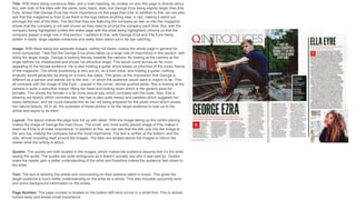
1. Title: With there being numerous titles, and a main heading, its unclear on who this page is directly about.
But, with both of the titles with the same, bold, black, style, but George Erza being slightly larger than Ella
Eyre, shows that George Erza has more importance on this page than Ella. In addition to this, we can also
see that this magazine is from Q as there is the logo before anything else, in red, making it stand out
amongst the rest of the titles. The fact that they are featuring the company so late on into the magazine
shows that the company is not well known as they need to prompt the company each time. But, with the
company being highlighted (unlike the drake page with the artist being highlighted) informs us that the
company played a large role in this section. I addition to this, with George Erza and Ella Eyre being
written in black, large capitals enhances and really does stand out to be eye catching.
Image: With there being two separate images, neither full bleed, makes the whole page in general far
more compacted. I feel that the George Erza photo takes up a large role of importance in this section, with
being the larger image. George is looking fiercely towards the camera. By looking at the camera at the
angle defines his cheekbones and shows his attractive angel. This would come across as far more
appealing to the female audience. He is also holding a guitar which keeps us informed of the music theme
of the magazine. The whole positioning is very put on, on a train track, and holding a guitar, nothing
anybody would generally be doing on a every day basis. This gives us the impression that George is
different as a person and stands out to the rest – in which the audience would want to inspire to be. This
all contrasts with the image of Ella Eyre – placed in the corner, almost pushed aside. She is looking at the
camera in quite a seductive manor, tilting her head and looking down which is the generic pose for
females. This shows the female in a far more sexual way which contrasts with the male. Also, Ella is
wearing red lipstick which connotes sex. Her hair is also quite messy and careless which suggests her
sassy behaviour, and we could interpret this as her not being prepared for the photo shoot which shows
her natural beauty. All in all, the purposes of these photos is for the target audience to look up to the
artists and aspire to be them.
Layout: The layout makes the page look full up with detail. With the image taking up the centre placing
makes the image of George the main focus. The small, and more subtly placed image of Ella makes it
seem as if Ella is at lower importance. In addition to this, we can see that the title cuts into the image at
the very top, making the company have the most importance. The text is written at the bottom, and the
side, almost moulding itself around the images. The titles are located above the images to inform the
reader what the writing is about.
Quotes: The quotes are both located in the images, which makes the audience assume that it’s the artist
saying the quote. The quotes are quite ambiguous as it doesn’t actually say who it was said by. Quotes
make the reader gain a better understanding of the artist and therefore makes the audience feel closer to
the artist.
Text: The text is idolizing the artists and commenting on their extreme talent in music. This gives the
target audience a much better understanding on the artist as a whole. This also includes upcoming work,
and some background information on the artists.
Page Number: The page number is located on the bottom left hand corner in a small font. This is almost
tucked away and shows small importance.
2. Title: The title is written not obviously, as there are many titles in a small font. The Maccabees,
are written in an old fashioned font. This gives us the impression that the target audience is for
older adults. In addition to this, there is a title at the top, ‘NEW ALBUMS’, which is in red. Red
connotes rebellious behaviour which blends in well with the style of this music, being rock and
roll, and slightly different from other music.
Image: The image is of the Maccabees. They are all extremely pale in the face, whether this is
intended or natural I am unaware of. If this is intended, this gives the band a different hipster
view as generically everyone wants to have tanned skin. This informs us that this type of music
is not for mainstreamers. Four members of the band are looking sharply towards the camera,
but in slouched positions. The end member is gazing elsewhere. This gives the effect that the
image was taken in motion. I am unaware if this was intended, but the members look like drug
addicts, work out faces, with dark circles under their eyes. This ties in with the genre of being
different and edgy.
Layout: The layout is created to make the centre focus on the Maccabees. The way that the
writing is separated into columns makes it come across as far less bulky, and more appealing
to read as a whole. There are quotes inputted within the writing to separate it and also make it
look far less bulky. In addition to this, there isn’t one eye catching title which instantly reels us
into reading this page. I think that this is cleverly laid out to give us a chance to read and find
out for ourselves.
Text: The text includes a short story in the life of themselves, the Maccabees.. This discusses
things their fans and how they follow where he is. It also mentions some of their life stories. The
text is written in 3rd person which makes it feel a lot less personal. This is why the quote is
included, to idolise the one line which he does speak. The first letter is a capital H, in black and
stands out from the rest as this is an original technique and many people do this in magazines,
newspapers, etc. Some of the interviewed quotes are written in red to make the quotes
significant from the rest of the text!
Quotes: The quotes are both located in the images, which makes the audience assume that it’s
the artist saying the quote. The quotes are quite ambiguous as it doesn’t actually say who it
was said by. Quotes make the reader gain a better understanding of the artist and therefore
makes the audience feel closer to the artist.
Page Number: The page number is located on the bottom left hand corner in a small font. This
is almost tucked away and shows small importance.