
Recommended
More Related Content
What's hot
What's hot (18)
Viewers also liked
Similar to D ouble page spread
Similar to D ouble page spread (20)
More from garrett001
More from garrett001 (16)
Recently uploaded
Recently uploaded (20)
D ouble page spread
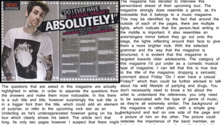
- 1. The magazine has decided to interview this person/band ahead of their upcoming tour. The magazine strongly does resemble a genre, as it’s noticeable that it belongs to a music magazine. This may be identified by the fact that around the outside of each of the pages, there are multiple lights, which indicate that the person./text writing in the middle is important. It also resembles an actor/singers mirror before they go out onto the stage, the lights reflecting around their face to give them a more brighter look. With the selected grammar and the way that the magazine is structured, it is evident that this magazine is targeted towards older adolescents. The category of this magazine I’d put under as a comedic musical type of magazine. I can tell that this is true due to the title of the magazine, dropping a sarcastic comment about Friday “Do I ever have a casual Friday?” which then could be further advised to talk about his wild lifestyle of partying and drugs. You don’t necessarily need to know a lot about the artist to understand the references, you only need to be associated with the type of genre of music, as they’re all extremely similar. The background of this magazine is rather plain, with a simple grey background and text on one side of the page and a picture of him on the other. The picture could reiterate the importance of the band member, as The questions that are asked in this magazine are actually highlighted in white, in order to separate the questions from the answers and make them more noticeable. In this there is a sub title and title, however surprisingly the sub title is in a bigger font than the title, which could add an element of surprise, or refer to the upcoming rock star as an Underdog as he's underappreciated however going on his first tour which clearly shows his talent. The article isn’t that long, Its only two pages however I suspect that there might
- 2. The magazine has decided to interview this person/band ahead of their upcoming tour. The magazine strongly does resemble a genre, as it’s noticeable that it belongs to a music magazine. The magazine represents a clean neat layout, with the colour co-ordination matching the colours of the entire magazine and the photo. The artist that’s been pictured is a well known established artist named Jay-Z which may be the reason that they gave him an entire page to himself. This highlights his importance to the magazine and also allows them to show off the skills of their photographers. The magazine also re-iterated that he’s one of the most exciting people in the music industry, which yet again shows us how highly they hold him. The amount of text there is equal to the size of the picture, even more in fact due to the small font and large paragraphs that’s in the issue. I’d say that this magazine would only be for teenagers and people older than that due to the formality of the magazine. The article isn’t too long and heavy due to the magazine knowing that the readers would get rather tired of it, and made it rather interesting. The large J in the middle of the text was designed to grab the attention of the readers towards the text rather than the picture. In this article it talks about Jay-Z’s most recent success, which constantly brings it up in many different ways. It talks about how and why he earned this reward, and everything he’s done in order to get there including making several no.1 songs, and bring up new artists and singers and sign them to his record label. In terms of the layout, the magazine is presented in two separate columns however is presented on the left by a studio shot of Jay-Z.
- 3. The magazine has decided to interview this person/band ahead of their upcoming tour. The magazine strongly does resemble a genre, as it’s noticeable that it belongs to a music magazine. Q magazine has chosen the American singer Lana Del ray to be portrayed for their magazine. I think this is recently after he latest album won many awards, which then continues to the magazine to tell us what happened and how she had to get there and what she had to do to get to that point in her life. The first page of the magazine shows us a studio shot of her without most make up, giving us a more natural vibe to her and what she looks like. Only three fingers of hers are shown in the show, touching her throat with her eyes closed and a rather normal expression to her face. This highlights her natural beauty as well, which I think is what the magazine was going for. On the right side of the page we are greeted by two columns of writing. However in this magazine the amount of writing is not equal to the size of the picture, which questions the design and normal amount that they do for other artists, which may show us how unique Lana del ray is. In the studio shoot, her expression is quite calm and careless, which could then show us the serious direct address, reflects the sense of passive confrontation. The background of this picture is rather complex, which then may lead me to believe that this isn’t actually a studio picture. However in order to add more of an effect, they’ve blurred out the other objects in front of her face to exacerbate her appearance. In this photo-shoot her original idea was to represent what she views herself as, bruised and broken.