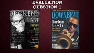
2. On the front cover of real media magazines there are
a number of conventions used to compliment its form.
Most front covers of real media
magazines have a similar form. The
layout of the cover usually has the
masthead very large at the top of the
page.Like this example, sometimes the main
image can overlap the masthead. This
shows that the name or brand of the
magazine is well know, and can be
recognised even if it being covered
I also used the convention of a masthead
to make a distinction between my product
and other jazz magazines. I followed the
usual form of real media products by
having the masthead at the top of the
page.
The design used on the
masthead reflects the
genre of the magazine
as the ‘N’ resembles the
slide on a trombone
I also developed this
convention by designing
two of my letters in the
masthead to resemble
strings on instruments
used in jazz. I think this
was effective as it
reflected the genre of
my magazine
3. COLOUR SCHEME
The colour scheme is also a
convention used on real media
products. The colours used for
the background, masthead, text,
image etc. All match or differ in a
way which will compliment the
product. For example the colour
scheme for this real magazine is
blue and gold. I know this as the
masthead, background and extra
design are all blue, whist the
selling line, cover lines/plugs and
iconography resemble a gold
colour. This colour scheme
works well in complimenting the
iconography of a trumpet, which
represents the entire magazine
as a jazz product.
blue
gold
From my questionnaire the results showed that
the black and white colour scheme was the most
popular. Because of this my main image and
background follow a monochromatic scheme.
The limited colour shown on the front of this
magazine is produced on the cover lines and
iconography.
Similar to the real music
magazine, my product
conforms to the method of
using the colour scheme to
compliment the product. For
example the yellow main cover
line compliments the acoustic
semi- electric guitar. Which is
an instrument commonly used
in jazz music, and this
represents my overall product.
4. LAYOUT
The form used on magazines of all genres
usually follow a similar layout. The selling
line and masthead on the top , the main
image consuming the majority of the page
and usually centred, then the cover lines
overlapping the main image along the sides
of the page.
My magazine conforms to a typical front
cover layout.
Comparing it to this specific jazz magazine,
my product differs in some ways. For
example, my masthead is placed on top of
my main image; whereas the masthead on
the real magazine is being overlapped by
the image. As my product is new , people
will not be familiar with my brand. Therefore
it would be better for my masthead to be
completely on show.
5. TYPOGRAPHY
The typography used on this real jazz
magazine is all the same on each convention
such as the cover lines, selling line, plugs
etc... This is to help create one clear overall
theme or design.
However the typography on my front cover rebels
against the usual consistency of one style. For
example a different style of font is used for each
cover line. I decided to challenge this convention
because I figured the different fonts worked well in
representing or reflecting that particular article in
a different way. For example the article about the
female artist ‘Lisa Solomon’ is presented on the
cover in an italic/calligraphy style, to reflect the
theme of beauty which relates to the article.