
Recommended
More Related Content
What's hot
What's hot (20)
Viewers also liked
Viewers also liked (18)
Similar to Double page spread
Similar to Double page spread (20)
More from joshwarburton800
More from joshwarburton800 (20)
Recently uploaded
Recently uploaded (20)
Double page spread
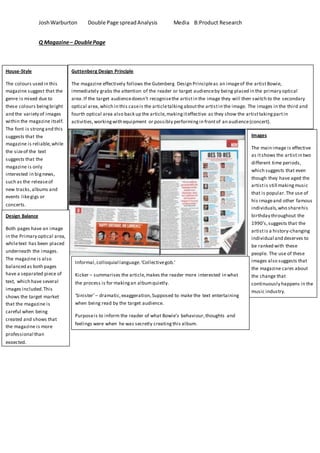
- 1. JoshWarburton Double Page spreadAnalysis Media B:Product Research Q Magazine– DoublePage House-Style The colours used in this magazine suggest that the genre is mixed due to these colours beingbright and the variety of images within the magazine itself. The font is strongand this suggests that the magazine is reliable,while the sizeof the text suggests that the magazine is only interested in bignews, such as the releaseof new tracks,albums and events likegigs or concerts. Guttenberg Design Principle The magazine effectively follows the Gutenberg Design Principleas an imageof the artistBowie, immediately grabs the attention of the reader or target audienceby being placed in the primary optical area.If the target audiencedoesn’t recognisethe artistin the image they will then switch to the secondary optical area,which in this caseis the articletalkingaboutthe artistin the image. The images in the third and fourth optical area also back up the article,makingiteffective as they show the artisttakingpartin activities,workingwith equipment or possibly performingin frontof an audience(concert). Images The main image is effective as itshows the artistin two different time periods, which suggests that even though they have aged the artistis still makingmusic that is popular.The use of his imageand other famous individuals, who sharehis birthday throughout the 1990’s,suggests that the artistis a history-changing individual and deserves to be ranked with these people. The use of these images also suggests that the magazine cares about the change that continuously happens in the music industry. Design Balance Both pages have an image in the Primary optical area, whiletext has been placed underneath the images. The magazine is also balanced as both pages have a separated piece of text, which have several images included.This shows the target market that the magazine is careful when being created and shows that the magazine is more professional than expected. Informal,colloquial language.‘Collectivegob.’ Kicker – summarises the article,makes the reader more interested in what the process is for makingan albumquietly. ‘Sinister’– dramatic,exaggeration,Supposed to make the text entertaining when being read by the target audience. Purposeis to inform the reader of what Bowie’s behaviour,thoughts and feelings were when he was secretly creatingthis album.
- 2. JoshWarburton Double Page spreadAnalysis Media B:Product Research Images The main image is effective as itshows the artist performing, which suggests that the artistis still making music and is still popular among e public.The use of his imageand other famous individuals suggests that the artistis participatingin a major event, which suggests that the popularity of the artistis still strong due to the fact that he was asked to perform in an event which would have probably included several major,both new and old, artists thatwould be included in the Top 40 music charts in the UK or Globally. Guttenberg Design Principle The magazine effectively follows the Gutenberg Design Principleas an imageof the artist immediately grabs the attention of the reader or target audienceby being placed in the primary optical area.If the target audiencedoesn’t recognisethe artistin the image they will then switch to the secondary optical area,which in this caseis the articletalkingaboutthe artistin the image. The images in the third and fourth optical area also back up the article,makingiteffective as they show the artisttakingpartin activities,workingwith equipment or possibly performingin frontof an audience(concert). House-Style The colours used in this magazine suggest that the genre is mixed due to these colours beingbright and the variety of images within the magazine itself. The font is strongand this suggests that the magazine is reliable,while the sizeof the text suggests that the magazine is only interested in bignews, such as the releaseof new tracks,albums and events likegigs or concerts. Design Balance Both pages have an image in the Primary optical area, whiletext has been placed underneath the images. The magazine is also balanced as both pages have a separated piece of text, which have several images included.This shows the target market that the magazine is careful when being created and shows that the magazine is more professional than expected. Informal,colloquial language.This is used to entertain the reader instead of makingthem become disinterested,which would reduce the potential of the company reachingtheir desired sales. Kicker – summarises the article,makes the reader more interested in why the articleis talkingaboutthis supposed major event. The text is clearly informing thereader about the artist,whilehavingsome areas that entertains the reader/customer whilethey go through the article. An example of that would be ‘three legged dog learns to run a different way, which suggests that the band has overcome a difficulty they have suffered from by dealingwith it differently than expected Purposeis to inform the reader of the artist’s history,whilealso givinga reason why they participated in this major event.
- 3. JoshWarburton Double Page spreadAnalysis Media B:Product Research