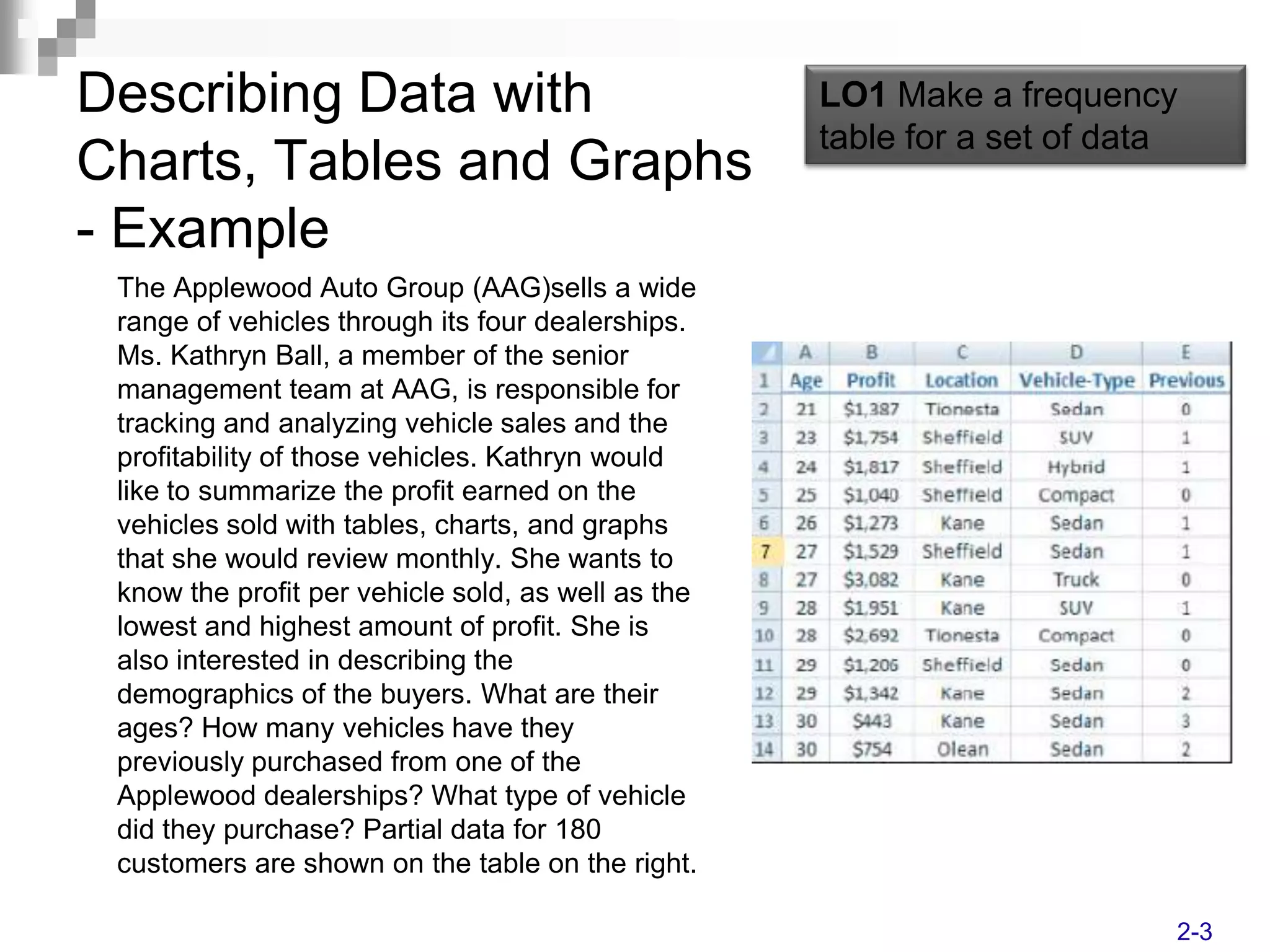
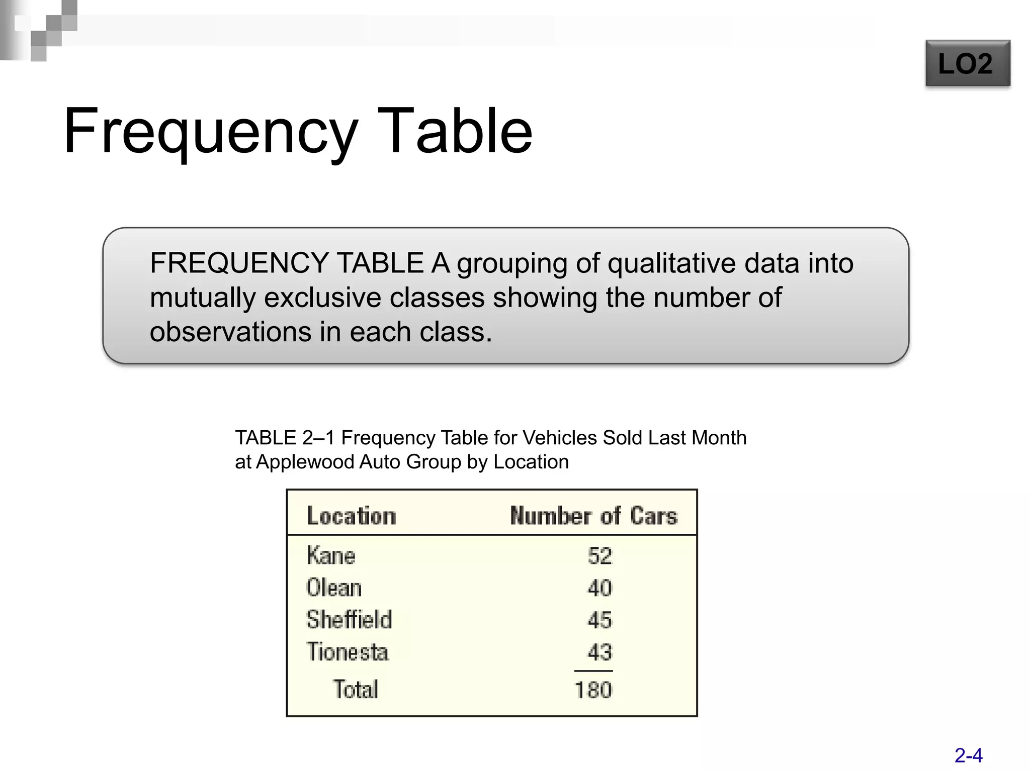
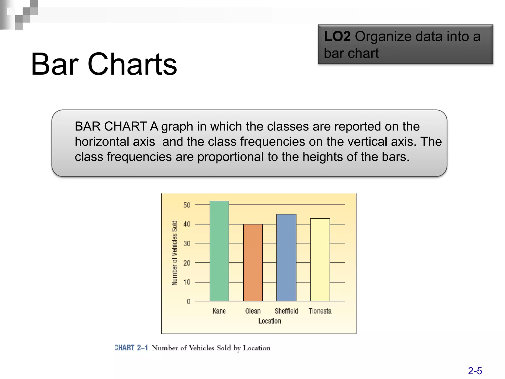
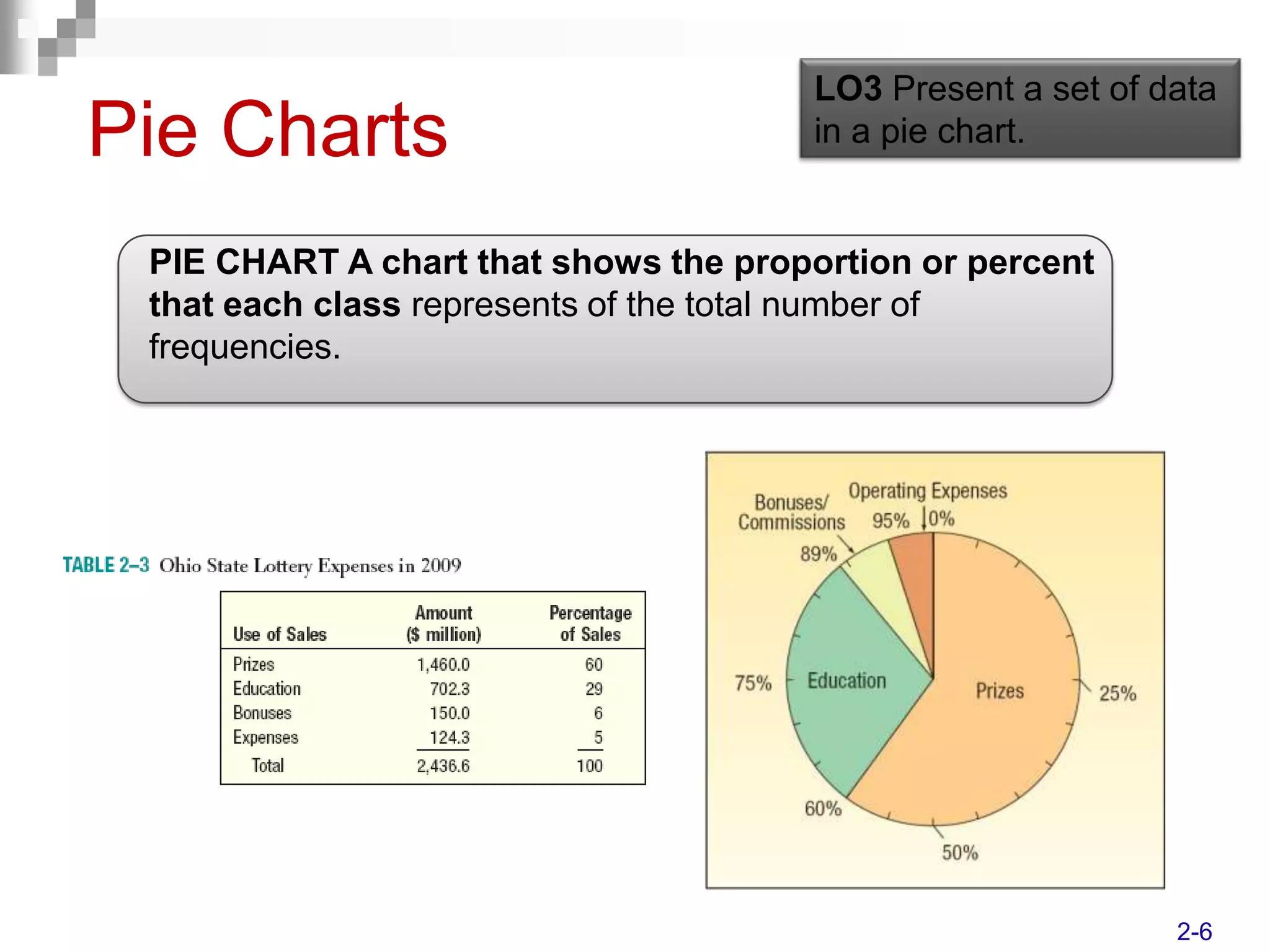
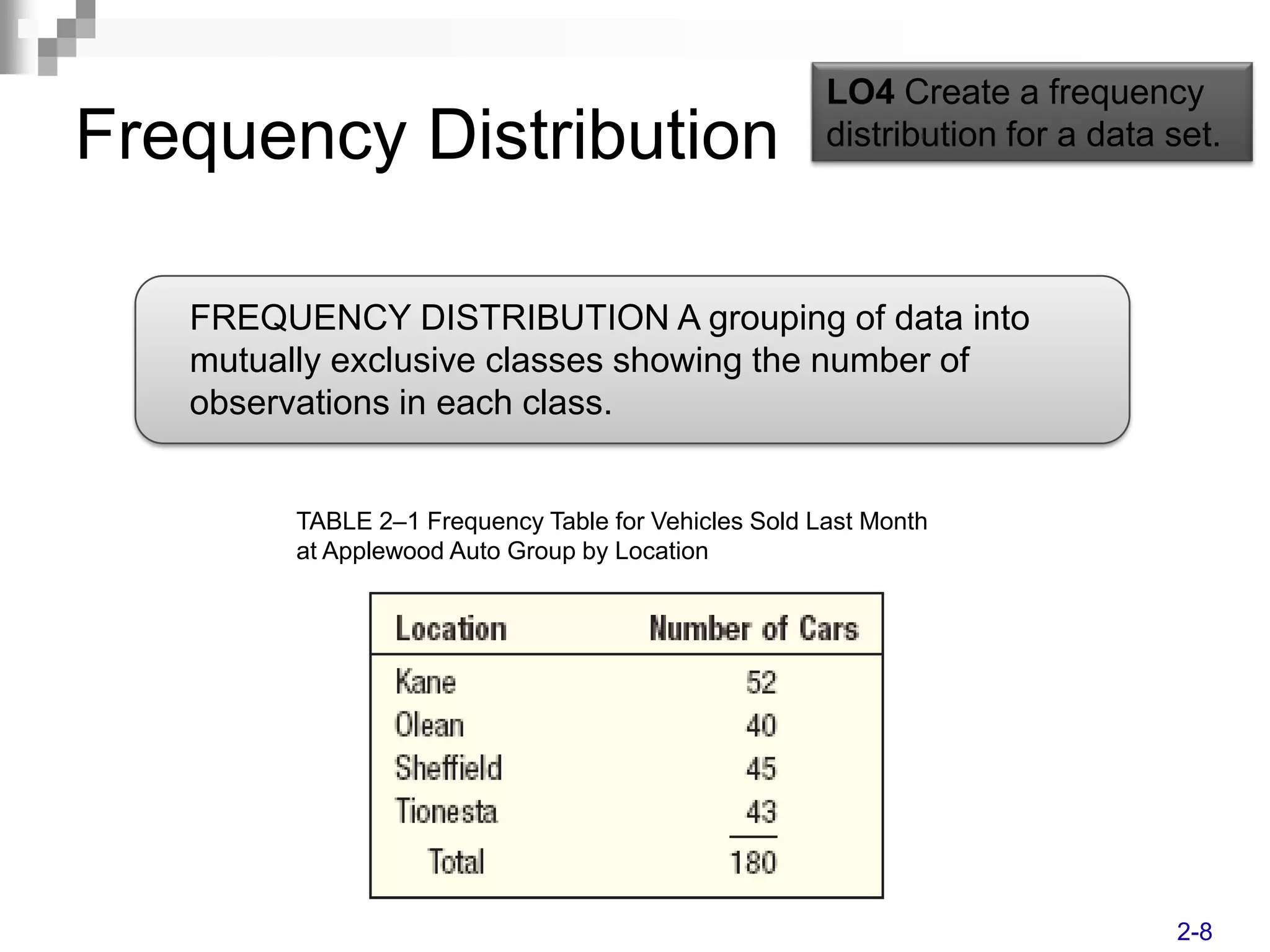
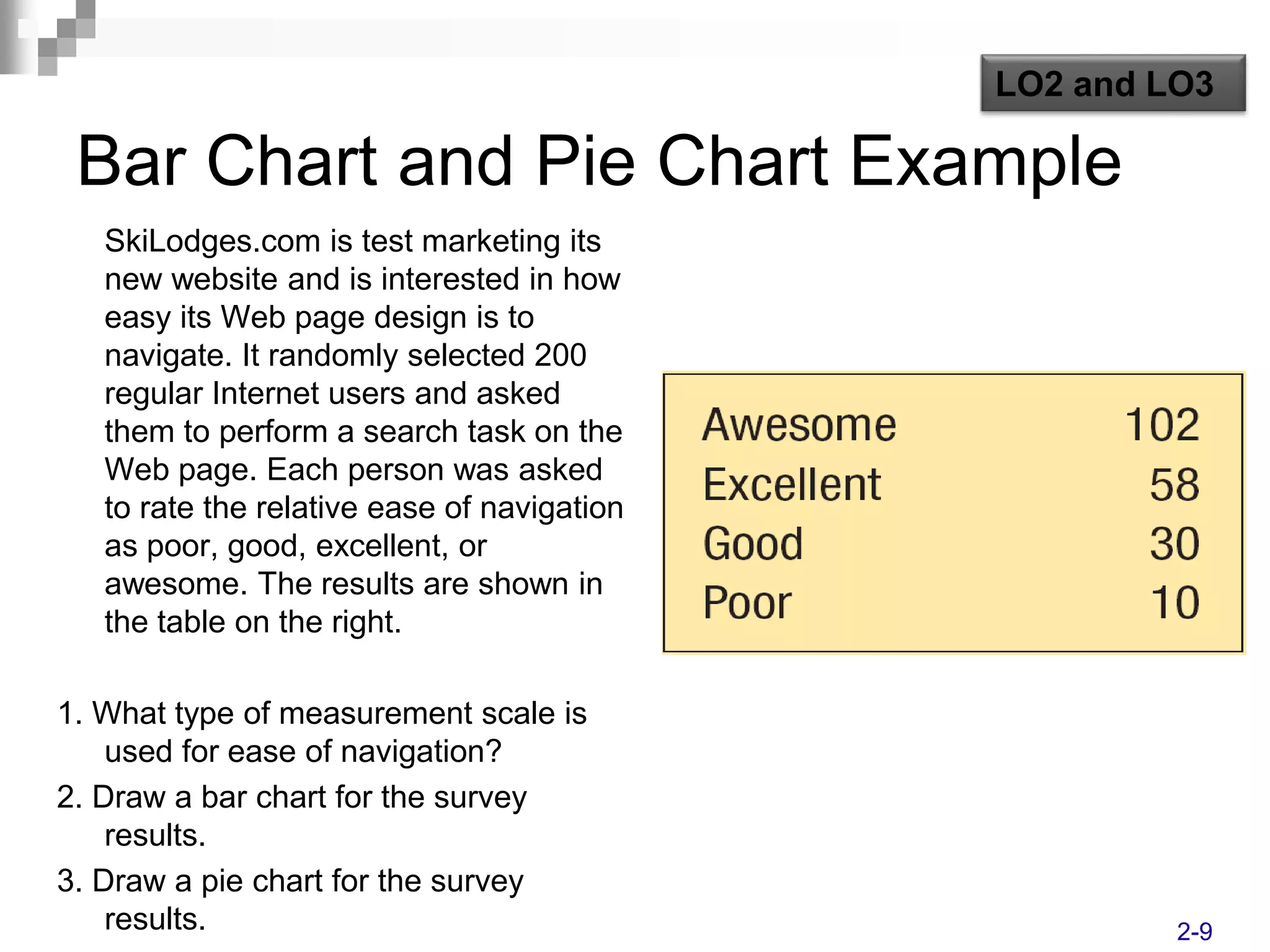
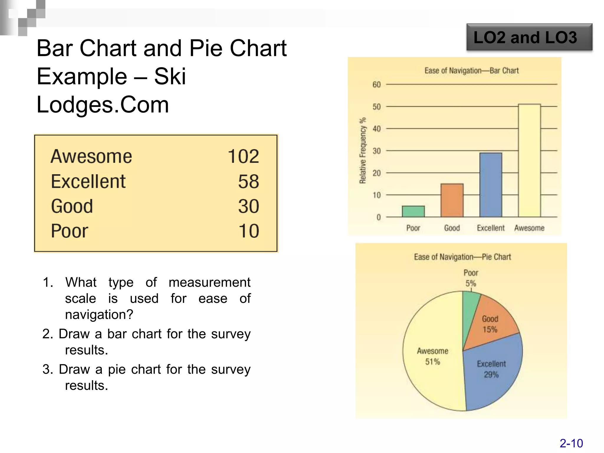
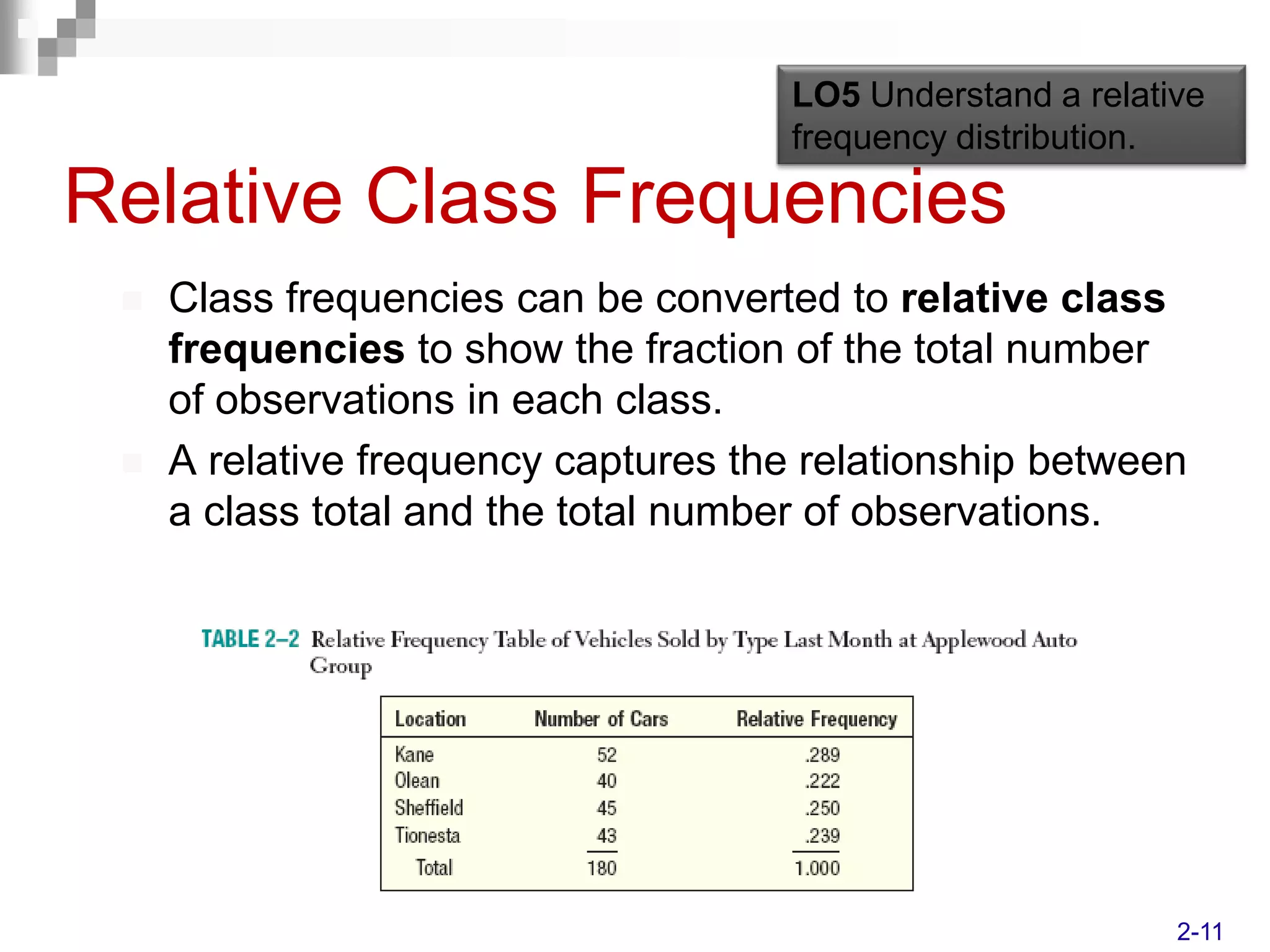
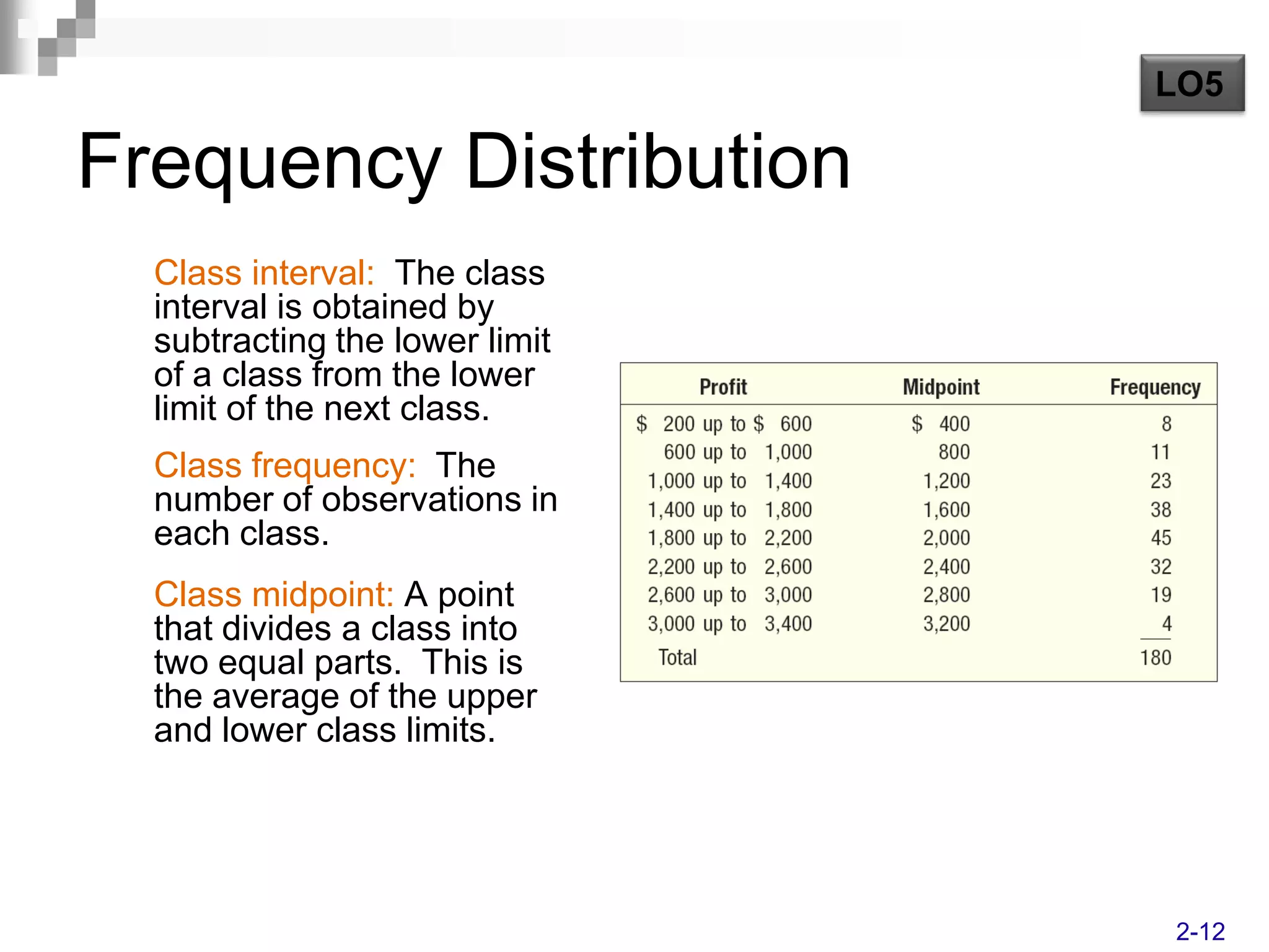
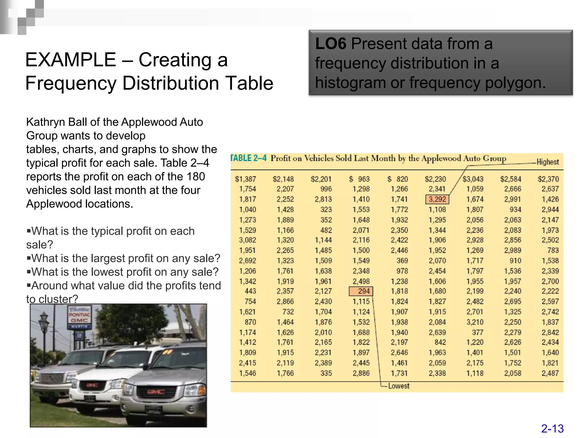
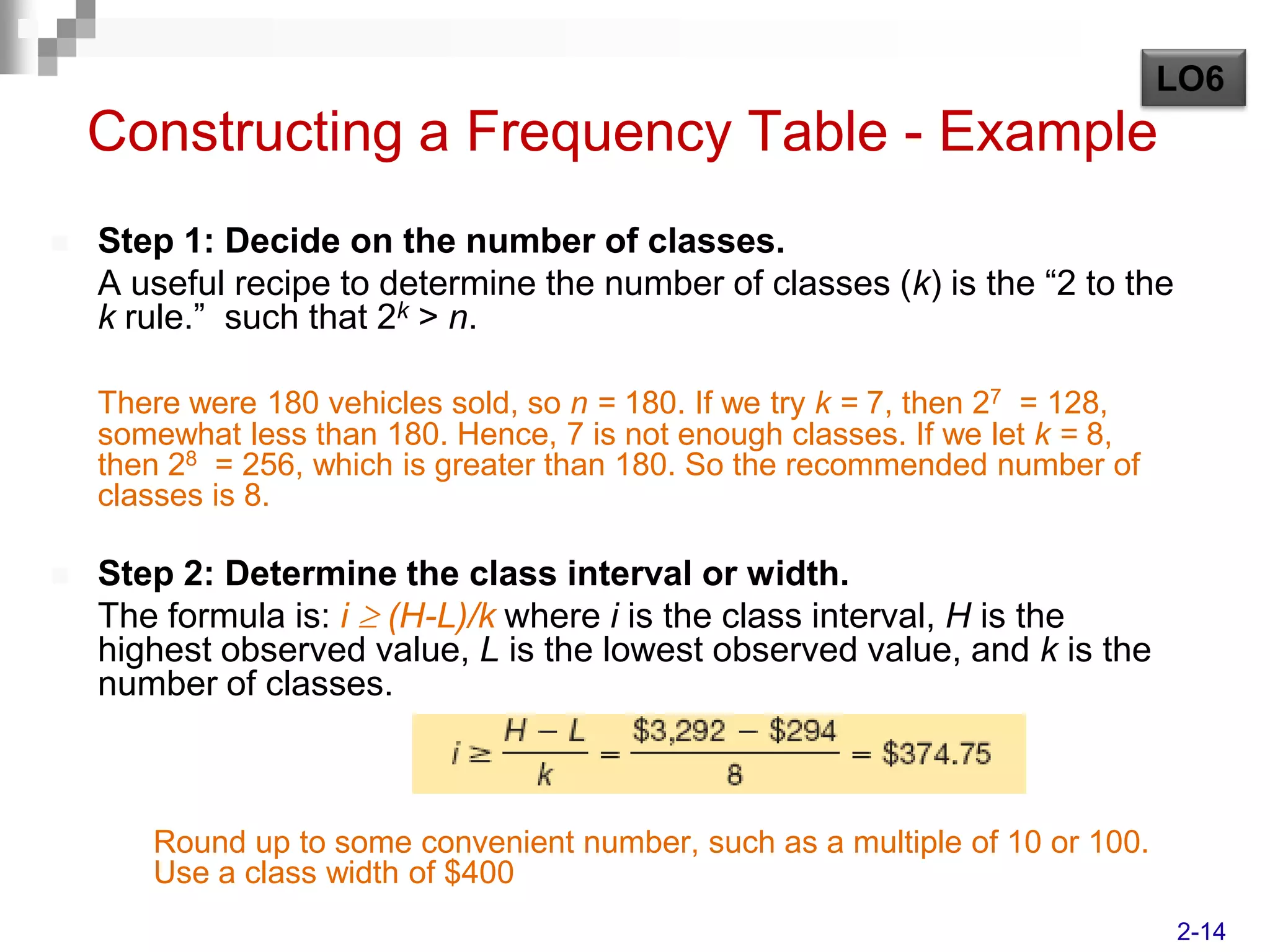
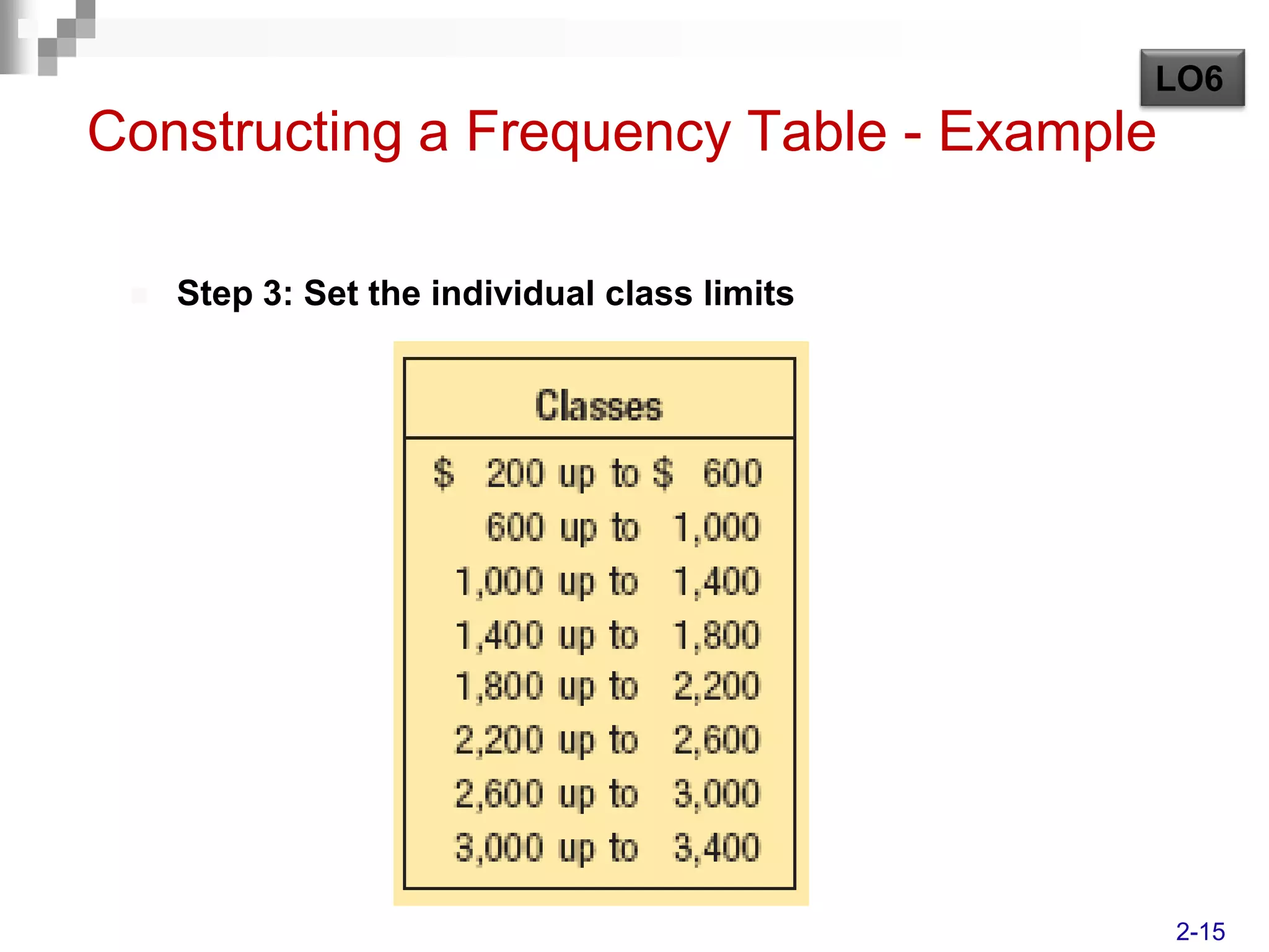
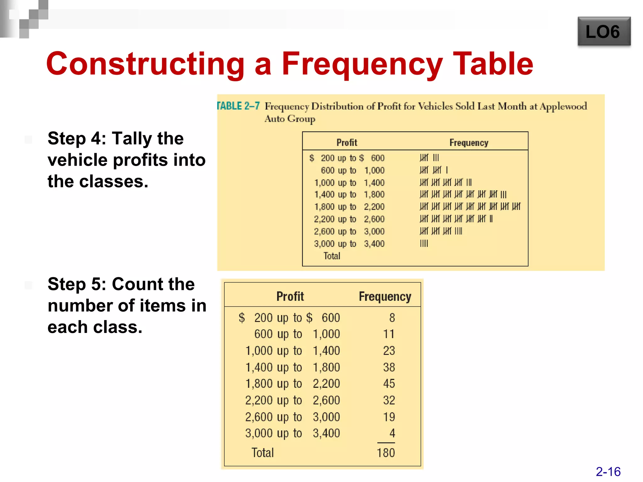
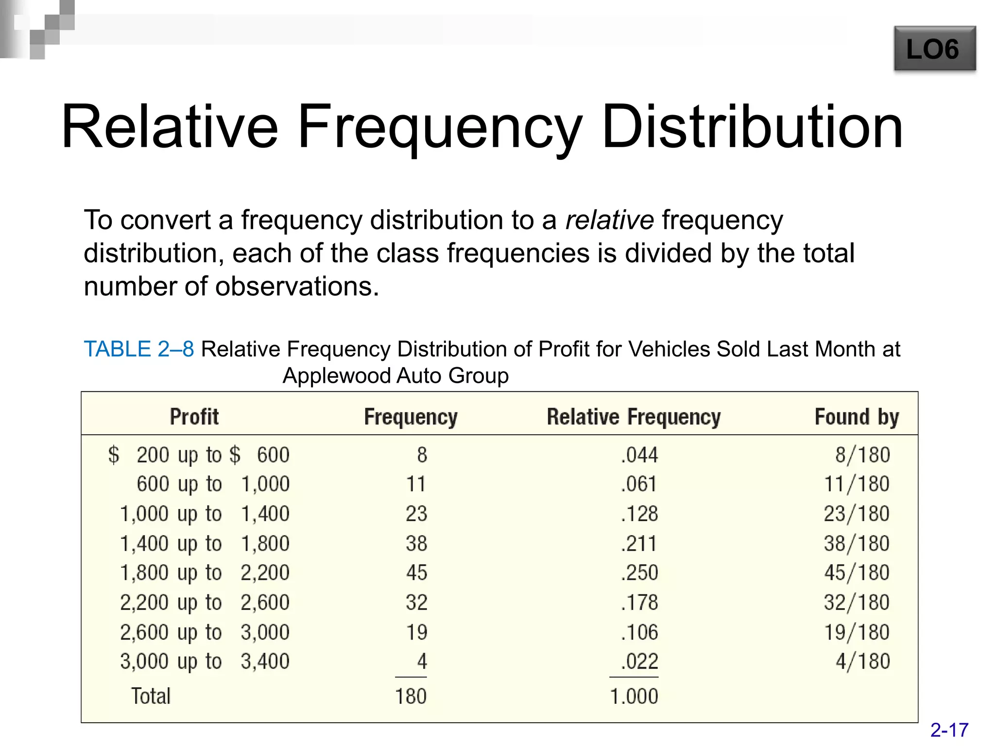
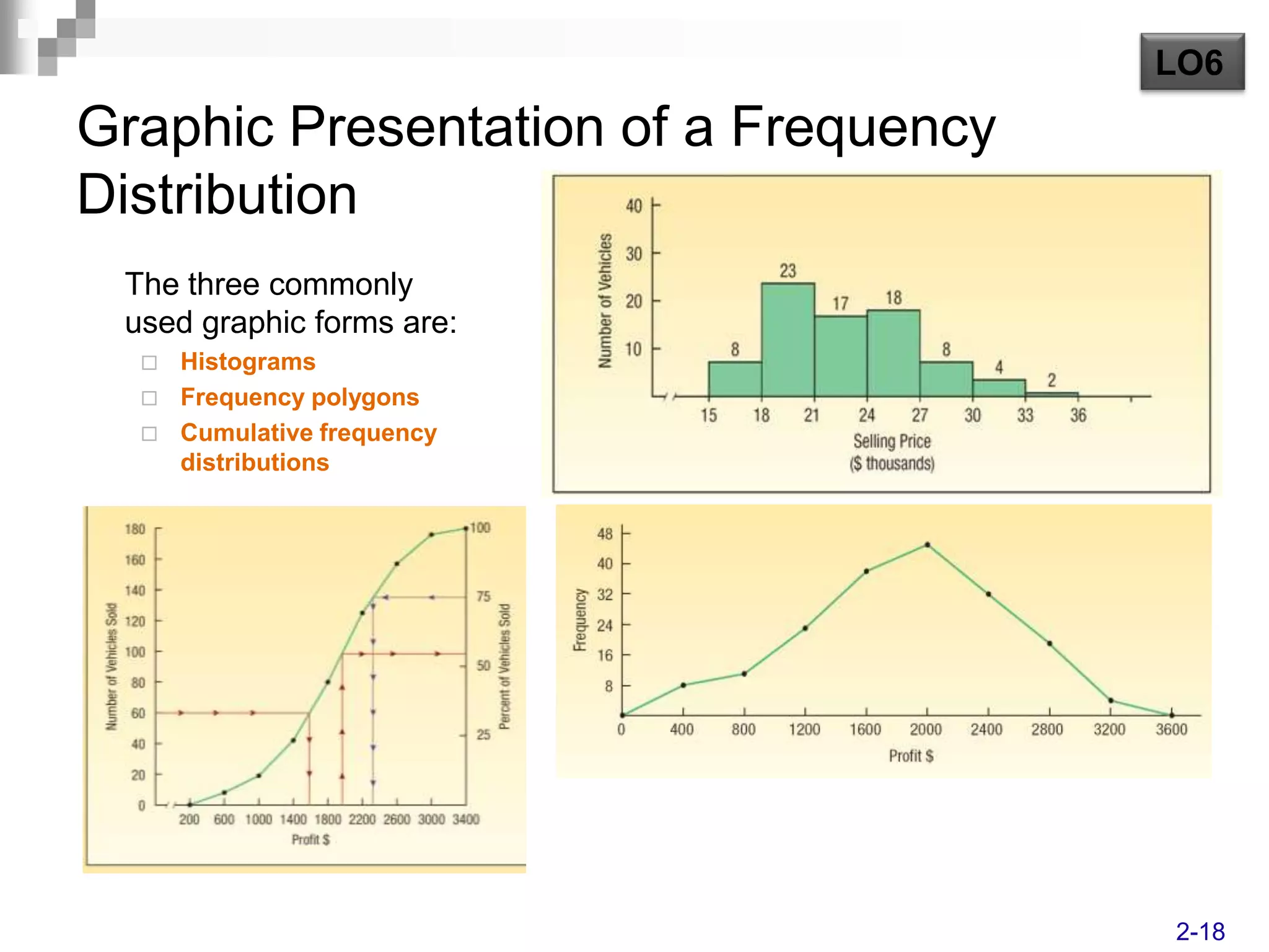
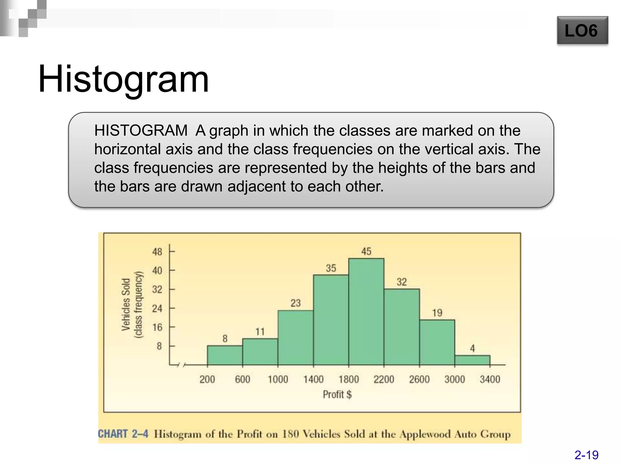
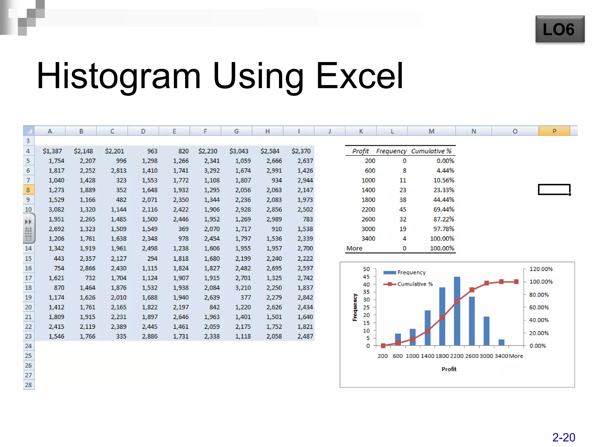
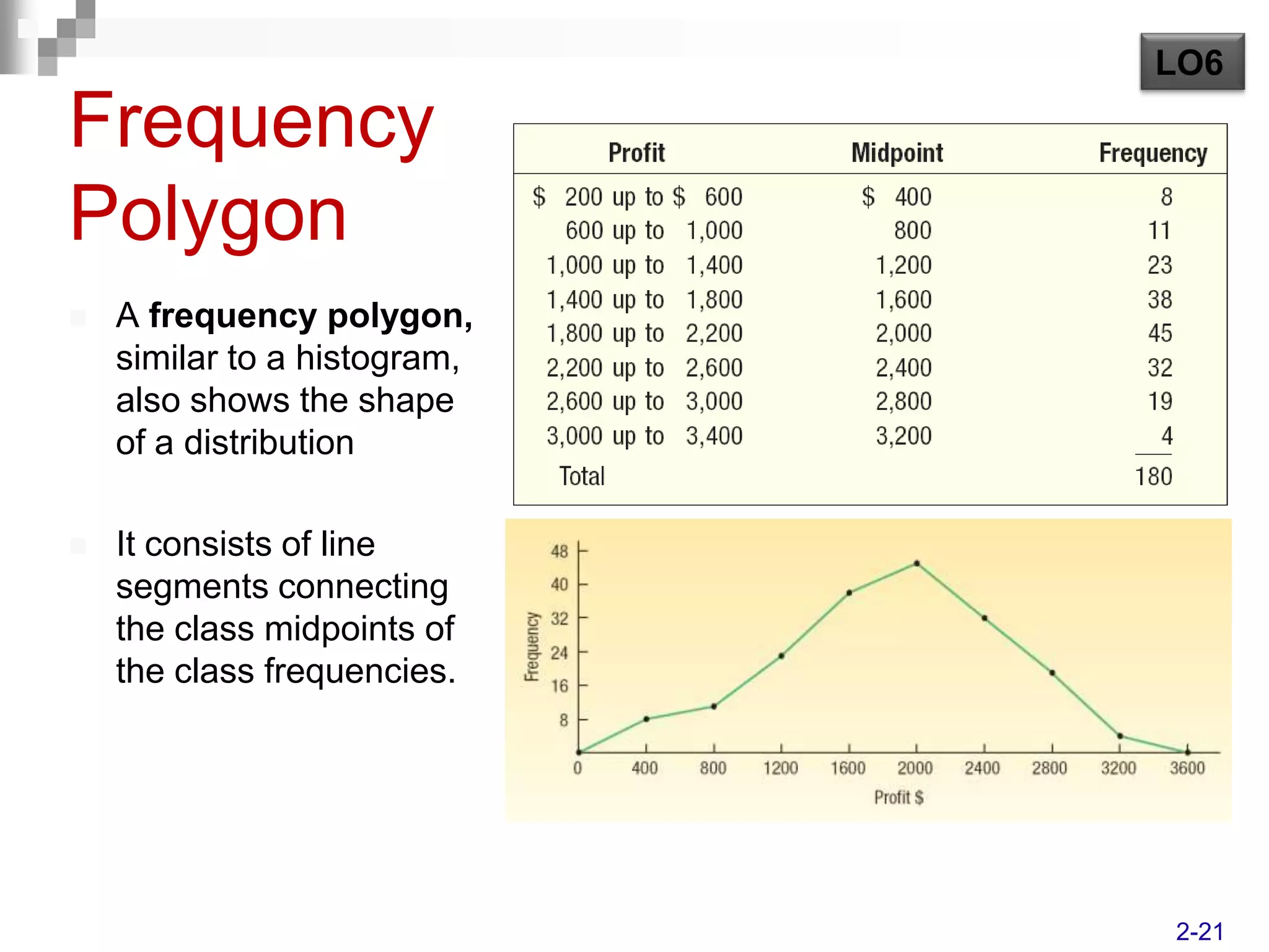
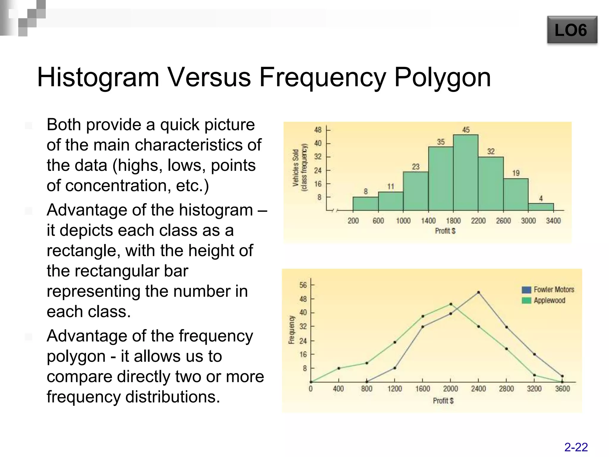
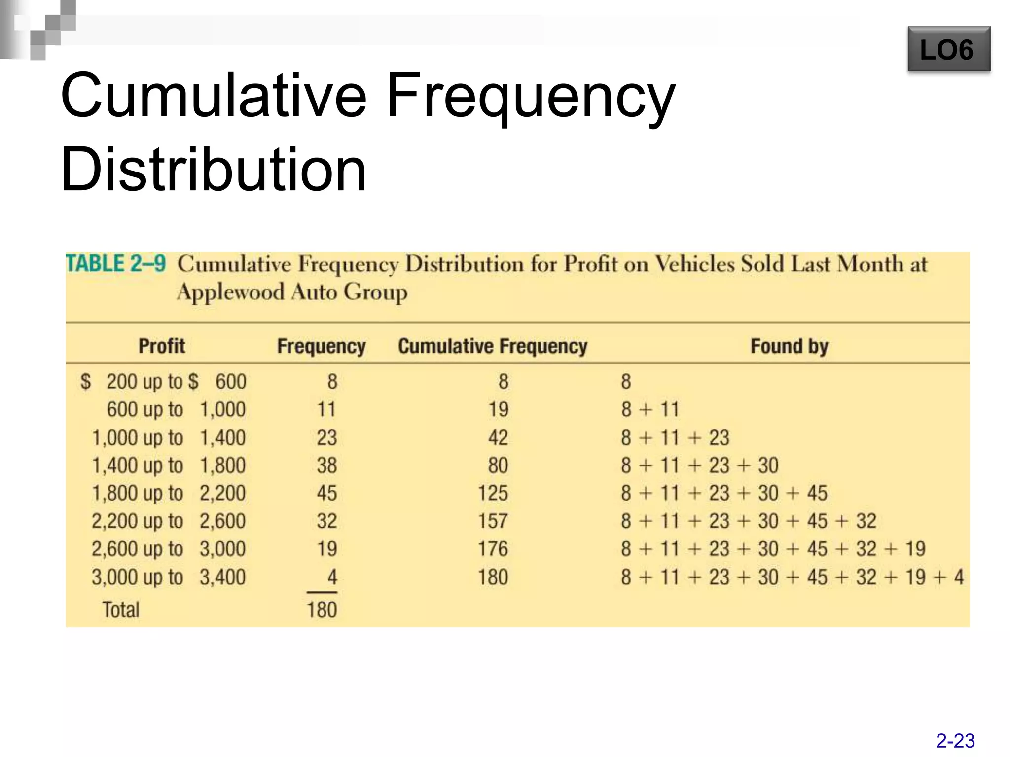
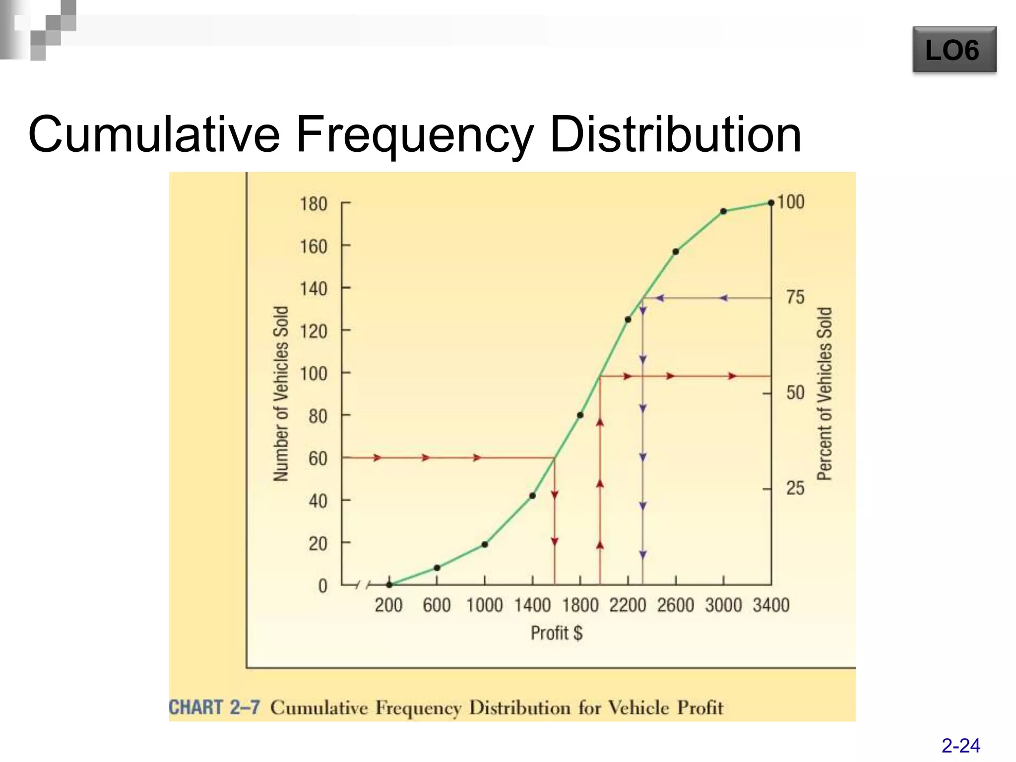
This document discusses various methods for organizing and presenting data visually, including frequency tables, bar charts, pie charts, frequency distributions, histograms, and frequency polygons. It provides examples and learning objectives for how to create each of these and use them to summarize key characteristics of a data set such as profits from vehicle sales.