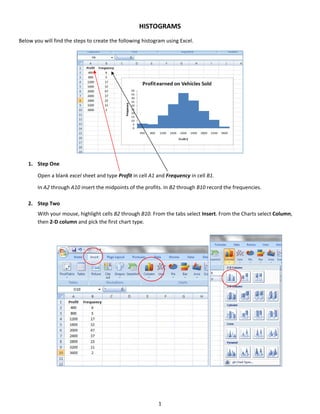
HISTOGRAMS 
Below you will find the steps to create the following histogram using Excel. 


    1. Step One 
         

        Open a blank excel sheet and type Profit in cell A1 and Frequency in cell B1. 
         

       In A2 through A10 insert the midpoints of the profits. In B2 through B10 record the frequencies. 
        
    2. Step Two 


        With your mouse, highlight cells B2 through B10. From the tabs select Insert. From the Charts select Column, 
        then 2‐D column and pick the first chart type.  


                                                             1 


        A graph will appear. 


    3. Step Three 
        
       To edit the table the graph, double click on one of the columns in the graph. The Chart Tools tab will appear. 
       Choose the Layout tab and click Format Selection. 


        A dialog box will appear. Under Series Option, change the Gap Width to 0% by moving the arrow all the way to 
        the left and then click the Close button.   


                                                            2 


    To add the midpoint data to the horizontal axis click on an area on the graph. The Chart Tools tab will appear. 
    Select the Design tab, and then select Data. Under Horizontal (Category) Axis Labels, click Edit, then use the 
    mouse to highlight cells A2 through A10 and click OK. 


    To add titles to the graph click the Layout tab under the Chart Tools tab and click Chart Title and Above Chart. 


    Type Profit earned on Vehicles Sold in the Chart Title box. 


                                   Profit Earned on Vehicles Sold
                              50
                              40
                              30
                              20                                                     Series1
                              10
                               0
                                   400 800 1200 1600 2000 2400 2800 3200 3600


                                                        3 


    Next we will add the axis titles. Still under the Layout tab click Axis Titles and Primary Horizontal Axis Title. Click 
    Title Below Axis. 


    Type Profit $ for the horizontal axis title.   
     
    Now add the vertical axis title. Still under the Layout tab click Axis Titles and Primary Vertical Axis Title. Click 
    Rotated Title. Type in Frequency for the vertical axis title. 


                                                           4 


    We will remove the legend from the graph since none is needed. Click Legend under the Layout tab. Click None. 


    Your histogram is now complete. 
     

                                        Profit Earned on Vehicles Sold
                                  50
                                  45
                                  40
                                  35
                      Frequency


                                  30
                                  25
                                  20
                                  15
                                  10
                                   5
                                   0
                                       400   800   1200   1600        2000      2400   2800   3200   3600
                                                                     Profit $


                                                          5 
 

Histograms

  • 1.
        HISTOGRAMS  Below you will find the steps to create the following histogram using Excel.    1. Step One    Open a blank excel sheet and type Profit in cell A1 and Frequency in cell B1.    In A2 through A10 insert the midpoints of the profits. In B2 through B10 record the frequencies.    2. Step Two    With your mouse, highlight cells B2 through B10. From the tabs select Insert. From the Charts select Column,  then 2‐D column and pick the first chart type.             1   
  • 2.
        A graph will appear.    3. Step Three    To edit the table the graph, double click on one of the columns in the graph. The Chart Tools tab will appear.  Choose the Layout tab and click Format Selection.        A dialog box will appear. Under Series Option, change the Gap Width to 0% by moving the arrow all the way to  the left and then click the Close button.        2   
  • 3.
        To add the midpoint data to the horizontal axis click on an area on the graph. The Chart Tools tab will appear.  Select the Design tab, and then select Data. Under Horizontal (Category) Axis Labels, click Edit, then use the  mouse to highlight cells A2 through A10 and click OK.        To add titles to the graph click the Layout tab under the Chart Tools tab and click Chart Title and Above Chart.        Type Profit earned on Vehicles Sold in the Chart Title box.    Profit Earned on Vehicles Sold 50 40 30 20 Series1 10 0 400 800 1200 1600 2000 2400 2800 3200 3600       3   
  • 4.
          Next we will add the axis titles. Still under the Layout tab click Axis Titles and Primary Horizontal Axis Title. Click  Title Below Axis.      Type Profit $ for the horizontal axis title.      Now add the vertical axis title. Still under the Layout tab click Axis Titles and Primary Vertical Axis Title. Click  Rotated Title. Type in Frequency for the vertical axis title.            4   
  • 5.
          We will remove the legend from the graph since none is needed. Click Legend under the Layout tab. Click None.        Your histogram is now complete.    Profit Earned on Vehicles Sold 50 45 40 35 Frequency 30 25 20 15 10 5 0 400 800 1200 1600 2000 2400 2800 3200 3600 Profit $     5