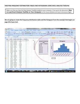
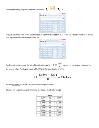
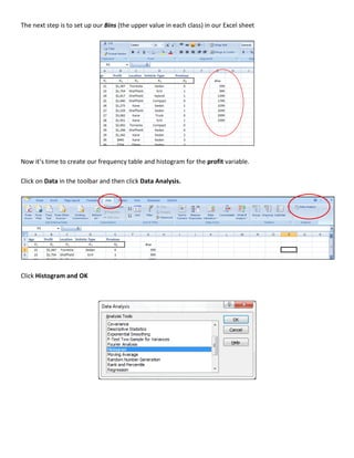
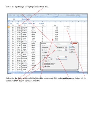
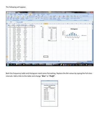
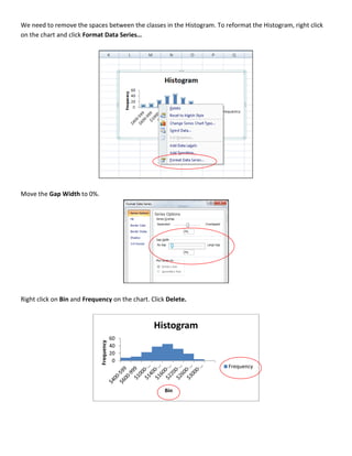
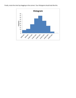
CREATING FREQUENCY DISTRIBUTION TABLES AND HISTOGRAMS USING EXCEL ANALYSIS TOOLPAK

  Make sure that you have the Data Analysis TookPak loaded on your computer. If not, go to the document, How
  to Load Excel Analysis ToolPak on Your Computer on the Course Website (on Excel Instructions Page).


We are going to create the frequency distribution table and the histogram from the example that begins on
page 30 of your text.
Download the Applewood_Chicago.xls file that you will find on the Data Files page of the course website.


Once we have downloaded our data we need to determine the number of “classes” and the “interval” size for
our frequency table.

To determine the number of classes for our table we need to find the smallest number of classes that is
                                                                                                k
greater than the number of observations. The formula for determining the number of classes is 2 . In our
                                                       y
example there were 180 vehicles sold. We will use the x button on the calculator.
Type the following sequence into the calculator:     2,        , 7, =


The 128 we obtain with k=7 is less than 180. If we try k=8 we obtain 256. This is the smallest number of classes
that is greater than the observation of 180.


The formula to determine the size of the class interval is     ≥          where H = the largest value and L =
the lowest value. The largest value is $3,292 and the lowest value is $294.


                                           $3,292 − $294
                                       ≥                 = $374.75
                                                 8
We will round up to the $400 for a more meaningful interval.

Next we set up our intervals (remember the classes must not overlap)

                                                     Classes
                                              $200      to        $599
                                              $600      to        $999
                                             $1000      to       $1399
                                             $1400      to       $1799
                                             $1800      to       $2199
                                             $2200      to       $2599
                                             $2600      to       $2999
                                             $3000      to       $3399
The next step is to set up our Bins (the upper value in each class) in our Excel sheet


Now it’s time to create our frequency table and histogram for the profit variable.

Click on Data in the toolbar and then click Data Analysis.


Click Histogram and OK
Click on the Input Range and highlight all the Profit data.


Click on the Bin Range and then highlight the Bins you entered. Click on Output Range and click on cell I3.
Make sure Chart Output is checked. Click OK.
The following will appear.


Both the frequency table and Histogram need some formatting. Replace the Bin values by typing the full class
intervals. Add a title to the table and change “Bins” to “Profit”.
We need to remove the spaces between the classes in the Histogram. To reformat the Histogram, right click
on the chart and click Format Data Series…


Move the Gap Width to 0%.


Right click on Bin and Frequency on the chart. Click Delete.


                                                Histogram
                                         60
                             Frequency


                                         40
                                         20
                                          0
                                                                        Frequency


                                                    Bin
Finally, resize the chart by dragging on the corners. Your Histogram should look like this.


                                                 Histogram
                                   50
                                   45
                                   40
                                   35
                       Frequency

                                   30
                                   25
                                   20
                                   15
                                   10
                                   5
                                   0

Creating frequency distribution tables and histograms using excel analysis toolpak

  • 1.
    CREATING FREQUENCY DISTRIBUTIONTABLES AND HISTOGRAMS USING EXCEL ANALYSIS TOOLPAK Make sure that you have the Data Analysis TookPak loaded on your computer. If not, go to the document, How to Load Excel Analysis ToolPak on Your Computer on the Course Website (on Excel Instructions Page). We are going to create the frequency distribution table and the histogram from the example that begins on page 30 of your text.
  • 2.
    Download the Applewood_Chicago.xlsfile that you will find on the Data Files page of the course website. Once we have downloaded our data we need to determine the number of “classes” and the “interval” size for our frequency table. To determine the number of classes for our table we need to find the smallest number of classes that is k greater than the number of observations. The formula for determining the number of classes is 2 . In our y example there were 180 vehicles sold. We will use the x button on the calculator.
  • 3.
    Type the followingsequence into the calculator: 2, , 7, = The 128 we obtain with k=7 is less than 180. If we try k=8 we obtain 256. This is the smallest number of classes that is greater than the observation of 180. The formula to determine the size of the class interval is ≥ where H = the largest value and L = the lowest value. The largest value is $3,292 and the lowest value is $294. $3,292 − $294 ≥ = $374.75 8 We will round up to the $400 for a more meaningful interval. Next we set up our intervals (remember the classes must not overlap) Classes $200 to $599 $600 to $999 $1000 to $1399 $1400 to $1799 $1800 to $2199 $2200 to $2599 $2600 to $2999 $3000 to $3399
  • 4.
    The next stepis to set up our Bins (the upper value in each class) in our Excel sheet Now it’s time to create our frequency table and histogram for the profit variable. Click on Data in the toolbar and then click Data Analysis. Click Histogram and OK
  • 5.
    Click on theInput Range and highlight all the Profit data. Click on the Bin Range and then highlight the Bins you entered. Click on Output Range and click on cell I3. Make sure Chart Output is checked. Click OK.
  • 6.
    The following willappear. Both the frequency table and Histogram need some formatting. Replace the Bin values by typing the full class intervals. Add a title to the table and change “Bins” to “Profit”.
  • 7.
    We need toremove the spaces between the classes in the Histogram. To reformat the Histogram, right click on the chart and click Format Data Series… Move the Gap Width to 0%. Right click on Bin and Frequency on the chart. Click Delete. Histogram 60 Frequency 40 20 0 Frequency Bin
  • 8.
    Finally, resize thechart by dragging on the corners. Your Histogram should look like this. Histogram 50 45 40 35 Frequency 30 25 20 15 10 5 0