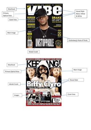
1. Masthead
House Style:
Primary Black, Yellow
Optical Area & White
Cover lines
Main Image
Guttenberg’s Rule of Thirds
Model Credit
Masthead
Main Image
Primary Optical Area
House Style
Model Credit
Cover lines
Images
2. Masthead
Main Image
Primary Optical
Area
Cover Lines House Style
Model
Credit
In this essay I will be comparing and contrasting the three front covers displayed above. I will be
comparing the target audiences of all three music magazines, and how they affect the design of the
magazine. I will also be looking at the Mastheads, House styles, Main Images, and the Rule of Thirds.
The first magazine I will be analysing is ‘Vibe’. This R&B and hip hop magazine, is aimed at young,
urban adults, who follow artists in this genre of music. The font of the magazine is bold, basic and
vibrant; this is eye catching so that it is recognisable from a distance. The masthead is situated at the
top of the page which is typical of magazines as this is the ideal place for it to be seen. The house
style of the front cover is White Black and Yellow. The white and black contracts well against one
and other, the white signifies purity and innocence whilst black connotes power, formality and
death. The colour yellow attracts the attention of the audience, especially with it being a younger
audience; however it is not typical of an R&B, hip hop magazine. The main image is the only image
on the page. The picture is a portrait of rapper Drake, who has a direct mode of address which draws
the reader in. The Guttenberg’s design principle is applied in this magazine, as the primary optical
area is Drakes hat which matches the house style and also Drakes eye, which captures the reader’s
attention. The terminal area is at the end of the model credit where it says ‘Unstoppable’. This is the
second place somebody would look when looking at the magazine. Vibe has put these in these
places so that the reader has an indication to what’s in the magazine. The main image matches the
house style of the magazine as Drake is dressed in black and is wearing silver necklaces which look
white on the image. The white writing behind Drakes head and the yellow and white writing around
drake stands out as they contrast well. Other cover lines are talking about Chris brown, Amber rose
and Serena, which highlights the genre of the magazine.
3. The second magazine is Kerrang, which is a rock magazine. The word Kerrang gives connotations of
musical culture as it sounds like a noise that a guitar would make. The way the masthead is
displayed, looks as though it has been smashed which is stereotypical of rock music and also it looks
quite rough around the edges. The white and black colours used match the house style which is
white black and red. This is quite a formal magazine cover, and is aimed at an older, mature
audience. The white and black similarly to the vibe magazine contrast each other well; white
connoting innocence and purity whereas black connotes power, death and formality. The red stands
out amongst the other colours. It is the colour of fire and blood, and is associated with energy,
danger, power and love. There are multiple images on the page; however the main image is of the
band ‘Biffy Clyro’. The top of the main band members head is in the primary optical area where the
reader will first look. The band uses a direct mode of address enticing the reader. The terminal area
is the second place that the audience will look at, which is at the end of the word Clyro. The other
cover lines include different artists which indicate which other artists are included in the magazine.
The third magazine I will be studying is Billboard. This is an international magazine which focuses on
charts rather than an individual genre, which meals that the target audience is quite versatile. This
magazine is less bold than the other two, and the colours are not as bright. This suggests that the
magazine is more relaxed than the others. The main house style colour is white, as all of the writing
is white. The background is a large image of Beyoncé which is more eye-catching than the actual
writing. The font of the magazine is not consistent; this suggests that the magazine is not as formal
as others. The masthead is however in its usual place, as the top of the page. The main image and
only image is using Guttenberg’s rule of thirds. The primary optical area is Beyoncé’s eye, which is
seductively using a direct mode of address, this draws the reader in. The terminal area is the ending
of the word Beyoncé, Live at Roseland, this is the second place that the reader looks at, and tells the
reader what is in the magazine.