SlideShare a Scribd company logo
1 of 2
Masthead font ideas
1. DubJunkie
2. DubJunkie
3. DubJunkie
4. DubJunkie
5. DubJunkie
Font 1. Pros & cons
Pro- looks very neat, not too bold or in your face.
Con- font could be thicker and more eye catching, isn’t really relatable to dubstep
Font 2. Pros & cons
Pro- very eye catching, big and bold makes it appealing. Slightly more relatable to dubstep.
Con- font letters look abit too close together and could be more evenly spread out.
Font 3. Pros & cons
Pro- letters spread out nicely, eye catching, style of font is very broad.
Cons- being a broadway font. Doesn’t show much relevance to my genre of music therefore I
wouldn’t use it.
Font 4. Pros & cons
Pros- font is permanently in caps, eye catching, letters spread out well
Cons- font could be thicker to add emphasis, again not related to dubstep so I wouldn’t use
it.
Font 5. Pros & cons
Pros- it is different from the other fonts, nice use of curls.
Cons- font is too thin, the curls on the letters are irrelevant, especially with my genre of
dubstep.
Font 6. Pros & cons
Pro- it is very eye catching, I
spent more time choosing
the font so it has more
relevance to the dubstep
scene. Very bold. I like the
use of white on black canvas
Con- this would have to be
on a dark/black cover, when
black fonts were most
favourable. Not entirely sure
if it is necessary
Font 7. Pros & cons
Pro- the use of army styled
font makes it easy to read
very bold and evenly spread
out letters. the needle adds
emphasis to the masthead.
Font 8. Pros & cons
Pro- this is my favourite
masthead. Using the fade
shell effect on the top
“dubjunkie” brings out the
bottom “dubjunkie” where
it has been duplicated and
faded. This is very eye
catching, bold and unique. I
think it is relevant to
dubstep.

More Related Content

What's hot

What's hot (20)

Font analysis
Font analysisFont analysis
Font analysis
 
Font types for our digi-pak
Font types for our digi-pakFont types for our digi-pak
Font types for our digi-pak
 
My suitable masthead fonts
My suitable masthead fonts My suitable masthead fonts
My suitable masthead fonts
 
General writing rubric
General writing rubricGeneral writing rubric
General writing rubric
 
10 book cover task
10 book cover task10 book cover task
10 book cover task
 
Final research- typography
Final research- typography Final research- typography
Final research- typography
 
My suitable masthead fonts
My suitable masthead fonts My suitable masthead fonts
My suitable masthead fonts
 
Identifying genre
Identifying genreIdentifying genre
Identifying genre
 
Fonts and colours
Fonts and coloursFonts and colours
Fonts and colours
 
Fonts
FontsFonts
Fonts
 
Documentary posters
Documentary postersDocumentary posters
Documentary posters
 
5. pre production(3)
5. pre production(3)5. pre production(3)
5. pre production(3)
 
Script Development 1
Script Development 1Script Development 1
Script Development 1
 
Fonts
FontsFonts
Fonts
 
Script Writing Handout
Script Writing HandoutScript Writing Handout
Script Writing Handout
 
Logo Font Examples
Logo Font Examples Logo Font Examples
Logo Font Examples
 
For the website task
For the website taskFor the website task
For the website task
 
Headline
HeadlineHeadline
Headline
 
Fonts 
Fonts Fonts 
Fonts 
 
Writing a Story
Writing a StoryWriting a Story
Writing a Story
 

Similar to Masthead font ideas

Similar to Masthead font ideas (20)

Fonts Testing
Fonts TestingFonts Testing
Fonts Testing
 
Different fonts
Different fontsDifferent fonts
Different fonts
 
Fonts media copy 3
Fonts   media copy 3Fonts   media copy 3
Fonts media copy 3
 
Text analysis for Cd cover and advert
Text analysis for Cd cover and advertText analysis for Cd cover and advert
Text analysis for Cd cover and advert
 
Fonts media copy 2
Fonts   media copy 2Fonts   media copy 2
Fonts media copy 2
 
Fonts media copy 2
Fonts   media copy 2Fonts   media copy 2
Fonts media copy 2
 
Font analysis
Font analysisFont analysis
Font analysis
 
Fonts
Fonts Fonts
Fonts
 
Planning For The Album Cover
Planning For The Album CoverPlanning For The Album Cover
Planning For The Album Cover
 
Fonts analysis
Fonts analysisFonts analysis
Fonts analysis
 
Different fonts
Different fontsDifferent fonts
Different fonts
 
Fonts
FontsFonts
Fonts
 
Different Fonts
Different Fonts  Different Fonts
Different Fonts
 
Task 23
 Task 23 Task 23
Task 23
 
Media Music Magazine Planning
Media Music Magazine PlanningMedia Music Magazine Planning
Media Music Magazine Planning
 
Planning
PlanningPlanning
Planning
 
Typefaces for poster
Typefaces for posterTypefaces for poster
Typefaces for poster
 
Font analysis
Font analysisFont analysis
Font analysis
 
Emily masthead font styles
Emily masthead font stylesEmily masthead font styles
Emily masthead font styles
 
Font analysis
Font analysisFont analysis
Font analysis
 

More from wilfjohnson

Audience feedback evaluation 250 word
Audience feedback evaluation 250 wordAudience feedback evaluation 250 word
Audience feedback evaluation 250 wordwilfjohnson
 
Music magazine step by step evaluation fc
Music magazine step by step evaluation fcMusic magazine step by step evaluation fc
Music magazine step by step evaluation fcwilfjohnson
 
Props and costumes for photoshoot
Props and costumes for photoshootProps and costumes for photoshoot
Props and costumes for photoshootwilfjohnson
 
Modeling email conformation
Modeling email conformationModeling email conformation
Modeling email conformationwilfjohnson
 
Finished mood board
Finished mood boardFinished mood board
Finished mood boardwilfjohnson
 
Flat plan template
Flat plan templateFlat plan template
Flat plan templatewilfjohnson
 
Uses and gratification theory
Uses and gratification theoryUses and gratification theory
Uses and gratification theorywilfjohnson
 

More from wilfjohnson (8)

Audience feedback evaluation 250 word
Audience feedback evaluation 250 wordAudience feedback evaluation 250 word
Audience feedback evaluation 250 word
 
Music magazine step by step evaluation fc
Music magazine step by step evaluation fcMusic magazine step by step evaluation fc
Music magazine step by step evaluation fc
 
Props and costumes for photoshoot
Props and costumes for photoshootProps and costumes for photoshoot
Props and costumes for photoshoot
 
Modeling email conformation
Modeling email conformationModeling email conformation
Modeling email conformation
 
Finished mood board
Finished mood boardFinished mood board
Finished mood board
 
Flat plan template
Flat plan templateFlat plan template
Flat plan template
 
555 media ting
555 media ting555 media ting
555 media ting
 
Uses and gratification theory
Uses and gratification theoryUses and gratification theory
Uses and gratification theory
 

Masthead font ideas

  • 1. Masthead font ideas
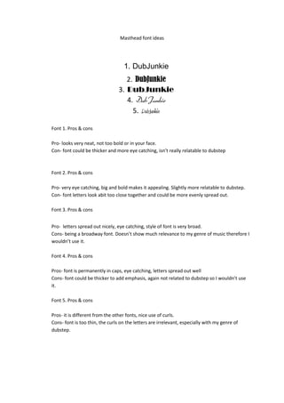
 1. DubJunkie 2. DubJunkie 3. DubJunkie 4. DubJunkie 5. DubJunkie Font 1. Pros & cons Pro- looks very neat, not too bold or in your face. Con- font could be thicker and more eye catching, isn’t really relatable to dubstep Font 2. Pros & cons Pro- very eye catching, big and bold makes it appealing. Slightly more relatable to dubstep. Con- font letters look abit too close together and could be more evenly spread out. Font 3. Pros & cons Pro- letters spread out nicely, eye catching, style of font is very broad. Cons- being a broadway font. Doesn’t show much relevance to my genre of music therefore I wouldn’t use it. Font 4. Pros & cons Pros- font is permanently in caps, eye catching, letters spread out well Cons- font could be thicker to add emphasis, again not related to dubstep so I wouldn’t use it. Font 5. Pros & cons Pros- it is different from the other fonts, nice use of curls. Cons- font is too thin, the curls on the letters are irrelevant, especially with my genre of dubstep.
  • 2. Font 6. Pros & cons Pro- it is very eye catching, I spent more time choosing the font so it has more relevance to the dubstep scene. Very bold. I like the use of white on black canvas Con- this would have to be on a dark/black cover, when black fonts were most favourable. Not entirely sure if it is necessary Font 7. Pros & cons Pro- the use of army styled font makes it easy to read very bold and evenly spread out letters. the needle adds emphasis to the masthead. Font 8. Pros & cons Pro- this is my favourite masthead. Using the fade shell effect on the top “dubjunkie” brings out the bottom “dubjunkie” where it has been duplicated and faded. This is very eye catching, bold and unique. I think it is relevant to dubstep.