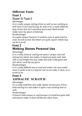
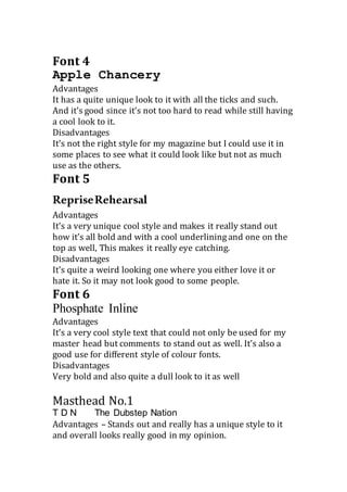
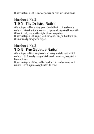
The document evaluates several fonts and masthead designs for a dubstep music magazine. It provides advantages and disadvantages for 6 fonts: Super G-Type 2, Walking Stones Personal Use, ASPHALTIC SCRATCH, Apple Chancery, RepriseRehearsal, and Phosphate Inline. It also considers 3 masthead designs for "T D N The Dubstep Nation". The fonts and mastheads are being considered based on uniqueness, readability, suitability for the dubstep genre, and ability to catch the eye of readers.
Different Fonts and Mastheads Compared for Dubstep Magazine
1. Different Fonts
Font 1
Super G-Type 2
Advantages
It is a really unique styling of text as well as eye catching as
well since it isn’t just boring. As well as it’s a really different
type of text that isn’t used that much and I think would
really suite my genre of dubstep.
Disadvantages
It is quite unique however it could be seen at quite hard to
read. As well as how the letters are quite square which may
not fit in at all.
Font 2
Walking Stones Personal Use
Advantages
It is a really classical styling and quite a unique and cool
styling text which also makes it stand out quite well. And
with a cool bright text may make this look really good and
just what I need for my genre
Disadvantages
Is it a really difficult text to read and seems not very useful
since it needs to be in a big text size to see make is clear, as it
needs to be
Font 3
ASPHALTIC SCRATCH
Advantages
It’s a really bold font and really stands out because of how
bold and big it is and makes it quite a eye catching font as
well.
Disadvantages
It doesn’t look unique or cool because it is bold but quite dull
and doesn’t make it show off like the other fonts.
2. Font 4
Apple Chancery
Advantages
It has a quite unique look to it with all the ticks and such.
And it’s good since it’s not too hard to read while still having
a cool look to it.
Disadvantages
It’s not the right style for my magazine but I could use it in
some places to see what it could look like but not as much
use as the others.
Font 5
RepriseRehearsal
Advantages
It’s a very unique cool style and makes it really stand out
how it’s all bold and with a cool underlining and one on the
top as well, This makes it really eye catching.
Disadvantages
It’s quite a weird looking one where you either love it or
hate it. So it may not look good to some people.
Font 6
Phosphate Inline
Advantages
It’s a very cool style text that could not only be used for my
master head but comments to stand out as well. It’s also a
good use for different style of colour fonts.
Disadvantages
Very bold and also quite a dull look to it as well
Masthead No.1
T D N The Dubstep Nation
Advantages – Stands out and really has a unique style to it
and overall looks really good in my opinion.
3. Disadvantages – It is not very easy to read or understand
Masthead No.2
T D N The Dubstep Nation
Advantages – Has a very good bold effect to it and really
makes it stand out and makes it eye catching. And I honestly
think it really suites the style of my magazine
Disadvantages – It’s quite dull since it’s only a bold text so
it’s not really fancy or unique.
Masthead No.3
T D N The Dubstep Nation
Advantages – It’s a very cool and unique style text, which
makes it look really unique style, and makes my magazine
look unique.
Disadvantages – It’s a really hard text to understand so it
makes it look quite complicated to read