1. Font Analysis
The fonts used in house music magazines, particularly the masthead are block bold
fonts which is perfectly suited to techno music. For my masthead I found four
appropriate fonts which I thought were perfect for my magazine cover.
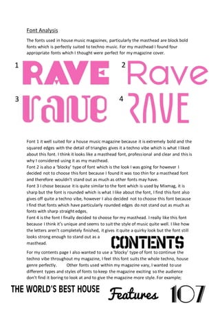
Font 1 it well suited for a house music magazine because it is extremely bold and the
squared edges with the detail of triangles gives it a techno vibe which is what I liked
about this font. I think it looks like a masthead font, professional and clear and this is
why I considered using it as my masthead.
Font 2 is also a ‘blocky’ type of font which is the look I was going for however I
decided not to choose this font because I found it was too thin for a masthead font
and therefore wouldn’t stand out as much as other fonts may have.
Font 3 I chose because it is quite similar to the font which is used by Mixmag, it is
sharp but the font is rounded which is what I like about the font, I find this font also
gives off quite a techno vibe, however I also decided not to choose this font because
I find that fonts which have particularly rounded edges do not stand out as much as
fonts with sharp straight edges.
Font 4 is the font I finally decided to choose for my masthead. I really like this font
because I think it’s unique and seems to suit the style of music quite well. I like how
the letters aren’t completely finished, it gives it quite a quirky look but the font still
looks strong enough to stand out as a
masthead.
For my contents page I also wanted to use a ‘blocky’ type of font to continue the
techno vibe throughout my magazine, I feel this font suits the whole techno, house
genre perfectly. Other fonts used within my magazine vary, I wanted to use
different types and styles of fonts to keep the magazine exciting so the audience
don’t find it boring to look at and to give the magazine more style. For example;
1
43
2