1. Audience Feedback Evaluation
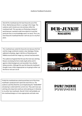
Overall this masthead was the least favourite out of the
three. Mainly because there is a syringe in the image. The
audience said it stands out a lot and does reflect the
masthead itself. This was done on Photoshop instead of
word because I wanted to add more detail to it and that
particular font, to my knowledge wasn’t on word. This is my
least favourite masthead therefor I will not use it in my final
piece.
This masthead was voted the favourite one because the font
and the image combined created a clear ideology of being
addicted to Dubstep. Again I did this on Photoshop and
fiddled around with the image e.g. contrast hue/saturation.
The audience all agreed that this was the most eye catching.
Reason one being the font is bold, big & white and it’s
against a black background, and secondly it has a Barbie
taking narcotics. Although this was the favourite masthead, I
thought it was a little inappropriate so im going to either use
the font or not use it at all.
Finally this masthead was voted second best out of the three
mastheads I produced and I spent the most time on. The
audience said they liked the use of duplicating the “DUBJUNKIE”
and placing it underneath the current one. They said it was eye
catching and unique but could use some spicing up in relevance
to my other two mastheads. Overall I think I will probably use
this masthead design as it more appropriate and looks neat.