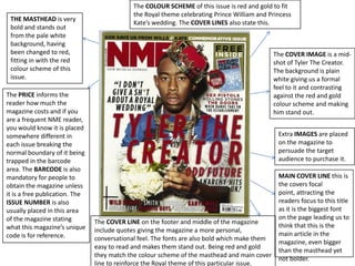
1. The COLOUR SCHEME of this issue is red and gold to fit
the Royal theme celebrating Prince William and Princess
THE MASTHEAD is very
Kate’s wedding. The COVER LINES also state this.
bold and stands out
from the pale white
background, having
been changed to red, The COVER IMAGE is a mid-
fitting in with the red shot of Tyler The Creator.
colour scheme of this The background is plain
issue. white giving us a formal
feel to it and contrasting
The PRICE informs the against the red and gold
reader how much the colour scheme and making
magazine costs and if you him stand out.
are a frequent NME reader,
you would know it is placed
somewhere different in Extra IMAGES are placed
each issue breaking the on the magazine to
normal boundary of it being persuade the target
trapped in the barcode audience to purchase it.
area. The BARCODE is also
mandatory for people to MAIN COVER LINE this is
obtain the magazine unless the covers focal
it is a free publication. The point, attracting the
ISSUE NUMBER is also readers focus to this title
usually placed in this area as it is the biggest font
of the magazine stating on the page leading us to
The COVER LINE on the footer and middle of the magazine
what this magazine’s unique think that this is the
include quotes giving the magazine a more personal,
code is for reference. main article in the
conversational feel. The fonts are also bold which make them
magazine, even bigger
easy to read and makes them stand out. Being red and gold
than the masthead yet
they match the colour scheme of the masthead and main cover
not bolder.
line to reinforce the Royal theme of this particular issue.