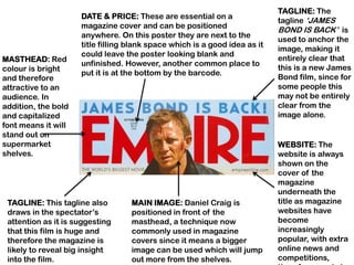
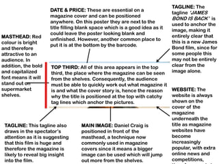
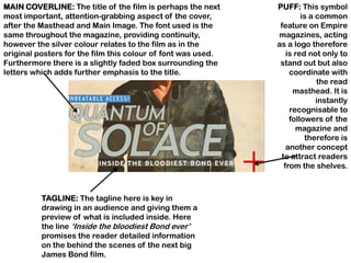
Magazine Cover Research
Cover
Analysis
TAGLINE: The
                     DATE & PRICE: These are essential on a
                                                                            tagline „JAMES
                     magazine cover and can be positioned
                                                                            BOND IS BACK‟ is
                     anywhere. On this poster they are next to the
                                                                            used to anchor the
                     title filling blank space which is a good idea as it
                                                                            image, making it
                     could leave the poster looking blank and
MASTHEAD: Red                                                               entirely clear that
                     unfinished. However, another common place to
colour is bright                                                            this is a new James
                     put it is at the bottom by the barcode.
and therefore                                                               Bond film, since for
attractive to an                                                            some people this
audience. In                                                                may not be entirely
addition, the bold                                                          clear from the
and capitalized                                                             image alone.
font means it will
stand out on
supermarket                                                                 WEBSITE: The
shelves.                                                                    website is always
                                                                            shown on the
                                                                            cover of the
                                                                            magazine
                                                                            underneath the
 TAGLINE: This tagline also        MAIN IMAGE: Daniel Craig is              title as magazine
 draws in the spectator‟s          positioned in front of the               websites have
 attention as it is suggesting     masthead, a technique now                become
 that this film is huge and        commonly used in magazine                increasingly
 therefore the magazine is         covers since it means a bigger           popular, with extra
 likely to reveal big insight      image can be used which will jump        online news and
 into the film.                    out more from the shelves.               competitions,
TAGLINE: The
                     DATE & PRICE: These are essential on a
                                                                            tagline „JAMES
                     magazine cover and can be positioned
                                                                            BOND IS BACK‟ is
                     anywhere. On this poster they are next to the
                                                                            used to anchor the
                     title filling blank space which is a good idea as it
                                                                            image, making it
                     could leave the poster looking blank and
MASTHEAD: Red                                                               entirely clear that
                     unfinished. However, another common place to
colour is bright                                                            this is a new James
                     put it is at the bottom by the barcode.
and therefore                                                               Bond film, since for
attractive to an                                                            some people this
audience. In                                                                may not be entirely
addition, the bold    TOP THIRD: All of this area appears in the top        clear from the
and capitalized       third, the place where the magazine can be seen       image alone.
font means it will    from the shelves. Consequently, the audience
stand out on          must be able to quickly work out what magazine it
supermarket           is and what the cover story is, hence the reason      WEBSITE: The
shelves.              why the title is positioned at the top with catchy    website is always
                      tag lines which anchor the pictures.                  shown on the
                                                                            cover of the
                                                                            magazine
                                                                            underneath the
 TAGLINE: This tagline also        MAIN IMAGE: Daniel Craig is              title as magazine
 draws in the spectator‟s          positioned in front of the               websites have
 attention as it is suggesting     masthead, a technique now                become
 that this film is huge and        commonly used in magazine                increasingly
 therefore the magazine is         covers since it means a bigger           popular, with extra
 likely to reveal big insight      image can be used which will jump        online news and
 into the film.                    out more from the shelves.               competitions,
MAIN COVERLINE: The title of the film is perhaps the next     PUFF: This symbol
most important, attention-grabbing aspect of the cover,               is a common
after the Masthead and Main Image. The font used is the        feature on Empire
same throughout the magazine, providing continuity,           magazines, acting
however the silver colour relates to the film as in the       as a logo therefore
original posters for the film this colour of font was used.      is red not only to
Furthermore there is a slightly faded box surrounding the      stand out but also
letters which adds further emphasis to the title.                 coordinate with
                                                                           the read
                                                                   masthead. It is
                                                                           instantly
                                                                  recognisable to
                                                                  followers of the
                                                                    magazine and
                                                                       therefore is
                                                                 another concept
                                                               to attract readers
                                                                from the shelves.


          TAGLINE: The tagline here is key in
          drawing in an audience and giving them a
          preview of what is included inside. Here
          the line „Inside the bloodiest Bond ever‟
          promises the reader detailed information
          on the behind the scenes of the next big
          James Bond film.
PUFF: Overlapping shapes such as this sticker                           COVERLINES: In
style circle are a fun way to add further                               addition to the
information and interest to the poster by                               main feature,
introducing more colour and filling otherwise                           smaller features
blank spaces. Here a red colour has been used                           are also advertised
again in order to coordinate with the rest of the                       with short, snappy
cover, which follows a red, white and blue theme.                       and to the point tag
This could be a subtle nod to the fact is featuring                     lines in order to
a British film.                                                         attract as big an
                                                                        audience as
                                                                        possible and show
                                                                        off what readers
                                                                        can expect to find
                                                                        inside.


BARCODE: The
barcode is an
essential part of
any magazine
                    LEFT THIRD                COVERLINE: The main aim of the cover is
and is usually
                                              to attract as big an audience as possible
located in the
                                              therefore they are commonly packed with
bottom third. In
                                              information advertising what‟s inside. At
this particular
                                              the bottom famous names have been
poster the
                                              mentioned which are always guaranteed
barcode is on the
                                              to attract a niche audience.
left hand side
since there is a
PUBLISHER


Total Film Magazine is owned by Future Publishing
(http://www.futureplc.com), a company which aims to
“inform, entertain and unite media communities”. It is
a huge company which covers a range of interests
including, film, computer games, cycling and music
and these are then published through the means of
magazines, events and websites. This publisher
would therefore be suited to enthusiast magazines
such as Total Film since it focuses on providing
editorial services for this market.
BRAND DESCRIPTION
• Future PLC gives Total Film the following brand
  description:
  “Total Film is the modern movie brand, taking an
  affectionate and irreverent look at Hollywood
  blockbusters, classic films and more indie fare.
  Reaching more valuable film fans than ever
  before, TotalFilm.com, the Total Film app and
  magazine provide users with all the latest
  gossip and news from the film world, including
  first looks at the coolest movies in production
  now. The Total Film brand offers the world‟s
  most reliable film and DVD reviews together
  with exclusive interviews with the biggest
  names and hottest talents working in movies
  right now.”
AUDIENCE
Advertising Clients include:   •   This therefore shows the
• Tesco                            magazine is aimed at a
• Ancestry.co.uk                   dominantly male audience
• O2                               since the products are
• Microsoft                        predominantly advertised to
• BSkyB                            men.
• Dell                         •   The target audience is also
• Adobe                            ABC1 since these categories
• Warner Home Video                have a disposable income so
• Nintendo                         are able to indulge in luxuries
• Sega                             such as film magazines.
• Korg
• FW Evans Cycles              •   There may, however, also be a
• Wiggle                           niche audience for film
• Sony                             enthusiasts who may not have
• Demon Tweeks                     disposable income to fit into
                                   the other categories but still
                                   buy the magazine.
AUDIENCE
The audience is classified using the following
  scale:
• A – Upper middle class – senior professional
• B – Middle class – professionals
• C1 – Lower middle class – white collar
  administrative workers
• C2 – Lower middle class – blue collar skilled
  workers
• D – Unskilled or semi-skilled workers
• E – Unemployed, students
PURPOSE
• Total Film aims to inform audiences about
  up-and-coming and current films by
  providing reviews and features such as
  interviews and behind the scenes
  information in order to promote films.
• It uses the slogan “The modern guide to
  movies” which sums up the purpose of the
  magazine in a short sentence.

Magazine Research

  • 1.
  • 2.
  • 3.
    TAGLINE: The DATE & PRICE: These are essential on a tagline „JAMES magazine cover and can be positioned BOND IS BACK‟ is anywhere. On this poster they are next to the used to anchor the title filling blank space which is a good idea as it image, making it could leave the poster looking blank and MASTHEAD: Red entirely clear that unfinished. However, another common place to colour is bright this is a new James put it is at the bottom by the barcode. and therefore Bond film, since for attractive to an some people this audience. In may not be entirely addition, the bold clear from the and capitalized image alone. font means it will stand out on supermarket WEBSITE: The shelves. website is always shown on the cover of the magazine underneath the TAGLINE: This tagline also MAIN IMAGE: Daniel Craig is title as magazine draws in the spectator‟s positioned in front of the websites have attention as it is suggesting masthead, a technique now become that this film is huge and commonly used in magazine increasingly therefore the magazine is covers since it means a bigger popular, with extra likely to reveal big insight image can be used which will jump online news and into the film. out more from the shelves. competitions,
  • 4.
    TAGLINE: The DATE & PRICE: These are essential on a tagline „JAMES magazine cover and can be positioned BOND IS BACK‟ is anywhere. On this poster they are next to the used to anchor the title filling blank space which is a good idea as it image, making it could leave the poster looking blank and MASTHEAD: Red entirely clear that unfinished. However, another common place to colour is bright this is a new James put it is at the bottom by the barcode. and therefore Bond film, since for attractive to an some people this audience. In may not be entirely addition, the bold TOP THIRD: All of this area appears in the top clear from the and capitalized third, the place where the magazine can be seen image alone. font means it will from the shelves. Consequently, the audience stand out on must be able to quickly work out what magazine it supermarket is and what the cover story is, hence the reason WEBSITE: The shelves. why the title is positioned at the top with catchy website is always tag lines which anchor the pictures. shown on the cover of the magazine underneath the TAGLINE: This tagline also MAIN IMAGE: Daniel Craig is title as magazine draws in the spectator‟s positioned in front of the websites have attention as it is suggesting masthead, a technique now become that this film is huge and commonly used in magazine increasingly therefore the magazine is covers since it means a bigger popular, with extra likely to reveal big insight image can be used which will jump online news and into the film. out more from the shelves. competitions,
  • 5.
    MAIN COVERLINE: Thetitle of the film is perhaps the next PUFF: This symbol most important, attention-grabbing aspect of the cover, is a common after the Masthead and Main Image. The font used is the feature on Empire same throughout the magazine, providing continuity, magazines, acting however the silver colour relates to the film as in the as a logo therefore original posters for the film this colour of font was used. is red not only to Furthermore there is a slightly faded box surrounding the stand out but also letters which adds further emphasis to the title. coordinate with the read masthead. It is instantly recognisable to followers of the magazine and therefore is another concept to attract readers from the shelves. TAGLINE: The tagline here is key in drawing in an audience and giving them a preview of what is included inside. Here the line „Inside the bloodiest Bond ever‟ promises the reader detailed information on the behind the scenes of the next big James Bond film.
  • 6.
    PUFF: Overlapping shapessuch as this sticker COVERLINES: In style circle are a fun way to add further addition to the information and interest to the poster by main feature, introducing more colour and filling otherwise smaller features blank spaces. Here a red colour has been used are also advertised again in order to coordinate with the rest of the with short, snappy cover, which follows a red, white and blue theme. and to the point tag This could be a subtle nod to the fact is featuring lines in order to a British film. attract as big an audience as possible and show off what readers can expect to find inside. BARCODE: The barcode is an essential part of any magazine LEFT THIRD COVERLINE: The main aim of the cover is and is usually to attract as big an audience as possible located in the therefore they are commonly packed with bottom third. In information advertising what‟s inside. At this particular the bottom famous names have been poster the mentioned which are always guaranteed barcode is on the to attract a niche audience. left hand side since there is a
  • 7.
    PUBLISHER Total Film Magazineis owned by Future Publishing (http://www.futureplc.com), a company which aims to “inform, entertain and unite media communities”. It is a huge company which covers a range of interests including, film, computer games, cycling and music and these are then published through the means of magazines, events and websites. This publisher would therefore be suited to enthusiast magazines such as Total Film since it focuses on providing editorial services for this market.
  • 8.
    BRAND DESCRIPTION • FuturePLC gives Total Film the following brand description: “Total Film is the modern movie brand, taking an affectionate and irreverent look at Hollywood blockbusters, classic films and more indie fare. Reaching more valuable film fans than ever before, TotalFilm.com, the Total Film app and magazine provide users with all the latest gossip and news from the film world, including first looks at the coolest movies in production now. The Total Film brand offers the world‟s most reliable film and DVD reviews together with exclusive interviews with the biggest names and hottest talents working in movies right now.”
  • 9.
    AUDIENCE Advertising Clients include: • This therefore shows the • Tesco magazine is aimed at a • Ancestry.co.uk dominantly male audience • O2 since the products are • Microsoft predominantly advertised to • BSkyB men. • Dell • The target audience is also • Adobe ABC1 since these categories • Warner Home Video have a disposable income so • Nintendo are able to indulge in luxuries • Sega such as film magazines. • Korg • FW Evans Cycles • There may, however, also be a • Wiggle niche audience for film • Sony enthusiasts who may not have • Demon Tweeks disposable income to fit into the other categories but still buy the magazine.
  • 10.
    AUDIENCE The audience isclassified using the following scale: • A – Upper middle class – senior professional • B – Middle class – professionals • C1 – Lower middle class – white collar administrative workers • C2 – Lower middle class – blue collar skilled workers • D – Unskilled or semi-skilled workers • E – Unemployed, students
  • 11.
    PURPOSE • Total Filmaims to inform audiences about up-and-coming and current films by providing reviews and features such as interviews and behind the scenes information in order to promote films. • It uses the slogan “The modern guide to movies” which sums up the purpose of the magazine in a short sentence.