Measures of Central Tendency: Mean, Median and Mode
Textual Analysis
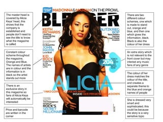
1. The master head is
covered by Alicia
Keys’ head, this
shows that the
company is
established and
people don’t need to
see the title to know
what the magazine
is called
Constant colour
scheme throughout
the magazine,
Orange and Blue.
The names of artists
are in colour and the
information is in
black so the artist
stands out more
There is an
exclusive story in
this magazine so
fans of Alicia Keys
will automatically be
interested
There are two
different colour
schemes, one which
is made to stand
out, orange and
blue, and then one
which gives the
information, black.
Black is also the
colour of her dress
An extra story which
is not relevant to the
front cover but may
interest any music
fans of any genre
The colour of her
dress matches the
colour of the title,
and creates a
separate theme to
the blue and orange
names of people
She is dressed very
smart and
sophisticated, this
could be because
the story is a very
sensitive topic
Price and barcode
are written in the
corner
2. In this image the
name of the
magazine is also put
behind, because
people can
automatically
recognise what
magazine it is by the
font style
Names of artists are
written larger so
they stand out more
to people, and if
they see someone
they like they will
buy the magazine
This looks like it has
been pasted over
the top, and people
can assume that it is
irrelevant to the
other stories in the
magazine, it is just
something people
may be interested in
reading about.
There is a dark
colour scheme
throughout the front
cover, which can be
a sign of fierceness
rather than bright
and happy colours
Silver, black and
white are prominent
colours throughout
the magazine
They give you an
idea of what the
story is about, here
it says Can Shakira
conquer the world,
this could be to do
with the success of
her music
internationally.
Shakira’s hair is
being blown back
which shows
dominance and her
facial expression
makes her seen
very important.
The date of publication is shown at the top so people know
that what they’re reading is in date, they also have websites
written here so people can find more information
Main Image: This is a Medium Long Shot because you can see her
entire body
3. Throughout the
three front covers I
have analysed the
person on the cover
has been covering
the name of the
magazine. From this
magazine we can
automatically
recognize that it is
Billboard magazine
because of the
orange fill in the d
A similar effect to
the title has been
used with his name,
everybody already
knows that it is
Justin Bieber so his
name doesn’t need
to be totally visible,
and there is a hint at
what the story will
be about written
over his name.
The same effect has
been used here as
with Justin Bieber’s
name, the
information has
been written over
the Flame in Waka
Flocka Flame
The information is
displayed very
neatly in this
magazine, rather
than being all over
the place, it is put in
one corner where
you can find out
about various
stories in the
magazine
Main image –
Medium shot, you
can see the majority
of his body but it
cuts off his legs. The
image is in front of
ALL the text, except
this one, which
could mean that this
has nothing to do
with Justin Bieber
Issue number, date
and websites are
displayed at the top
so people know the
magazine is in date,
and know where
they can find more
info
4. Her tongue is out
which shows that
she’s a rebellious
person
This cover is very
extreme, it may be
because Miley
Cyrus used to be a
children's
entertainer and has
completely changed
her image. At the
time this cover was
released everyone
was talking about
Miley Cyrus and
how she has
changed so much
because such a
drastic change
would shock people.
This cover wouldn’t
be as shocking if it
were somebody like
Rihanna doing it,
She has shining
jewellery, which
shows wealth but no
clothes.
The hot list is
irrelevant to the front
cover but this
catches the people’s
attention who aren’t
interested in Miley
Cyrus
5. Colours and theme: Nicki Minaj’s lips match the colour of the text, and her dress matches the colour of her hair. The
colours are very girly and fits in with Nicki Minaj’s theme, her music is mainly targeted towards girls (although boys will
listen too). Her albums are all titled Pink Friday… which again is very girl and out there, this article fits in with that. Her
ring spreads across four fingers and reads the word ICON, this shows she’s very important and popular in the music
industry.
Direct eye
contact with the
camera,
meaning she’s
focused
The text curves
around her body
and nothing
comes in front of
her, making it
look like she is
standing in front
of it, her name is
covered by her,
because people
are more likely
to recognise her
by her face than
her name
because she’s
that popular and
unique
The reason the theme is pink could be to do with the fact that rap is mainly dominated by men, and appeals to men,
Nicki Minaj may say she’s changed the rap industry by making it feminine, which explains the extreme use of pink.
6. The letter L is the only coloured thing on the page, L being the first letter of Lady Gaga. This already shows that it is
very dominant and the page will only be about Lady Gaga
The image takes up the same amount of space, because people will be able to instantly recognise her this way
The image takes up the same amount of space, because people will be able to instantly recognise her this way
7. The colour scheme is powerful and epitomises Beyoncé. The purple symbolises royalty. She’s wearing some kind of
metal armour which makes it seem like she is really important and a leader of something.
The metal armour links to the title, Fierce; Beyoncé is also known by her alter ego Sasha Fierce which is who she acts
as when she preforms, somebody fierce is likely to wear armour to protect them
White text on coloured background The text at the top is bolder than the word “Creative”
She’s wearing very
strong make up which
is showing that she’s
feminine and proud,
however the look in her
eyes also shows that
she’s powerful and can
be just as powerful as a
man
8. The name and logo
of the magazine and
the date is still
present but is shrunk
down.
The colour red and
black are prominent,
these colours
represent importance
and power
The first person is
wearing a lot of bling
which shows that
they are wealthy,
from this we can
assume the second
person is also
wearing lots of
accessories but we
can’t see because of
the way he is
standing – you can
see the top of a
necklace.
Websites and places
to find other
information is usually
displayed at the
bottom of the page
for peoples’
information,
Page number so
people can easily
navigate through
using the contents
page
9. Issue number and
date is written here
so people know
they’re up to date
Reminder of the
name of the
magazine
Sparkly dress is
extremely feminine
and really stands out
and automatically
catches your eye
10. The logo is displayed
here to remind you
what magazine
you’re reading
The chart is the first
thing you read so it
can appeal to
anyone, not just fans
of the articles.
Instantly recognizable
images
All the text matches
and the colours
match
All the text matches
and the colours
match
The scheme is very
broken up and not all
restricted