
Recommended
More Related Content
What's hot
What's hot (20)
Viewers also liked
Viewers also liked (20)
Similar to Magazine Advert Analysis
Similar to Magazine Advert Analysis (20)
Recently uploaded
Recently uploaded (20)
Magazine Advert Analysis
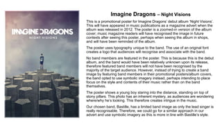
- 1. Imagine Dragons – Night Visions This is a promotional poster for Imagine Dragons’ debut album ‘Night Visions’. This will have appeared in music publications as a magazine advert when the album was released in 2012. The poster is a zoomed-in version of the album cover; music magazine readers will have recognised the image in future contexts after seeing this poster, perhaps when seeing the album in shops, and will have been reminded of the album. The poster uses typography unique to the band. The use of an original font creates a logo that audiences will recognise and associate with the band. No band members are featured in the poster. This is because this is the debut album, and the band would have been relatively unknown upon its release, therefore featured band members will not have been recognised by the majority of the target audience. However, instead of trying to create a band image by featuring band members in their promotional posters/album covers, the band opted to use symbolic imagery instead, perhaps intending to place focus on the style and contents of their music rather than on the band themselves. The poster shows a young boy staring into the distance, standing on top of stony pillars. This photo has an inherent mystery, as audiences are wondering where/why he’s looking. This therefore creates intrigue in the music. Our chosen band, Bastille, has a limited band image as only the lead singer is really recognisable. Therefore, we could go for a similar approach in our advert and use symbolic imagery as this is more in line with Bastille’s style.
- 2. Frank Ocean – Blonde This series of images were used to promote Frank Ocean’s sophomore album Blonde when it was unexpectedly released in August 2016. They were featured as advertisements in Ocean’s magazine ‘Boys Don’t Cry. The images share the same typography overlay: ‘blonde’ written in large lettering with Frank Ocean written in a smaller size above it. The small size of the artist name infers that Frank Ocean doesn’t need his name advertised as he already has popularity. (Ocean’s second album was widely anticipated following the success of his debut album ‘Channel Orange’.) The album title, however, is much larger and eye-catching. This signifies a change in Ocean’s style and a progression in his career, as it differs from the design of his previous work and makes that known to the audience with its large size. The album title is one-word and easily remembered; this impact is boosted by the presentation of it. The second image uses the photo on the album cover as the background for the image. Ocean’s covered crying face with green hair is striking iconography, and audiences that view it will recognise it as associated with the album when they see it in future, and will be reminded of the album. The third image is an alternate album cover, and will have the same effect. The first and third image reference the notion of looking: the girl and the motorcyclist both stare at the camera, with their hands in similar positions. These characters represent female and male gender respectively. Their similar poses blurs the line between genders, which is a theme reflected in the album (the album cover spells the title ‘blond’, the masculine term, while it is called ‘blonde’ officially) and associated music videos (Ocean wears eyeliner in the video for ‘Nikes’). Ultimately, themes of the music are conveyed in its advertisement, which informs audiences what to expect from the music and provokes intrigue from those that may be interested in it. These techniques of relating the advert to the album should be incorporated into our own magazine advertisement. As Ocean’s magazine will have only been viewed by a limited audience, and perhaps only by people who were already fans of his music, these images were also used on iTunes to promote his album when it was released. This utilisation of digital media to advertise the music meant that these adverts were seen by a huge audience as iTunes has a substantial userbase. The use of digital media to promote a magazine advert is a concept that our group may take into account when creating our magazine advert.