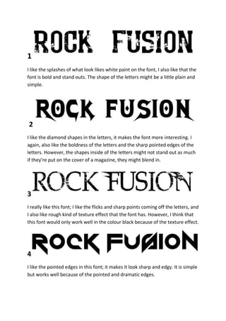
1. 1
I like the splashes of what look likes white paint on the font, I also like that the
font is bold and stand outs. The shape of the letters might be a little plain and
simple.
2
I like the diamond shapes in the letters, it makes the font more interesting. I
again, also like the boldness of the letters and the sharp pointed edges of the
letters. However, the shapes inside of the letters might not stand out as much
if they’re put on the cover of a magazine, they might blend in.
3
I really like this font; I like the flicks and sharp points coming off the letters, and
I also like rough kind of texture effect that the font has. However, I think that
this font would only work well in the colour black because of the texture effect.
4
I like the pointed edges in this font; it makes it look sharp and edgy. It is simple
but works well because of the pointed and dramatic edges.