BDSM⚡Call Girls in Sector 93 Noida Escorts >༒8448380779 Escort Service
Double page spread
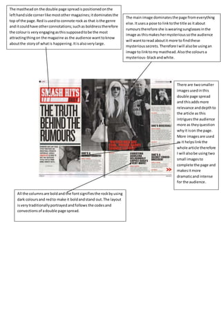
1. The masthead on the double page spread is positioned on the
left hand side corner like most other magazines; it dominates the
top of the page. Red is used to connote rock as that is the genre
and it could have other connotations; such as boldness therefore
the colour is very engaging as this supposed to be the most
attracting thing on the magazine as the audience want to know
about the story of what is happening. It is also very large.
The main image dominates the page from everything
else. It uses a pose to link to the title as it about
rumours therefore she is wearing sunglasses in the
image as this makes her mysterious so the audience
will want to read about it more to find these
mysterious secrets. Therefore I will also be using an
image to link to my masthead. Also the colours a
mysterious- black and white.
There are two smaller
images used in this
double page spread
and this adds more
relevance and depth to
the article as this
intrigues the audience
more as they question
why it is on the page.
More images are used
as it helps link the
whole article therefore
I will also be using two
small images to
complete the page and
makes it more
dramatic and intense
for the audience.
All the columns are bold and the font signifies the rock by using
dark colours and red to make it bold and stand out. The layout
is very traditionally portrayed and follows the codes and
convections of a double page spread.