SlideShare a Scribd company logo
1 of 3
In the ‘Q’ magazine these three aspects all include The Killers as their main feature, using the same
dull, mysterious colours of grey and beige to give off a unique, intriguing atmosphere. The Front cover
is a long shot, showing the singer in an interesting pose. Typically front covers only include one or three
members, therefore by using one, who is always giving straight eye-contact increases the intensity and
draws in the audience. This then varies from the other photographs on the other pages as they use
master shots to show all the band members. They link together by the colours and musky tone, as well
as the defensive poses, making the band appear strong and rebellious. On the contents they have used
                                                        smaller images which gives the audience a
                                                        snippet of the contents within. Typically on the
                                                        contents page they have contrasted the image
                                                        with a black and white one, to make the main one
                                                        stand-out and emphasise who their main focus is.
                                                        All the images are in an outside location which
                                                        creates an individual and adventurous appeal
                                                        about it. To show the band are individual and
                                                        don’t mind perfection they purposely included
                                                        the photographer in the bottom right corner of
                                                        the contents page photograph as this gives
                                                        variation between the other pictures, however
                                                        still strongly links with the unusual style. To
                            reinforce they are the same band, the contents page band member is
                            wearing the same outfit as in the double page spread, purposely showing
                            cohesion and a strong link, putting ease upon the audience. I like the
                            individuality of each of the images and however they show a rebellious
                            stance and atmosphere. This may be hard to replicate/consider, however I
                            will take the moody tone into consideration


                                 Cohesion of images
All these images of Kate Lawler follow the similar        down the page which gives     spread contains the same image as the contents which
unique, shocked style to show cohesion throughout         an interesting appeal. The    shows cohesion and proves a link between the story and its
the magazine. It follows the three colour code of         location at which these       location, whilst still continuing the three code colour system
Peach, lemon and white which flows easily, keeping a      pictures are taken are very   as the front cover. The photograph has a harsh edit which
link remaining throughout. The front page shows a         simplistic with canvas        emphasises the contours within her body, demonstrating the
low angle of the model to present her with authority      backgrounds, making it        shocked expression. It makes you feel as though as an
to show certainty upon the audience. The facial           classic and simplistic and    audience you’re also holding your breathe and feel
expression is quirky and fairly seductive which           convey a focussed             empowered. Her facial expression implies she is shocked the
suggests their target audience is of a teenagers age      impression. The double page   audience is finding out about her situation/life. Her eye-line
group. Also looking straight towards the camera                                         is extremely direct which captivates the audience and
which draws in the audiences attention and develops                                     emphasises her Smokey eyed make-up, which gives a funky
a connection between the two. The lighting upon her                                     sense. I believe they were trying to achieve a simplistic
face is prominent upon her cheek, making her jawline                                    look, however still consider the semantic field of music by
more prominent and showing perfection upon her                                          placing headphones on her.
complexity and beauty which will appeal to the
audience. I believe this picture is trying to achieve a
unique style and present individuality to draw in their
Target audience of informal, quirky pop-lovers. The
contents page Contains smaller scaled images which
contains images of a different individual style using
close-up images, mid-shots and high angles to vary
the selection of pictures and make the audience
intentionally feel intrigued into the content of the
magazine. The posing on the Images are open and
portray confidence
which will imply their
interviews and story
content will be fun and
out-going. Whereas in
contrast, the close –up
image suggests that
particular story will
contain ‘Up, close and
personal’ features and
conversation which
makes it appear more
intriguing. The lighting
progress darker going
In this ‘XXL ‘ magazine all the images of ‘50 Cent’ follow
                          a style of dark, deep and moody tone. They completed
                          this by making all the images less vibrant and dulling
                          down the tone to make the artist appear more
                          mysterious which will consequently intrigue the
                          audience. They have used the standard conventions of
                          camera angles and distance throughout, firstly using a
                          close-up for the front cover. Then cleverly linking into
                          the contents by using the same facial expression, but
                          moving the camera backwards to create a mid-shot.
                          Further extending backwards for a mid-shot/long shot,
                          which represents to the audience that the story is
                          extending and information Is increasing as we extend
                          the amount of body language we can see of 50 Cent.
                          This causing a smoother flow of cohesion throughout
                          the images and links into the intimacy of the article. The
                          costume in the images remains the same throughout
                          which shows images are fairly straight forward and
                          simplistic as the background is plain. This suggests the
                          article is just about the artist and that the information is
                          standard and all about him. The audience will
appreciate this feature as they know the article won’t go off on tangents and
that it’s all focused, promoting the magazine positively. I like this idea of having
a simplistic background as this won’t be complicated and appear neater and
more effectively visual. This isn't the genre of music that I want to complete my
music of, however I needed to address all area’s to gather idea’s and consider
all possibilities. However, I also enjoy the mysterious, moody tone, therefore
this cover appealed to me, hence this analysis. From

More Related Content

What's hot

Magazine cover analysis Q Magazine
Magazine cover analysis Q MagazineMagazine cover analysis Q Magazine
Magazine cover analysis Q Magazinegemma-louise
 
Textual analysis powerpoint media
Textual analysis powerpoint mediaTextual analysis powerpoint media
Textual analysis powerpoint mediajojoycexxx
 
Double page spread research
Double page spread researchDouble page spread research
Double page spread researcholiviaolives
 
Magazine cover anylysis billboard
Magazine cover anylysis   billboardMagazine cover anylysis   billboard
Magazine cover anylysis billboardamybrackenridge
 
Independent project
Independent projectIndependent project
Independent projectA-Verishine
 
Secondary photography project powerpoint
Secondary photography project powerpointSecondary photography project powerpoint
Secondary photography project powerpointdemibromfield123
 
Billboard magazine
Billboard magazineBillboard magazine
Billboard magazineasmediaf12
 
Photographers analysis
Photographers analysisPhotographers analysis
Photographers analysis101k_
 
Pictures for poster and digipack
Pictures for poster and digipackPictures for poster and digipack
Pictures for poster and digipackNathanWrigley
 
Evalaution
EvalautionEvalaution
EvalautionPJG123
 
Evalaution
EvalautionEvalaution
EvalautionPJG123
 
Analysis of front covers
Analysis of front covers Analysis of front covers
Analysis of front covers melrose08
 

What's hot (20)

Magazine cover analysis Q Magazine
Magazine cover analysis Q MagazineMagazine cover analysis Q Magazine
Magazine cover analysis Q Magazine
 
Textual analysis powerpoint media
Textual analysis powerpoint mediaTextual analysis powerpoint media
Textual analysis powerpoint media
 
Mojo
MojoMojo
Mojo
 
Double page spread research
Double page spread researchDouble page spread research
Double page spread research
 
Magazine cover anylysis billboard
Magazine cover anylysis   billboardMagazine cover anylysis   billboard
Magazine cover anylysis billboard
 
Dev of ideas
Dev of ideasDev of ideas
Dev of ideas
 
Independent project
Independent projectIndependent project
Independent project
 
Secondary photography project powerpoint
Secondary photography project powerpointSecondary photography project powerpoint
Secondary photography project powerpoint
 
Nme
NmeNme
Nme
 
Digipak 3
Digipak 3Digipak 3
Digipak 3
 
Billboard magazine
Billboard magazineBillboard magazine
Billboard magazine
 
Photographers analysis
Photographers analysisPhotographers analysis
Photographers analysis
 
Hockney joiner
Hockney joinerHockney joiner
Hockney joiner
 
Pictures for poster and digipack
Pictures for poster and digipackPictures for poster and digipack
Pictures for poster and digipack
 
Editing of Magazine Image
Editing of Magazine ImageEditing of Magazine Image
Editing of Magazine Image
 
Evalaution
EvalautionEvalaution
Evalaution
 
Evalaution
EvalautionEvalaution
Evalaution
 
Analysis of front covers
Analysis of front covers Analysis of front covers
Analysis of front covers
 
Image Analysis
Image AnalysisImage Analysis
Image Analysis
 
Image Analysis
Image AnalysisImage Analysis
Image Analysis
 

Similar to Cohesion of images

Print production analysis
Print production analysisPrint production analysis
Print production analysisHarry Ames
 
Print production analysis
Print production analysisPrint production analysis
Print production analysisHarry Ames
 
Media evaluation question seven
Media evaluation question sevenMedia evaluation question seven
Media evaluation question sevenmarcopetulla
 
Photography planning media
Photography planning mediaPhotography planning media
Photography planning mediaNatt Suchecki
 
Evaluation question 1 pt 2
Evaluation question 1 pt 2Evaluation question 1 pt 2
Evaluation question 1 pt 2Harry Ames
 
Photography planning
Photography planningPhotography planning
Photography planningTonishaMedia
 
Mag photo analtsis
Mag photo analtsisMag photo analtsis
Mag photo analtsiscoleybop
 
Photography planning
Photography planningPhotography planning
Photography planningTonishaMedia
 
Film magazine research
Film magazine researchFilm magazine research
Film magazine researchdilaratasd
 
Film Poster Evaluation
Film Poster EvaluationFilm Poster Evaluation
Film Poster Evaluation12moorek
 
How did you attract
How did you attractHow did you attract
How did you attractKalise
 
Photography planning
Photography planningPhotography planning
Photography planningTonishaMedia
 
Film poster analysis
Film poster analysisFilm poster analysis
Film poster analysisKB160923
 
Evaluation question 5
Evaluation question 5Evaluation question 5
Evaluation question 5adelleclarke
 
Ancillary product analysis - poster
Ancillary product analysis - posterAncillary product analysis - poster
Ancillary product analysis - posteradamfox2052
 

Similar to Cohesion of images (20)

Print production analysis
Print production analysisPrint production analysis
Print production analysis
 
Print production analysis
Print production analysisPrint production analysis
Print production analysis
 
Media evaluation question seven
Media evaluation question sevenMedia evaluation question seven
Media evaluation question seven
 
Photography planning media
Photography planning mediaPhotography planning media
Photography planning media
 
Evaluation question 1 pt 2
Evaluation question 1 pt 2Evaluation question 1 pt 2
Evaluation question 1 pt 2
 
Photography planning
Photography planningPhotography planning
Photography planning
 
Posters
PostersPosters
Posters
 
Development of ideas
Development of ideasDevelopment of ideas
Development of ideas
 
Mag photo analtsis
Mag photo analtsisMag photo analtsis
Mag photo analtsis
 
The Pitch
The PitchThe Pitch
The Pitch
 
Album analysis
Album analysisAlbum analysis
Album analysis
 
Photography planning
Photography planningPhotography planning
Photography planning
 
Film magazine research
Film magazine researchFilm magazine research
Film magazine research
 
Film Poster Evaluation
Film Poster EvaluationFilm Poster Evaluation
Film Poster Evaluation
 
How did you attract
How did you attractHow did you attract
How did you attract
 
Photography planning
Photography planningPhotography planning
Photography planning
 
Film poster analysis
Film poster analysisFilm poster analysis
Film poster analysis
 
Evaluation question 5
Evaluation question 5Evaluation question 5
Evaluation question 5
 
Question 1
Question 1Question 1
Question 1
 
Ancillary product analysis - poster
Ancillary product analysis - posterAncillary product analysis - poster
Ancillary product analysis - poster
 

Cohesion of images

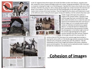
  • 1. In the ‘Q’ magazine these three aspects all include The Killers as their main feature, using the same dull, mysterious colours of grey and beige to give off a unique, intriguing atmosphere. The Front cover is a long shot, showing the singer in an interesting pose. Typically front covers only include one or three members, therefore by using one, who is always giving straight eye-contact increases the intensity and draws in the audience. This then varies from the other photographs on the other pages as they use master shots to show all the band members. They link together by the colours and musky tone, as well as the defensive poses, making the band appear strong and rebellious. On the contents they have used smaller images which gives the audience a snippet of the contents within. Typically on the contents page they have contrasted the image with a black and white one, to make the main one stand-out and emphasise who their main focus is. All the images are in an outside location which creates an individual and adventurous appeal about it. To show the band are individual and don’t mind perfection they purposely included the photographer in the bottom right corner of the contents page photograph as this gives variation between the other pictures, however still strongly links with the unusual style. To reinforce they are the same band, the contents page band member is wearing the same outfit as in the double page spread, purposely showing cohesion and a strong link, putting ease upon the audience. I like the individuality of each of the images and however they show a rebellious stance and atmosphere. This may be hard to replicate/consider, however I will take the moody tone into consideration Cohesion of images
  • 2. All these images of Kate Lawler follow the similar down the page which gives spread contains the same image as the contents which unique, shocked style to show cohesion throughout an interesting appeal. The shows cohesion and proves a link between the story and its the magazine. It follows the three colour code of location at which these location, whilst still continuing the three code colour system Peach, lemon and white which flows easily, keeping a pictures are taken are very as the front cover. The photograph has a harsh edit which link remaining throughout. The front page shows a simplistic with canvas emphasises the contours within her body, demonstrating the low angle of the model to present her with authority backgrounds, making it shocked expression. It makes you feel as though as an to show certainty upon the audience. The facial classic and simplistic and audience you’re also holding your breathe and feel expression is quirky and fairly seductive which convey a focussed empowered. Her facial expression implies she is shocked the suggests their target audience is of a teenagers age impression. The double page audience is finding out about her situation/life. Her eye-line group. Also looking straight towards the camera is extremely direct which captivates the audience and which draws in the audiences attention and develops emphasises her Smokey eyed make-up, which gives a funky a connection between the two. The lighting upon her sense. I believe they were trying to achieve a simplistic face is prominent upon her cheek, making her jawline look, however still consider the semantic field of music by more prominent and showing perfection upon her placing headphones on her. complexity and beauty which will appeal to the audience. I believe this picture is trying to achieve a unique style and present individuality to draw in their Target audience of informal, quirky pop-lovers. The contents page Contains smaller scaled images which contains images of a different individual style using close-up images, mid-shots and high angles to vary the selection of pictures and make the audience intentionally feel intrigued into the content of the magazine. The posing on the Images are open and portray confidence which will imply their interviews and story content will be fun and out-going. Whereas in contrast, the close –up image suggests that particular story will contain ‘Up, close and personal’ features and conversation which makes it appear more intriguing. The lighting progress darker going
  • 3. In this ‘XXL ‘ magazine all the images of ‘50 Cent’ follow a style of dark, deep and moody tone. They completed this by making all the images less vibrant and dulling down the tone to make the artist appear more mysterious which will consequently intrigue the audience. They have used the standard conventions of camera angles and distance throughout, firstly using a close-up for the front cover. Then cleverly linking into the contents by using the same facial expression, but moving the camera backwards to create a mid-shot. Further extending backwards for a mid-shot/long shot, which represents to the audience that the story is extending and information Is increasing as we extend the amount of body language we can see of 50 Cent. This causing a smoother flow of cohesion throughout the images and links into the intimacy of the article. The costume in the images remains the same throughout which shows images are fairly straight forward and simplistic as the background is plain. This suggests the article is just about the artist and that the information is standard and all about him. The audience will appreciate this feature as they know the article won’t go off on tangents and that it’s all focused, promoting the magazine positively. I like this idea of having a simplistic background as this won’t be complicated and appear neater and more effectively visual. This isn't the genre of music that I want to complete my music of, however I needed to address all area’s to gather idea’s and consider all possibilities. However, I also enjoy the mysterious, moody tone, therefore this cover appealed to me, hence this analysis. From