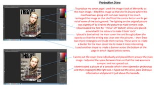
1. To produce my cover page I used the image I took of Weronika as
the main image. I tilted the image so that she fit around where the
masthead was going with out over lapping it too much.
I enlarged the image so that she fitted the centre better and to get
rid of some of the back ground. The lighting on the original picture
was slightly off so I edited the picture to make it more clear.
I downloaded the font for ‘Thrive’ off ‘Dafont’ online and played
around with the colours to make it look ‘rock’.
I placed a box behind the main cover line and brought down the
opacity so that the writing was clear over the pictures. I then drew
two more rectangles and made them narrow. These were to create
a border for the main cover line to make it more interesting.
I used another shape to create a banner across the bottom of the
page in which I typed artists names.
I wrote out the cover lines individually and placed them around the main
image. I adjusted the space between lines so that the text was more
compact and not spaced out.
I downloaded a picture of a barcode which I then opened in photoshop
and then cropped to the right size. I typed out the price, date and issue
information and placed it just above the barcode.
Production Diary