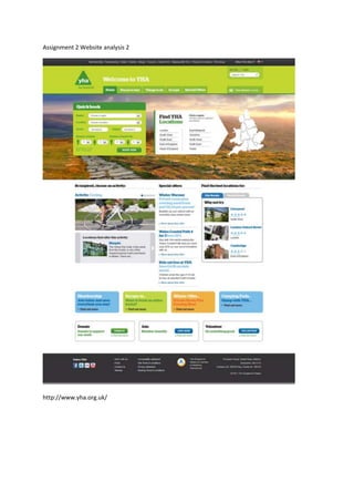
2. Visual styles and Colour Pallet
The colour scheme reflects an upbeat atmosphere the kind expected from going on holiday. The
colours stand out because of the white background and dark borders. The other hints of colours
include pastel shades and are not as vibrant as the Australian site. It’s easier on the eyes.
The tabs and boxes have rounded edges and stylised buttons which makes the overall feel of the
page rather calming and informal. As opposed to harsh right angles you might find elsewhere.
This page is very user friendly. The layout is also an aid to the Presentation. It comes across as a very
professional webpage.
Typography
The typography and font are easily definable between headings, link and body text. The headings are
quite bold because of the colour contrasting on the backgrounds. The titles are lower case and share
the same font as the body, the only difference is the bold and colour.
The body text is smaller and easy on the eyes and not as bold as the titles, so no confusion there.
The Links are large boxes which is comparable to newspaper articles. They have a large heading with
a smaller sub heading underneath and then body text underneath that. The whole box is one link.
Sounds
None.
Animations
The only noticeable animation is on the right hand side of the page and it is a very simple transition
between user submitted pictures.
The animation is a slow fade and each image is a link to another part of the site.
Interactivity
The interactivity is almost identical the Australian page.
It is again limited but it is still a nice touch. The headings on the navigation bar deploy a drop down
menu when the mouse hovers over it and the map, used for easy booking, changes colour when the
mouse is moved over the states.