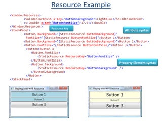
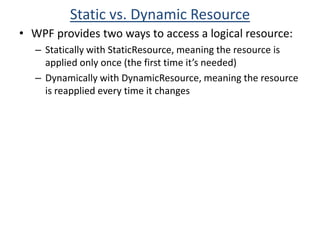
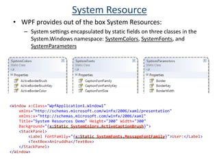
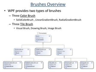
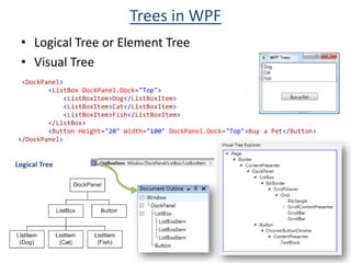
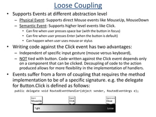
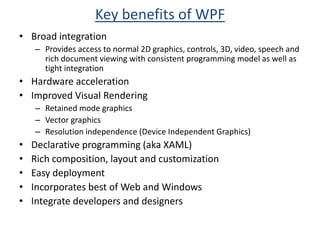
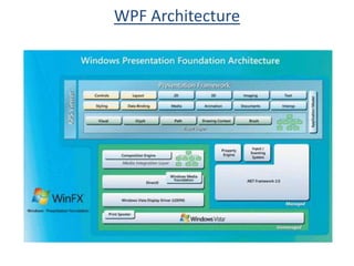
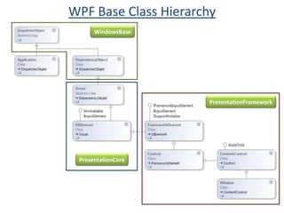
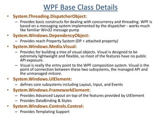
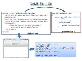
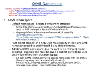
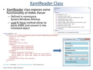
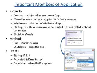
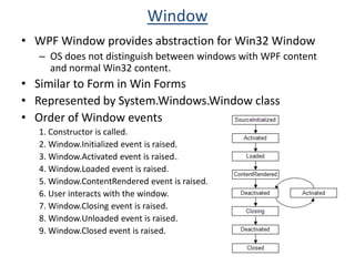
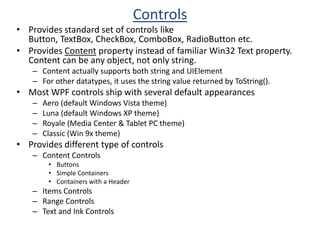
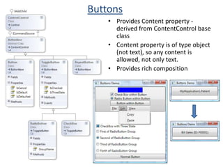
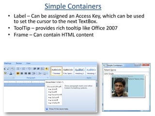
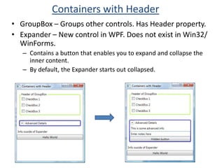
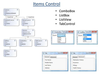
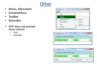
WPF provides access to 2D and 3D graphics, controls, and rich document viewing with a consistent programming model. It uses hardware acceleration for improved visual rendering. Key benefits include broad integration, resolution independence, and declarative programming using XAML. The core WPF assemblies include PresentationFramework, PresentationCore, and WindowsBase. The Application class manages the lifetime of a WPF application, while the Window class represents individual windows. Controls such as buttons, text boxes, and containers are used to build the user interface.


![Mapping defined in PresentationFramework.dll assembly [assembly:XmlnsDefinition (“http://schemas.microsoft.com/winfx/2006/xaml/presentation”, “System.Windows.Controls”)]](https://image.slidesharecdn.com/wpfdeepdive-124903530609-phpapp02/85/WPF-Deep-Dive-37-320.jpg)

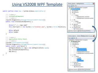
![The [STAThread] marker on the entry-point function is required like Win Forms and User32First WPF Appusing System;using System.Windows;namespace ConsoleApplication1{ class Program{[STAThread]static void Main(string[]args){Window mainWin =new Window();mainWin.Title ="First WPF App";Application app =new Application();app.Run(mainWin); } }}](https://image.slidesharecdn.com/wpfdeepdive-124903530609-phpapp02/85/WPF-Deep-Dive-53-320.jpg)