
Recommended
More Related Content
What's hot
What's hot (18)
Viewers also liked
Similar to Webpage Analysis - Digital Switchover
Similar to Webpage Analysis - Digital Switchover (20)
More from Zahra06
More from Zahra06 (18)
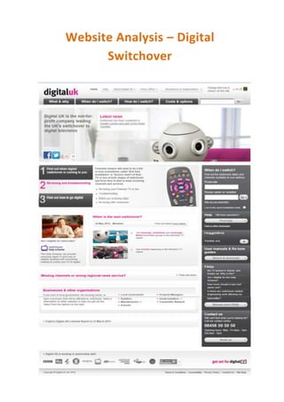
Webpage Analysis - Digital Switchover
- 1. Website Analysis – Digital Switchover
- 2. I have analysed Digital UK’s website which is all about the digital switch over. Straight away I have noticed the logo in the top left hand corner where most websites place there logo. I think the logo is has been made very well done and stands out with the use of the pink. I would definitely keep my logo in the top left hand corner when creating my website. They have created two sets of tabs, in which the first set is for the less important subjects and the second set is made bolder and is for the more important topics. I would only include one set of tabs in my campaign to keep things slightly more simple. They have used the robot image throughout their campaign. This is seen to be their mascot and is always associated with the digital switch over. They have also made this robot one of the main central images at the top of the page. I really like the idea of using this image as it is easily noticeable when used on their campaigning strategies but don’t think I would use it in my campaign and it wouldn’t fit it in with my topic. The social networking tabs are placed at the top of the page, whereas they are usually at the bottom of the website. It is useful to have these icons on your page to help keep your audience up to date with information but I’m not too sure if I would place it at the top as there is already a lot going on. The colour scheme has been kept very simple with the use of grey, white and pink. These colours are associated with the theme of the digital switchover. I think it is important to use only a few colours in order to keep things simple. I will need to ensure my colours are designed to target my audience. The font throughout the campaign throughout the website is kept very simple which is good to not draw attention away from the main message. However, it may not be so good to keep things simple as my target audience is teenagers On the right hand side of this website they have included an information box and loads of other helpful things such as where to get help. I would like to include some sort of petition box for my campaign for my audience to sign up but I feel there is way too many boxes and they may need to be separated. They have included three simple steps on the left hand side which lead to different page. This is a very good idea as it doesn’t make the website look to cramped but the numbers are very eye catching and make you feel as if it is an easy job to do within three simple steps. This would be good for our campaign to give our audience easy steps to be safer on Facebook. They haven’t included much little information, but the information they do have are with bold sub-headings; I feel the sub-headings have more of an impact on the audience than the actual text. I would make my sub- headings bold in order to make the main points of my campaign stand out. Lastly, they have included various sponsors and companies who they are working with at the bottom of the page. I don’t think sponsors are such an important thing for our campaign and our audience won’t be that interested.