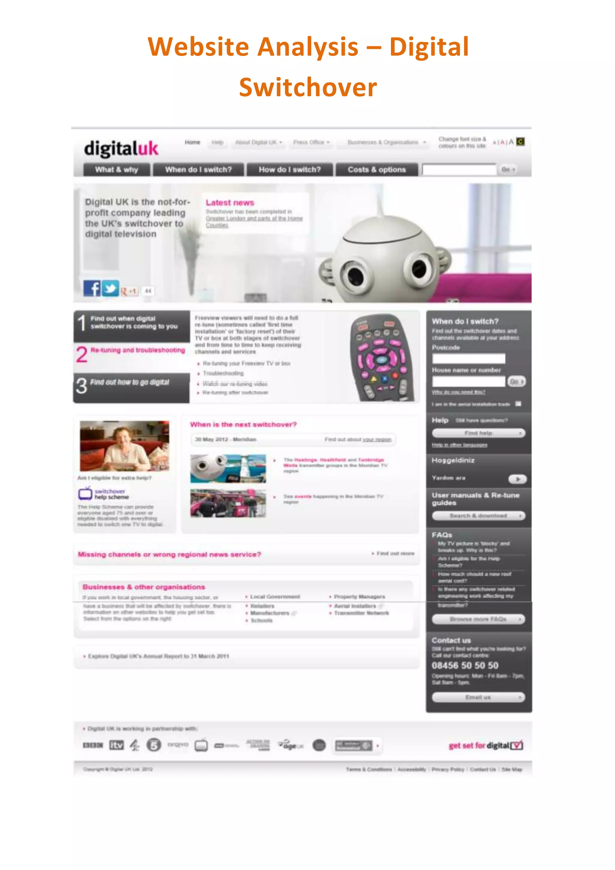
The author analyzed Digital UK's website about the digital TV switchover and noticed several design elements they liked and might incorporate into their own website, such as keeping the logo in the top left corner and using bold tabs to distinguish important topics. They also liked how Digital UK used a consistent robot mascot image and simple color scheme associated with the theme. However, the author felt there were too many boxes of information on the right side and that social media tabs worked better at the bottom. Overall, the author found several elements of Digital UK's site that provided good ideas for website design and user experience.