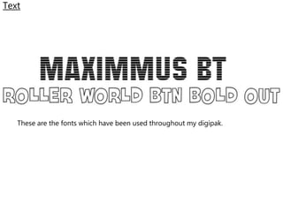
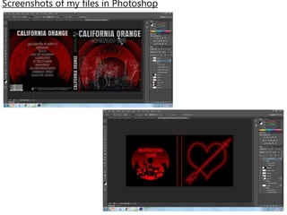
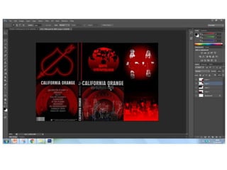
Digipak Development
Images Used in my Digipak
This image was used in the front cover of my digipak. I
edited this image using blending modes to make the band
members look like faint outlines.
This image was taken whilst filming the music video. The image was used
for the inside of my digipak. The editing done to this image included a red
to black gradient, which was blended with the image.
These images were
taken against a
white wall after we
had filmed the
performance for
my music video. In
order to include
these images I
placed them in
each corner of the
canvas and edited
them by creating a
red layer, which
then included a
black vignette. I
then made the
band members
look like they are
sketches using the
filter gallery.
Tools Used
This tool was used in order to
make the band members look
like they are sketches. the tool is
called the filter gallery, where I
carefully chose which effect to
use. I eventually decided to use
the ‘graphic pen effect’ which
can be found under sketch.
I also used ‘Gaussian Blur’
which blurred the vignette
on the image of the band
members.
This tool was used to
create the gradient over
the top of the images.
The gradients consist of
red and black.
I used the blending modes throughout my
work. I first used it to create the red
pattered circle which is the background on
my front cover. I then used the blending
modes to make the band members look as
though they are just white outlines.
Blending modes were also used for
blending the images with the red, or red
and black overlayers used.
Text
These are the fonts which have been used throughout my digipak.
Screenshots of my files in Photoshop
Digipak development

Digipak development

  • 1.
  • 2.
    Images Used inmy Digipak This image was used in the front cover of my digipak. I edited this image using blending modes to make the band members look like faint outlines.
  • 3.
    This image wastaken whilst filming the music video. The image was used for the inside of my digipak. The editing done to this image included a red to black gradient, which was blended with the image.
  • 4.
    These images were takenagainst a white wall after we had filmed the performance for my music video. In order to include these images I placed them in each corner of the canvas and edited them by creating a red layer, which then included a black vignette. I then made the band members look like they are sketches using the filter gallery.
  • 5.
    Tools Used This toolwas used in order to make the band members look like they are sketches. the tool is called the filter gallery, where I carefully chose which effect to use. I eventually decided to use the ‘graphic pen effect’ which can be found under sketch.
  • 6.
    I also used‘Gaussian Blur’ which blurred the vignette on the image of the band members.
  • 7.
    This tool wasused to create the gradient over the top of the images. The gradients consist of red and black.
  • 8.
    I used theblending modes throughout my work. I first used it to create the red pattered circle which is the background on my front cover. I then used the blending modes to make the band members look as though they are just white outlines. Blending modes were also used for blending the images with the red, or red and black overlayers used.
  • 9.
    Text These are thefonts which have been used throughout my digipak.
  • 10.
    Screenshots of myfiles in Photoshop