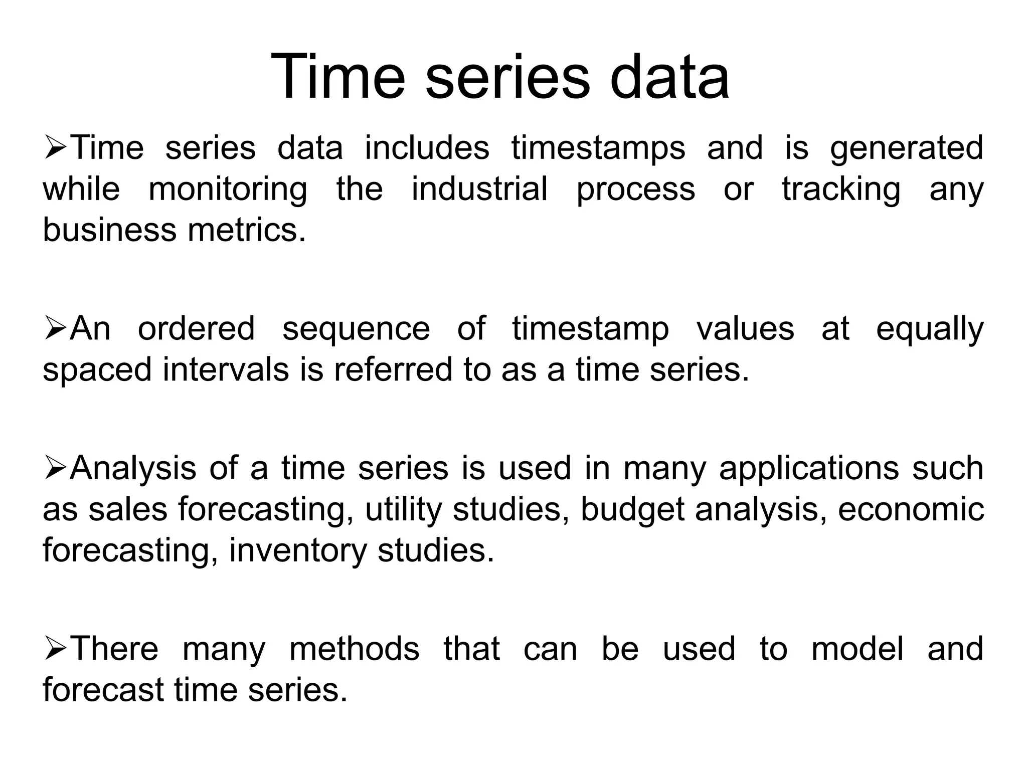
1) The document discusses fundamentals of time series analysis including characteristics of time series data, data cleaning, time-based indexing, visualization, and resampling of time series data.
2) Methods discussed include plotting univariate time series data from a random walk model and open power system data to analyze electricity consumption trends over time in Germany.
3) The data is cleaned, indexed by date, and grouped to visualize patterns like seasonal effects and differences between weekdays and weekends.


![The output of the preceding code is given here:
[ 0.91315139 0.51955858 -1.03172053 -0.725203 1.88933611 -0.39631515
0.71957305 0.01773119 -1.88369523 0.62272576 -1.22417583 -0.3920638
0.45239854 0.15720562 0.11885262 -0.96940705 -1.20997492 0.93202519
-0.37246211 1.11134324 0.15633954 -0.5439416 0.16875613 0.2826228
0.58295158 0.3245175 0.42985676 0.97500729 0.24721019 -0.45684401
-0.58347696 -0.68752098 0.82822652 -0.72181389 0.39490961 -1.792727
-0.6237392 -0.24644562 -0.22952135 3.06311553 -3.05745406 1.37894995
-0.39553 -0.26359025 -0.21658428 0.63820235 -1.7740917 0.66671788
-0.89029947 0.39759542]](https://image.slidesharecdn.com/unit-5timeseriesdataanalysis-230831051347-ebd30502/75/Unit-5-Time-series-data-Analysis-pptx-4-2048.jpg)
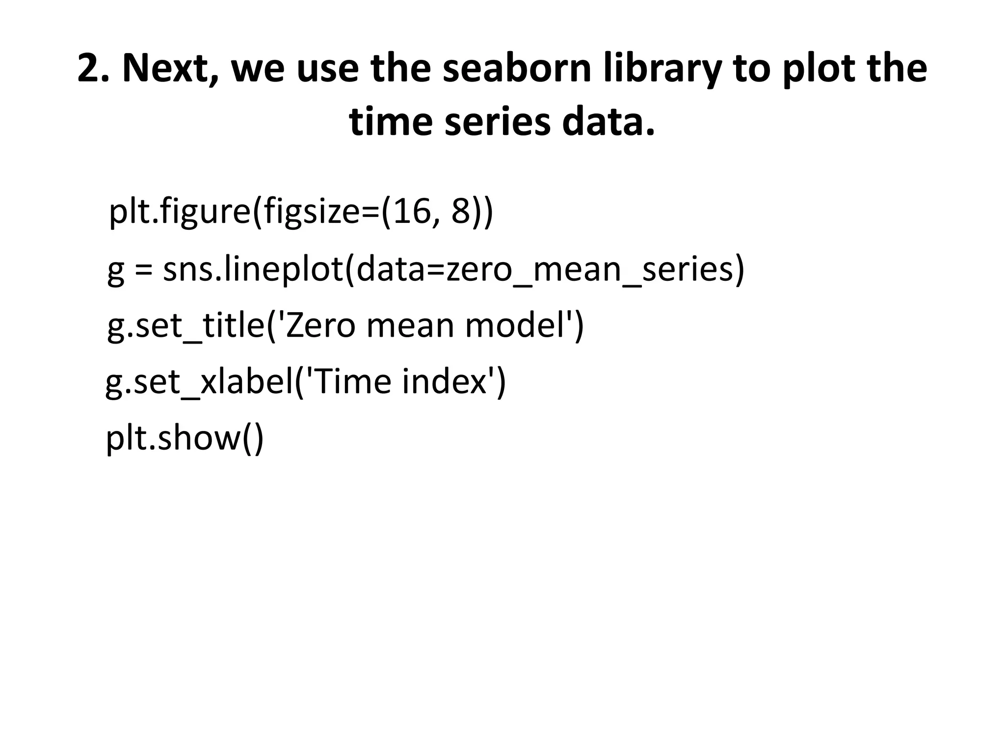

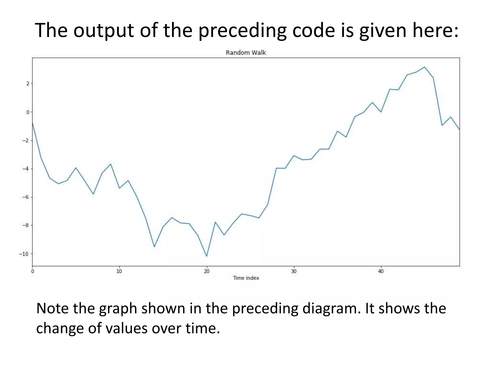
![3. We can perform a cumulative sum over the list and
then plot the data using a time series plot. The plot
gives more interesting results
random_walk = np.cumsum(zero_mean_series)
print(random_walk)
It generates an array of the cumulative sum as shown here:
[ 0.91315139 1.43270997 0.40098944 -0.32421356 1.56512255 1.1688074
1.88838045 1.90611164 0.0224164 0.64514216 -0.57903366 -0.97109746
-0.51869892 -0.36149331 -0.24264069 -1.21204774 -2.42202265 -1.48999747
-1.86245958 -0.75111634 -0.5947768 -1.1387184 -0.96996227 -0.68733947
-0.10438789 0.22012962 0.64998637 1.62499367 1.87220386 1.41535986
0.8318829 0.14436192 0.97258843 0.25077455 0.64568416 -1.14704284
-1.77078204 -2.01722767 -2.24674902 0.81636651 -2.24108755 -0.86213759
-1.25766759 -1.52125784 -1.73784212 -1.09963977 -2.87373147 -2.20701359
-3.09731306 -2.69971764]
Note that for any particular value, the next value is the sum of previous values.](https://image.slidesharecdn.com/unit-5timeseriesdataanalysis-230831051347-ebd30502/75/Unit-5-Time-series-data-Analysis-pptx-7-2048.jpg)


![The output of the preceding code is given here:
Index(['Consumption', 'Wind', 'Solar', 'Wind+Solar'],
dtype='object')
The columns of the dataframe are described here:
• Date: The date is in the format yyyy-mm-dd.
• Consumption: This indicates electricity consumption in
GWh.
• Solar: This indicates solar power production in GWh.
• Wind+Solar: This represents the sum of solar and wind
power production in GWh.](https://image.slidesharecdn.com/unit-5timeseriesdataanalysis-230831051347-ebd30502/75/Unit-5-Time-series-data-Analysis-pptx-13-2048.jpg)


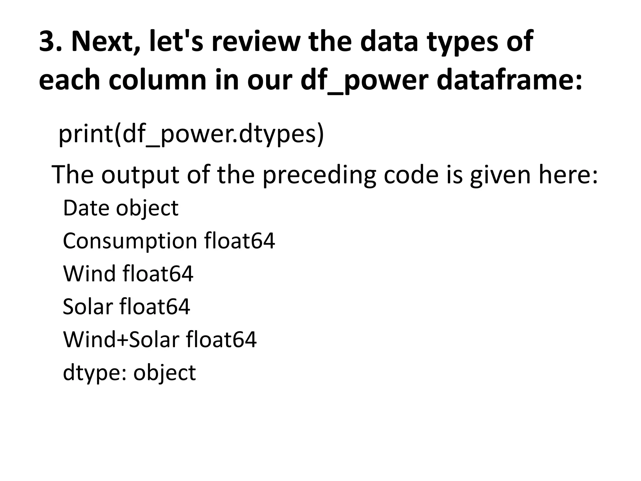
![4. Note that the Date column has a data type of object. This is not
correct. So, the next step is to correct the Date column, as shown
here:
#convert object to datetime format
df_power['Date'] = pd.to_datetime(df_power['Date'])
5. It should convert the Date column to Datetime format. We can verify
this again:
print(df_power.dtypes)
The output of the preceding code is given here:
Date datetime64[ns]
Consumption float64
Wind float64
Solar float64
Wind+Solar float64
dtype: object
Note that the Date column has been changed into the correct data
type.](https://image.slidesharecdn.com/unit-5timeseriesdataanalysis-230831051347-ebd30502/75/Unit-5-Time-series-data-Analysis-pptx-17-2048.jpg)

![7. We can simply verify this by using the code snippet given here:
Print(df_power.index)
The output of the preceding code is given here:
DatetimeIndex(['2006-01-01', '2006-01-02', '2006-01-03',
'2006-01-04', '2006-01-05', '2006-01-06', '2006-01-07',
'2006-01-08', '2006-01-09', '2006-01-10', ... '2017-12-22',
'2017-12-23', '2017-12-24', '2017-12-25', '2017-12-26',
'2017-12-27', '2017-12-28', '2017-12-29', '2017-12-30',
'2017-12-31'],dtype='datetime64[ns]', name='Date', length=4383,
freq=None)
8. Since our index is the DatetimeIndex object, now we can use it to
analyze thedataframe. Let's add more columns to our dataframe to
make it easier. Let's add Year, Month, and Weekday Name:
# Add columns with year, month, and weekday name
df_power['Year'] = df_power.index.year
df_power['Month'] = df_power.index.month
df_power['Weekday Name'] = df_power.index.day_name()](https://image.slidesharecdn.com/unit-5timeseriesdataanalysis-230831051347-ebd30502/75/Unit-5-Time-series-data-Analysis-pptx-19-2048.jpg)

![Time-based indexing
Time-based indexing is a very powerful method of the pandas
library. Having time-based indexing allows using a formatted string
to select data.
See the following code, for example:
print(df_power.loc['2015-10-02'])
The output of the preceding code is given here:
Consumption 1391.05
Wind 81.229
Solar 160.641
Wind+Solar 241.87
Year 2015
Month 10
Weekday Name Friday
Name: 2015-10-02 00:00:00, dtype: object
Note that we used the pandas dataframe loc accessor. In the preceding
example, we used a date as a string to select a row. We can use all sorts of
techniques to access rows just as we can do with a normal dataframe
index.](https://image.slidesharecdn.com/unit-5timeseriesdataanalysis-230831051347-ebd30502/75/Unit-5-Time-series-data-Analysis-pptx-21-2048.jpg)
![Visualizing time series
Let's visualize the time series dataset. We will continue using the
same df_power dataframe:
1. The first step is to import the seaborn and matplotlib libraries:
import matplotlib.pyplot as plt
import seaborn as sns
sns.set(rc={'figure.figsize':(11, 4)})
plt.rcParams['figure.figsize'] = (8,5)
plt.rcParams['figure.dpi'] = 150
2. Next, let's generate a line plot of the full time series of Germany's
daily electricity consumption:
df_power['Consumption'].plot(linewidth=0.5)](https://image.slidesharecdn.com/unit-5timeseriesdataanalysis-230831051347-ebd30502/75/Unit-5-Time-series-data-Analysis-pptx-22-2048.jpg)

![3. Let's use the dots to plot the data for all the other columns:
cols_to_plot = ['Consumption', 'Solar', 'Wind']
axes = df_power[cols_to_plot].plot(marker='.', alpha=0.5,
linestyle='None',figsize=(14, 6), subplots=True)
for ax in axes:
ax.set_ylabel('Daily Totals (GWh)')
The output of the preceding code is given here:
The output shows that electricity consumption can be broken down into two
distinct patterns:
One cluster roughly from 1,400 GWh and above
Another cluster roughly below 1,400 GWh
Moreover, solar production is higher in summer and lower in winter. Over the years,
there seems to have been a strong increasing trend in the output of wind power.](https://image.slidesharecdn.com/unit-5timeseriesdataanalysis-230831051347-ebd30502/75/Unit-5-Time-series-data-Analysis-pptx-24-2048.jpg)
![4. We can further investigate a single year to have a closer look.
Check the code given here:
ax = df_power.loc['2016', 'Consumption'].plot()
ax.set_ylabel('Daily Consumption (GWh)');
The output of the preceding code is given here:
From the preceding screenshot, we can see clearly the
consumption of electricity for 2016.
The graph shows a drastic decrease in the consumption of
electricity at the end of the year(December) and during August.](https://image.slidesharecdn.com/unit-5timeseriesdataanalysis-230831051347-ebd30502/75/Unit-5-Time-series-data-Analysis-pptx-25-2048.jpg)
![Let's examine the month of December 2016 with the following
code block:
ax = df_power.loc['2016-12',
'Consumption'].plot(marker='o', linestyle='-')
ax.set_ylabel('Daily Consumption (GWh)');
The output of the preceding code is given here:
As shown in the preceding graph, electricity consumption is higher
on weekdays and lowest at the weekends. We can see the
consumption for each day of the month. We can zoom in further to
see how consumption plays out in the last week of December.](https://image.slidesharecdn.com/unit-5timeseriesdataanalysis-230831051347-ebd30502/75/Unit-5-Time-series-data-Analysis-pptx-26-2048.jpg)
![In order to indicate a particular week of December, we can supply a specific date
range as shown here:
ax = df_power.loc['2016-12-23':'2016-12-30',
'Consumption'].plot(marker='o', linestyle='-')
ax.set_ylabel('Daily Consumption (GWh)');
As illustrated in the preceding code, we want to see the electricity consumption
between 2016-12-23 and 2016-12-30. The output of the preceding code is given here:
As illustrated in the preceding screenshot, electricity consumption was lowest
on the day of Christmas, probably because people were busy partying. After
Christmas, the consumption increased.](https://image.slidesharecdn.com/unit-5timeseriesdataanalysis-230831051347-ebd30502/75/Unit-5-Time-series-data-Analysis-pptx-27-2048.jpg)
![Grouping time series data
1. We can first group the data by months and then use the
box plots to visualize the data:
fig, axes = plt.subplots(3, 1, figsize=(8, 7), sharex=True)
for name, ax in zip(['Consumption', 'Solar', 'Wind'], axes):
sns.boxplot(data=df_power, x='Month', y=name, ax=ax)
ax.set_ylabel('GWh')
ax.set_title(name)
if ax != axes[-1]:
ax.set_xlabel('')
The output of the preceding code is given here:](https://image.slidesharecdn.com/unit-5timeseriesdataanalysis-230831051347-ebd30502/75/Unit-5-Time-series-data-Analysis-pptx-28-2048.jpg)

![Resampling time series data
It is often required to resample the dataset at lower or higher frequencies. This
resampling is done based on aggregation or grouping operations. For example, we can
resample the data based on the weekly mean time series as follows:
1. We can use the code given here to resample our data:
columns = ['Consumption', 'Wind', 'Solar', 'Wind+Solar']
power_weekly_mean = df_power[columns].resample('W').mean()
power_weekly_mean
The output of the preceding code is given here:
As shown in the preceding screenshot, the first row, labeled 2006-01-01, includes the
average of all the data. We can plot the daily and weekly time series to compare the
dataset over the six-month period.](https://image.slidesharecdn.com/unit-5timeseriesdataanalysis-230831051347-ebd30502/75/Unit-5-Time-series-data-Analysis-pptx-30-2048.jpg)
![2. Let's see the last six months of 2016. Let's start by initializing
the variable:
start, end = '2016-01', '2016-06‘
3. Next, let's plot the graph using the code given here:
fig, ax = plt.subplots()
ax.plot(df_power.loc[start:end, 'Solar'],
marker='.', linestyle='-', linewidth=0.5, label='Daily')
ax.plot(power_weekly_mean.loc[start:end, 'Solar'],
marker='o', markersize=8, linestyle='-', label='Weekly Mean
Resample')
ax.set_ylabel('Solar Production in (GWh)')
ax.legend();](https://image.slidesharecdn.com/unit-5timeseriesdataanalysis-230831051347-ebd30502/75/Unit-5-Time-series-data-Analysis-pptx-31-2048.jpg)


![Introduction to Pandas and Time Series Analysis [PyCon DE]](https://cdn.slidesharecdn.com/ss_thumbnails/introductiontopandasandtimeseriesanalysispyconde-170617163724-thumbnail.jpg?width=640&height=640&fit=bounds)


![Introduction to Data Analtics with Pandas [PyCon Cz]](https://cdn.slidesharecdn.com/ss_thumbnails/introductiontodataanalticswithpandaspyconcz-170617163446-thumbnail.jpg?width=640&height=640&fit=bounds)
![Introduction to Pandas and Time Series Analysis [Budapest BI Forum]](https://cdn.slidesharecdn.com/ss_thumbnails/introductiontopandasandtimeseriesanalysis-170617163829-thumbnail.jpg?width=640&height=640&fit=bounds)