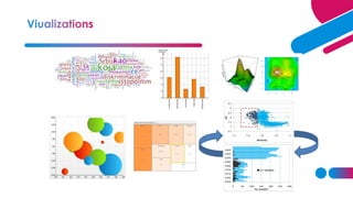
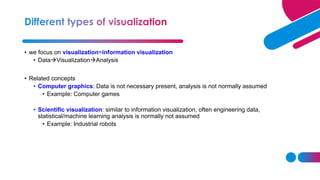
• we focus on visualization=information visualization
• Data→Visualization→Analysis
• Related concepts
• Computer graphics: Data is not necessary present, analysis is not normally assumed
• Example: Computer games
• Scientific visualization: similar to information visualization, often engineering data,
statistical/machine learning analysis is normally not assumed
• Example: Industrial robots
https://www.youtube.com/watch?v=mpechGIfPbw
Scientific visualization Information visualization
• Which graphs can be used for analysis of my data?
• How to create these graphs?
• How should these graphs be analysed?
• How to make these graphs looking good enough for publication or presentation?
• Human sight = primary resource for information understanding
• Visualization is often the quickest way for data understanding
• The way of data visualization may affect decision making dramatically
Decision here: population does not
increase so much, no intervention
needed
Decision here: population
increases quickly, intervention is
required
Visual perception problem
Source: Elting Linda S, Martin Charles
G, Cantor Scott B, Rubenstein Edward
B. Influence of data display formats on
physician investigators' decisions to
stop clinical trials: prospective trial with
repeated measures BMJ 1999; 318
:1527
• Visualization for exploration
• Clusters
• Trends
• Anomalies
• …
• Confirmatory visualization
• Example 1: Perform linear regression, analyse residuals→ was linear regression reasonable
• Example 2: Discover clusters by K-means, visualize clusters→ are they clusters actually?
• Visualization for presentation
Key ingredient: mapping data columns to visual
structures (aesthetics)
• Human visual system has limitations
• These limitations may lead to wrong/incomplete analysis of graphs
• Understanding how we see→ better displays
• Misleading graphics needs to be avoided
• Color= hue + saturation + value (lightness)
• 8% of males are color deficient→ what are good colors?
https://henrydangprg.com/2016/06/26/color-detection-in-python-with-opencv/
http://www.ilusa.com/gallery/elephant-illusion.jpg
How quickly can you identify a
red dot? How quickly can you identify a
square of right-handed Rs?
• Certain aesthetics are fast to process
• How can this affect analysis?
• Viewing raw data is often prefered
• Sometimes some preprocessing is needed
• Missing values and Data cleaning
• Discard the bad record →may remove almost all data
• Assign sentinel value
• Column mean imputation
• Nearest neighbor imputation
• Other imputations
• Normalization
• Converting column to range [0,1]. Useful in for ex. color mapping
• Centering and scaling 0/1
• Nonlinear transformations: log, sqrt
• Segmentation
• Split data according to some column
• Sampling, subsetting and expanding
• Random sampling reduces size of data and facilitates overplotting (for ex. scatterplots)
• Interpolation: linear (one dimension), bilinear (two dimensions), nonlinear. Select necessary
amount of intrepolation points.
• Dimension reduction
• PCA
• MDS
• Other techniques (ex. ICA, Autoencoders), welcome to Machine Learning...
• Mapping nominal dimensions to numbers
• Random mapping should never be done unless intrinsic ordering is present
• Use other numeric variables to measure in the data to measure “closeness” of values in the
nominal variable
• Correspondence analysis
• Aggregation and summarization
1. Grouping observations
2. Computing summary statistics per group
• Smoothing and filtering
• Replace original values with a smoothed versions
Commercial:
• SAS and SAS JMP – environment. Special visual tools are available (JMP), require separate license. Well documented.
Good even for large sets. SAS Enterprise Guide has many visual static tools
• Spotfire – Many static and interactive visualization tools
• Tableau– Many static and interactive visualization tools
• InfoScope – visualizing maps, interactive visualizations
• Infographics-
Free:
• R – programming language. Set of packages is constantly updated. A lot of statistical tools (even the newest methods)
Badly documented
• Plotly – a tool for interactive and dynamic graphics, R interface available
• Shiny - – a tool for R-based web applications using graphics
• GraphViz – visualization of graph data, coding needed
• Jigsaw – Text analysis
Tools for the web (used by web designers):
• ActionScript
• JavaScript
• Prefuse
• VTK
… much more references given in the course book
• Install R: http://www.r-project.org/
• Install RStudio: http://rstudio.org/
Progra
m
Execution
console
Plots
Workspace
• R base: basic plotting, not
publication quality Grob package: low-level plotting
tools, new types of plots
Zhou, Lutong, and W. John Braun. "Fun with the r grid package." Journal of Statistics Education
18.3 (2010).
Ggplot2 package: based on
grammar of graphics, close to
publication quality
Plotly package: Ggplot2 + interactivity
Base R graphical procedures:
• plot(x,..) plots time series
• plot(x,y) scatter plot
• plot(x,y) followed by points(x,y) plots several
scatterplots in one coordinate system
• hist(x,..) plots a hitogram
• persp(x,y,z,…) creates surface plots
• cloud(formula,data..) creates 3D scatter plot
• Visualization for exploration
• Default settings
• Visualization for presentation for publication
• Higher quality graphics is required
• Improve the graph quality in the software (often requires quite a bit of
programming)
• Use postprocessing tools, such as Inkscape or Adobe Illustrator
Plot processed in
Inkscape
Example: Compare two plots and state
what is improved in the second plot.
• Install Inkscape
• http://inkscape.org/
• Inkscape is an open source, SVG-based
vector drawing program
• file format that Inkscape uses is
compact and quickly transmittable over
the Internet.
• Vector graphics: image is defined in
terms of lines, not pixels
• Benefit: can be enlarged without loss
of picture quality
1. Save your R plot as PDF and import it to
Inkscape
2. Make changes and export your plot as a
PNG-file or save it as PDF.
Bitmap image and vector
image (enlarged)
• Menu bar (Important: File, Object, Path, Text, View→Grid)
• Command bar (Zoom to fit page, Edit object’s colors)
• Tool controls
• Tool box (Select and transform, zoom, Text, Eraser, Fill)
• Color palette
• Status bar
• Course book, chapters 1.1, 1.3-1.8 and 2
• Manual to InkScape: http://tavmjong.free.fr/INKSCAPE/MANUAL/html/index.php

UNit4.pdf

  • 4.
    • we focuson visualization=information visualization • Data→Visualization→Analysis • Related concepts • Computer graphics: Data is not necessary present, analysis is not normally assumed • Example: Computer games • Scientific visualization: similar to information visualization, often engineering data, statistical/machine learning analysis is normally not assumed • Example: Industrial robots
  • 5.
  • 27.
    • Which graphscan be used for analysis of my data? • How to create these graphs? • How should these graphs be analysed? • How to make these graphs looking good enough for publication or presentation?
  • 28.
    • Human sight= primary resource for information understanding • Visualization is often the quickest way for data understanding • The way of data visualization may affect decision making dramatically
  • 29.
    Decision here: populationdoes not increase so much, no intervention needed Decision here: population increases quickly, intervention is required Visual perception problem
  • 30.
    Source: Elting LindaS, Martin Charles G, Cantor Scott B, Rubenstein Edward B. Influence of data display formats on physician investigators' decisions to stop clinical trials: prospective trial with repeated measures BMJ 1999; 318 :1527
  • 31.
    • Visualization forexploration • Clusters • Trends • Anomalies • … • Confirmatory visualization • Example 1: Perform linear regression, analyse residuals→ was linear regression reasonable • Example 2: Discover clusters by K-means, visualize clusters→ are they clusters actually? • Visualization for presentation
  • 32.
    Key ingredient: mappingdata columns to visual structures (aesthetics)
  • 33.
    • Human visualsystem has limitations • These limitations may lead to wrong/incomplete analysis of graphs • Understanding how we see→ better displays • Misleading graphics needs to be avoided
  • 34.
    • Color= hue+ saturation + value (lightness) • 8% of males are color deficient→ what are good colors? https://henrydangprg.com/2016/06/26/color-detection-in-python-with-opencv/
  • 35.
  • 36.
    How quickly canyou identify a red dot? How quickly can you identify a square of right-handed Rs? • Certain aesthetics are fast to process
  • 37.
    • How canthis affect analysis?
  • 38.
    • Viewing rawdata is often prefered • Sometimes some preprocessing is needed • Missing values and Data cleaning • Discard the bad record →may remove almost all data • Assign sentinel value • Column mean imputation • Nearest neighbor imputation • Other imputations
  • 39.
    • Normalization • Convertingcolumn to range [0,1]. Useful in for ex. color mapping • Centering and scaling 0/1 • Nonlinear transformations: log, sqrt • Segmentation • Split data according to some column
  • 40.
    • Sampling, subsettingand expanding • Random sampling reduces size of data and facilitates overplotting (for ex. scatterplots) • Interpolation: linear (one dimension), bilinear (two dimensions), nonlinear. Select necessary amount of intrepolation points. • Dimension reduction • PCA • MDS • Other techniques (ex. ICA, Autoencoders), welcome to Machine Learning...
  • 41.
    • Mapping nominaldimensions to numbers • Random mapping should never be done unless intrinsic ordering is present • Use other numeric variables to measure in the data to measure “closeness” of values in the nominal variable • Correspondence analysis • Aggregation and summarization 1. Grouping observations 2. Computing summary statistics per group
  • 42.
    • Smoothing andfiltering • Replace original values with a smoothed versions
  • 61.
    Commercial: • SAS andSAS JMP – environment. Special visual tools are available (JMP), require separate license. Well documented. Good even for large sets. SAS Enterprise Guide has many visual static tools • Spotfire – Many static and interactive visualization tools • Tableau– Many static and interactive visualization tools • InfoScope – visualizing maps, interactive visualizations • Infographics- Free: • R – programming language. Set of packages is constantly updated. A lot of statistical tools (even the newest methods) Badly documented • Plotly – a tool for interactive and dynamic graphics, R interface available • Shiny - – a tool for R-based web applications using graphics • GraphViz – visualization of graph data, coding needed • Jigsaw – Text analysis
  • 62.
    Tools for theweb (used by web designers): • ActionScript • JavaScript • Prefuse • VTK … much more references given in the course book
  • 64.
    • Install R:http://www.r-project.org/ • Install RStudio: http://rstudio.org/ Progra m Execution console Plots Workspace
  • 65.
    • R base:basic plotting, not publication quality Grob package: low-level plotting tools, new types of plots Zhou, Lutong, and W. John Braun. "Fun with the r grid package." Journal of Statistics Education 18.3 (2010).
  • 66.
    Ggplot2 package: basedon grammar of graphics, close to publication quality Plotly package: Ggplot2 + interactivity
  • 67.
    Base R graphicalprocedures: • plot(x,..) plots time series • plot(x,y) scatter plot • plot(x,y) followed by points(x,y) plots several scatterplots in one coordinate system • hist(x,..) plots a hitogram • persp(x,y,z,…) creates surface plots • cloud(formula,data..) creates 3D scatter plot
  • 68.
    • Visualization forexploration • Default settings • Visualization for presentation for publication • Higher quality graphics is required • Improve the graph quality in the software (often requires quite a bit of programming) • Use postprocessing tools, such as Inkscape or Adobe Illustrator
  • 69.
    Plot processed in Inkscape Example:Compare two plots and state what is improved in the second plot.
  • 70.
    • Install Inkscape •http://inkscape.org/ • Inkscape is an open source, SVG-based vector drawing program • file format that Inkscape uses is compact and quickly transmittable over the Internet. • Vector graphics: image is defined in terms of lines, not pixels • Benefit: can be enlarged without loss of picture quality 1. Save your R plot as PDF and import it to Inkscape 2. Make changes and export your plot as a PNG-file or save it as PDF. Bitmap image and vector image (enlarged)
  • 71.
    • Menu bar(Important: File, Object, Path, Text, View→Grid) • Command bar (Zoom to fit page, Edit object’s colors) • Tool controls • Tool box (Select and transform, zoom, Text, Eraser, Fill) • Color palette • Status bar
  • 72.
    • Course book,chapters 1.1, 1.3-1.8 and 2 • Manual to InkScape: http://tavmjong.free.fr/INKSCAPE/MANUAL/html/index.php