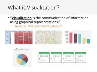
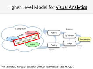
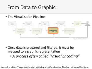
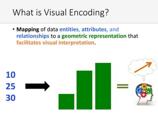
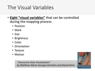
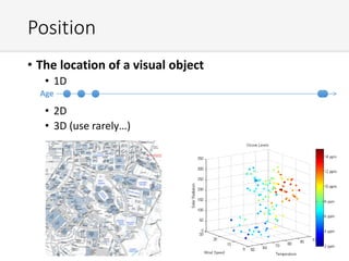
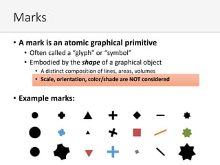
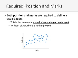
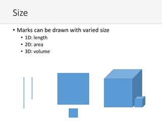
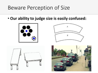
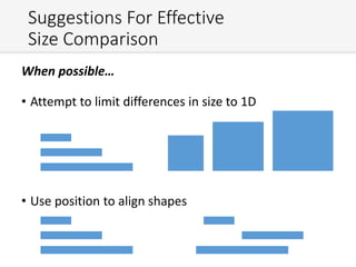
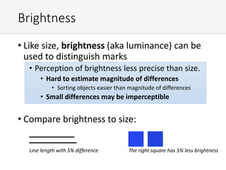
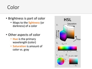
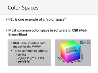
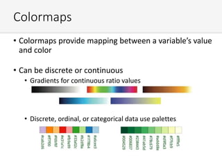
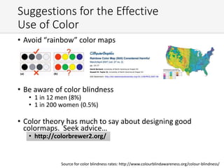
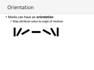
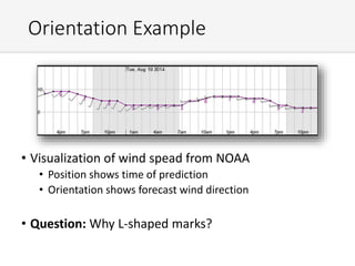
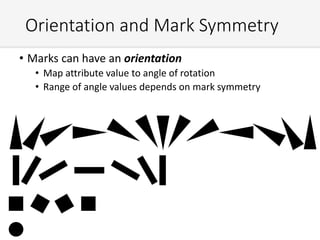
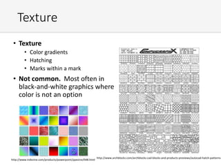
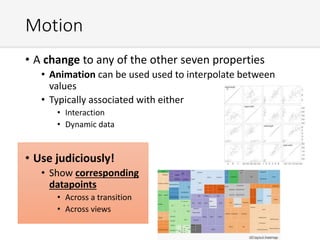
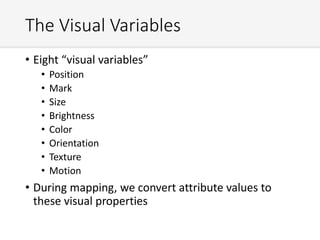
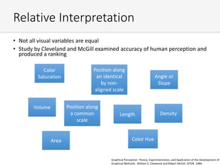
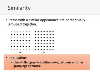
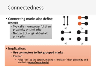
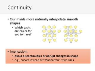
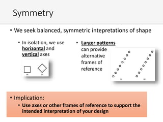
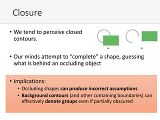
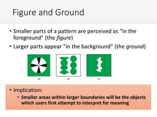
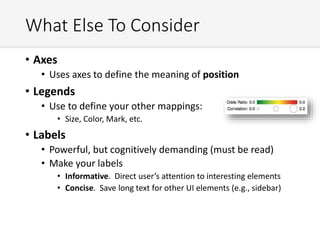
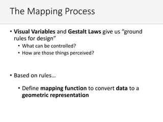
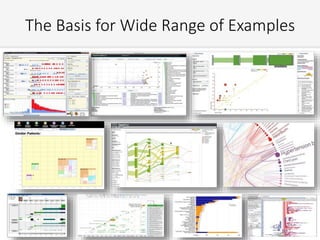
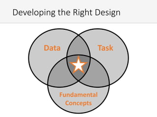
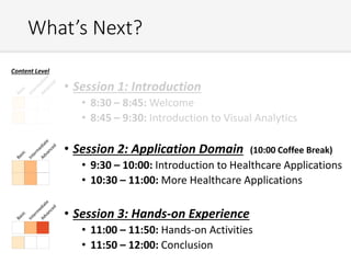
An Introduction to Visual
Analytics in Healthcare
A tutorial sponsored by the
Visual Analytics Working Group
An Introduction to Visual Analytics in
Healthcare
Disclosure:
• David Gotz discloses that he has received grant funding
from Amazon and the National Consortium for Data
Science, an industry-academic partnership that receives
funding from Cisco, Deloitte, EMC, GE, and IBM.
• Jesus Caban discloses that he has no relationships with
commercial interests.
• Adam Perer discloses that he is employed by IBM.
• Josua Krause discloses that he has no relationships
with commercial interests.
Tutorial Organizers
• David Gotz
• Jesus Caban
• Adam Perer
• Josua Krause NYU
Tutorial Agenda
• Session 1: Introduction
• 8:30 – 8:45: Welcome
• 8:45 – 9:30: Introduction to Visual Analytics
• Session 2: Application Domain (10:00 Coffee Break)
• 9:30 – 10:00: Introduction to Healthcare Applications
• 10:30 – 11:00: More Healthcare Applications
• Session 3: Hands-on Experience
• 11:00 – 11:50: Hands-on Activities
• 11:50 – 12:00: Conclusion
Content Level
The Context: Setting the Stage for
Visual Analytics
March 2015 Issue of JAMIA
AMIA VIS Working Group
• AMIA’s newest working group
• Are you an AMIA member?
• Sign up to get involved
• http://communities.amia.org/vis-wg
• VIS-WG@lists.amia.org
• Not an AMIA member?
• Become one… then join working
group
• Mailing list maintained by
www.visualanalyticshealthcare.org/
Synergistic Activities
• The 6th Annual Visual Analytics in
Healthcare (VAHC) Workshop
• Chicago on October 25, 2015
• Part of IEEE VIS
• Papers archived in ACM Digital Library
• http://dl.acm.org/
• Demos, posters, etc. archived on workshop website
• http://www.visualanalyticshealthcare.org/
• Past VAHC Workshops; Annually since 2010
• 2010-2012 at IEEE VIS; 2013-2014 events held at AMIA
• Proceedings from previous years available on workshop website
• http://www.visualanalyticshealthcare.org/proceedings.html
• Future: AMIA in 2016?
Get Involved!
• Vibrant communities depend on volunteers
• Participate in events
• Help generate ideas (events, resources, etc.)
• Donate time to help organize
• How to get involved?
1. Join the VIS Working Group
2. Attend the VIS Working Group meeting
3. Contact us if you want to volunteer to help lead
8pm
Monday
Nov 16
Franciscan B
What is Visual Analytics?
Why use it?
What should we know?
Let’s start by looking
at a table of data….
First, A Test….
First, A Test….
Raise your hand when you have found the single highest sales figure.
How about the top 3? Or bottom 3?
What is Visualization?
• “Visualization is the communication of information
using graphical representations.”
• Ward et al., “Interactive Data Visualization”
Multiple Views of the Same Data
0
20000
40000
60000
80000
100000
1Q 2Q 3Q 4Q 1Q 2Q 3Q 4Q 1Q 2Q 3Q 4Q
2011 2012 2013
Quarterly Sales
North South East West
Lookup values; Identify Outliers
Trends over time in each region Quarterly patterns?
More Complex Examples
John Snow, 1854
http://en.wikipedia.org/wiki/1854_Broad_Street_cholera_outbreak
• Map of Cholera fatalities
by location in 1854
outbreak
• Leading hypothesis was
“bad air” (germ theory
was not yet known)
• Map showed connection
to water pump
• Map persuaded the local
authorities to disable the
pump
Why Does Visualization Work?
• Why is a good visualization
easier to “see” than tables
of numbers?
• Our visual systems have
tremendous power to:
• See patterns
• Identify Trends
• Locate Outliers and
anomalies
• Much of that power is
precognitive
• Fast
• Efficient
• The Visualization Pipeline
• Rendering is largely “solved”
• e.g., Canvas, SVG, OpenGL, DirectX, Java 2D
• Creating a visualization includes designing for
analysis, filtering, mapping, and interaction
From Data to Graphic
Image from http://www.infovis-wiki.net/index.php/Visualization_Pipeline, with modifications.
User Interactions
Higher Level Model for Visual Analytics
From Sacha et al., “Knowledge Generation Model for Visual Analytics” (IEEE VAST 2014)
• The Visualization Pipeline
• Once data is prepared and filtered, it must be
mapped to a graphic representation
• A process often called “Visual Encoding”
From Data to Graphic
Image from http://www.infovis-wiki.net/index.php/Visualization_Pipeline, with modifications.
User Interactions
What is Visual Encoding?
• Mapping of data entities, attributes, and
relationships to a geometric representation that
facilitates visual interpretation.
10
25
30
The Designer’s Role
• Your job as a visualization designer
• Design an interpretable visual representation
• Define the mapping function to algorithmically convert
data to geometry
• The algorithmic requirement is important
• Not a “one time design”
• Repeatable for a defined class of data
• What types of data? What prerequisites are there?
• What are the “edge cases” that need to work?
• How would the appearance of outliers impact the design?
• How will it scale to larger volumes of data?
• This is what makes mapping challenging (and fun!)
The Visual Variables
• Eight “visual variables” that can be controlled
during the mapping process
• Position
• Mark
• Size
• Brightness
• Color
• Orientation
• Texture
• Motion
"Interactive Data Visualization”
by Matthew Ward, Georges Grinstein and Daniel Keim
Position
• The location of a visual object
• 1D
• 2D
• 3D (use rarely…)
Age
Marks
• A mark is an atomic graphical primitive
• Often called a “glyph” or “symbol”
• Embodied by the shape of a graphical object
• A distinct composition of lines, areas, volumes
• Scale, orientation, color/shade are NOT considered
• Example marks:
Required: Position and Marks
• Both position and marks are required to define a
visualization.
• This is the minimum: a mark drawn at a particular spot
• Without either, there is nothing to see
b
Age
Height
Size
• Marks can be drawn with varied size
• 1D: length
• 2D: area
• 3D: volume
Beware Perception of Size
• Our ability to judge size is easily confused:
Suggestions For Effective
Size Comparison
When possible…
• Attempt to limit differences in size to 1D
• Use position to align shapes
Brightness
• Like size, brightness (aka luminance) can be
used to distinguish marks
• Perception of brightness less precise than size.
• Hard to estimate magnitude of differences
• Sorting objects easier than magnitude of differences
• Small differences may be imperceptible
• Compare brightness to size:
Line length with 5% difference The right square has 5% less brightness
Beware “Fancy” Shading With
Gradients
The Gradient Illusion
Color
• Brightness is part of color
• Maps to the lightness (or
darkness) of a color
• Other aspects of color
• Hue is the primary
wavelength (color)
• Saturation is amount of
color vs. gray
Color Spaces
• HSL is one example of a “color space”
• Most common color space in software is RGB (Red-
Green-Blue)
• RGB is the standard color
model for the WWW
• Three common notations:
• white
• rgb(255,255,255)
• #ffffff
Colormaps
• Colormaps provide mapping between a variable’s value
and color
• Can be discrete or continuous
• Gradients for continuous ratio values
• Discrete, ordinal, or categorical data use palettes
Suggestions for the Effective
Use of Color
• Avoid “rainbow” color maps
• Be aware of color blindness
• 1 in 12 men (8%)
• 1 in 200 women (0.5%)
• Color theory has much to say about designing good
colormaps. Seek advice…
• http://colorbrewer2.org/
Source for color blindness rates: http://www.colourblindawareness.org/colour-blindness/
Orientation
• Marks can have an orientation
• Map attribute value to angle of rotation
Orientation Example
• Visualization of wind spead from NOAA
• Position shows time of prediction
• Orientation shows forecast wind direction
• Question: Why L-shaped marks?
Orientation and Mark Symmetry
• Marks can have an orientation
• Map attribute value to angle of rotation
• Range of angle values depends on mark symmetry
Texture
• Texture
• Color gradients
• Hatching
• Marks within a mark
• Not common. Most often in
black-and-white graphics where
color is not an option
http://www.indezine.com/products/powerpoint/ppezine/048.html
http://www.archblocks.com/archblocks-cad-blocks-and-products-previews/autocad-hatch-patterns
Motion
• A change to any of the other seven properties
• Animation can be used used to interpolate between
values
• Typically associated with either
• Interaction
• Dynamic data
• Use judiciously!
• Show corresponding
datapoints
• Across a transition
• Across views
The Visual Variables
• Eight “visual variables”
• Position
• Mark
• Size
• Brightness
• Color
• Orientation
• Texture
• Motion
• During mapping, we convert attribute values to
these visual properties
Relative Interpretation
• Not all visual variables are equal
• Study by Cleveland and McGill examined accuracy of human perception and
produced a ranking
1. Position along a common scale
• Scatter plot, Points on a map
2. Position along an identical but non-aligned scale
• Scatter plot matrix
3. Length
• Bar chart
• Histogram
4. Angle and slope
• Pie chart
• Gradient lines
5. Area
• Treemap
• Bubble chart
6. Volume, density, and color saturation
• 3D visualization
• Heat map
7. Color hue
• Color scales
Position along
a common
scale
Position along
an identical
by non-
aligned scale
Length
Angle or
Slope
Area
Volume
Density
Color
Saturation
Color Hue
Graphical Perception: Theory, Experimentation, and Application of the Development of
Graphical Methods. William S. Cleveland and Robert McGill. JSTOR. 1984.
An Example: Room for Improvement
• From a meeting at NIH last week…
Moving Beyond Individual Marks
• These eight variables apply to individual marks
• Graphical elements are not interpreted in isolation.
• Relationships between visual elements also have
perceptual power
Patterns
Gestalt Laws
• Proximity
• Similarity
• Connectedness
• Continuity
• Symmetry
• Closure
• Figure and Ground
Proximity
• Items positioned near each other are perceptually
grouped together.
• Implication:
• Marks representing related information should be
positioned close together.
Similarity
• Items with a similar appearance are perceptually
grouped together.
• Implication:
• Use similar graphics define rows, columns or other
groupings of marks.
Connectedness
• Connecting marks also define
groups
• Typically more powerful than
proximity or similarity
• Not part of original Gestalt
principles
• Implication:
• Use connectors to link grouped marks
• Caveat:
• Adds “ink” to the screen, making it “messier” than proximity and
similarity (visual complexity)
Continuity
• Our minds more naturally interpolate smooth
shapes
• Which paths
are easier for
you to trace?
• Implication:
• Avoid discontinuities or abrupt changes in shape
• e.g., curves instead of “Manhattan”-style lines
Symmetry
• We seek balanced, symmetric intepretations of shape
• In isolation, we use
horizontal and
vertical axes
• Implication:
• Use axes or other frames of reference to support the
intended interpretation of your design
• Larger patterns
can provide
alternative
frames of
reference
Closure
• We tend to perceive closed
contours.
• Our minds attempt to “complete” a shape, guessing
what is behind an occluding object
• Implications:
• Occluding shapes can produce incorrect assumptions
• Background contours (and other containing boundaries) can
effectively denote groups even if partially obscured
Figure and Ground
• Smaller parts of a pattern are perceived as “in the
foreground” (the figure)
• Larger parts appear “in the background” (the ground)
• Implication:
• Smaller areas within larger boundaries will be the objects
which users first attempt to interpret for meaning
What Else To Consider
• Axes
• Uses axes to define the meaning of position
• Legends
• Use to define your other mappings:
• Size, Color, Mark, etc.
• Labels
• Powerful, but cognitively demanding (must be read)
• Make your labels
• Informative. Direct user’s attention to interesting elements
• Concise. Save long text for other UI elements (e.g., sidebar)
The Mapping Process
• Visual Variables and Gestalt Laws give us “ground
rules for design”
• What can be controlled?
• How are those things perceived?
• Based on rules…
• Define mapping function to convert data to a
geometric representation
The Basis for Wide Range of Examples
Developing the Right Design
Fundamental
Concepts
Data Task
What’s Next?
• Session 1: Introduction
• 8:30 – 8:45: Welcome
• 8:45 – 9:30: Introduction to Visual Analytics
• Session 2: Application Domain (10:00 Coffee Break)
• 9:30 – 10:00: Introduction to Healthcare Applications
• 10:30 – 11:00: More Healthcare Applications
• Session 3: Hands-on Experience
• 11:00 – 11:50: Hands-on Activities
• 11:50 – 12:00: Conclusion
Content Level

AMIA 2015 Visual Analytics in Healthcare Tutorial Part 1

  • 1.
    An Introduction toVisual Analytics in Healthcare A tutorial sponsored by the Visual Analytics Working Group
  • 2.
    An Introduction toVisual Analytics in Healthcare Disclosure: • David Gotz discloses that he has received grant funding from Amazon and the National Consortium for Data Science, an industry-academic partnership that receives funding from Cisco, Deloitte, EMC, GE, and IBM. • Jesus Caban discloses that he has no relationships with commercial interests. • Adam Perer discloses that he is employed by IBM. • Josua Krause discloses that he has no relationships with commercial interests.
  • 3.
    Tutorial Organizers • DavidGotz • Jesus Caban • Adam Perer • Josua Krause NYU
  • 4.
    Tutorial Agenda • Session1: Introduction • 8:30 – 8:45: Welcome • 8:45 – 9:30: Introduction to Visual Analytics • Session 2: Application Domain (10:00 Coffee Break) • 9:30 – 10:00: Introduction to Healthcare Applications • 10:30 – 11:00: More Healthcare Applications • Session 3: Hands-on Experience • 11:00 – 11:50: Hands-on Activities • 11:50 – 12:00: Conclusion Content Level
  • 5.
    The Context: Settingthe Stage for Visual Analytics March 2015 Issue of JAMIA
  • 6.
    AMIA VIS WorkingGroup • AMIA’s newest working group • Are you an AMIA member? • Sign up to get involved • http://communities.amia.org/vis-wg • VIS-WG@lists.amia.org • Not an AMIA member? • Become one… then join working group • Mailing list maintained by www.visualanalyticshealthcare.org/
  • 7.
    Synergistic Activities • The6th Annual Visual Analytics in Healthcare (VAHC) Workshop • Chicago on October 25, 2015 • Part of IEEE VIS • Papers archived in ACM Digital Library • http://dl.acm.org/ • Demos, posters, etc. archived on workshop website • http://www.visualanalyticshealthcare.org/ • Past VAHC Workshops; Annually since 2010 • 2010-2012 at IEEE VIS; 2013-2014 events held at AMIA • Proceedings from previous years available on workshop website • http://www.visualanalyticshealthcare.org/proceedings.html • Future: AMIA in 2016?
  • 8.
    Get Involved! • Vibrantcommunities depend on volunteers • Participate in events • Help generate ideas (events, resources, etc.) • Donate time to help organize • How to get involved? 1. Join the VIS Working Group 2. Attend the VIS Working Group meeting 3. Contact us if you want to volunteer to help lead 8pm Monday Nov 16 Franciscan B
  • 9.
    What is VisualAnalytics? Why use it? What should we know?
  • 10.
    Let’s start bylooking at a table of data…. First, A Test….
  • 11.
    First, A Test…. Raiseyour hand when you have found the single highest sales figure. How about the top 3? Or bottom 3?
  • 12.
    What is Visualization? •“Visualization is the communication of information using graphical representations.” • Ward et al., “Interactive Data Visualization”
  • 13.
    Multiple Views ofthe Same Data 0 20000 40000 60000 80000 100000 1Q 2Q 3Q 4Q 1Q 2Q 3Q 4Q 1Q 2Q 3Q 4Q 2011 2012 2013 Quarterly Sales North South East West Lookup values; Identify Outliers Trends over time in each region Quarterly patterns?
  • 14.
  • 15.
    John Snow, 1854 http://en.wikipedia.org/wiki/1854_Broad_Street_cholera_outbreak •Map of Cholera fatalities by location in 1854 outbreak • Leading hypothesis was “bad air” (germ theory was not yet known) • Map showed connection to water pump • Map persuaded the local authorities to disable the pump
  • 16.
    Why Does VisualizationWork? • Why is a good visualization easier to “see” than tables of numbers? • Our visual systems have tremendous power to: • See patterns • Identify Trends • Locate Outliers and anomalies • Much of that power is precognitive • Fast • Efficient
  • 17.
    • The VisualizationPipeline • Rendering is largely “solved” • e.g., Canvas, SVG, OpenGL, DirectX, Java 2D • Creating a visualization includes designing for analysis, filtering, mapping, and interaction From Data to Graphic Image from http://www.infovis-wiki.net/index.php/Visualization_Pipeline, with modifications. User Interactions
  • 18.
    Higher Level Modelfor Visual Analytics From Sacha et al., “Knowledge Generation Model for Visual Analytics” (IEEE VAST 2014)
  • 19.
    • The VisualizationPipeline • Once data is prepared and filtered, it must be mapped to a graphic representation • A process often called “Visual Encoding” From Data to Graphic Image from http://www.infovis-wiki.net/index.php/Visualization_Pipeline, with modifications. User Interactions
  • 20.
    What is VisualEncoding? • Mapping of data entities, attributes, and relationships to a geometric representation that facilitates visual interpretation. 10 25 30
  • 21.
    The Designer’s Role •Your job as a visualization designer • Design an interpretable visual representation • Define the mapping function to algorithmically convert data to geometry • The algorithmic requirement is important • Not a “one time design” • Repeatable for a defined class of data • What types of data? What prerequisites are there? • What are the “edge cases” that need to work? • How would the appearance of outliers impact the design? • How will it scale to larger volumes of data? • This is what makes mapping challenging (and fun!)
  • 22.
    The Visual Variables •Eight “visual variables” that can be controlled during the mapping process • Position • Mark • Size • Brightness • Color • Orientation • Texture • Motion "Interactive Data Visualization” by Matthew Ward, Georges Grinstein and Daniel Keim
  • 23.
    Position • The locationof a visual object • 1D • 2D • 3D (use rarely…) Age
  • 24.
    Marks • A markis an atomic graphical primitive • Often called a “glyph” or “symbol” • Embodied by the shape of a graphical object • A distinct composition of lines, areas, volumes • Scale, orientation, color/shade are NOT considered • Example marks:
  • 25.
    Required: Position andMarks • Both position and marks are required to define a visualization. • This is the minimum: a mark drawn at a particular spot • Without either, there is nothing to see b Age Height
  • 26.
    Size • Marks canbe drawn with varied size • 1D: length • 2D: area • 3D: volume
  • 27.
    Beware Perception ofSize • Our ability to judge size is easily confused:
  • 28.
    Suggestions For Effective SizeComparison When possible… • Attempt to limit differences in size to 1D • Use position to align shapes
  • 29.
    Brightness • Like size,brightness (aka luminance) can be used to distinguish marks • Perception of brightness less precise than size. • Hard to estimate magnitude of differences • Sorting objects easier than magnitude of differences • Small differences may be imperceptible • Compare brightness to size: Line length with 5% difference The right square has 5% less brightness
  • 30.
    Beware “Fancy” ShadingWith Gradients The Gradient Illusion
  • 31.
    Color • Brightness ispart of color • Maps to the lightness (or darkness) of a color • Other aspects of color • Hue is the primary wavelength (color) • Saturation is amount of color vs. gray
  • 32.
    Color Spaces • HSLis one example of a “color space” • Most common color space in software is RGB (Red- Green-Blue) • RGB is the standard color model for the WWW • Three common notations: • white • rgb(255,255,255) • #ffffff
  • 33.
    Colormaps • Colormaps providemapping between a variable’s value and color • Can be discrete or continuous • Gradients for continuous ratio values • Discrete, ordinal, or categorical data use palettes
  • 34.
    Suggestions for theEffective Use of Color • Avoid “rainbow” color maps • Be aware of color blindness • 1 in 12 men (8%) • 1 in 200 women (0.5%) • Color theory has much to say about designing good colormaps. Seek advice… • http://colorbrewer2.org/ Source for color blindness rates: http://www.colourblindawareness.org/colour-blindness/
  • 35.
    Orientation • Marks canhave an orientation • Map attribute value to angle of rotation
  • 36.
    Orientation Example • Visualizationof wind spead from NOAA • Position shows time of prediction • Orientation shows forecast wind direction • Question: Why L-shaped marks?
  • 37.
    Orientation and MarkSymmetry • Marks can have an orientation • Map attribute value to angle of rotation • Range of angle values depends on mark symmetry
  • 38.
    Texture • Texture • Colorgradients • Hatching • Marks within a mark • Not common. Most often in black-and-white graphics where color is not an option http://www.indezine.com/products/powerpoint/ppezine/048.html http://www.archblocks.com/archblocks-cad-blocks-and-products-previews/autocad-hatch-patterns
  • 39.
    Motion • A changeto any of the other seven properties • Animation can be used used to interpolate between values • Typically associated with either • Interaction • Dynamic data • Use judiciously! • Show corresponding datapoints • Across a transition • Across views
  • 40.
    The Visual Variables •Eight “visual variables” • Position • Mark • Size • Brightness • Color • Orientation • Texture • Motion • During mapping, we convert attribute values to these visual properties
  • 41.
    Relative Interpretation • Notall visual variables are equal • Study by Cleveland and McGill examined accuracy of human perception and produced a ranking 1. Position along a common scale • Scatter plot, Points on a map 2. Position along an identical but non-aligned scale • Scatter plot matrix 3. Length • Bar chart • Histogram 4. Angle and slope • Pie chart • Gradient lines 5. Area • Treemap • Bubble chart 6. Volume, density, and color saturation • 3D visualization • Heat map 7. Color hue • Color scales Position along a common scale Position along an identical by non- aligned scale Length Angle or Slope Area Volume Density Color Saturation Color Hue Graphical Perception: Theory, Experimentation, and Application of the Development of Graphical Methods. William S. Cleveland and Robert McGill. JSTOR. 1984.
  • 42.
    An Example: Roomfor Improvement • From a meeting at NIH last week…
  • 43.
    Moving Beyond IndividualMarks • These eight variables apply to individual marks • Graphical elements are not interpreted in isolation. • Relationships between visual elements also have perceptual power Patterns
  • 44.
    Gestalt Laws • Proximity •Similarity • Connectedness • Continuity • Symmetry • Closure • Figure and Ground
  • 45.
    Proximity • Items positionednear each other are perceptually grouped together. • Implication: • Marks representing related information should be positioned close together.
  • 46.
    Similarity • Items witha similar appearance are perceptually grouped together. • Implication: • Use similar graphics define rows, columns or other groupings of marks.
  • 47.
    Connectedness • Connecting marksalso define groups • Typically more powerful than proximity or similarity • Not part of original Gestalt principles • Implication: • Use connectors to link grouped marks • Caveat: • Adds “ink” to the screen, making it “messier” than proximity and similarity (visual complexity)
  • 48.
    Continuity • Our mindsmore naturally interpolate smooth shapes • Which paths are easier for you to trace? • Implication: • Avoid discontinuities or abrupt changes in shape • e.g., curves instead of “Manhattan”-style lines
  • 49.
    Symmetry • We seekbalanced, symmetric intepretations of shape • In isolation, we use horizontal and vertical axes • Implication: • Use axes or other frames of reference to support the intended interpretation of your design • Larger patterns can provide alternative frames of reference
  • 50.
    Closure • We tendto perceive closed contours. • Our minds attempt to “complete” a shape, guessing what is behind an occluding object • Implications: • Occluding shapes can produce incorrect assumptions • Background contours (and other containing boundaries) can effectively denote groups even if partially obscured
  • 51.
    Figure and Ground •Smaller parts of a pattern are perceived as “in the foreground” (the figure) • Larger parts appear “in the background” (the ground) • Implication: • Smaller areas within larger boundaries will be the objects which users first attempt to interpret for meaning
  • 52.
    What Else ToConsider • Axes • Uses axes to define the meaning of position • Legends • Use to define your other mappings: • Size, Color, Mark, etc. • Labels • Powerful, but cognitively demanding (must be read) • Make your labels • Informative. Direct user’s attention to interesting elements • Concise. Save long text for other UI elements (e.g., sidebar)
  • 53.
    The Mapping Process •Visual Variables and Gestalt Laws give us “ground rules for design” • What can be controlled? • How are those things perceived? • Based on rules… • Define mapping function to convert data to a geometric representation
  • 54.
    The Basis forWide Range of Examples
  • 55.
    Developing the RightDesign Fundamental Concepts Data Task
  • 56.
    What’s Next? • Session1: Introduction • 8:30 – 8:45: Welcome • 8:45 – 9:30: Introduction to Visual Analytics • Session 2: Application Domain (10:00 Coffee Break) • 9:30 – 10:00: Introduction to Healthcare Applications • 10:30 – 11:00: More Healthcare Applications • Session 3: Hands-on Experience • 11:00 – 11:50: Hands-on Activities • 11:50 – 12:00: Conclusion Content Level

Editor's Notes

  • #8 Goal to alternate between IEEE VIS and AMIA to help bridge communities. Also a recent special issue of JAMIA; past panel at AMIA; was well attended; a popular topic.
  • #9 You’re here because you have at least a passing interest in the topic. If, after the tutorial, you want to get involved, there are many ways to do so.
  • #12 All right. So with that example, showing how changes in the visual presentation can convert a task from “hard” to “easy”, let’s talk about visualization.
  • #14 Why choose one view vs. another? It depends what TASK you intend to support! Lookup specific values? TABLE. See trend over time? Line charts. See if there is a quarterly pattern? A different view makes sense.
  • #15 Can also integrate less familiar graphical representations, high levels of interactivity, connect with sophisticated analytics algorithms, to produce very powerful visual exploratory analysis platforms.
  • #16 John Snow is sometimes called the “Father of Modern Epidemiology”
  • #25 .
  • #27 3rd visual variable
  • #32 This gives us the HSL color space: Hue Saturation Lightness
  • #33 We will use RGB
  • #34 Ratio values: gradients Discrete, ordinal, categorical: use defined palettes. Q: WHICH PALETE IS FOR ORDINALS?
  • #39 Why rarely used? Lots of “high frequency” visual variation. DISTRACTING! Attracts attention. Also, HARD TO DISTINGUISH! What kind of data? CATEGORICAL. Used carefully, perhaps ORDINAL.
  • #43 1. 3D perspective, distorting our ability to compare size. REMEMBER THE THREE CARS? 2. Brightness gradients making colors less distinctive (NOT SUCH A BIG DEAL with categorical data, but still unnecessary) 3. Pie chart uses angles. Why not use a sorted bar chart? Length much easier to compare than angle. This chart isn’t such a big deal. No decision is being made, just some light information. But what if it was patient data, and you had to make a treatment decision of some kind? Now much more important.
  • #46 Is seen as rows because dots are closer together horizontally. Is seen as columns because dots are closer vertically We perceive two groups because of spatial proximity.
  • #50 Is a square Is a diamond
  • #51 Our minds see a complete circle in (a); not a broken arc.
  • #52 Black elements appear to “float” in part A. Part B has green objects Part C has 1 white object. Often encountered in maps…. Regions cut off by zoom can seem to disappear into the “background.”
  • #53 Those are the Gestalt Laws. We also talked about visual variables. What else should we consider?
  • #54 Last hands on: HYBRID. X axis was LOCAL. Y axis was GLOBAL.
  • #55 Combine those mappings, with interaction to control parameters of the mappings, and to link across views Many powerful views