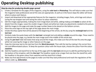
Slide No. Contents
3 Setting up equipment
4 Pre- production materials- Hand drawn drafts, photography
plan, draft articles
5 Pre- production materials- Graphic layout, mood board, final
drawn drafts
6 Test photography
7 Production process
8 Operating desktop publishing- step-by- step for importing
images
9 Operating desktop publishing- step-by-step for editing images
10 Operating desktop publishing- step-by-step for editing images
11 Operating desktop publishing- step-by-step for producing
front cover
12 Operating desktop publishing- step-by-step for producing
double page spread
13 Conclusion
LO3- Contents page
Setting up equipment
This is the setup of equipment I needed to take the photos for the pages in
my magazine. I have used the plain white wall in the photography studio to
create a white background in my photos. The equipment I have used is a stool
for the subject to sit on, a SLR camera with tripod and finally two studio
lights.
Settings on the camera
The settings I used on the camera was ‘aperture priority’ with the light
settings set on tungsten light. I then originally set up the camera with an ISO
number of 800. As I was taking the images the settings on the camera were
changed slightly to make the images look their possible best.
Light settings
I set the lights for the pictures at the brightest so that the subject could be lit
well. By using two lights it allowed me to eliminate shadows on the face of
the subject.
Pre- production materials
Type of material Image Changes made
Hand drawn drafts Once I had decided what idea for a magazine I was
going to produce, I continued the layout of the idea
for M. I made a few changes when producing M that
can be seen in the final drawn draft. These included
changing the cover line break up is a straight line not
a Zig-Zag line. This made the magazine look
professional and sleek. I also put the headline at the
bottom of the page, this helped it stand out from the
magazine.
Photography plan A change that was made after producing my
photography plan was I used one of the locations
chosen to take my photos. The location I used was
the school studio. This was the best location for my
pictures because it meant I was able to control the
lighting and background better. By using the studio it
also allowed me to make sure that the subject was
comfortable.
Draft article The changes I made after my draft article were
cropping and changing the content if needed to be
able to fit into the final double page spread. When
cropping and making alterations to the interview I
needed to make sure not to defame the subject or
manipulate what they said in anyway.
To ensure that I had all the appropriate content I used a
checklist this helped me to make sure that all the expected
conventions were in this content too.
Pre- production materials
These are all the pre-production materials that were not changed,
this is because they were all suitable for the final design of my
magazine. My mood board helped me to create the design, purpose
and gain inspiration for my magazine. My final hand drawn pages
were good for my magazine because they were the best layout for my
magazine and were suitable for publishing. Similarly to the hand
drawn drafts the graphic layout was suitable for the layout of my
magazine because I could fit all the content on well and the content
was clear to read and see.
Test photography
These are some of my test photos, many photos were taken to ensure that there would be some final good
quality ones. Some of these were the final photos that were chosen to use in the magazine and some were
not at a high quality so were not used. These photos have not been edited or manipulated in any way.
Production process
The production process for my magazine is a month
long, this production process was for the release
date of the 1st December. The deadline is the 1st of
the month because it allows the magazine to have a
whole month to collect more content, as well as it
allows the content to be able to reflect on the last
months music news. I followed this as efficiently as
possible, which included making sure to reach all the
deadlines that I had set myself. By doing this it
meant that the production process of my magazine
was successful as the magazine could be published
on the release date.
The evidence I have for this is when I was pitching to
the publisher I had all the final pages and content
ready to show them. Another example of evidence I
have for following my production process as closely
as possible is the pictures I took for the pages of my
magazine were taken in the designated time and
were appropriate for my magazine.
The main obstacle that I faced during the production
process was making sure that all content was
appropriate for deadlines. This meant that in the
photoshoot I needed to make sure that the images
were as suitable as they possibly could be to fit into
my magazine as I would have not had another
opportunity to take them again.
Operating Desktop publishing
Step-by-step for importing images
1. Create a new Adobe Photoshop CS5 document,
making the canvas the appropriate size (A4).
2. Select the size preset as ‘International Paper’,
so that it is the suitable A4 size.
3. Import the final images into the document.
4. Make the most appropriate editing to the images.
Operating Desktop publishing
Step-by-step for editing images
1. The first thing I did when editing the images for my
magazine was add a mask to them, this allowed me
to be able to make sure that when they were
imported they looked professional and neat. The tool
I used to do this was the ‘quick mask tool’.
2. I then selected the hair with the ‘quick selection
tool’ and zooming in. By selecting the hair separately
it would allow me to darken the hair to suit and
reflect on the artist.
3. I darkened the hair by changing the exposure, this
was located in the ‘Image’ drop down menu, then
clicking ‘Adjustments’ then the ‘Exposure’ option. I
then moved the exposure to darker.
Operating Desktop publishing
Step-by-step for editing images
4. To make my images look as professional as possible I made
sure that the makeup was as precise and as ‘airbrushed’ as
possible. First I removed any spots and colour imperfections
in the skin, I did this by using the ‘spot healing tool’. To
remove the darker circles around the eyes I used the ‘colour
sampler tool’ to select the skin colour from another area and
save it as a sample. I then used the ‘paint tool’ with an
opacity of approximately 50 to blend the skin colour all over
the face to make it look even and eventually air brushed.
5. I then used the ‘paint tool’ with a black colour to add the
makeup around the eyes, again the opacity of this was
approximately 50-75. I then changed the colour to a darker
blue to add the eye shadow to the eyes. I followed a tutorial
to make sure that it was perfect. Finally to make the eyes
look as good as possible I used the ‘burning in tool’ to make
sure that the eyelashes stood out and were bold.
6. Taking inspiration from Q Magazine I decided to make the
colours black and white. I did this by going on the ‘Image’
drop down menu then following ‘Adjustments’ to the ‘Black
and White’ selection. And making the appropriate
adjustments to the blacks and whites to make the image look
as effective as possible.
Operating Desktop publishing
Step-by-step for producing magazine front cover
1. Create a template for the pages of the magazine, using the ruler tool on Photoshop. This will help to make sure that
the magazine looks professional and all the sizes are appropriate. This will also help to make sure that the layout of
the magazine will be appropriate for publishing.
2. Import and download all the appropriate features for the magazine, including images, fonts, colours (using the eye
dropper tool and saving the colour to colour swatches).
3. Edit the images appropriately, making the images black and white, adding makeup and masks to select all the details
from the images.
4. With the rectangle tool make a white rectangle with a black outline that all the barcode details will be added into.
Using the ruler tool make sure that the layout of each extra feature in the barcode box is appropriately set out. Then
add the website address using the text tool, adjusting the font and size till it fits appropriately. Add the logos to the
right of this box, if needed use the free transform tool to make sure that the size is right, holding Shift to make sure
that it is square. Finally to finish the barcode box add the small logos of the social media sites to the top left, once
again using the free transform tool to make the sixe right. Then add the barcode to the box.
5. The next step is to add all the features in the correct places, this will help to make sure that the magazine is of a high
quality. This includes these features into the magazine, this means placing the barcode in the bottom left corner, the
mast head in the top left hand corner and the main image centred in the middle of the magazine. When placing the
image the free transform tool may need to be used to get the size correct for the magazine. To make sure that the
image stays a high quality make sure to hold the shift key so the pixels stay the same.
6. Additionally start adding the text onto the page with the text tool. This includes the headline which needs a stroke
around the edge and needs to be a big size. Then add the cover lines to the top right of the page, making sure to
add the partitioning lines between each one. This can be done with the line tool.
7. Next add the puff promotion to the left of the page, this needs to be a appropriate size so that it can be seen from a
distance but doesn’t take up the whole front cover. This can be achieved with the free transform tool. The tools that
will need to be used when making this feature is the circle tool, text tool and the swatches.
8. Finally make any final adjustments to the pages to make sure that they look professional and reach the regulations
of the editors code e.g. defamation.
Operating Desktop publishing
Step-by-step for producing double page spread
1. Create a template for the pages of the magazine, using the ruler tool on Photoshop. This will help to make sure that
the magazine looks professional and all the sizes are appropriate. As well as in the future steps the editor will know
where to place each feature.
2. Import and download all the appropriate features for the magazine, including images, fonts, artist logo and colours
(using the eye dropper tool and saving the colour to colour swatches).
3. Edit the images appropriately, making the main image black and white, adding makeup and masks to select all the
details from the images. Leave the smaller image in black and white but make any adjustments needed to the picture.
4. Add the images to the page and make the page number boxes to be placed on the bottom corners.
5. Place the artist logo on the top right of the page above the main image.
6. Create the drop capital that will be placed at the beginning of the article, do this by using the rectangle tool and the
text tool.
7. Similarly make the quote boxes with the text tool, rectangle tool and adding a stroke around the edge. These need to
be placed onto the page, e.g. beside the main image and in the middle of the article text.
8. Using the pen tool make text boxes that wrap around the image, this make sure that all the text fits onto the page
whilst not covering the image or other features on the page.
9. Copy the interview text to the text box from the Word document. Then edit the text by making it the correct font,
size and differentiated colours. To keep the question colour with the house style, choose the colour from the colour
swatches.
10. Add the headline and stand first to the top of the page with the text tool and ensure to add the partitioning line at
the bottom of the strapline, with the line tool. The headline needs to be a larger font size than the stand first, with
the headline in the green colour from swatches and the stand first in black.
11. Make any final adjustments to the pages to make sure that they look professional and reach the regulations of the
editors code e.g. defamation.
LO3 Conclusion
This learning outcome was all about producing the magazine material, this included some of the pre-
production material, taking test photography as well as the processes in editing for the final print.
Setting up the equipment for the photos correctly was important because this made sure that the
lighting and setting was correct for the photos. Additionally by making sure that the camera settings
were correct was important because it meant that the photo would be suitable for publishing. This
included details such as lighting, sharpness and eliminating any movement in the image.
Test photography was important when producing the materials for the magazine as it allowed me to be
able to test out all the settings of the camera and equipment. By taking test photos it also allowed me
to test editing the images for the magazine before making any adjustments to the final images for the
magazine.
The production plan was important for this learning outcome as it allowed me to make sure that I was
reaching all the deadlines that I had set. By reaching the deadlines it allowed me to publish and release
my final print for the magazine on the correct date. Overall, the production plan allowed the
production process of the magazine to be as efficient as possible.
The final part to this outcome was operating desktop publishing, this included step-by steps for the
editing stages of the magazine. This included editing images, importing images and producing the
magazine. By making these step-by-steps it will allow me to be able to use them in the future as a
reference when editing future editions.

Unit 14 LO3

  • 2.
    Slide No. Contents 3Setting up equipment 4 Pre- production materials- Hand drawn drafts, photography plan, draft articles 5 Pre- production materials- Graphic layout, mood board, final drawn drafts 6 Test photography 7 Production process 8 Operating desktop publishing- step-by- step for importing images 9 Operating desktop publishing- step-by-step for editing images 10 Operating desktop publishing- step-by-step for editing images 11 Operating desktop publishing- step-by-step for producing front cover 12 Operating desktop publishing- step-by-step for producing double page spread 13 Conclusion LO3- Contents page
  • 3.
    Setting up equipment Thisis the setup of equipment I needed to take the photos for the pages in my magazine. I have used the plain white wall in the photography studio to create a white background in my photos. The equipment I have used is a stool for the subject to sit on, a SLR camera with tripod and finally two studio lights. Settings on the camera The settings I used on the camera was ‘aperture priority’ with the light settings set on tungsten light. I then originally set up the camera with an ISO number of 800. As I was taking the images the settings on the camera were changed slightly to make the images look their possible best. Light settings I set the lights for the pictures at the brightest so that the subject could be lit well. By using two lights it allowed me to eliminate shadows on the face of the subject.
  • 4.
    Pre- production materials Typeof material Image Changes made Hand drawn drafts Once I had decided what idea for a magazine I was going to produce, I continued the layout of the idea for M. I made a few changes when producing M that can be seen in the final drawn draft. These included changing the cover line break up is a straight line not a Zig-Zag line. This made the magazine look professional and sleek. I also put the headline at the bottom of the page, this helped it stand out from the magazine. Photography plan A change that was made after producing my photography plan was I used one of the locations chosen to take my photos. The location I used was the school studio. This was the best location for my pictures because it meant I was able to control the lighting and background better. By using the studio it also allowed me to make sure that the subject was comfortable. Draft article The changes I made after my draft article were cropping and changing the content if needed to be able to fit into the final double page spread. When cropping and making alterations to the interview I needed to make sure not to defame the subject or manipulate what they said in anyway. To ensure that I had all the appropriate content I used a checklist this helped me to make sure that all the expected conventions were in this content too.
  • 5.
    Pre- production materials Theseare all the pre-production materials that were not changed, this is because they were all suitable for the final design of my magazine. My mood board helped me to create the design, purpose and gain inspiration for my magazine. My final hand drawn pages were good for my magazine because they were the best layout for my magazine and were suitable for publishing. Similarly to the hand drawn drafts the graphic layout was suitable for the layout of my magazine because I could fit all the content on well and the content was clear to read and see.
  • 6.
    Test photography These aresome of my test photos, many photos were taken to ensure that there would be some final good quality ones. Some of these were the final photos that were chosen to use in the magazine and some were not at a high quality so were not used. These photos have not been edited or manipulated in any way.
  • 7.
    Production process The productionprocess for my magazine is a month long, this production process was for the release date of the 1st December. The deadline is the 1st of the month because it allows the magazine to have a whole month to collect more content, as well as it allows the content to be able to reflect on the last months music news. I followed this as efficiently as possible, which included making sure to reach all the deadlines that I had set myself. By doing this it meant that the production process of my magazine was successful as the magazine could be published on the release date. The evidence I have for this is when I was pitching to the publisher I had all the final pages and content ready to show them. Another example of evidence I have for following my production process as closely as possible is the pictures I took for the pages of my magazine were taken in the designated time and were appropriate for my magazine. The main obstacle that I faced during the production process was making sure that all content was appropriate for deadlines. This meant that in the photoshoot I needed to make sure that the images were as suitable as they possibly could be to fit into my magazine as I would have not had another opportunity to take them again.
  • 8.
    Operating Desktop publishing Step-by-stepfor importing images 1. Create a new Adobe Photoshop CS5 document, making the canvas the appropriate size (A4). 2. Select the size preset as ‘International Paper’, so that it is the suitable A4 size. 3. Import the final images into the document. 4. Make the most appropriate editing to the images.
  • 9.
    Operating Desktop publishing Step-by-stepfor editing images 1. The first thing I did when editing the images for my magazine was add a mask to them, this allowed me to be able to make sure that when they were imported they looked professional and neat. The tool I used to do this was the ‘quick mask tool’. 2. I then selected the hair with the ‘quick selection tool’ and zooming in. By selecting the hair separately it would allow me to darken the hair to suit and reflect on the artist. 3. I darkened the hair by changing the exposure, this was located in the ‘Image’ drop down menu, then clicking ‘Adjustments’ then the ‘Exposure’ option. I then moved the exposure to darker.
  • 10.
    Operating Desktop publishing Step-by-stepfor editing images 4. To make my images look as professional as possible I made sure that the makeup was as precise and as ‘airbrushed’ as possible. First I removed any spots and colour imperfections in the skin, I did this by using the ‘spot healing tool’. To remove the darker circles around the eyes I used the ‘colour sampler tool’ to select the skin colour from another area and save it as a sample. I then used the ‘paint tool’ with an opacity of approximately 50 to blend the skin colour all over the face to make it look even and eventually air brushed. 5. I then used the ‘paint tool’ with a black colour to add the makeup around the eyes, again the opacity of this was approximately 50-75. I then changed the colour to a darker blue to add the eye shadow to the eyes. I followed a tutorial to make sure that it was perfect. Finally to make the eyes look as good as possible I used the ‘burning in tool’ to make sure that the eyelashes stood out and were bold. 6. Taking inspiration from Q Magazine I decided to make the colours black and white. I did this by going on the ‘Image’ drop down menu then following ‘Adjustments’ to the ‘Black and White’ selection. And making the appropriate adjustments to the blacks and whites to make the image look as effective as possible.
  • 11.
    Operating Desktop publishing Step-by-stepfor producing magazine front cover 1. Create a template for the pages of the magazine, using the ruler tool on Photoshop. This will help to make sure that the magazine looks professional and all the sizes are appropriate. This will also help to make sure that the layout of the magazine will be appropriate for publishing. 2. Import and download all the appropriate features for the magazine, including images, fonts, colours (using the eye dropper tool and saving the colour to colour swatches). 3. Edit the images appropriately, making the images black and white, adding makeup and masks to select all the details from the images. 4. With the rectangle tool make a white rectangle with a black outline that all the barcode details will be added into. Using the ruler tool make sure that the layout of each extra feature in the barcode box is appropriately set out. Then add the website address using the text tool, adjusting the font and size till it fits appropriately. Add the logos to the right of this box, if needed use the free transform tool to make sure that the size is right, holding Shift to make sure that it is square. Finally to finish the barcode box add the small logos of the social media sites to the top left, once again using the free transform tool to make the sixe right. Then add the barcode to the box. 5. The next step is to add all the features in the correct places, this will help to make sure that the magazine is of a high quality. This includes these features into the magazine, this means placing the barcode in the bottom left corner, the mast head in the top left hand corner and the main image centred in the middle of the magazine. When placing the image the free transform tool may need to be used to get the size correct for the magazine. To make sure that the image stays a high quality make sure to hold the shift key so the pixels stay the same. 6. Additionally start adding the text onto the page with the text tool. This includes the headline which needs a stroke around the edge and needs to be a big size. Then add the cover lines to the top right of the page, making sure to add the partitioning lines between each one. This can be done with the line tool. 7. Next add the puff promotion to the left of the page, this needs to be a appropriate size so that it can be seen from a distance but doesn’t take up the whole front cover. This can be achieved with the free transform tool. The tools that will need to be used when making this feature is the circle tool, text tool and the swatches. 8. Finally make any final adjustments to the pages to make sure that they look professional and reach the regulations of the editors code e.g. defamation.
  • 12.
    Operating Desktop publishing Step-by-stepfor producing double page spread 1. Create a template for the pages of the magazine, using the ruler tool on Photoshop. This will help to make sure that the magazine looks professional and all the sizes are appropriate. As well as in the future steps the editor will know where to place each feature. 2. Import and download all the appropriate features for the magazine, including images, fonts, artist logo and colours (using the eye dropper tool and saving the colour to colour swatches). 3. Edit the images appropriately, making the main image black and white, adding makeup and masks to select all the details from the images. Leave the smaller image in black and white but make any adjustments needed to the picture. 4. Add the images to the page and make the page number boxes to be placed on the bottom corners. 5. Place the artist logo on the top right of the page above the main image. 6. Create the drop capital that will be placed at the beginning of the article, do this by using the rectangle tool and the text tool. 7. Similarly make the quote boxes with the text tool, rectangle tool and adding a stroke around the edge. These need to be placed onto the page, e.g. beside the main image and in the middle of the article text. 8. Using the pen tool make text boxes that wrap around the image, this make sure that all the text fits onto the page whilst not covering the image or other features on the page. 9. Copy the interview text to the text box from the Word document. Then edit the text by making it the correct font, size and differentiated colours. To keep the question colour with the house style, choose the colour from the colour swatches. 10. Add the headline and stand first to the top of the page with the text tool and ensure to add the partitioning line at the bottom of the strapline, with the line tool. The headline needs to be a larger font size than the stand first, with the headline in the green colour from swatches and the stand first in black. 11. Make any final adjustments to the pages to make sure that they look professional and reach the regulations of the editors code e.g. defamation.
  • 13.
    LO3 Conclusion This learningoutcome was all about producing the magazine material, this included some of the pre- production material, taking test photography as well as the processes in editing for the final print. Setting up the equipment for the photos correctly was important because this made sure that the lighting and setting was correct for the photos. Additionally by making sure that the camera settings were correct was important because it meant that the photo would be suitable for publishing. This included details such as lighting, sharpness and eliminating any movement in the image. Test photography was important when producing the materials for the magazine as it allowed me to be able to test out all the settings of the camera and equipment. By taking test photos it also allowed me to test editing the images for the magazine before making any adjustments to the final images for the magazine. The production plan was important for this learning outcome as it allowed me to make sure that I was reaching all the deadlines that I had set. By reaching the deadlines it allowed me to publish and release my final print for the magazine on the correct date. Overall, the production plan allowed the production process of the magazine to be as efficient as possible. The final part to this outcome was operating desktop publishing, this included step-by steps for the editing stages of the magazine. This included editing images, importing images and producing the magazine. By making these step-by-steps it will allow me to be able to use them in the future as a reference when editing future editions.