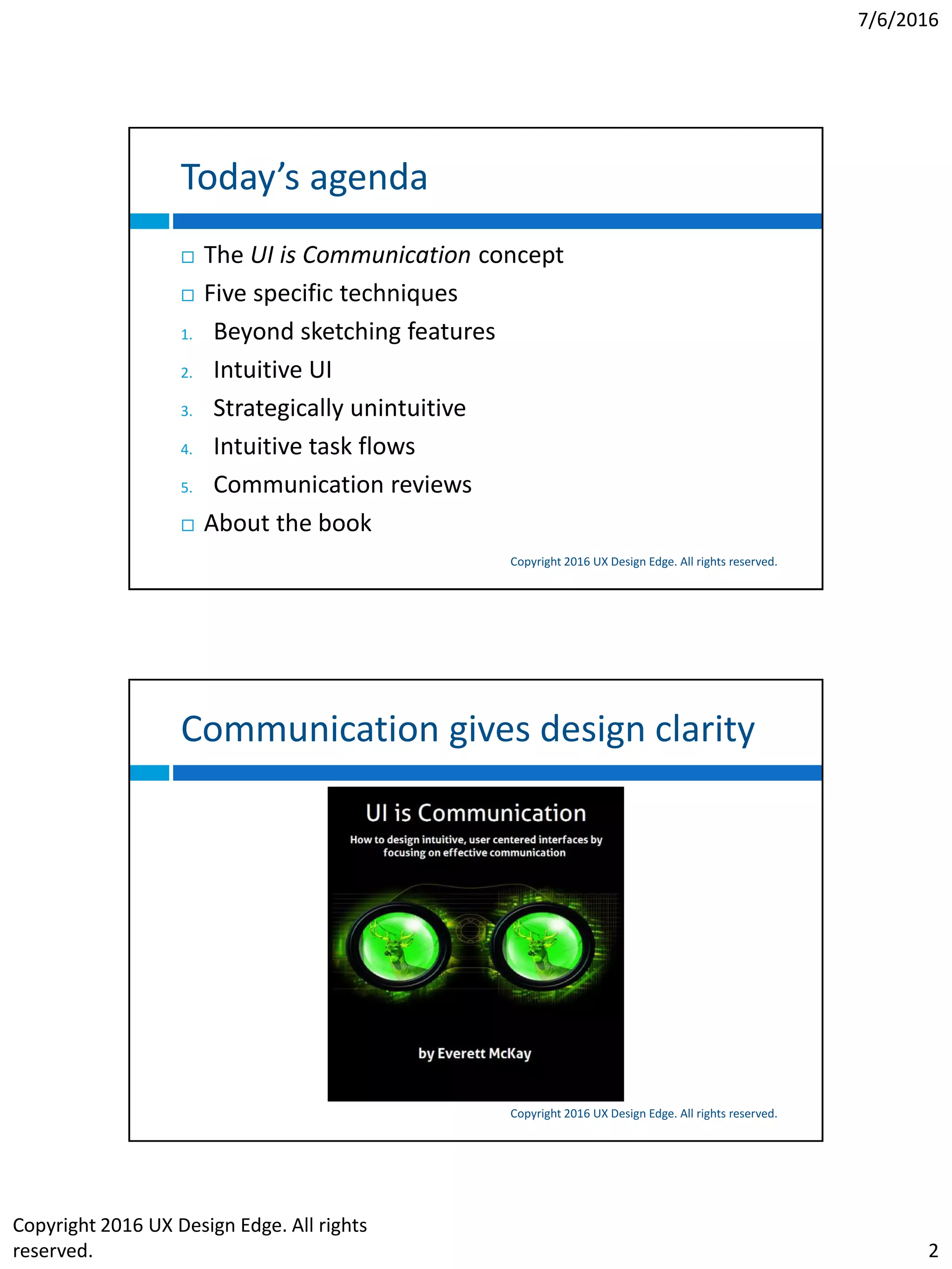
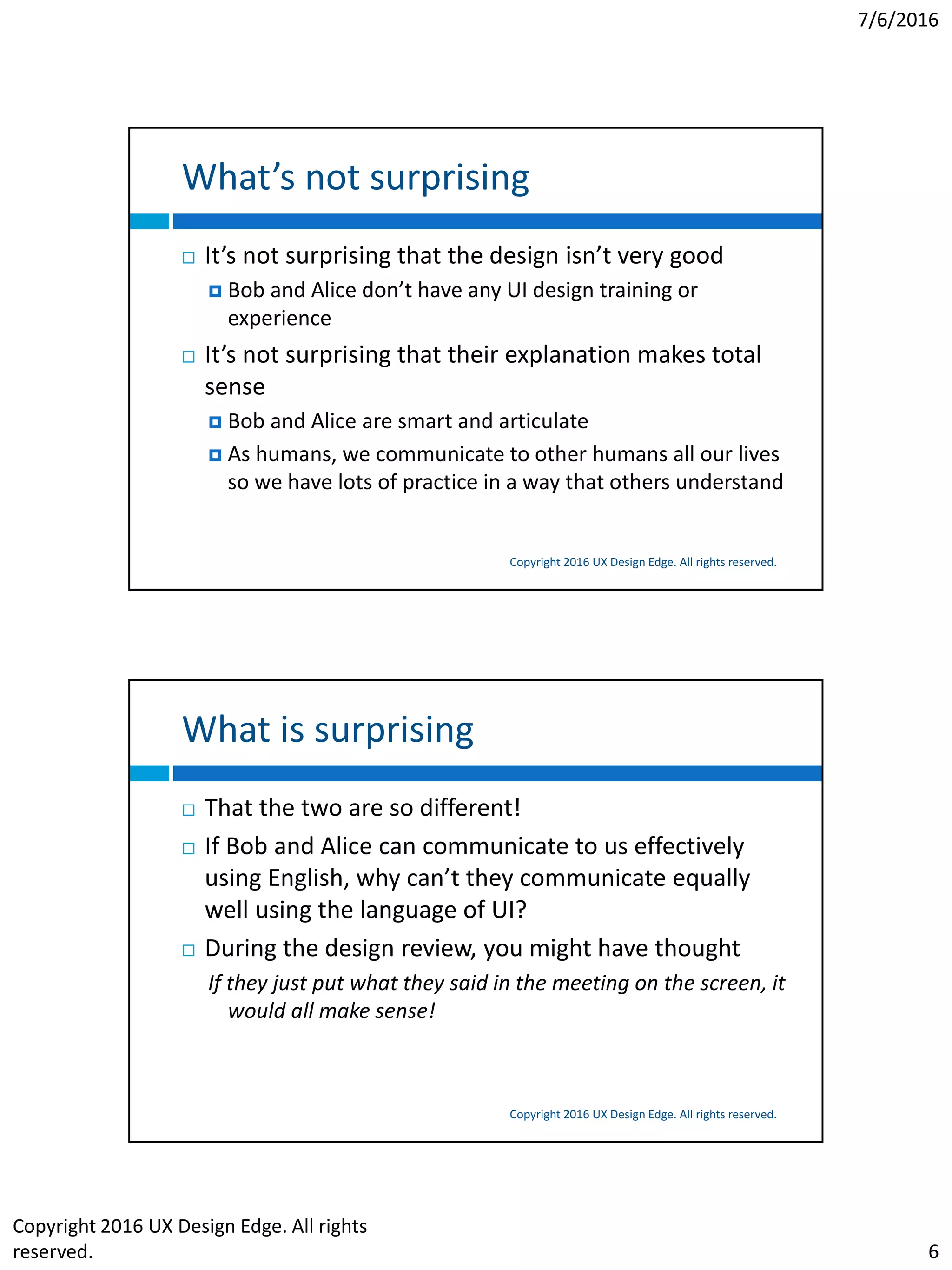
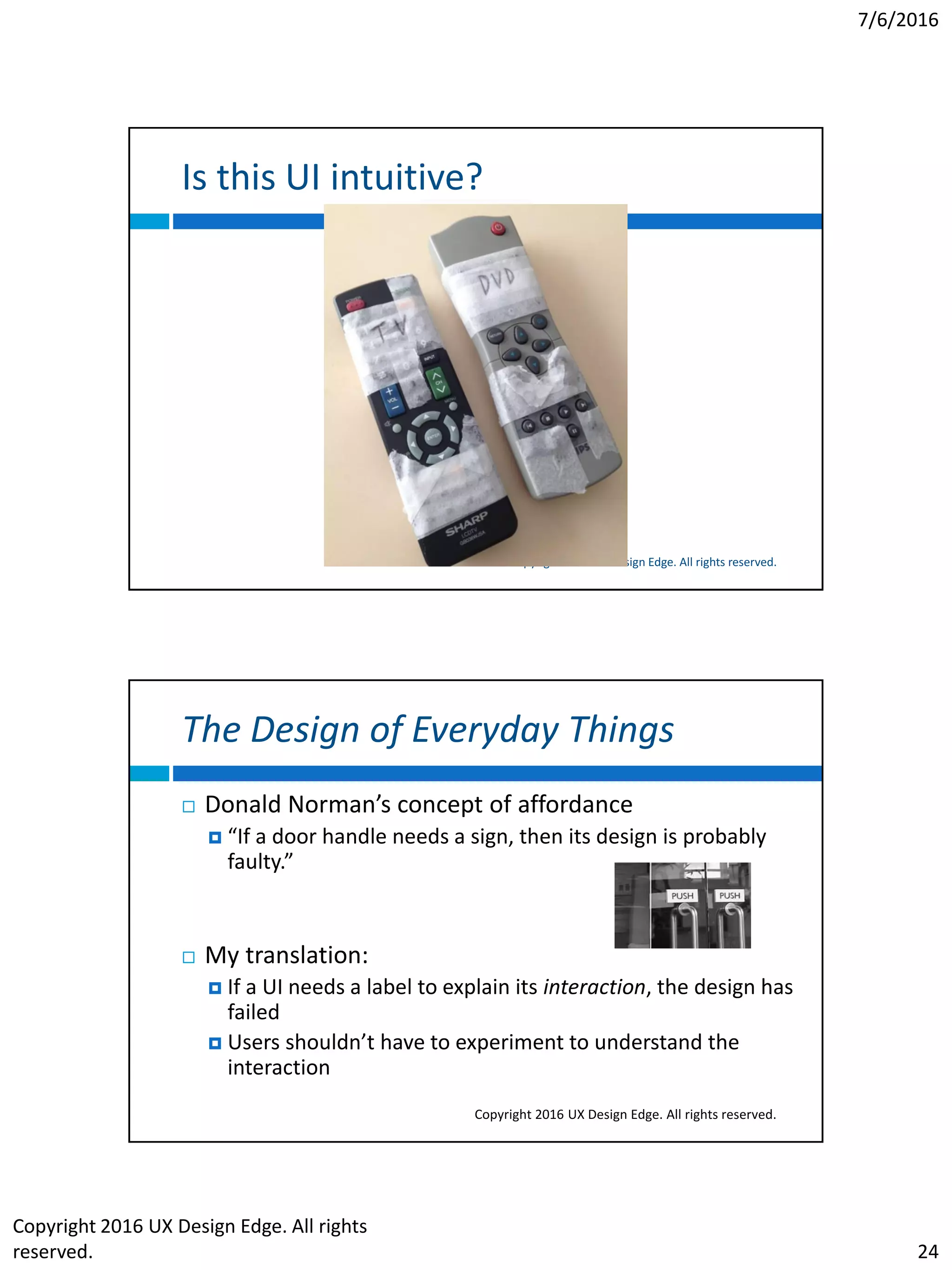
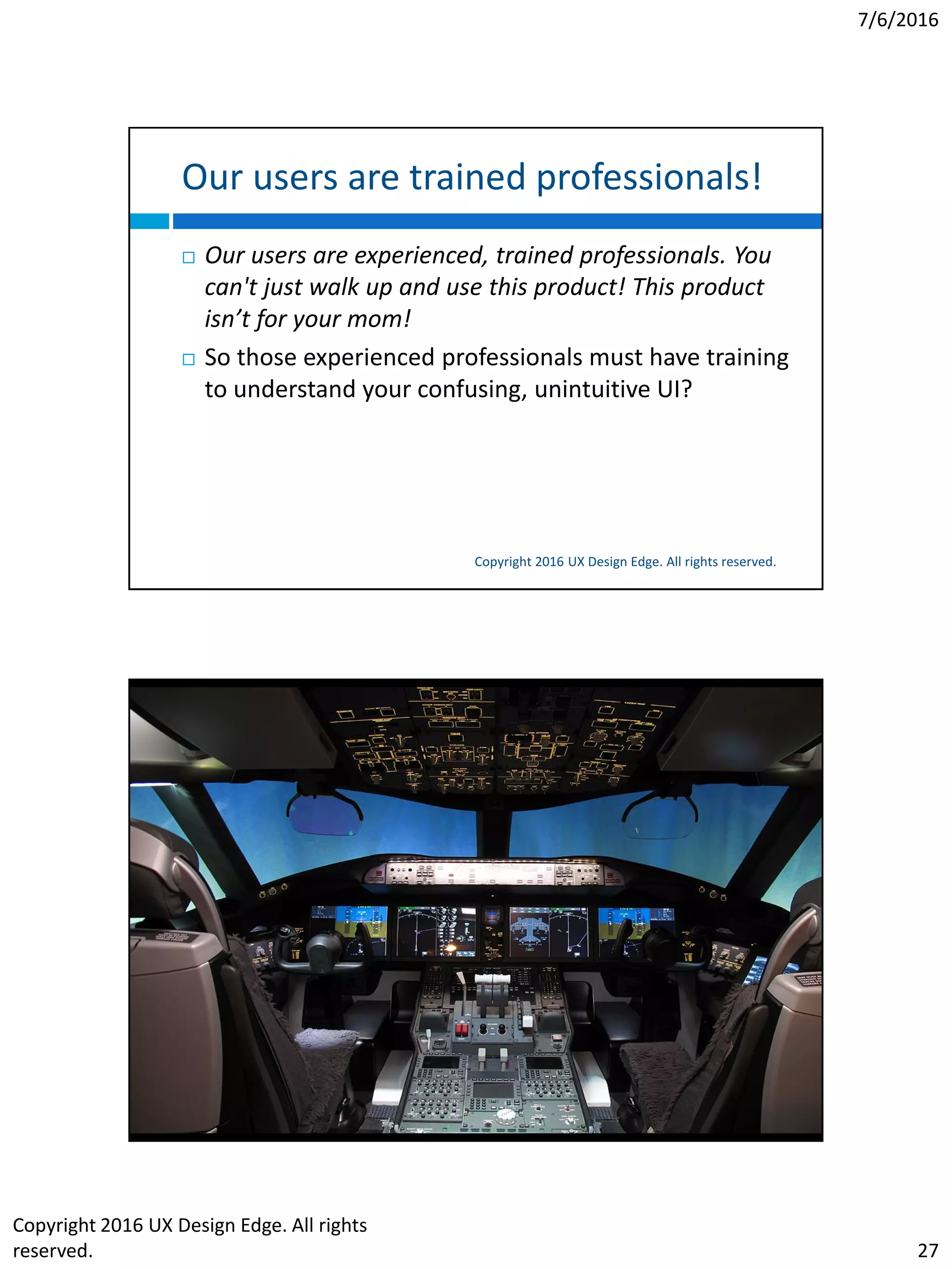
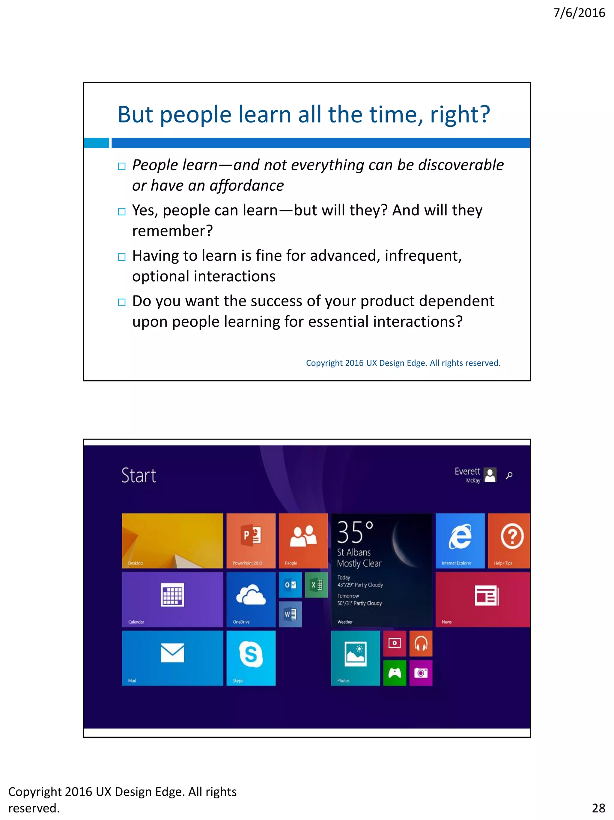
SlideShare a Scribd company logo
7/6/2016
Copyright 2016 UX Design Edge. All rights
reserved. 1
UI IS COMMUNICATION
How to design intuitive, user-centered
interfaces by focusing on effective
communication
Everett McKay
UX Design Edge
uxdesignedge.com, freeuxwebinars.com
@uxdesignedge
Amsterdam UX, July 2016
I have a new book!
Copyright 2016 UX Design Edge. All rights reserved.
7/6/2016
Copyright 2016 UX Design Edge. All rights
reserved. 2
Today’s agenda
Copyright 2016 UX Design Edge. All rights reserved.
 The UI is Communication concept
 Five specific techniques
1. Beyond sketching features
2. Intuitive UI
3. Strategically unintuitive
4. Intuitive task flows
5. Communication reviews
 About the book
Communication gives design clarity
Copyright 2016 UX Design Edge. All rights reserved.
7/6/2016
Copyright 2016 UX Design Edge. All rights
reserved. 3
My promise
Copyright 2016 UX Design Edge. All rights reserved.
 From now on, you will think about UI design
differently!
 As if you had night vision goggles!
What’s it all about
The UI is Communication Concept
Copyright 2016 UX Design Edge. All rights reserved.
7/6/2016
Copyright 2016 UX Design Edge. All rights
reserved. 4
A bold claim
Copyright 2016 UX Design Edge. All rights reserved.
A user interface is an objective, principled form
of human communication, not a subjective art!
Four core concepts
Copyright 2016 UX Design Edge. All rights reserved.
1. A user interface is essentially a conversation between
users and the technology to perform tasks
2. A UI can and should be evaluated by how well it
communicates
3. Scenarios and effective human communication should
drive the design process (not features, requirements,
schedules)
4. Focusing on effective communication removes much
of the mystique and subjectivity from UI design
7/6/2016
Copyright 2016 UX Design Edge. All rights
reserved. 5
Copyright 2016 UX Design Edge. All rights reserved.
My expectations
Copyright 2016 UX Design Edge. All rights reserved.
 Their initial UI design won’t be very good
 Bob and Alice will make the classic process mistakes
 They will design for themselves
 They will consider only one solution (with mechanical usability)
 They’ll focus on technology and features instead of user goals
and tasks
 The screens will be confusing, complicated, and often non-
standard
 Their explanation of the design will be excellent
 Bob and Alice are very intelligent, and that will show through in
their explanation
 The design makes total sense when they explain it in person
7/6/2016
Copyright 2016 UX Design Edge. All rights
reserved. 6
What’s not surprising
Copyright 2016 UX Design Edge. All rights reserved.
 It’s not surprising that the design isn’t very good
 Bob and Alice don’t have any UI design training or
experience
 It’s not surprising that their explanation makes total
sense
 Bob and Alice are smart and articulate
 As humans, we communicate to other humans all our lives
so we have lots of practice in a way that others understand
What is surprising
Copyright 2016 UX Design Edge. All rights reserved.
 That the two are so different!
 If Bob and Alice can communicate to us effectively
using English, why can’t they communicate equally
well using the language of UI?
 During the design review, you might have thought
If they just put what they said in the meeting on the screen, it
would all make sense!
7/6/2016
Copyright 2016 UX Design Edge. All rights
reserved. 7
Why does this happen?
Copyright 2016 UX Design Edge. All rights reserved.
Communication between people tends to
 Be natural, friendly, using plain language (vs.
unnatural, technical tone)
 Be goal, results oriented, purposeful (vs. technology or
mechanically oriented, not explaining why)
 Follow mental models and natural workflows (vs. the
way the code works)
 Be simple, getting right to the point (vs. overly
complicated, laboring over unimportant details)
Can’t we use the same approach?
Copyright 2016 UX Design Edge. All rights reserved.
 Q: If the way we communicate in person is so much
better, can’t we just design UI to be like that?
 A: Yes! We can and we should!
 The differences are artificial and historical
 There’s (usually) no technical requirement to do this
 Great UI design boils down to eliminating these
differences, making the experience simple and natural
7/6/2016
Copyright 2016 UX Design Edge. All rights
reserved. 8
The UI is Communication concept
Copyright 2016 UX Design Edge. All rights reserved.
1. UI design is ultimately about communicating to users
2. If you can explain how to perform a task to the target
user in person in a way that’s clear and concise, you
can apply those same communication techniques in a
UI
3. We should have the same standards for software
interaction as we do for social interaction
4. If a UI feels like a natural, professional, friendly
conversation, it’s probably a good design
Imagine a personal conversation
Copyright 2016 UX Design Edge. All rights reserved.
 Suppose you are looking over a user’s shoulder and he
or she asks, “What do I do here?” Think about the
explanation you would give—the steps, their order, the
language you’d use, and the way you explain things.
Also think about what you wouldn’t say
 This is a high-level guide to design and evaluate task
flows
7/6/2016
Copyright 2016 UX Design Edge. All rights
reserved. 9
Communications applies to all UI
Copyright 2016 UX Design Edge. All rights reserved.
 All UI elements communicate something:
 UI text
 Controls
 Icons, graphics, colors
 Animations, transitions
 Page layout
 Feedback
 Everything in a UI is there to communicate something
to someone for some reason
Key takeaways
Copyright 2016 UX Design Edge. All rights reserved.
 We know how to communicate to our users in person
(even our most technical devs can), but we don’t take
advantage of this in the design process because we are
focused on other stuff
 If users fail to perform a task, the root cause is always
the same—they didn’t understand it
7/6/2016
Copyright 2016 UX Design Edge. All rights
reserved. 10
Technique #1: Beyond sketching features
UI as conversations
Copyright 2016 UX Design Edge. All rights reserved.
Apple’s App Design Strategy
Copyright 2016 UX Design Edge. All rights reserved.
From the iOS Human Interface Guidelines
1. List all the features you think users might like
2. Determine who your users are
3. Filter the list through the audience definition
4. Don’t stop there…
5. Prototype and iterate
7/6/2016
Copyright 2016 UX Design Edge. All rights
reserved. 11
Sketching a pile of features
Copyright 2016 UX Design Edge. All rights reserved.
Sketching a pile of features
Copyright 2016 UX Design Edge. All rights reserved.
 While this process can work, the focus is on features,
their physical layout, and performing tasks
mechanically
 Instead, let’s use users and their goals (scenarios), plus
effective communication drive the process
7/6/2016
Copyright 2016 UX Design Edge. All rights
reserved. 12
Features and requirements aren’t enough
Copyright 2016 UX Design Edge. All rights reserved.
A typical design process needs a miracle
Copyright 2016 UX Design Edge. All rights reserved.
7/6/2016
Copyright 2016 UX Design Edge. All rights
reserved. 13
A typical story
Copyright 2016 UX Design Edge. All rights reserved.
 Victor asked for help with mobile app for a national
park
 A good home screen: a home page, menu, or map?
 We could have brainstormed and sketched
 But instead we had a personal conversation…
 Found three themes: explore, plan, do
 The best home screen: that conversation to support
those scenarios
 Now we can brainstorm and sketch!
What should the home screen be?
Copyright 2016 UX Design Edge. All rights reserved.
7/6/2016
Copyright 2016 UX Design Edge. All rights
reserved. 14
What should the home screen be?
Copyright 2016 UX Design Edge. All rights reserved.
 We could have brainstormed and sketched
 But instead we had a personal conversation…
 There were three clear themes
1. Explore the park
2. Plan a trip
3. Take a trip
What should the home screen be?
Copyright 2016 UX Design Edge. All rights reserved.
 The best home screen: that conversation to support
those scenarios, elevate content people care about
 Now we can sketch!
7/6/2016
Copyright 2016 UX Design Edge. All rights
reserved. 15
What just happened?
Copyright 2016 UX Design Edge. All rights reserved.
 We deliberately focused on the target users and their
goals, and the human experience
 We elevated the content that people care about (an
iOS guideline)
 We didn’t think about the technology, features,
patterns, task flows, requirements
 We still need to brainstorm, sketch, etc. but now we
have a clear direction
 And we saved a lot of time! (spent minutes vs. days)
Doesn’t this result in chatty UI?
Copyright 2016 UX Design Edge. All rights reserved.
 No!
 If your human conversation would be concise, this
technique should result in concise UI
 Example: Sunglass Shack shopping tool—if you were to
walk into a sunglass store, what would be the human
conversation
 Salesperson: May I help you?
 You: No thanks, just browsing
 Conclusion: The UX should start with browsing!
7/6/2016
Copyright 2016 UX Design Edge. All rights
reserved. 16
Key takeaways
Copyright 2016 UX Design Edge. All rights reserved.
 There is tremendous insight in the human
conversation, yet we rarely take advantage of it
 A great user experience should feel like a great human
experience—that’s fully enhanced through technology
Technique #2: What the heck is it? It’s effective
communication!
Intuitive UI
Copyright 2016 UX Design Edge. All rights reserved.
7/6/2016
Copyright 2016 UX Design Edge. All rights
reserved. 17
Everybody wants an intuitive UI
Copyright 2016 UX Design Edge. All rights reserved.
 Having an intuitive UI is a top goal for any UX project
 To users, describing a UI as intuitive is the highest
praise they can bestow
 Funny thing: nobody really knows what an “intuitive
UI” is
Some popular definitions
Copyright 2016 UX Design Edge. All rights reserved.
Are these useful definitions?
 Simple, easy to use, better
 Confused with other concepts
 Really “dumbed down” so any idiot can get it
 An “unrealistically high bar” that most UIs can’t achieve
 If so, why bother?
 A gap between the design model and the user model
 Based on Norman’s The Design of Everyday Things, but difficult in
practice
 Familiar/learnable
 Whatever Apple does
 Not sure, but I know it when I see it—it just feels right
7/6/2016
Copyright 2016 UX Design Edge. All rights
reserved. 18
The dictionary definition is useless
Copyright 2016 UX Design Edge. All rights reserved.
A typical dictionary definition:
 Instinctive (based on behavior or knowledge we are
born with)
My definition
Copyright 2016 UX Design Edge. All rights reserved.
 A UI is intuitive when target users understand its
behavior and effect without use of reason,
memorization, experimentation, assistance, or training
More simply, an intuitive UI is immediately self-
explanatory
Intuitive UIs communicate their purpose well!
7/6/2016
Copyright 2016 UX Design Edge. All rights
reserved. 19
Ever heard this one?
Copyright 2016 UX Design Edge. All rights reserved.
It’s intuitive once you learn it!
A clear sign your UI isn’t intuitive
Copyright 2016 UX Design Edge. All rights reserved.
An intuitive UI shouldn’t need a manual or training
7/6/2016
Copyright 2016 UX Design Edge. All rights
reserved. 20
Are you going to read the manual?
Copyright 2016 UX Design Edge. All rights reserved.
The definition is a good start
Copyright 2016 UX Design Edge. All rights reserved.
 We can determine if a UI isn’t intuitive just by applying
the definition
 But to make a UI intuitive, we need more
7/6/2016
Copyright 2016 UX Design Edge. All rights
reserved. 21
So, what’s an intuitive UI really?
Copyright 2016 UX Design Edge. All rights reserved.
A UI is intuitive when it has an appropriate combination of:
1. Discoverability Users can easily find the feature—when they need it.
2. Affordance Visually, the UI has clues that indicate what the user needs to do.
Users don’t have to experiment or deduce the interaction
3. Comprehensible Target users understand the UI elements and can make
informed decisions, with the knowledge they already have
4. Responsiveness The UI gives clear, immediate feedback to indicate that the
action is happening, and was either successful or unsuccessful
5. Predictability Functionally, the UI delivers the expected results, with no surprises.
Users don’t have to experiment or deduce the effect
6. Efficiency The UI enables users to perform an action with a minimum amount of
effort
7. Forgiveness If users make a mistake, either the right thing happens anyway or
they can fix or undo the action with ease
8. Explorability Users can explore without fear of making mistakes or getting lost
Let’s consider the interaction lifecycle
Steps required for interaction—the user
 Sets a goal
 Finds an interactive UI that might achieve the goal
 Performs the interaction
 Observes the results to determine if goal is achieved
An intuitive UI helps users achieve their goal at each of
these steps
Without the use of reason, memorization, experimentation,
assistance, or training
Copyright 2016 UX Design Edge. All rights reserved.
7/6/2016
Copyright 2016 UX Design Edge. All rights
reserved. 22
Is this UI intuitive?
Copyright 2016 UX Design Edge. All rights reserved.
Is this UI intuitive?
Copyright 2016 UX Design Edge. All rights reserved.
7/6/2016
Copyright 2016 UX Design Edge. All rights
reserved. 23
Is this UI intuitive?
Copyright 2016 UX Design Edge. All rights reserved.
From a health care professional job posting tool
Intuitive UI is consistent
Copyright 2016 UX Design Edge. All rights reserved.
 Consistency is crucial to being intuitive
 Jakob Nielsen’s Law of UX (rephrased):
 Users spend most of their time using software other than
yours
7/6/2016
Copyright 2016 UX Design Edge. All rights
reserved. 24
Is this UI intuitive?
Copyright 2016 UX Design Edge. All rights reserved.
The Design of Everyday Things
Copyright 2016 UX Design Edge. All rights reserved.
 Donald Norman’s concept of affordance
 “If a door handle needs a sign, then its design is probably
faulty.”
 My translation:
 If a UI needs a label to explain its interaction, the design has
failed
 Users shouldn’t have to experiment to understand the
interaction
7/6/2016
Copyright 2016 UX Design Edge. All rights
reserved. 25
Is this intuitive?
Copyright 2016 UX Design Edge. All rights reserved.
Key takeaways
Copyright 2016 UX Design Edge. All rights reserved.
 Intuitive interactions are self-explanatory—they
communicate well
 Users fail tasks because they don’t understand the
interactions
 We expect users to understand interactions that we
explain poorly—yet they rarely do
7/6/2016
Copyright 2016 UX Design Edge. All rights
reserved. 26
Technique #3: Being strategically unintuitive
Does everything need to be intuitive?
Surprisingly…no!
Strategically unintuitive
Copyright 2016 UX Design Edge. All rights reserved.
Now that we know what it means…
Copyright 2016 UX Design Edge. All rights reserved.
 Most interactions should be intuitive
 But some interactions just aren’t worth it
 Let’s explore…starting with common excuses
7/6/2016
Copyright 2016 UX Design Edge. All rights
reserved. 27
Our users are trained professionals!
Copyright 2016 UX Design Edge. All rights reserved.
 Our users are experienced, trained professionals. You
can't just walk up and use this product! This product
isn’t for your mom!
 So those experienced professionals must have training
to understand your confusing, unintuitive UI?
7/6/2016
Copyright 2016 UX Design Edge. All rights
reserved. 28
But people learn all the time, right?
Copyright 2016 UX Design Edge. All rights reserved.
 People learn—and not everything can be discoverable
or have an affordance
 Yes, people can learn—but will they? And will they
remember?
 Having to learn is fine for advanced, infrequent,
optional interactions
 Do you want the success of your product dependent
upon people learning for essential interactions?
Is this UI intuitive?
Copyright 2016 UX Design Edge. All rights reserved.
7/6/2016
Copyright 2016 UX Design Edge. All rights
reserved. 29
Common unintuitive UI
Copyright 2016 UX Design Edge. All rights reserved.
 Advanced, infrequent, optional commands
 Might not be worth making discoverable
 Shortcuts and gestures
 Not a problem if advanced and redundant
 Inevitable discoverability
 Users can’t not find these
 Delighters
 Experienced users are rewarded by finding them
 Advanced modes
 You don’t want users to find these accidentally
Games and puzzles are unintuitive
Copyright 2016 UX Design Edge. All rights reserved.
 We enjoy the challenge of solving them
7/6/2016
Copyright 2016 UX Design Edge. All rights
reserved. 30
An intuitive Where’s Waldo?
Copyright 2016 UX Design Edge. All rights reserved.
Intuitive UI has a cost
Copyright 2016 UX Design Edge. All rights reserved.
 Discoverability
 May result in clutter, feature might be inappropriate for
some users
 Affordance
 May look cluttered and heavy
 Predictability
 May require too much explanation
 Forgiveness
 Might not be practical or may harm performance
7/6/2016
Copyright 2016 UX Design Edge. All rights
reserved. 31
Levels of intuitiveness
Copyright 2016 UX Design Edge. All rights reserved.
Levels of intuitiveness
Copyright 2016 UX Design Edge. All rights reserved.
All users will get
Trained users might
remember
7/6/2016
Copyright 2016 UX Design Edge. All rights
reserved. 32
What about “single trial learning”?
Copyright 2016 UX Design Edge. All rights reserved.
 It’s reflected in the intuitiveness levels
 Sensible Single trial, figured out on your own
 Learnable Single trial+, somebody showed you
 Guessable Multiple trials, figured out on our own
 Trainable Multiple trials, somebody else showed you
 Yes, people do learn things, but the retention rate is
very low
 Often more like “Multiple trial forgetting”
Some UI can be unintuitive if strategic
Copyright 2016 UX Design Edge. All rights reserved.
 …instead of accidental
 Most unintuitive UI is accidental
 Sensible and learnable are good alternatives
7/6/2016
Copyright 2016 UX Design Edge. All rights
reserved. 33
Technique #4: Using “main instructions” to make
task flows intuitive
Intuitive task flows
Copyright 2016 UX Design Edge. All rights reserved.
Inductive UI
Copyright 2016 UX Design Edge. All rights reserved.
 An inductive UI is designed to be self-explanatory to
lead users through the task steps
 Goal: To design intuitive task flows, to eliminate need
to think and experiment at the task level
 The top question everyone has: What am I supposed
to do here?
 When not obvious, we should consider answering this
question explicitly
7/6/2016
Copyright 2016 UX Design Edge. All rights
reserved. 34
Explainable first
Copyright 2016 UX Design Edge. All rights reserved.
 An explainable UI is understandable, intuitive UI so
let’s start task design by making it explainable first
 First step is to design the main instructions for each
step in a task
 The quality of the main instruction often predicts the
quality of the page (ex: “Manage” is very weak)
 If the task flow is complex, convoluted, unnatural, or
unintuitive, it should be apparent at this point
A “deductive” UI example
Copyright 2016 UX Design Edge. All rights reserved.
7/6/2016
Copyright 2016 UX Design Edge. All rights
reserved. 35
An “inductive” UI example
Copyright 2016 UX Design Edge. All rights reserved.
Elements of inductivity
Copyright 2016 UX Design Edge. All rights reserved.
 A clear main instruction that explains the purpose of a
page
 Page content that is related to the main instruction
 To clarify: the goal is to eliminate thought and
experimentation, not to have a lot of text
7/6/2016
Copyright 2016 UX Design Edge. All rights
reserved. 36
This really works!
Copyright 2016 UX Design Edge. All rights reserved.
 You might be skeptical, but if you:
 Take a page
 Determine a good main instruction
 Redesign the page to focus on that instruction
The resulting page and/or task flow will be better
 Having a clear, explicit understanding of what a page is for
makes it better
 This is true even if you don’t display the main instruction on the
page!
 Having explicit instructions reduces the need for training
This really works: an example
Copyright 2016 UX Design Edge. All rights reserved.
7/6/2016
Copyright 2016 UX Design Edge. All rights
reserved. 37
This really works: another example
Copyright 2016 UX Design Edge. All rights reserved.
This really works: yet another example
Copyright 2016 UX Design Edge. All rights reserved.
7/6/2016
Copyright 2016 UX Design Edge. All rights
reserved. 38
Copyright 2016 UX Design Edge
“If I had an hour to solve
a problem and my life
depended on it, I would
use the first 55 minutes
determining the proper
question to ask, for once
I knew the proper
question, I could solve
the problem in less than
five minutes.”
Albert Einstein
Key takeaways
Copyright 2016 UX Design Edge. All rights reserved.
 Comprehensible tasks are easily explainable
 The main instruction gives us insight on how to design
the page
 Put the main instruction explicitly on the page if its
purpose isn’t obvious
7/6/2016
Copyright 2016 UX Design Edge. All rights
reserved. 39
Technique #5: Using effective communication as a
design review tool
Communication reviews
Copyright 2016 UX Design Edge. All rights reserved.
A good UI feels like a conversation
Copyright 2016 UX Design Edge. All rights reserved.
7/6/2016
Copyright 2016 UX Design Edge. All rights
reserved. 40
If what we say in person is better…
Copyright 2016 UX Design Edge. All rights reserved.
 If you find yourself in a “show and tell” design review…
 BTW: My least favorite design review technique
 and the presenter translates UI elements into “what
they really mean”…
 You have just found a design problem!
 Intuitive UIs are self explanatory, so if the presenter
says something different from what is on the screen,
the UI is wrong!
 Remember Bob and Alice
Communication reviews
Copyright 2016 UX Design Edge. All rights reserved.
 A communication review evaluates how well a design
communicates
 Use this when someone is presenting a design to your
team (the “show and tell”)
 Process: Listen to what they say, compare to what is on
the screen
 Things to check:
 Does it feel like something you would say in person?
 Is the language natural, friendly, and concise?
 Is the language focused on purpose and goals?
7/6/2016
Copyright 2016 UX Design Edge. All rights
reserved. 41
Communication review example
Copyright 2016 UX Design Edge. All rights reserved.
Key takeaways
Copyright 2016 UX Design Edge. All rights reserved.
 When we explain a UI in person, we explain it in terms
the target users understand
 If our explanation is different from the UI, the UI is
probably wrong
 Let’s take advantage of this during design reviews
 You will be amazed by what you can find
7/6/2016
Copyright 2016 UX Design Edge. All rights
reserved. 42
The details
About the book
Copyright 2016 UX Design Edge. All rights reserved.
Available now!
Copyright 2016 UX Design Edge. All rights reserved.
7/6/2016
Copyright 2016 UX Design Edge. All rights
reserved. 43
Just the facts
Copyright 2016 UX Design Edge. All rights reserved.
 Published by Morgan Kaufmann in June 2013
 363 pages, all in color!
 Price $44.45
 $42.70 on Amazon, Rs. 2638 on FlipKart
 Kindle, ebook versions available!
 Sales so far—sluggish  (I need your help!)
My goals
Copyright 2016 UX Design Edge. All rights reserved.
 Top goal: the “one book” to get started in UI design
 An approachable, fun, quick read
 Designed for scanning
 Many, many UI examples
 Technology neutral (but many mobile examples)
 Recommendable (instead of DOET, DMMT)
 6 Dilbert cartoons!
7/6/2016
Copyright 2016 UX Design Edge. All rights
reserved. 44
Table of contents
Copyright 2016 UX Design Edge. All rights reserved.
 Ch 1: Communication Design Principles
 Ch 2: Interaction Design
 Ch 3: Visual Design
 Ch 4: Communicating to People
 Ch 5: A Communication-Driven Design Process
 Ch 6: UI Design Process Examples (web and mobile)
Special request
Copyright 2016 UX Design Edge. All rights reserved.
 Buy the book!
 Review the book!
 Recommend and discuss the book!
 Use #UIComm on Twitter
 Tell your friends!
7/6/2016
Copyright 2016 UX Design Edge. All rights
reserved. 45
Summary and wrap up
Copyright 2016 UX Design Edge. All rights reserved.
Four core UI is Communication concepts
Copyright 2016 UX Design Edge. All rights reserved.
1. A user interface is essentially a conversation between
users and the technology to perform tasks
2. A UI can and should be evaluated by how well it
communicates
3. Scenarios and effective human communication should
drive the design process (not features, requirements)
4. Focusing on effective communication removes much
of the mystique and subjectivity from UI design
7/6/2016
Copyright 2016 UX Design Edge. All rights
reserved. 46
Five techniques we learned today
Copyright 2016 UX Design Edge. All rights reserved.
1. Start your designs by thinking about the human
experience, not sketching a list of features
2. The attributes of an intuitive UI relate to communicating
interaction and purpose
3. Not everything has to be intuitive—recognize
strategically when it isn’t worth it
4. “Inductive” UI makes task flows intuitive and reduces
need for documentation and training
5. We can evaluate a UI easily just by comparing what we
say in person to what is on the UI, such as during design
reviews
Calls to action!
Copyright 2016 UX Design Edge. All rights reserved.
 Got feedback? Would love to hear it! Please contact
me at everettm@uxdesignedge.com
 Join the UX Design Edge mailing list
 Let’s connect on LinkedIn, follow me at
@uxdesignedge
 Consider hosting a workshop at your company
(uxdesignworkshop.com)
 Check out my onDemand classes (ux-ondemand.com)
7/6/2016
Copyright 2016 UX Design Edge. All rights
reserved. 47
One last thing…
Copyright 2016 UX Design Edge. All rights reserved.
 I plan to present a workshop at UXNL on Nov 2nd!
 I will be back soon!
Swag time!
Questions
Copyright 2016 UX Design Edge. All rights reserved.
7/6/2016
Copyright 2016 UX Design Edge. All rights
reserved. 48
Copyright 2016 UX Design Edge. All rights reserved.
Lekker!
Thank you!
Copyright 2016 UX Design Edge. All rights reserved.

More Related Content

What's hot

Agent architectures
Agent architecturesAgent architectures
Agent architectures
guesta6bfe2
 
What is UX design?
What is UX design? What is UX design?
What is UX design?
Kristen Hardy
 
UI/UX Fundamentals
UI/UX FundamentalsUI/UX Fundamentals
UI/UX Fundamentals
Dijup Tuladhar
 
Prototyping
PrototypingPrototyping
Prototyping
Eman Abed AlWahhab
 
Chapter five HCI
Chapter five HCIChapter five HCI
Chapter five HCI
yihunie ayalew
 
Design process
Design processDesign process
Design process
Leandro Puca
 
Affordances
AffordancesAffordances
Affordances
cijat
 
Principle to support usability
Principle to support usabilityPrinciple to support usability
Principle to support usability
Zeeshan598
 
Interaction styles
Interaction stylesInteraction styles
Interaction styles
David Lamas
 
Human computer interaction
Human computer interactionHuman computer interaction
Human computer interaction
emaan waseem
 
Basic Principles of Interface design
Basic Principles of Interface designBasic Principles of Interface design
Basic Principles of Interface design
Zdeněk Lanc
 
The Future Of Human Computer Interaction And Its Implications For Library Ser...
The Future Of Human Computer Interaction And Its Implications For Library Ser...The Future Of Human Computer Interaction And Its Implications For Library Ser...
The Future Of Human Computer Interaction And Its Implications For Library Ser...
Matthew Hamilton
 
User interface design: definitions, processes and principles
User interface design: definitions, processes and principlesUser interface design: definitions, processes and principles
User interface design: definitions, processes and principles
David Little
 
UX RULES: 10 ESSENTIAL PRINCIPLES
UX RULES: 10 ESSENTIAL PRINCIPLESUX RULES: 10 ESSENTIAL PRINCIPLES
UX RULES: 10 ESSENTIAL PRINCIPLES
Jeremy Robinson
 
Probabilistic Reasoning
Probabilistic ReasoningProbabilistic Reasoning
Probabilistic Reasoning
Junya Tanaka
 
Usabilidad y Experiencia de Usuario
Usabilidad y Experiencia de UsuarioUsabilidad y Experiencia de Usuario
Usabilidad y Experiencia de Usuario
Workshop Digital
 
UI & UX Engineering
UI & UX EngineeringUI & UX Engineering
UI & UX Engineering
suslpst
 
Design principles
Design principlesDesign principles
Usability and User Experience
Usability and User ExperienceUsability and User Experience
Usability and User Experience
Shawn Calvert
 
History and future of Human Computer Interaction (HCI) and Interaction Design
History and future of Human Computer Interaction (HCI) and Interaction DesignHistory and future of Human Computer Interaction (HCI) and Interaction Design
History and future of Human Computer Interaction (HCI) and Interaction Design
Agnieszka Szóstek
 

What's hot (20)

Agent architectures
Agent architecturesAgent architectures
Agent architectures
 
What is UX design?
What is UX design? What is UX design?
What is UX design?
 
UI/UX Fundamentals
UI/UX FundamentalsUI/UX Fundamentals
UI/UX Fundamentals
 
Prototyping
PrototypingPrototyping
Prototyping
 
Chapter five HCI
Chapter five HCIChapter five HCI
Chapter five HCI
 
Design process
Design processDesign process
Design process
 
Affordances
AffordancesAffordances
Affordances
 
Principle to support usability
Principle to support usabilityPrinciple to support usability
Principle to support usability
 
Interaction styles
Interaction stylesInteraction styles
Interaction styles
 
Human computer interaction
Human computer interactionHuman computer interaction
Human computer interaction
 
Basic Principles of Interface design
Basic Principles of Interface designBasic Principles of Interface design
Basic Principles of Interface design
 
The Future Of Human Computer Interaction And Its Implications For Library Ser...
The Future Of Human Computer Interaction And Its Implications For Library Ser...The Future Of Human Computer Interaction And Its Implications For Library Ser...
The Future Of Human Computer Interaction And Its Implications For Library Ser...
 
User interface design: definitions, processes and principles
User interface design: definitions, processes and principlesUser interface design: definitions, processes and principles
User interface design: definitions, processes and principles
 
UX RULES: 10 ESSENTIAL PRINCIPLES
UX RULES: 10 ESSENTIAL PRINCIPLESUX RULES: 10 ESSENTIAL PRINCIPLES
UX RULES: 10 ESSENTIAL PRINCIPLES
 
Probabilistic Reasoning
Probabilistic ReasoningProbabilistic Reasoning
Probabilistic Reasoning
 
Usabilidad y Experiencia de Usuario
Usabilidad y Experiencia de UsuarioUsabilidad y Experiencia de Usuario
Usabilidad y Experiencia de Usuario
 
UI & UX Engineering
UI & UX EngineeringUI & UX Engineering
UI & UX Engineering
 
Design principles
Design principlesDesign principles
Design principles
 
Usability and User Experience
Usability and User ExperienceUsability and User Experience
Usability and User Experience
 
History and future of Human Computer Interaction (HCI) and Interaction Design
History and future of Human Computer Interaction (HCI) and Interaction DesignHistory and future of Human Computer Interaction (HCI) and Interaction Design
History and future of Human Computer Interaction (HCI) and Interaction Design
 

Similar to Ui is communication by Everett McKay

Ui is Communication: How to design intuitive, user-centered interfaces by foc...
Ui is Communication: How to design intuitive, user-centered interfaces by foc...Ui is Communication: How to design intuitive, user-centered interfaces by foc...
Ui is Communication: How to design intuitive, user-centered interfaces by foc...
Everett McKay
 
UI UX in depth
UI UX in depthUI UX in depth
UI UX in depth
Shrestha Raaz
 
Ui design by mhm
Ui design by mhmUi design by mhm
Ui design by mhm
Md Mosharof Hosen
 
UI/UX-Distinction and Trend
UI/UX-Distinction and TrendUI/UX-Distinction and Trend
UI/UX-Distinction and Trend
Quikr
 
UI/UX: Distinction and Trends
UI/UX: Distinction and TrendsUI/UX: Distinction and Trends
UI/UX: Distinction and Trends
Ankur Sharma
 
Uxpin mobile UI Design Patterns 2014
Uxpin mobile UI Design Patterns 2014Uxpin mobile UI Design Patterns 2014
Uxpin mobile UI Design Patterns 2014
Jessie Doan
 
UI.docx
UI.docxUI.docx
UI.docx
UI.docxUI.docx
UI/UX Designer in the year 2020 | Developers Day Nov.19
UI/UX Designer in the year 2020 | Developers Day Nov.19UI/UX Designer in the year 2020 | Developers Day Nov.19
UI/UX Designer in the year 2020 | Developers Day Nov.19
Lena Lekkou
 
Mobile ui design patterns
Mobile ui design patternsMobile ui design patterns
Mobile ui design patterns
KevinHao14
 
Mobile UI Design Patterns 2014
Mobile UI Design Patterns 2014Mobile UI Design Patterns 2014
Mobile UI Design Patterns 2014
Lewis Lin 🦊
 
Uxpin mobile ui_design_patterns_2014
Uxpin mobile ui_design_patterns_2014Uxpin mobile ui_design_patterns_2014
Uxpin mobile ui_design_patterns_2014
Akhil Kumar
 
UI Design Patterns for the Web, Part 1
UI Design Patterns for the Web, Part 1UI Design Patterns for the Web, Part 1
UI Design Patterns for the Web, Part 1
Lewis Lin 🦊
 
UX UI - Principles and Best Practices 2014-2015
UX UI - Principles and Best Practices 2014-2015UX UI - Principles and Best Practices 2014-2015
UX UI - Principles and Best Practices 2014-2015
Harsh Wardhan Dave
 
What is UX v2
What is UX v2What is UX v2
What is UX v2
Mike Gallers
 
i/o extended: Intro to <UX> Design
i/o extended: Intro to <UX> Design  i/o extended: Intro to <UX> Design
i/o extended: Intro to <UX> Design
GDGKuwaitGoogleDevel
 
essentials-of-ui-design.pdf
essentials-of-ui-design.pdfessentials-of-ui-design.pdf
essentials-of-ui-design.pdf
SandeshGyawali2
 
Game interface design part 1
Game interface design part 1Game interface design part 1
Game interface design part 1
Durgesh Pandey
 
Designing for Digital Magazines - Rob Boynes for Guardian Masterclasses
Designing for Digital Magazines - Rob Boynes for Guardian MasterclassesDesigning for Digital Magazines - Rob Boynes for Guardian Masterclasses
Designing for Digital Magazines - Rob Boynes for Guardian Masterclasses
Rob Boynes
 
UI_UX Design Program.pdf
UI_UX Design Program.pdfUI_UX Design Program.pdf
UI_UX Design Program.pdf
topseowebmaster
 

Similar to Ui is communication by Everett McKay (20)

Ui is Communication: How to design intuitive, user-centered interfaces by foc...
Ui is Communication: How to design intuitive, user-centered interfaces by foc...Ui is Communication: How to design intuitive, user-centered interfaces by foc...
Ui is Communication: How to design intuitive, user-centered interfaces by foc...
 
UI UX in depth
UI UX in depthUI UX in depth
UI UX in depth
 
Ui design by mhm
Ui design by mhmUi design by mhm
Ui design by mhm
 
UI/UX-Distinction and Trend
UI/UX-Distinction and TrendUI/UX-Distinction and Trend
UI/UX-Distinction and Trend
 
UI/UX: Distinction and Trends
UI/UX: Distinction and TrendsUI/UX: Distinction and Trends
UI/UX: Distinction and Trends
 
Uxpin mobile UI Design Patterns 2014
Uxpin mobile UI Design Patterns 2014Uxpin mobile UI Design Patterns 2014
Uxpin mobile UI Design Patterns 2014
 
UI.docx
UI.docxUI.docx
UI.docx
 
UI.docx
UI.docxUI.docx
UI.docx
 
UI/UX Designer in the year 2020 | Developers Day Nov.19
UI/UX Designer in the year 2020 | Developers Day Nov.19UI/UX Designer in the year 2020 | Developers Day Nov.19
UI/UX Designer in the year 2020 | Developers Day Nov.19
 
Mobile ui design patterns
Mobile ui design patternsMobile ui design patterns
Mobile ui design patterns
 
Mobile UI Design Patterns 2014
Mobile UI Design Patterns 2014Mobile UI Design Patterns 2014
Mobile UI Design Patterns 2014
 
Uxpin mobile ui_design_patterns_2014
Uxpin mobile ui_design_patterns_2014Uxpin mobile ui_design_patterns_2014
Uxpin mobile ui_design_patterns_2014
 
UI Design Patterns for the Web, Part 1
UI Design Patterns for the Web, Part 1UI Design Patterns for the Web, Part 1
UI Design Patterns for the Web, Part 1
 
UX UI - Principles and Best Practices 2014-2015
UX UI - Principles and Best Practices 2014-2015UX UI - Principles and Best Practices 2014-2015
UX UI - Principles and Best Practices 2014-2015
 
What is UX v2
What is UX v2What is UX v2
What is UX v2
 
i/o extended: Intro to <UX> Design
i/o extended: Intro to <UX> Design  i/o extended: Intro to <UX> Design
i/o extended: Intro to <UX> Design
 
essentials-of-ui-design.pdf
essentials-of-ui-design.pdfessentials-of-ui-design.pdf
essentials-of-ui-design.pdf
 
Game interface design part 1
Game interface design part 1Game interface design part 1
Game interface design part 1
 
Designing for Digital Magazines - Rob Boynes for Guardian Masterclasses
Designing for Digital Magazines - Rob Boynes for Guardian MasterclassesDesigning for Digital Magazines - Rob Boynes for Guardian Masterclasses
Designing for Digital Magazines - Rob Boynes for Guardian Masterclasses
 
UI_UX Design Program.pdf
UI_UX Design Program.pdfUI_UX Design Program.pdf
UI_UX Design Program.pdf
 

Recently uploaded

AHMED TALAAT ARCHITECTURE PORTFOLIO .pdf
AHMED TALAAT ARCHITECTURE PORTFOLIO .pdfAHMED TALAAT ARCHITECTURE PORTFOLIO .pdf
AHMED TALAAT ARCHITECTURE PORTFOLIO .pdf
talaatahm
 
一比一原版南安普顿索伦特大学毕业证Southampton成绩单一模一样
一比一原版南安普顿索伦特大学毕业证Southampton成绩单一模一样一比一原版南安普顿索伦特大学毕业证Southampton成绩单一模一样
一比一原版南安普顿索伦特大学毕业证Southampton成绩单一模一样
3vgr39kx
 
一比一原版美国哥伦比亚大学毕业证Columbia成绩单一模一样
一比一原版美国哥伦比亚大学毕业证Columbia成绩单一模一样一比一原版美国哥伦比亚大学毕业证Columbia成绩单一模一样
一比一原版美国哥伦比亚大学毕业证Columbia成绩单一模一样
881evgn0
 
Practical eLearning Makeovers for Everyone
Practical eLearning Makeovers for EveryonePractical eLearning Makeovers for Everyone
Practical eLearning Makeovers for Everyone
Bianca Woods
 
CocaCola_Brand_equity_package_2012__.pdf
CocaCola_Brand_equity_package_2012__.pdfCocaCola_Brand_equity_package_2012__.pdf
CocaCola_Brand_equity_package_2012__.pdf
PabloMartelLpez
 
Divertidamente SLIDE.pptxufururururuhrurid8dj
Divertidamente SLIDE.pptxufururururuhrurid8djDivertidamente SLIDE.pptxufururururuhrurid8dj
Divertidamente SLIDE.pptxufururururuhrurid8dj
lunaemel03
 
按照学校原版(UIUC文凭证书)伊利诺伊大学|厄巴纳-香槟分校毕业证快速办理
按照学校原版(UIUC文凭证书)伊利诺伊大学|厄巴纳-香槟分校毕业证快速办理按照学校原版(UIUC文凭证书)伊利诺伊大学|厄巴纳-香槟分校毕业证快速办理
按照学校原版(UIUC文凭证书)伊利诺伊大学|厄巴纳-香槟分校毕业证快速办理
kuapy
 
Getting Data Ready for Culture Hack by Neontribe
Getting Data Ready for Culture Hack by NeontribeGetting Data Ready for Culture Hack by Neontribe
Getting Data Ready for Culture Hack by Neontribe
Harry Harrold
 
一比一原版马来西亚世纪大学毕业证成绩单一模一样
一比一原版马来西亚世纪大学毕业证成绩单一模一样一比一原版马来西亚世纪大学毕业证成绩单一模一样
一比一原版马来西亚世纪大学毕业证成绩单一模一样
k4krdgxx
 
Manual ISH (International Society of Hypertension)
Manual ISH (International Society of Hypertension)Manual ISH (International Society of Hypertension)
Manual ISH (International Society of Hypertension)
bagmai
 
定制美国西雅图城市大学毕业证学历证书原版一模一样
定制美国西雅图城市大学毕业证学历证书原版一模一样定制美国西雅图城市大学毕业证学历证书原版一模一样
定制美国西雅图城市大学毕业证学历证书原版一模一样
qo1as76n
 
一比一原版亚利桑那大学毕业证(UA毕业证书)如何办理
一比一原版亚利桑那大学毕业证(UA毕业证书)如何办理一比一原版亚利桑那大学毕业证(UA毕业证书)如何办理
一比一原版亚利桑那大学毕业证(UA毕业证书)如何办理
21uul8se
 
哪里办理美国中央华盛顿大学毕业证双学位证书原版一模一样
哪里办理美国中央华盛顿大学毕业证双学位证书原版一模一样哪里办理美国中央华盛顿大学毕业证双学位证书原版一模一样
哪里办理美国中央华盛顿大学毕业证双学位证书原版一模一样
qo1as76n
 
ARENA - Young adults in the workplace (Knight Moves).pdf
ARENA - Young adults in the workplace (Knight Moves).pdfARENA - Young adults in the workplace (Knight Moves).pdf
ARENA - Young adults in the workplace (Knight Moves).pdf
Knight Moves
 
Introduction to User experience design for beginner
Introduction to User experience design for beginnerIntroduction to User experience design for beginner
Introduction to User experience design for beginner
ellemjani
 
UXpert_Report (UALR Mapping Renewal 2022).pdf
UXpert_Report (UALR Mapping Renewal 2022).pdfUXpert_Report (UALR Mapping Renewal 2022).pdf
UXpert_Report (UALR Mapping Renewal 2022).pdf
anthonylin333
 
Discovering the Best Indian Architects A Spotlight on Design Forum Internatio...
Discovering the Best Indian Architects A Spotlight on Design Forum Internatio...Discovering the Best Indian Architects A Spotlight on Design Forum Internatio...
Discovering the Best Indian Architects A Spotlight on Design Forum Internatio...
Designforuminternational
 
LGBTQIA Pride Month presentation Template
LGBTQIA Pride Month presentation TemplateLGBTQIA Pride Month presentation Template
LGBTQIA Pride Month presentation Template
DakshGudwani
 
原版制作(MDIS毕业证书)新加坡管理发展学院毕业证学位证一模一样
原版制作(MDIS毕业证书)新加坡管理发展学院毕业证学位证一模一样原版制作(MDIS毕业证书)新加坡管理发展学院毕业证学位证一模一样
原版制作(MDIS毕业证书)新加坡管理发展学院毕业证学位证一模一样
hw2xf1m
 
一比一原版肯特大学毕业证UKC成绩单一模一样
一比一原版肯特大学毕业证UKC成绩单一模一样一比一原版肯特大学毕业证UKC成绩单一模一样
一比一原版肯特大学毕业证UKC成绩单一模一样
tobbk6s8
 

Recently uploaded (20)

AHMED TALAAT ARCHITECTURE PORTFOLIO .pdf
AHMED TALAAT ARCHITECTURE PORTFOLIO .pdfAHMED TALAAT ARCHITECTURE PORTFOLIO .pdf
AHMED TALAAT ARCHITECTURE PORTFOLIO .pdf
 
一比一原版南安普顿索伦特大学毕业证Southampton成绩单一模一样
一比一原版南安普顿索伦特大学毕业证Southampton成绩单一模一样一比一原版南安普顿索伦特大学毕业证Southampton成绩单一模一样
一比一原版南安普顿索伦特大学毕业证Southampton成绩单一模一样
 
一比一原版美国哥伦比亚大学毕业证Columbia成绩单一模一样
一比一原版美国哥伦比亚大学毕业证Columbia成绩单一模一样一比一原版美国哥伦比亚大学毕业证Columbia成绩单一模一样
一比一原版美国哥伦比亚大学毕业证Columbia成绩单一模一样
 
Practical eLearning Makeovers for Everyone
Practical eLearning Makeovers for EveryonePractical eLearning Makeovers for Everyone
Practical eLearning Makeovers for Everyone
 
CocaCola_Brand_equity_package_2012__.pdf
CocaCola_Brand_equity_package_2012__.pdfCocaCola_Brand_equity_package_2012__.pdf
CocaCola_Brand_equity_package_2012__.pdf
 
Divertidamente SLIDE.pptxufururururuhrurid8dj
Divertidamente SLIDE.pptxufururururuhrurid8djDivertidamente SLIDE.pptxufururururuhrurid8dj
Divertidamente SLIDE.pptxufururururuhrurid8dj
 
按照学校原版(UIUC文凭证书)伊利诺伊大学|厄巴纳-香槟分校毕业证快速办理
按照学校原版(UIUC文凭证书)伊利诺伊大学|厄巴纳-香槟分校毕业证快速办理按照学校原版(UIUC文凭证书)伊利诺伊大学|厄巴纳-香槟分校毕业证快速办理
按照学校原版(UIUC文凭证书)伊利诺伊大学|厄巴纳-香槟分校毕业证快速办理
 
Getting Data Ready for Culture Hack by Neontribe
Getting Data Ready for Culture Hack by NeontribeGetting Data Ready for Culture Hack by Neontribe
Getting Data Ready for Culture Hack by Neontribe
 
一比一原版马来西亚世纪大学毕业证成绩单一模一样
一比一原版马来西亚世纪大学毕业证成绩单一模一样一比一原版马来西亚世纪大学毕业证成绩单一模一样
一比一原版马来西亚世纪大学毕业证成绩单一模一样
 
Manual ISH (International Society of Hypertension)
Manual ISH (International Society of Hypertension)Manual ISH (International Society of Hypertension)
Manual ISH (International Society of Hypertension)
 
定制美国西雅图城市大学毕业证学历证书原版一模一样
定制美国西雅图城市大学毕业证学历证书原版一模一样定制美国西雅图城市大学毕业证学历证书原版一模一样
定制美国西雅图城市大学毕业证学历证书原版一模一样
 
一比一原版亚利桑那大学毕业证(UA毕业证书)如何办理
一比一原版亚利桑那大学毕业证(UA毕业证书)如何办理一比一原版亚利桑那大学毕业证(UA毕业证书)如何办理
一比一原版亚利桑那大学毕业证(UA毕业证书)如何办理
 
哪里办理美国中央华盛顿大学毕业证双学位证书原版一模一样
哪里办理美国中央华盛顿大学毕业证双学位证书原版一模一样哪里办理美国中央华盛顿大学毕业证双学位证书原版一模一样
哪里办理美国中央华盛顿大学毕业证双学位证书原版一模一样
 
ARENA - Young adults in the workplace (Knight Moves).pdf
ARENA - Young adults in the workplace (Knight Moves).pdfARENA - Young adults in the workplace (Knight Moves).pdf
ARENA - Young adults in the workplace (Knight Moves).pdf
 
Introduction to User experience design for beginner
Introduction to User experience design for beginnerIntroduction to User experience design for beginner
Introduction to User experience design for beginner
 
UXpert_Report (UALR Mapping Renewal 2022).pdf
UXpert_Report (UALR Mapping Renewal 2022).pdfUXpert_Report (UALR Mapping Renewal 2022).pdf
UXpert_Report (UALR Mapping Renewal 2022).pdf
 
Discovering the Best Indian Architects A Spotlight on Design Forum Internatio...
Discovering the Best Indian Architects A Spotlight on Design Forum Internatio...Discovering the Best Indian Architects A Spotlight on Design Forum Internatio...
Discovering the Best Indian Architects A Spotlight on Design Forum Internatio...
 
LGBTQIA Pride Month presentation Template
LGBTQIA Pride Month presentation TemplateLGBTQIA Pride Month presentation Template
LGBTQIA Pride Month presentation Template
 
原版制作(MDIS毕业证书)新加坡管理发展学院毕业证学位证一模一样
原版制作(MDIS毕业证书)新加坡管理发展学院毕业证学位证一模一样原版制作(MDIS毕业证书)新加坡管理发展学院毕业证学位证一模一样
原版制作(MDIS毕业证书)新加坡管理发展学院毕业证学位证一模一样
 
一比一原版肯特大学毕业证UKC成绩单一模一样
一比一原版肯特大学毕业证UKC成绩单一模一样一比一原版肯特大学毕业证UKC成绩单一模一样
一比一原版肯特大学毕业证UKC成绩单一模一样
 

Ui is communication by Everett McKay

  • 1. 7/6/2016 Copyright 2016 UX Design Edge. All rights reserved. 1 UI IS COMMUNICATION How to design intuitive, user-centered interfaces by focusing on effective communication Everett McKay UX Design Edge uxdesignedge.com, freeuxwebinars.com @uxdesignedge Amsterdam UX, July 2016 I have a new book! Copyright 2016 UX Design Edge. All rights reserved.
  • 2. 7/6/2016 Copyright 2016 UX Design Edge. All rights reserved. 2 Today’s agenda Copyright 2016 UX Design Edge. All rights reserved.  The UI is Communication concept  Five specific techniques 1. Beyond sketching features 2. Intuitive UI 3. Strategically unintuitive 4. Intuitive task flows 5. Communication reviews  About the book Communication gives design clarity Copyright 2016 UX Design Edge. All rights reserved.
  • 3. 7/6/2016 Copyright 2016 UX Design Edge. All rights reserved. 3 My promise Copyright 2016 UX Design Edge. All rights reserved.  From now on, you will think about UI design differently!  As if you had night vision goggles! What’s it all about The UI is Communication Concept Copyright 2016 UX Design Edge. All rights reserved.
  • 4. 7/6/2016 Copyright 2016 UX Design Edge. All rights reserved. 4 A bold claim Copyright 2016 UX Design Edge. All rights reserved. A user interface is an objective, principled form of human communication, not a subjective art! Four core concepts Copyright 2016 UX Design Edge. All rights reserved. 1. A user interface is essentially a conversation between users and the technology to perform tasks 2. A UI can and should be evaluated by how well it communicates 3. Scenarios and effective human communication should drive the design process (not features, requirements, schedules) 4. Focusing on effective communication removes much of the mystique and subjectivity from UI design
  • 5. 7/6/2016 Copyright 2016 UX Design Edge. All rights reserved. 5 Copyright 2016 UX Design Edge. All rights reserved. My expectations Copyright 2016 UX Design Edge. All rights reserved.  Their initial UI design won’t be very good  Bob and Alice will make the classic process mistakes  They will design for themselves  They will consider only one solution (with mechanical usability)  They’ll focus on technology and features instead of user goals and tasks  The screens will be confusing, complicated, and often non- standard  Their explanation of the design will be excellent  Bob and Alice are very intelligent, and that will show through in their explanation  The design makes total sense when they explain it in person
  • 6. 7/6/2016 Copyright 2016 UX Design Edge. All rights reserved. 6 What’s not surprising Copyright 2016 UX Design Edge. All rights reserved.  It’s not surprising that the design isn’t very good  Bob and Alice don’t have any UI design training or experience  It’s not surprising that their explanation makes total sense  Bob and Alice are smart and articulate  As humans, we communicate to other humans all our lives so we have lots of practice in a way that others understand What is surprising Copyright 2016 UX Design Edge. All rights reserved.  That the two are so different!  If Bob and Alice can communicate to us effectively using English, why can’t they communicate equally well using the language of UI?  During the design review, you might have thought If they just put what they said in the meeting on the screen, it would all make sense!
  • 7. 7/6/2016 Copyright 2016 UX Design Edge. All rights reserved. 7 Why does this happen? Copyright 2016 UX Design Edge. All rights reserved. Communication between people tends to  Be natural, friendly, using plain language (vs. unnatural, technical tone)  Be goal, results oriented, purposeful (vs. technology or mechanically oriented, not explaining why)  Follow mental models and natural workflows (vs. the way the code works)  Be simple, getting right to the point (vs. overly complicated, laboring over unimportant details) Can’t we use the same approach? Copyright 2016 UX Design Edge. All rights reserved.  Q: If the way we communicate in person is so much better, can’t we just design UI to be like that?  A: Yes! We can and we should!  The differences are artificial and historical  There’s (usually) no technical requirement to do this  Great UI design boils down to eliminating these differences, making the experience simple and natural
  • 8. 7/6/2016 Copyright 2016 UX Design Edge. All rights reserved. 8 The UI is Communication concept Copyright 2016 UX Design Edge. All rights reserved. 1. UI design is ultimately about communicating to users 2. If you can explain how to perform a task to the target user in person in a way that’s clear and concise, you can apply those same communication techniques in a UI 3. We should have the same standards for software interaction as we do for social interaction 4. If a UI feels like a natural, professional, friendly conversation, it’s probably a good design Imagine a personal conversation Copyright 2016 UX Design Edge. All rights reserved.  Suppose you are looking over a user’s shoulder and he or she asks, “What do I do here?” Think about the explanation you would give—the steps, their order, the language you’d use, and the way you explain things. Also think about what you wouldn’t say  This is a high-level guide to design and evaluate task flows
  • 9. 7/6/2016 Copyright 2016 UX Design Edge. All rights reserved. 9 Communications applies to all UI Copyright 2016 UX Design Edge. All rights reserved.  All UI elements communicate something:  UI text  Controls  Icons, graphics, colors  Animations, transitions  Page layout  Feedback  Everything in a UI is there to communicate something to someone for some reason Key takeaways Copyright 2016 UX Design Edge. All rights reserved.  We know how to communicate to our users in person (even our most technical devs can), but we don’t take advantage of this in the design process because we are focused on other stuff  If users fail to perform a task, the root cause is always the same—they didn’t understand it
  • 10. 7/6/2016 Copyright 2016 UX Design Edge. All rights reserved. 10 Technique #1: Beyond sketching features UI as conversations Copyright 2016 UX Design Edge. All rights reserved. Apple’s App Design Strategy Copyright 2016 UX Design Edge. All rights reserved. From the iOS Human Interface Guidelines 1. List all the features you think users might like 2. Determine who your users are 3. Filter the list through the audience definition 4. Don’t stop there… 5. Prototype and iterate
  • 11. 7/6/2016 Copyright 2016 UX Design Edge. All rights reserved. 11 Sketching a pile of features Copyright 2016 UX Design Edge. All rights reserved. Sketching a pile of features Copyright 2016 UX Design Edge. All rights reserved.  While this process can work, the focus is on features, their physical layout, and performing tasks mechanically  Instead, let’s use users and their goals (scenarios), plus effective communication drive the process
  • 12. 7/6/2016 Copyright 2016 UX Design Edge. All rights reserved. 12 Features and requirements aren’t enough Copyright 2016 UX Design Edge. All rights reserved. A typical design process needs a miracle Copyright 2016 UX Design Edge. All rights reserved.
  • 13. 7/6/2016 Copyright 2016 UX Design Edge. All rights reserved. 13 A typical story Copyright 2016 UX Design Edge. All rights reserved.  Victor asked for help with mobile app for a national park  A good home screen: a home page, menu, or map?  We could have brainstormed and sketched  But instead we had a personal conversation…  Found three themes: explore, plan, do  The best home screen: that conversation to support those scenarios  Now we can brainstorm and sketch! What should the home screen be? Copyright 2016 UX Design Edge. All rights reserved.
  • 14. 7/6/2016 Copyright 2016 UX Design Edge. All rights reserved. 14 What should the home screen be? Copyright 2016 UX Design Edge. All rights reserved.  We could have brainstormed and sketched  But instead we had a personal conversation…  There were three clear themes 1. Explore the park 2. Plan a trip 3. Take a trip What should the home screen be? Copyright 2016 UX Design Edge. All rights reserved.  The best home screen: that conversation to support those scenarios, elevate content people care about  Now we can sketch!
  • 15. 7/6/2016 Copyright 2016 UX Design Edge. All rights reserved. 15 What just happened? Copyright 2016 UX Design Edge. All rights reserved.  We deliberately focused on the target users and their goals, and the human experience  We elevated the content that people care about (an iOS guideline)  We didn’t think about the technology, features, patterns, task flows, requirements  We still need to brainstorm, sketch, etc. but now we have a clear direction  And we saved a lot of time! (spent minutes vs. days) Doesn’t this result in chatty UI? Copyright 2016 UX Design Edge. All rights reserved.  No!  If your human conversation would be concise, this technique should result in concise UI  Example: Sunglass Shack shopping tool—if you were to walk into a sunglass store, what would be the human conversation  Salesperson: May I help you?  You: No thanks, just browsing  Conclusion: The UX should start with browsing!
  • 16. 7/6/2016 Copyright 2016 UX Design Edge. All rights reserved. 16 Key takeaways Copyright 2016 UX Design Edge. All rights reserved.  There is tremendous insight in the human conversation, yet we rarely take advantage of it  A great user experience should feel like a great human experience—that’s fully enhanced through technology Technique #2: What the heck is it? It’s effective communication! Intuitive UI Copyright 2016 UX Design Edge. All rights reserved.
  • 17. 7/6/2016 Copyright 2016 UX Design Edge. All rights reserved. 17 Everybody wants an intuitive UI Copyright 2016 UX Design Edge. All rights reserved.  Having an intuitive UI is a top goal for any UX project  To users, describing a UI as intuitive is the highest praise they can bestow  Funny thing: nobody really knows what an “intuitive UI” is Some popular definitions Copyright 2016 UX Design Edge. All rights reserved. Are these useful definitions?  Simple, easy to use, better  Confused with other concepts  Really “dumbed down” so any idiot can get it  An “unrealistically high bar” that most UIs can’t achieve  If so, why bother?  A gap between the design model and the user model  Based on Norman’s The Design of Everyday Things, but difficult in practice  Familiar/learnable  Whatever Apple does  Not sure, but I know it when I see it—it just feels right
  • 18. 7/6/2016 Copyright 2016 UX Design Edge. All rights reserved. 18 The dictionary definition is useless Copyright 2016 UX Design Edge. All rights reserved. A typical dictionary definition:  Instinctive (based on behavior or knowledge we are born with) My definition Copyright 2016 UX Design Edge. All rights reserved.  A UI is intuitive when target users understand its behavior and effect without use of reason, memorization, experimentation, assistance, or training More simply, an intuitive UI is immediately self- explanatory Intuitive UIs communicate their purpose well!
  • 19. 7/6/2016 Copyright 2016 UX Design Edge. All rights reserved. 19 Ever heard this one? Copyright 2016 UX Design Edge. All rights reserved. It’s intuitive once you learn it! A clear sign your UI isn’t intuitive Copyright 2016 UX Design Edge. All rights reserved. An intuitive UI shouldn’t need a manual or training
  • 20. 7/6/2016 Copyright 2016 UX Design Edge. All rights reserved. 20 Are you going to read the manual? Copyright 2016 UX Design Edge. All rights reserved. The definition is a good start Copyright 2016 UX Design Edge. All rights reserved.  We can determine if a UI isn’t intuitive just by applying the definition  But to make a UI intuitive, we need more
  • 21. 7/6/2016 Copyright 2016 UX Design Edge. All rights reserved. 21 So, what’s an intuitive UI really? Copyright 2016 UX Design Edge. All rights reserved. A UI is intuitive when it has an appropriate combination of: 1. Discoverability Users can easily find the feature—when they need it. 2. Affordance Visually, the UI has clues that indicate what the user needs to do. Users don’t have to experiment or deduce the interaction 3. Comprehensible Target users understand the UI elements and can make informed decisions, with the knowledge they already have 4. Responsiveness The UI gives clear, immediate feedback to indicate that the action is happening, and was either successful or unsuccessful 5. Predictability Functionally, the UI delivers the expected results, with no surprises. Users don’t have to experiment or deduce the effect 6. Efficiency The UI enables users to perform an action with a minimum amount of effort 7. Forgiveness If users make a mistake, either the right thing happens anyway or they can fix or undo the action with ease 8. Explorability Users can explore without fear of making mistakes or getting lost Let’s consider the interaction lifecycle Steps required for interaction—the user  Sets a goal  Finds an interactive UI that might achieve the goal  Performs the interaction  Observes the results to determine if goal is achieved An intuitive UI helps users achieve their goal at each of these steps Without the use of reason, memorization, experimentation, assistance, or training Copyright 2016 UX Design Edge. All rights reserved.
  • 22. 7/6/2016 Copyright 2016 UX Design Edge. All rights reserved. 22 Is this UI intuitive? Copyright 2016 UX Design Edge. All rights reserved. Is this UI intuitive? Copyright 2016 UX Design Edge. All rights reserved.
  • 23. 7/6/2016 Copyright 2016 UX Design Edge. All rights reserved. 23 Is this UI intuitive? Copyright 2016 UX Design Edge. All rights reserved. From a health care professional job posting tool Intuitive UI is consistent Copyright 2016 UX Design Edge. All rights reserved.  Consistency is crucial to being intuitive  Jakob Nielsen’s Law of UX (rephrased):  Users spend most of their time using software other than yours
  • 24. 7/6/2016 Copyright 2016 UX Design Edge. All rights reserved. 24 Is this UI intuitive? Copyright 2016 UX Design Edge. All rights reserved. The Design of Everyday Things Copyright 2016 UX Design Edge. All rights reserved.  Donald Norman’s concept of affordance  “If a door handle needs a sign, then its design is probably faulty.”  My translation:  If a UI needs a label to explain its interaction, the design has failed  Users shouldn’t have to experiment to understand the interaction
  • 25. 7/6/2016 Copyright 2016 UX Design Edge. All rights reserved. 25 Is this intuitive? Copyright 2016 UX Design Edge. All rights reserved. Key takeaways Copyright 2016 UX Design Edge. All rights reserved.  Intuitive interactions are self-explanatory—they communicate well  Users fail tasks because they don’t understand the interactions  We expect users to understand interactions that we explain poorly—yet they rarely do
  • 26. 7/6/2016 Copyright 2016 UX Design Edge. All rights reserved. 26 Technique #3: Being strategically unintuitive Does everything need to be intuitive? Surprisingly…no! Strategically unintuitive Copyright 2016 UX Design Edge. All rights reserved. Now that we know what it means… Copyright 2016 UX Design Edge. All rights reserved.  Most interactions should be intuitive  But some interactions just aren’t worth it  Let’s explore…starting with common excuses
  • 27. 7/6/2016 Copyright 2016 UX Design Edge. All rights reserved. 27 Our users are trained professionals! Copyright 2016 UX Design Edge. All rights reserved.  Our users are experienced, trained professionals. You can't just walk up and use this product! This product isn’t for your mom!  So those experienced professionals must have training to understand your confusing, unintuitive UI?
  • 28. 7/6/2016 Copyright 2016 UX Design Edge. All rights reserved. 28 But people learn all the time, right? Copyright 2016 UX Design Edge. All rights reserved.  People learn—and not everything can be discoverable or have an affordance  Yes, people can learn—but will they? And will they remember?  Having to learn is fine for advanced, infrequent, optional interactions  Do you want the success of your product dependent upon people learning for essential interactions? Is this UI intuitive? Copyright 2016 UX Design Edge. All rights reserved.
  • 29. 7/6/2016 Copyright 2016 UX Design Edge. All rights reserved. 29 Common unintuitive UI Copyright 2016 UX Design Edge. All rights reserved.  Advanced, infrequent, optional commands  Might not be worth making discoverable  Shortcuts and gestures  Not a problem if advanced and redundant  Inevitable discoverability  Users can’t not find these  Delighters  Experienced users are rewarded by finding them  Advanced modes  You don’t want users to find these accidentally Games and puzzles are unintuitive Copyright 2016 UX Design Edge. All rights reserved.  We enjoy the challenge of solving them
  • 30. 7/6/2016 Copyright 2016 UX Design Edge. All rights reserved. 30 An intuitive Where’s Waldo? Copyright 2016 UX Design Edge. All rights reserved. Intuitive UI has a cost Copyright 2016 UX Design Edge. All rights reserved.  Discoverability  May result in clutter, feature might be inappropriate for some users  Affordance  May look cluttered and heavy  Predictability  May require too much explanation  Forgiveness  Might not be practical or may harm performance
  • 31. 7/6/2016 Copyright 2016 UX Design Edge. All rights reserved. 31 Levels of intuitiveness Copyright 2016 UX Design Edge. All rights reserved. Levels of intuitiveness Copyright 2016 UX Design Edge. All rights reserved. All users will get Trained users might remember
  • 32. 7/6/2016 Copyright 2016 UX Design Edge. All rights reserved. 32 What about “single trial learning”? Copyright 2016 UX Design Edge. All rights reserved.  It’s reflected in the intuitiveness levels  Sensible Single trial, figured out on your own  Learnable Single trial+, somebody showed you  Guessable Multiple trials, figured out on our own  Trainable Multiple trials, somebody else showed you  Yes, people do learn things, but the retention rate is very low  Often more like “Multiple trial forgetting” Some UI can be unintuitive if strategic Copyright 2016 UX Design Edge. All rights reserved.  …instead of accidental  Most unintuitive UI is accidental  Sensible and learnable are good alternatives
  • 33. 7/6/2016 Copyright 2016 UX Design Edge. All rights reserved. 33 Technique #4: Using “main instructions” to make task flows intuitive Intuitive task flows Copyright 2016 UX Design Edge. All rights reserved. Inductive UI Copyright 2016 UX Design Edge. All rights reserved.  An inductive UI is designed to be self-explanatory to lead users through the task steps  Goal: To design intuitive task flows, to eliminate need to think and experiment at the task level  The top question everyone has: What am I supposed to do here?  When not obvious, we should consider answering this question explicitly
  • 34. 7/6/2016 Copyright 2016 UX Design Edge. All rights reserved. 34 Explainable first Copyright 2016 UX Design Edge. All rights reserved.  An explainable UI is understandable, intuitive UI so let’s start task design by making it explainable first  First step is to design the main instructions for each step in a task  The quality of the main instruction often predicts the quality of the page (ex: “Manage” is very weak)  If the task flow is complex, convoluted, unnatural, or unintuitive, it should be apparent at this point A “deductive” UI example Copyright 2016 UX Design Edge. All rights reserved.
  • 35. 7/6/2016 Copyright 2016 UX Design Edge. All rights reserved. 35 An “inductive” UI example Copyright 2016 UX Design Edge. All rights reserved. Elements of inductivity Copyright 2016 UX Design Edge. All rights reserved.  A clear main instruction that explains the purpose of a page  Page content that is related to the main instruction  To clarify: the goal is to eliminate thought and experimentation, not to have a lot of text
  • 36. 7/6/2016 Copyright 2016 UX Design Edge. All rights reserved. 36 This really works! Copyright 2016 UX Design Edge. All rights reserved.  You might be skeptical, but if you:  Take a page  Determine a good main instruction  Redesign the page to focus on that instruction The resulting page and/or task flow will be better  Having a clear, explicit understanding of what a page is for makes it better  This is true even if you don’t display the main instruction on the page!  Having explicit instructions reduces the need for training This really works: an example Copyright 2016 UX Design Edge. All rights reserved.
  • 37. 7/6/2016 Copyright 2016 UX Design Edge. All rights reserved. 37 This really works: another example Copyright 2016 UX Design Edge. All rights reserved. This really works: yet another example Copyright 2016 UX Design Edge. All rights reserved.
  • 38. 7/6/2016 Copyright 2016 UX Design Edge. All rights reserved. 38 Copyright 2016 UX Design Edge “If I had an hour to solve a problem and my life depended on it, I would use the first 55 minutes determining the proper question to ask, for once I knew the proper question, I could solve the problem in less than five minutes.” Albert Einstein Key takeaways Copyright 2016 UX Design Edge. All rights reserved.  Comprehensible tasks are easily explainable  The main instruction gives us insight on how to design the page  Put the main instruction explicitly on the page if its purpose isn’t obvious
  • 39. 7/6/2016 Copyright 2016 UX Design Edge. All rights reserved. 39 Technique #5: Using effective communication as a design review tool Communication reviews Copyright 2016 UX Design Edge. All rights reserved. A good UI feels like a conversation Copyright 2016 UX Design Edge. All rights reserved.
  • 40. 7/6/2016 Copyright 2016 UX Design Edge. All rights reserved. 40 If what we say in person is better… Copyright 2016 UX Design Edge. All rights reserved.  If you find yourself in a “show and tell” design review…  BTW: My least favorite design review technique  and the presenter translates UI elements into “what they really mean”…  You have just found a design problem!  Intuitive UIs are self explanatory, so if the presenter says something different from what is on the screen, the UI is wrong!  Remember Bob and Alice Communication reviews Copyright 2016 UX Design Edge. All rights reserved.  A communication review evaluates how well a design communicates  Use this when someone is presenting a design to your team (the “show and tell”)  Process: Listen to what they say, compare to what is on the screen  Things to check:  Does it feel like something you would say in person?  Is the language natural, friendly, and concise?  Is the language focused on purpose and goals?
  • 41. 7/6/2016 Copyright 2016 UX Design Edge. All rights reserved. 41 Communication review example Copyright 2016 UX Design Edge. All rights reserved. Key takeaways Copyright 2016 UX Design Edge. All rights reserved.  When we explain a UI in person, we explain it in terms the target users understand  If our explanation is different from the UI, the UI is probably wrong  Let’s take advantage of this during design reviews  You will be amazed by what you can find
  • 42. 7/6/2016 Copyright 2016 UX Design Edge. All rights reserved. 42 The details About the book Copyright 2016 UX Design Edge. All rights reserved. Available now! Copyright 2016 UX Design Edge. All rights reserved.
  • 43. 7/6/2016 Copyright 2016 UX Design Edge. All rights reserved. 43 Just the facts Copyright 2016 UX Design Edge. All rights reserved.  Published by Morgan Kaufmann in June 2013  363 pages, all in color!  Price $44.45  $42.70 on Amazon, Rs. 2638 on FlipKart  Kindle, ebook versions available!  Sales so far—sluggish  (I need your help!) My goals Copyright 2016 UX Design Edge. All rights reserved.  Top goal: the “one book” to get started in UI design  An approachable, fun, quick read  Designed for scanning  Many, many UI examples  Technology neutral (but many mobile examples)  Recommendable (instead of DOET, DMMT)  6 Dilbert cartoons!
  • 44. 7/6/2016 Copyright 2016 UX Design Edge. All rights reserved. 44 Table of contents Copyright 2016 UX Design Edge. All rights reserved.  Ch 1: Communication Design Principles  Ch 2: Interaction Design  Ch 3: Visual Design  Ch 4: Communicating to People  Ch 5: A Communication-Driven Design Process  Ch 6: UI Design Process Examples (web and mobile) Special request Copyright 2016 UX Design Edge. All rights reserved.  Buy the book!  Review the book!  Recommend and discuss the book!  Use #UIComm on Twitter  Tell your friends!
  • 45. 7/6/2016 Copyright 2016 UX Design Edge. All rights reserved. 45 Summary and wrap up Copyright 2016 UX Design Edge. All rights reserved. Four core UI is Communication concepts Copyright 2016 UX Design Edge. All rights reserved. 1. A user interface is essentially a conversation between users and the technology to perform tasks 2. A UI can and should be evaluated by how well it communicates 3. Scenarios and effective human communication should drive the design process (not features, requirements) 4. Focusing on effective communication removes much of the mystique and subjectivity from UI design
  • 46. 7/6/2016 Copyright 2016 UX Design Edge. All rights reserved. 46 Five techniques we learned today Copyright 2016 UX Design Edge. All rights reserved. 1. Start your designs by thinking about the human experience, not sketching a list of features 2. The attributes of an intuitive UI relate to communicating interaction and purpose 3. Not everything has to be intuitive—recognize strategically when it isn’t worth it 4. “Inductive” UI makes task flows intuitive and reduces need for documentation and training 5. We can evaluate a UI easily just by comparing what we say in person to what is on the UI, such as during design reviews Calls to action! Copyright 2016 UX Design Edge. All rights reserved.  Got feedback? Would love to hear it! Please contact me at everettm@uxdesignedge.com  Join the UX Design Edge mailing list  Let’s connect on LinkedIn, follow me at @uxdesignedge  Consider hosting a workshop at your company (uxdesignworkshop.com)  Check out my onDemand classes (ux-ondemand.com)
  • 47. 7/6/2016 Copyright 2016 UX Design Edge. All rights reserved. 47 One last thing… Copyright 2016 UX Design Edge. All rights reserved.  I plan to present a workshop at UXNL on Nov 2nd!  I will be back soon! Swag time! Questions Copyright 2016 UX Design Edge. All rights reserved.
  • 48. 7/6/2016 Copyright 2016 UX Design Edge. All rights reserved. 48 Copyright 2016 UX Design Edge. All rights reserved. Lekker! Thank you! Copyright 2016 UX Design Edge. All rights reserved.