Downloaded 145 times


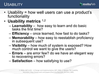


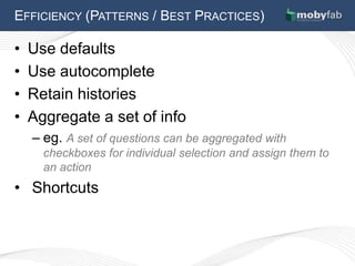
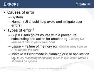


The document discusses several key principles of user interface design: 1. Usability is critical and is defined by metrics like learnability, efficiency, memorability, visibility, errors, and satisfaction. 2. It is important to understand users and gain insights through methods like observation and empathy mapping. 3. Visibility, affordances, and following principles of human learning and perception can improve learnability, while efficiency can be increased through defaults, autocomplete, and reducing steps. 4. Errors should be prevented through careful design that avoids common slips, lapses, and mistakes, and clear error messages should be provided when errors do occur.