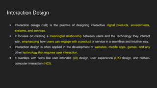
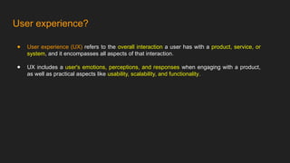
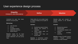
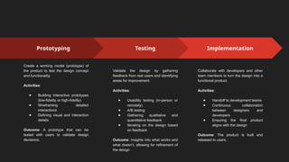
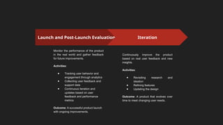
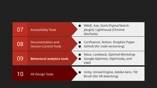
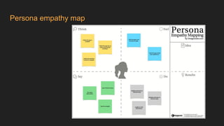
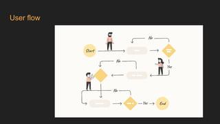
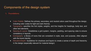
Introduction to
interaction Design
Interaction Design
● Interaction design (IxD) is the practice of designing interactive digital products, environments,
systems, and services.
● It focuses on creating a meaningful relationship between users and the technology they interact
with, emphasizing how users can engage with a product or service in a seamless and intuitive way.
● Interaction design is often applied in the development of websites, mobile apps, games, and any
other technology that requires user interaction.
● It overlaps with fields like user interface (UI) design, user experience (UX) design, and human-
computer interaction (HCI).
User experience?
● User experience (UX) refers to the overall interaction a user has with a product, service, or
system, and it encompasses all aspects of that interaction.
● UX includes a user's emotions, perceptions, and responses when engaging with a product,
as well as practical aspects like usability, scalability, and functionality.
‘‘Without good user research, we cannot offer a
good user experience.’’
- Jared Spool
2. Process
User experience design process
Ideation
Generate ideas and concepts for
potential solutions to the identified
problems.
Activities:
● Brainstorming sessions
● Sketching ideas
● Conceptualizing features and
interactions
● Creating low-fidelity
wireframes
Outcome: A range of possible solutions
visualized through sketches,
wireframes, or rough prototypes.
Empathy
(research and discovery)
Understand the users, their needs,
behaviors, and pain points.
Methodology:
● User interviews
● Surveys
● Competitive analysis
● Stakeholder interviews
● Market research
Outcome: insights into the target
audience, including user personas,
problem statements, and user journey
maps.
Define
Clearly define the core problem based
on research findings and set goals for
the project.
Activities:
● Synthesizing research findings
● Defining user problems or
challenges
● Setting project goals and
success metrics
● Creating user flows and
journey maps
Outcome: A well-defined problem
statement, user needs, and objectives.
Prototyping
Create a working model (prototype) of
the product to test the design concept
and functionality.
Activities:
● Building interactive prototypes
(low-fidelity or high-fidelity)
● Wireframing detailed
interactions
● Defining visual and interaction
details
Outcome: A prototype that can be
tested with users to validate design
decisions.
Testing
Validate the design by gathering
feedback from real users and identifying
areas for improvement.
Activities:
● Usability testing (in-person or
remotely)
● A/B testing
● Gathering qualitative and
quantitative feedback
● Iterating on the design based
on feedback
Outcome: Insights into what works and
what doesn’t, allowing for refinement of
the design
Implementation
Collaborate with developers and other
team members to turn the design into a
functional product.
Activities:
● Handoff to development teams
● Continuous collaboration
between designers and
developers
● Ensuring the final product
aligns with the design
Outcome: The product is built and
released to users.
Launch and Post-Launch Evaluation
Monitor the performance of the product
in the real world and gather feedback
for future improvements.
Activities:
● Tracking user behavior and
engagement through analytics
● Collecting user feedback and
support data
● Continuous iteration and
updates based on user
feedback and performance
metrics
Outcome: A successful product launch
with ongoing improvements.
Iteration
Continuously improve the product
based on real user feedback and new
insights.
Activities:
● Revisiting research and
ideation
● Refining features
● Updating the design
Outcome: A product that evolves over
time to meet changing user needs.
3. Tools
Toolbox for interaction designers
Design Tools
03
● Noun Project, Material Design, Font
Awesome
● IBM Kit, Bootstrap, and UI Kit
Wireframing and
prototyping tools
02
● Miro borad Balsamiq
● Adobe XD, Figma
Research Tools
01
● Google Forms, Survey Monkey
● Notion, Evernote
Testing and tools
06
● Maze, Lookback, Optimal Workshop
● Google Optimize, Optimizely, and
VWO
Collaboration Tools
05
● Slack, Microsoft Teams, Trello, Asana,
Jira, Zeplin, and InVision (for sharing
design specs with developers)
Interaction Design Tools
04
● Principle, ProtoPie, Framer, AE (for
motion design), FlowMapp,
Lucidchart, Whimsical
Behavioral analytics tools
09
● Maze, Lookback, Optimal Workshop
● Google Optimize, Optimizely, and
VWO
Documentation and
Version Control Tools
08
● Confluence, Notion, Dropbox Paper
● GitHub (for code versioning)
Accessibility Tools
07
● WAVE, Axe, Stark (Figma/Sketch
plugin), Lighthouse (Chrome
DevTools)
XR Design Tools
10
● Unity, Unreal Engine, Adobe Aero, Tilt
Brush (for VR sketching)
4. Context and motivation
Understanding context
Context refers to the environment, situation, or conditions in which users interact with a product or system.
Understanding context involves identifying the "where," "when," and "how" of user interactions. This includes:
● Physical context: the physical environment where the interaction takes place (e.g., at home, on the go, in
the office).
● Device context: The type of device or platform the user is interacting with (e.g., mobile, desktop, wearables,
voice interfaces).
● Social context: The presence or absence of other people during the interaction (e.g., using a public kiosk,
social media platforms, or collaborative tools).
● Task context: The specific tasks users are trying to accomplish and the steps involved in those tasks.
● Emotional context: The emotional state of users when interacting with the product (e.g., stress, excitement,
frustration).
Understanding motivation
Motivation refers to the underlying reasons or incentives that drive users to interact with a product. It
answers the question "why" users engage with a system or service. Understanding motivation involves:
● User Goals: The desired outcomes or results users want to achieve (e.g., booking a flight, learning
a new skill, staying connected with friends).
● Needs and Desires: The basic and higher-level needs driving user behavior, such as convenience,
status, enjoyment, or self-improvement,
● Pain Points: The frustrations, obstacles, or challenges users face that motivate them to seek a
solution (e.g., long wait times, confusing interfaces, lack of information).
● Behavioral Triggers: External or internal factors that prompt users to take action, such as a
notification, a deadline, or a desire for accomplishment.
Examples in Interaction Design
● Physical context
A navigation app designed for drivers may focus on voice commands and large, readable text to
minimize distractions.
● Motivation:
A meditation app might tap into users' motivation to reduce stress by offering quick, guided
sessions and daily reminders that align with their goals of relaxation and mindfulness.
5. Interface design principles
Interface design principles
1. Clarity
The UI should clearly communicate its purpose and allow users to understand what actions they can
take. Clarity is crucial in preventing confusion and helping users achieve their goals quickly.
Implementation:
○ Use simple and familiar language.
○ Ensure labels, icons, and actions are understandable at a glance.
○ Avoid clutter and unnecessary elements.
2. Consistency
Consistent UI elements create a sense of familiarity, making the interface easier to learn and use. Users
should be able to predict what will happen when they interact with various elements.
Implementation:
● Maintain uniformity in color schemes, fonts, and layouts across the application.
● Follow platform-specific guidelines (e.g., Android, iOS).
● Ensure interactive elements behave similarly throughout the interface.
3. Feedback
Users should receive immediate, clear feedback on their actions. Feedback lets users know whether their
actions were successful, whether there was an error, or what the system is currently doing.
Implementation:
● Use visual cues like button animations, loading indicators, or error messages.
● Provide sound feedback when appropriate (e.g., notifications and alerts).
● Make error messages specific and helpful rather than vague.
4. Affordance
Affordance refers to the design’s ability to suggest how an object should be used. UI elements should
make it clear what they are and how users can interact with them.
Implementation:
● Use visual cues like buttons, sliders, and icons that resemble real-world objects.
● Ensure that interactive elements look clickable (e.g., raised buttons).
● Use hover effects or tooltips to reinforce affordance.
5. Simplicity
Keep the design simple and focused. Overloading users with too many options or information can lead to
confusion. Simplicity helps users focus on key actions without unnecessary distractions.
Implementation:
● Prioritize content and remove non-essential elements.
● Break down complex tasks into smaller, manageable steps.
● Use white space effectively to create breathing room around elements.
6. Visibility
Important elements should be easily visible and accessible. Users should be able to locate key functions
or information quickly without unnecessary searching or clicking.
Implementation:
● Position frequently used features prominently.
● Use contrasting colors and bold typography for important information.
● Avoid hiding essential features behind complex menus or secondary screens.
7. Error prevention
The UI should be designed in a way that minimizes the possibility of user errors. Preventing errors is often
more effective than providing solutions after they occur.
Implementation:
● Use constraints (e.g., disabling certain buttons until required fields are filled).
● Offer clear instructions and input validation.
● Use confirmation dialogs for irreversible actions.
8. Flexibility
The UI should accommodate a variety of users and allow for different levels of expertise. Flexibility
ensures that both novice and advanced users can navigate the interface effectively.
Implementation:
● Provide shortcuts or advanced options for experienced users.
● Allow users to customize the interface where possible (e.g., rearrange panels, adjust settings).
● Offer multiple ways to accomplish a task (e.g., mouse and keyboard shortcuts).
9. Aesthetic Integrity
The visual design of the interface should align with the purpose and function of the system. Aesthetics are
important for creating a pleasing experience, but they should not overwhelm functionality.
Implementation:
● Maintain a balance between visual elements and usability.
● Design an interface that aligns with the product’s tone and purpose (e.g., professional, playful).
● Use a cohesive color palette and typography that enhances readability and visual appeal.
10. Learnability
Users should be able to learn how to use the interface quickly and easily. A learnable UI reduces the
cognitive load on users, allowing them to become proficient without a steep learning curve.
Implementation:
● Use familiar design patterns and conventions.
● Provide intuitive navigation and clear instructions.
● Offer onboarding or tutorials for complex features.
11. Efficiency
The interface should enable users to complete tasks in an efficient manner, reducing the time and effort
required. Efficiency is key to enhancing productivity and user satisfaction.
Implementation:
● Optimize workflows and minimize the number of steps required to complete tasks.
● Implement features like auto-complete, predictive text, and keyboard shortcuts.
● Ensure quick response times and performance.
12. Accessibility
The UI should be accessible to all users, including those with disabilities. Accessibility ensures that
everyone, regardless of their abilities, can interact with the product.
Implementation:
● Follow accessibility standards (e.g., WCAG guidelines).
● Ensure color contrast, font size, and alternative text for images.
● Support assistive technologies like screen readers and keyboard navigation.
Resources:
● WCAG 2.1 Guidelines
● W3C Web Accessibility Initiative (WAI)
13. Scalability
The design should scale well across different devices, screen sizes, and contexts. Scalability ensures that
the interface remains usable and visually appealing in various environments.
Implementation:
● Use responsive design techniques to adapt layouts to different screen sizes.
● Ensure that the interface performs well on both low- and high-resolution displays.
● Design for touch, mouse, and keyboard input, depending on the platform.
14. User Control
Give users control over the interface, allowing them to make decisions and take actions freely. Users
should feel in control of their interactions and be able to undo or correct mistakes.
Implementation:
● Allow users to undo or redo actions.
● Offer options to save, reset, or cancel tasks.
● Provide clear pathways for navigation, including back buttons and escape routes.
Activity
UI Design Challenge
6. Persona design and user flow
Components of persona design
1. Demographics (age, gender, location, occupation, education, income, etc.).
2. Psychographics ( Motivations, values, personality traits, lifestyle, technology comfort
level, etc.).
3. Goals ( primary and secondary)
4. Pain points ( Challenges, barriers, and current solutions)
5. Behavior patterns (similar product use, decision making process, device)
6. Scenarios (use cases, day in the life)
7. User Environment (Where and how the persona will use the product—at home, at work,
on the go, or social environment )
Persona empathy map
User flow
7. Design system
Famous design system
1. Material Design (Google)
2. Carbon Design System (IBM)
3. Fluent Design System (Microsoft)
4. Polaris (Shopify)
5. Thought over design (Flipkart)
6. Cloudscape Design System (Amazon)
7. Ant Design (Alibaba)
8. Lightning Design System (Salesforce)
9. Human Interface Guidelines (Apple)
10. Primer (GitHub)
11. Spectrum (Adobe)
12. Bolt Design System
13. Evergreen (Segment)
14. Audi Design System
15. Base Web (Uber)
Components of the design system
1. Foundations
● Color Palette: Defines the primary, secondary, and neutral colors used throughout the design,
including color codes for light and dark themes.
● Typography: specifies the font styles, weights, and line heights for headings, body text, and
other text elements.
● Spacing & Layout: Establishes a grid system, margins, padding, and spacing rules to ensure
consistency in layouts.
● Iconography: a library of icons that are consistent in style, size, and purpose, often aligned
with the brand identity.
● Elevation/Depth: Guidelines for shadows and layers to create a sense of depth and hierarchy
in the design (especially relevant for material design)
2. Components
● UI Components: Reusable UI elements such as buttons, input fields, cards, modals, and
sliders that are styled and behave consistently.
● Navigation: Patterns for navigation, such as menus, tabs, breadcrumbs, and pagination.
● Form Elements: Input controls like text fields, dropdowns, checkboxes, and radio buttons.
● Feedback Indicators: Elements that communicate the system's response to user actions, like
loaders, notifications, alerts, and progress bars.
3. Patterns
● Interaction Patterns: Standardized ways of interacting with the UI, such as form validation,
error handling, or drag-and-drop functionality.
● Responsive Design: Rules and patterns for adapting the design to different screen sizes and
orientations.
● Accessibility: Guidelines to ensure that the design is inclusive, covering keyboard navigation,
contrast ratios, alt text, and screen reader compatibility.
● Motion and Animation: Principles and Guidelines for the Use of motion to enhance user
interactions without being distracting.
4. Documentation
● Usage Guidelines: Instructions on how to use each component, including dos and don’ts, best
practices, and usage examples.
● Design Tokens: Abstract variables that store design-related properties such as colors, fonts,
and spacing, ensuring consistency in the implementation.
● Code Snippets: Pre-built code that developers can use to implement the design components,
often provided in multiple frameworks like React, Angular, etc.
5. Branding
● Logo Usage: Guidelines for logo placement, size, and usage in different contexts.
● Voice and Tone: Recommendations on the tone of communication, ensuring consistency in
how the brand speaks across different touchpoints.
● Imagery: Guidelines on the style, tone, and usage of photography and illustrations.
8. Grid system
Constructing thinking and decisions
1. Understanding Users and Their Goals
● User Research: This involves gathering data about users through methods like interviews, surveys,
and observations. The goal is to understand their needs, preferences, and pain points.
● Personas: Developing detailed personas helps designers empathize with users by creating
representative profiles. These personas embody the characteristics, goals, and behaviors of real
users, guiding design decision
2. Defining User Tasks and Scenarios
● Task Analysis: This involves breaking down user tasks into smaller, manageable components to
understand how users accomplish their goals.
● Scenarios: Scenarios are narrative descriptions of how users interact with the product to achieve
specific goals. They help designers visualize user interactions in context.
3. Designing Interaction Patterns
● Goal-Directed Design: Focuses on creating designs that support users in achieving their goals efficiently.
The design should align with user intentions and streamline their interactions.
● Interaction Models: Use well-established interaction models and patterns (e.g., command-line interfaces,
direct manipulation) to guide design decisions and create intuitive experiences.
4. Creating Prototypes and Iterating
● Prototyping: Build prototypes to explore and test design ideas. These can range from low-fidelity sketches
to high-fidelity interactive models.
● User Testing: Conduct usability testing with real users to gather feedback and identify issues. Iteratively
refine the design based on this feedback to enhance usability.
5. Design Principles and Guidelines
● Consistency: Ensure that design elements are consistent throughout the application to help users form
accurate mental models.
● Feedback: Provide immediate and clear feedback to users about their actions and the system’s status.
● Affordances and Signifiers: Use visual cues to suggest how an element can be used. For example,
buttons should look clickable, and icons should be recognizable.
6. Decision-Making Framework
● Balancing Trade-offs: Make informed decisions by balancing usability, aesthetics, technical
constraints, and business goals. Prioritize user needs and the overall user experience.
● Heuristic Evaluation: Use established usability heuristics (e.g., Nielsen’s heuristics) to evaluate
the design and identify potential usability issues.
7. Design Iteration and Refinement
● Feedback Loops: Create continuous feedback loops with users and stakeholders to iteratively
refine the design.
● Evolutionary Design: Embrace an evolutionary approach where the design evolves based on
testing and user feedback, rather than aiming for a perfect final product from the start.
Type of navigation
1. Global Navigation
Global navigation refers to the primary navigation elements that allow users to access major sections of a
website or application. It is typically consistent across all pages or screens.
● Top Navigation Bar: A horizontal menu usually found at the top of the page. It often includes links
to the most important sections of the site or app.
● Side Navigation (Sidebar): A vertical menu placed on the left or right side of the screen. It’s often
used for applications with multiple sections or complex hierarchies.
● Navigation Drawer: A panel that slides out from the side of the screen, commonly used in mobile
apps and some websites to save space and provide access to various sections.
2. Local Navigation
Local navigation is designed to help users navigate within a specific section or context of the application
or website.
● Tabs: Horizontal or vertical tabs are used to switch between different views or sections within the
same context, such as between different content categories or settings.
● Accordion Menus: Expandable menus that allow users to view additional options or sections by
expanding or collapsing items. Useful for organizing related content in a compact way.
3. Contextual Navigation
Contextual navigation provides options based on the user’s current context or task, making it relevant to
the specific content being viewed.
● Context Menus: Pop-up menus that appear upon right-clicking or tapping an element, offering
actions relevant to that specific item or context.
● Inline Navigation: Links or buttons embedded within content that allow users to navigate to related
or additional content without leaving the current page.
4. Hierarchical Navigation
Hierarchical navigation organizes content in a tree-like structure, allowing users to drill down from general
to more specific levels.
● Breadcrumbs: Display the user’s current location within the site’s hierarchy and provide links to
higher-level pages. This helps users understand their position and navigate back to previous levels.
● Drop-down Menus: Menus that expand to reveal additional options or sub-categories when
hovered over or clicked. Useful for organizing large amounts of content within a compact area.
5. Search-Based Navigation
Search-based navigation allows users to find specific content or functionality by entering search terms or
using filters.
● Search Bars: Provide a field where users can enter keywords to find content or features. Often
accompanied by autocomplete or suggestion features to assist with query formulation.
● Filtering and Sorting: Tools that allow users to refine and organize search results or content based
on criteria such as date, relevance, category, or other attributes.
6. Visual Navigation
Visual navigation leverages visual elements to help users navigate and interact with the interface.
● Icons: Small graphic representations that represent actions or sections. Icons should be intuitive
and recognizable to aid in navigation.
● Maps and Diagrams: Interactive visual representations of content or data that allow users to
explore different areas or sections by interacting with the visuals.
7. Adaptive Navigation
Adaptive navigation adjusts based on user behavior, preferences, or device.
● Personalized Navigation: Changes navigation options based on user preferences or past
interactions. For example, recommending frequently visited sections or customizing the menu
based on user roles.
● Responsive Navigation: Adapts navigation layout and elements based on the device or screen
size. For instance, a navigation bar may turn into a hamburger menu on mobile devices.
8. Command-Based Navigation
Command-based navigation relies on user input or commands to perform actions or navigate.
● Command-Line Interfaces (CLI): Users type commands to perform tasks or navigate. This is more
common in advanced or technical applications.
● Voice Navigation: Allows users to navigate or control the interface using voice commands. Useful
in hands-free or accessibility-focused designs.
Behaviour and interaction
Behavior refers to how users interact with a system and how the system responds to these interactions.
Understanding behavior involves considering both user actions and system responses.
● User Goals and Actions: Designers need to anticipate and support users' goals by understanding
the actions they will take to achieve those goals. This includes knowing what tasks users want to
perform and designing interactions that enable those tasks efficiently.
● System Responses: The system should provide clear and immediate feedback to users' actions.
This feedback helps users understand the result of their actions, informs them of errors, and guides
them through the interaction process.
● Consistency: Maintaining consistent behavior across the interface ensures users can predict how
the system will respond. Consistency in behavior reduces cognitive load and helps users build
accurate mental models of how the system operates.
● Error Handling: Designing for error prevention and recovery is crucial. Users should be informed
when an error occurs and given clear instructions on how to correct it. Good design anticipates
common errors and provides solutions or safeguards to minimize their impact.
Interaction refers to the ways users engage with the interface to perform tasks. It encompasses various
aspects, including the design of controls, the flow of tasks, and how users navigate through the system.
● Interaction Models: Interaction models define how users will interact with the system. For
example, direct manipulation allows users to interact with on-screen objects as if they were physical
objects, while command-line interfaces require users to input textual comma.
● Feedback and Response: Providing feedback is essential for effective interaction. When a user
performs an action, the system should respond in a way that confirms the action and provides
information about the outcome. Feedback can be visual (like a change in color), auditory (a sound),
or tactile (a vibration).
● Navigation and Flow: The interaction design should facilitate smooth navigation and task flow.
This involves designing intuitive pathways for users to follow and ensuring that the system supports
users in completing their tasks efficiently.
● Interaction Patterns: Common interaction patterns, such as drag-and-drop, swipe gestures, or
modal dialogs, should be used appropriately. Designers should follow established patterns where
users expect them to reduce the learning curve and enhance usability
● User Control and Freedom: Users should feel in control of their interactions. This includes the
ability to easily undo actions, cancel processes, or modify inputs. Providing control and freedom
helps users feel more confident and reduces frustration.
Practice for providing feedback
1. Immediate and Clear Feedback
● Timeliness: Feedback should be immediate to confirm that the system has received and processed the user's
action. Delays in feedback can confuse users and lead to uncertainty about whether their action was successful.
● Clarity: Feedback should be easy to understand. Avoid ambiguous messages or visual indicators that might
confuse users about the outcome of their actions.
2. Types of Feedback
● Visual Feedback: Changes in the interface, such as highlighting a button when clicked, showing progress bars,
or displaying error messages, provide visual confirmation of actions. Visual feedback helps users understand
the state of the system at a glance.
● Auditory Feedback: Sounds or alerts can accompany visual feedback to reinforce the system's response. For
example, a beep or chime can indicate successful completion of an action, while an error sound can alert users
to issues.
● Tactile Feedback: On devices with touchscreens or haptic feedback, vibrations or physical responses can
confirm actions, such as a gentle vibration when a button is pressed.
3. Feedback for Different Actions
● Success: Clearly indicate successful completion of an action, such as displaying a confirmation
message or updating the interface to reflect the new state. This reassures users that their action
was successful.
● Error: Provide informative error messages that explain what went wrong and how users can correct
the issue. Error feedback should be constructive and guide users towards resolving the problem.
● Progress: Show progress indicators for tasks that take time to complete, such as loading screens
or progress bars. This helps users understand that the system is working and prevents them from
thinking the application is unresponsive.
4. Designing Feedback for Usability
● Relevance: Ensure that feedback is relevant to the user's action and context. For example, if a
user submits a form, the feedback should confirm the submission and not simply provide a generic
message.
● Aesthetics: Feedback should be visually consistent with the overall design of the interface. Use
colors, shapes, and fonts that align with the design system to maintain a cohesive look and feel.
● Non-Intrusiveness: Feedback should be noticeable but not disruptive. Avoid feedback that
obstructs the user's view or interrupts their workflow. For instance, error messages should be
visible but should not obscure important content.
5. User Control and Freedom
● Undo Actions: Provide users with the ability to undo actions or correct mistakes. This helps users
feel more in control and reduces the risk of frustration if they make an error.
● Confirmations: For critical actions (like deleting data), include confirmation dialogs to prevent
accidental operations. These confirmations give users a chance to review their decision before it is
finalized.
6. Consistency in Feedback
● Standardization: Use consistent feedback patterns throughout the interface. For example, if a
button click always triggers a specific visual change, users will learn to expect and interpret that
feedback reliably.
● Predictability: Ensure that feedback is predictable and aligns with user expectations. Consistent
feedback patterns help users build accurate mental models of how the system behaves.
7. Feedback in Different Contexts
● Error States: Clearly differentiate between different types of errors and their severity. Provide
specific guidance on how to address each type of error.
● Interactive Elements: For interactive elements like form fields or buttons, provide real-time
feedback as users interact with them. For example, showing validation errors as users type in a
form field can help correct issues before submission.
UI design pattern
● Reference link: Interaction design foundation
https://www.interaction-design.org/literature/topics/ui-design-patterns?srsltid=AfmBOoqlG8WTthaHddf2_7AQa06PFJ
WGWyRoTNvt4sORn9xz1tIFSfWs

Introduction to Intrection design UX UI.

  • 1.
  • 2.
    Interaction Design ● Interactiondesign (IxD) is the practice of designing interactive digital products, environments, systems, and services. ● It focuses on creating a meaningful relationship between users and the technology they interact with, emphasizing how users can engage with a product or service in a seamless and intuitive way. ● Interaction design is often applied in the development of websites, mobile apps, games, and any other technology that requires user interaction. ● It overlaps with fields like user interface (UI) design, user experience (UX) design, and human- computer interaction (HCI).
  • 3.
    User experience? ● Userexperience (UX) refers to the overall interaction a user has with a product, service, or system, and it encompasses all aspects of that interaction. ● UX includes a user's emotions, perceptions, and responses when engaging with a product, as well as practical aspects like usability, scalability, and functionality.
  • 4.
    ‘‘Without good userresearch, we cannot offer a good user experience.’’ - Jared Spool
  • 5.
  • 6.
    User experience designprocess Ideation Generate ideas and concepts for potential solutions to the identified problems. Activities: ● Brainstorming sessions ● Sketching ideas ● Conceptualizing features and interactions ● Creating low-fidelity wireframes Outcome: A range of possible solutions visualized through sketches, wireframes, or rough prototypes. Empathy (research and discovery) Understand the users, their needs, behaviors, and pain points. Methodology: ● User interviews ● Surveys ● Competitive analysis ● Stakeholder interviews ● Market research Outcome: insights into the target audience, including user personas, problem statements, and user journey maps. Define Clearly define the core problem based on research findings and set goals for the project. Activities: ● Synthesizing research findings ● Defining user problems or challenges ● Setting project goals and success metrics ● Creating user flows and journey maps Outcome: A well-defined problem statement, user needs, and objectives.
  • 7.
    Prototyping Create a workingmodel (prototype) of the product to test the design concept and functionality. Activities: ● Building interactive prototypes (low-fidelity or high-fidelity) ● Wireframing detailed interactions ● Defining visual and interaction details Outcome: A prototype that can be tested with users to validate design decisions. Testing Validate the design by gathering feedback from real users and identifying areas for improvement. Activities: ● Usability testing (in-person or remotely) ● A/B testing ● Gathering qualitative and quantitative feedback ● Iterating on the design based on feedback Outcome: Insights into what works and what doesn’t, allowing for refinement of the design Implementation Collaborate with developers and other team members to turn the design into a functional product. Activities: ● Handoff to development teams ● Continuous collaboration between designers and developers ● Ensuring the final product aligns with the design Outcome: The product is built and released to users.
  • 8.
    Launch and Post-LaunchEvaluation Monitor the performance of the product in the real world and gather feedback for future improvements. Activities: ● Tracking user behavior and engagement through analytics ● Collecting user feedback and support data ● Continuous iteration and updates based on user feedback and performance metrics Outcome: A successful product launch with ongoing improvements. Iteration Continuously improve the product based on real user feedback and new insights. Activities: ● Revisiting research and ideation ● Refining features ● Updating the design Outcome: A product that evolves over time to meet changing user needs.
  • 9.
  • 10.
    Toolbox for interactiondesigners Design Tools 03 ● Noun Project, Material Design, Font Awesome ● IBM Kit, Bootstrap, and UI Kit Wireframing and prototyping tools 02 ● Miro borad Balsamiq ● Adobe XD, Figma Research Tools 01 ● Google Forms, Survey Monkey ● Notion, Evernote
  • 11.
    Testing and tools 06 ●Maze, Lookback, Optimal Workshop ● Google Optimize, Optimizely, and VWO Collaboration Tools 05 ● Slack, Microsoft Teams, Trello, Asana, Jira, Zeplin, and InVision (for sharing design specs with developers) Interaction Design Tools 04 ● Principle, ProtoPie, Framer, AE (for motion design), FlowMapp, Lucidchart, Whimsical
  • 12.
    Behavioral analytics tools 09 ●Maze, Lookback, Optimal Workshop ● Google Optimize, Optimizely, and VWO Documentation and Version Control Tools 08 ● Confluence, Notion, Dropbox Paper ● GitHub (for code versioning) Accessibility Tools 07 ● WAVE, Axe, Stark (Figma/Sketch plugin), Lighthouse (Chrome DevTools) XR Design Tools 10 ● Unity, Unreal Engine, Adobe Aero, Tilt Brush (for VR sketching)
  • 13.
    4. Context andmotivation
  • 14.
    Understanding context Context refersto the environment, situation, or conditions in which users interact with a product or system. Understanding context involves identifying the "where," "when," and "how" of user interactions. This includes: ● Physical context: the physical environment where the interaction takes place (e.g., at home, on the go, in the office). ● Device context: The type of device or platform the user is interacting with (e.g., mobile, desktop, wearables, voice interfaces). ● Social context: The presence or absence of other people during the interaction (e.g., using a public kiosk, social media platforms, or collaborative tools). ● Task context: The specific tasks users are trying to accomplish and the steps involved in those tasks. ● Emotional context: The emotional state of users when interacting with the product (e.g., stress, excitement, frustration).
  • 15.
    Understanding motivation Motivation refersto the underlying reasons or incentives that drive users to interact with a product. It answers the question "why" users engage with a system or service. Understanding motivation involves: ● User Goals: The desired outcomes or results users want to achieve (e.g., booking a flight, learning a new skill, staying connected with friends). ● Needs and Desires: The basic and higher-level needs driving user behavior, such as convenience, status, enjoyment, or self-improvement, ● Pain Points: The frustrations, obstacles, or challenges users face that motivate them to seek a solution (e.g., long wait times, confusing interfaces, lack of information). ● Behavioral Triggers: External or internal factors that prompt users to take action, such as a notification, a deadline, or a desire for accomplishment.
  • 16.
    Examples in InteractionDesign ● Physical context A navigation app designed for drivers may focus on voice commands and large, readable text to minimize distractions. ● Motivation: A meditation app might tap into users' motivation to reduce stress by offering quick, guided sessions and daily reminders that align with their goals of relaxation and mindfulness.
  • 17.
  • 18.
    Interface design principles 1.Clarity The UI should clearly communicate its purpose and allow users to understand what actions they can take. Clarity is crucial in preventing confusion and helping users achieve their goals quickly. Implementation: ○ Use simple and familiar language. ○ Ensure labels, icons, and actions are understandable at a glance. ○ Avoid clutter and unnecessary elements.
  • 19.
    2. Consistency Consistent UIelements create a sense of familiarity, making the interface easier to learn and use. Users should be able to predict what will happen when they interact with various elements. Implementation: ● Maintain uniformity in color schemes, fonts, and layouts across the application. ● Follow platform-specific guidelines (e.g., Android, iOS). ● Ensure interactive elements behave similarly throughout the interface.
  • 20.
    3. Feedback Users shouldreceive immediate, clear feedback on their actions. Feedback lets users know whether their actions were successful, whether there was an error, or what the system is currently doing. Implementation: ● Use visual cues like button animations, loading indicators, or error messages. ● Provide sound feedback when appropriate (e.g., notifications and alerts). ● Make error messages specific and helpful rather than vague.
  • 21.
    4. Affordance Affordance refersto the design’s ability to suggest how an object should be used. UI elements should make it clear what they are and how users can interact with them. Implementation: ● Use visual cues like buttons, sliders, and icons that resemble real-world objects. ● Ensure that interactive elements look clickable (e.g., raised buttons). ● Use hover effects or tooltips to reinforce affordance.
  • 22.
    5. Simplicity Keep thedesign simple and focused. Overloading users with too many options or information can lead to confusion. Simplicity helps users focus on key actions without unnecessary distractions. Implementation: ● Prioritize content and remove non-essential elements. ● Break down complex tasks into smaller, manageable steps. ● Use white space effectively to create breathing room around elements.
  • 23.
    5. Simplicity Keep thedesign simple and focused. Overloading users with too many options or information can lead to confusion. Simplicity helps users focus on key actions without unnecessary distractions. Implementation: ● Prioritize content and remove non-essential elements. ● Break down complex tasks into smaller, manageable steps. ● Use white space effectively to create breathing room around elements.
  • 24.
    6. Visibility Important elementsshould be easily visible and accessible. Users should be able to locate key functions or information quickly without unnecessary searching or clicking. Implementation: ● Position frequently used features prominently. ● Use contrasting colors and bold typography for important information. ● Avoid hiding essential features behind complex menus or secondary screens.
  • 25.
    7. Error prevention TheUI should be designed in a way that minimizes the possibility of user errors. Preventing errors is often more effective than providing solutions after they occur. Implementation: ● Use constraints (e.g., disabling certain buttons until required fields are filled). ● Offer clear instructions and input validation. ● Use confirmation dialogs for irreversible actions.
  • 26.
    8. Flexibility The UIshould accommodate a variety of users and allow for different levels of expertise. Flexibility ensures that both novice and advanced users can navigate the interface effectively. Implementation: ● Provide shortcuts or advanced options for experienced users. ● Allow users to customize the interface where possible (e.g., rearrange panels, adjust settings). ● Offer multiple ways to accomplish a task (e.g., mouse and keyboard shortcuts).
  • 27.
    9. Aesthetic Integrity Thevisual design of the interface should align with the purpose and function of the system. Aesthetics are important for creating a pleasing experience, but they should not overwhelm functionality. Implementation: ● Maintain a balance between visual elements and usability. ● Design an interface that aligns with the product’s tone and purpose (e.g., professional, playful). ● Use a cohesive color palette and typography that enhances readability and visual appeal.
  • 28.
    10. Learnability Users shouldbe able to learn how to use the interface quickly and easily. A learnable UI reduces the cognitive load on users, allowing them to become proficient without a steep learning curve. Implementation: ● Use familiar design patterns and conventions. ● Provide intuitive navigation and clear instructions. ● Offer onboarding or tutorials for complex features.
  • 29.
    11. Efficiency The interfaceshould enable users to complete tasks in an efficient manner, reducing the time and effort required. Efficiency is key to enhancing productivity and user satisfaction. Implementation: ● Optimize workflows and minimize the number of steps required to complete tasks. ● Implement features like auto-complete, predictive text, and keyboard shortcuts. ● Ensure quick response times and performance.
  • 30.
    12. Accessibility The UIshould be accessible to all users, including those with disabilities. Accessibility ensures that everyone, regardless of their abilities, can interact with the product. Implementation: ● Follow accessibility standards (e.g., WCAG guidelines). ● Ensure color contrast, font size, and alternative text for images. ● Support assistive technologies like screen readers and keyboard navigation. Resources: ● WCAG 2.1 Guidelines ● W3C Web Accessibility Initiative (WAI)
  • 31.
    13. Scalability The designshould scale well across different devices, screen sizes, and contexts. Scalability ensures that the interface remains usable and visually appealing in various environments. Implementation: ● Use responsive design techniques to adapt layouts to different screen sizes. ● Ensure that the interface performs well on both low- and high-resolution displays. ● Design for touch, mouse, and keyboard input, depending on the platform.
  • 32.
    14. User Control Giveusers control over the interface, allowing them to make decisions and take actions freely. Users should feel in control of their interactions and be able to undo or correct mistakes. Implementation: ● Allow users to undo or redo actions. ● Offer options to save, reset, or cancel tasks. ● Provide clear pathways for navigation, including back buttons and escape routes.
  • 33.
  • 34.
    6. Persona designand user flow
  • 35.
    Components of personadesign 1. Demographics (age, gender, location, occupation, education, income, etc.). 2. Psychographics ( Motivations, values, personality traits, lifestyle, technology comfort level, etc.). 3. Goals ( primary and secondary) 4. Pain points ( Challenges, barriers, and current solutions) 5. Behavior patterns (similar product use, decision making process, device) 6. Scenarios (use cases, day in the life) 7. User Environment (Where and how the persona will use the product—at home, at work, on the go, or social environment )
  • 36.
  • 37.
  • 38.
  • 39.
    Famous design system 1.Material Design (Google) 2. Carbon Design System (IBM) 3. Fluent Design System (Microsoft) 4. Polaris (Shopify) 5. Thought over design (Flipkart) 6. Cloudscape Design System (Amazon) 7. Ant Design (Alibaba) 8. Lightning Design System (Salesforce) 9. Human Interface Guidelines (Apple) 10. Primer (GitHub) 11. Spectrum (Adobe) 12. Bolt Design System 13. Evergreen (Segment) 14. Audi Design System 15. Base Web (Uber)
  • 40.
    Components of thedesign system 1. Foundations ● Color Palette: Defines the primary, secondary, and neutral colors used throughout the design, including color codes for light and dark themes. ● Typography: specifies the font styles, weights, and line heights for headings, body text, and other text elements. ● Spacing & Layout: Establishes a grid system, margins, padding, and spacing rules to ensure consistency in layouts. ● Iconography: a library of icons that are consistent in style, size, and purpose, often aligned with the brand identity. ● Elevation/Depth: Guidelines for shadows and layers to create a sense of depth and hierarchy in the design (especially relevant for material design)
  • 41.
    2. Components ● UIComponents: Reusable UI elements such as buttons, input fields, cards, modals, and sliders that are styled and behave consistently. ● Navigation: Patterns for navigation, such as menus, tabs, breadcrumbs, and pagination. ● Form Elements: Input controls like text fields, dropdowns, checkboxes, and radio buttons. ● Feedback Indicators: Elements that communicate the system's response to user actions, like loaders, notifications, alerts, and progress bars.
  • 42.
    3. Patterns ● InteractionPatterns: Standardized ways of interacting with the UI, such as form validation, error handling, or drag-and-drop functionality. ● Responsive Design: Rules and patterns for adapting the design to different screen sizes and orientations. ● Accessibility: Guidelines to ensure that the design is inclusive, covering keyboard navigation, contrast ratios, alt text, and screen reader compatibility. ● Motion and Animation: Principles and Guidelines for the Use of motion to enhance user interactions without being distracting.
  • 43.
    4. Documentation ● UsageGuidelines: Instructions on how to use each component, including dos and don’ts, best practices, and usage examples. ● Design Tokens: Abstract variables that store design-related properties such as colors, fonts, and spacing, ensuring consistency in the implementation. ● Code Snippets: Pre-built code that developers can use to implement the design components, often provided in multiple frameworks like React, Angular, etc.
  • 44.
    5. Branding ● LogoUsage: Guidelines for logo placement, size, and usage in different contexts. ● Voice and Tone: Recommendations on the tone of communication, ensuring consistency in how the brand speaks across different touchpoints. ● Imagery: Guidelines on the style, tone, and usage of photography and illustrations.
  • 45.
  • 48.
    Constructing thinking anddecisions 1. Understanding Users and Their Goals ● User Research: This involves gathering data about users through methods like interviews, surveys, and observations. The goal is to understand their needs, preferences, and pain points. ● Personas: Developing detailed personas helps designers empathize with users by creating representative profiles. These personas embody the characteristics, goals, and behaviors of real users, guiding design decision 2. Defining User Tasks and Scenarios ● Task Analysis: This involves breaking down user tasks into smaller, manageable components to understand how users accomplish their goals. ● Scenarios: Scenarios are narrative descriptions of how users interact with the product to achieve specific goals. They help designers visualize user interactions in context.
  • 49.
    3. Designing InteractionPatterns ● Goal-Directed Design: Focuses on creating designs that support users in achieving their goals efficiently. The design should align with user intentions and streamline their interactions. ● Interaction Models: Use well-established interaction models and patterns (e.g., command-line interfaces, direct manipulation) to guide design decisions and create intuitive experiences. 4. Creating Prototypes and Iterating ● Prototyping: Build prototypes to explore and test design ideas. These can range from low-fidelity sketches to high-fidelity interactive models. ● User Testing: Conduct usability testing with real users to gather feedback and identify issues. Iteratively refine the design based on this feedback to enhance usability. 5. Design Principles and Guidelines ● Consistency: Ensure that design elements are consistent throughout the application to help users form accurate mental models. ● Feedback: Provide immediate and clear feedback to users about their actions and the system’s status. ● Affordances and Signifiers: Use visual cues to suggest how an element can be used. For example, buttons should look clickable, and icons should be recognizable.
  • 50.
    6. Decision-Making Framework ●Balancing Trade-offs: Make informed decisions by balancing usability, aesthetics, technical constraints, and business goals. Prioritize user needs and the overall user experience. ● Heuristic Evaluation: Use established usability heuristics (e.g., Nielsen’s heuristics) to evaluate the design and identify potential usability issues. 7. Design Iteration and Refinement ● Feedback Loops: Create continuous feedback loops with users and stakeholders to iteratively refine the design. ● Evolutionary Design: Embrace an evolutionary approach where the design evolves based on testing and user feedback, rather than aiming for a perfect final product from the start.
  • 51.
    Type of navigation 1.Global Navigation Global navigation refers to the primary navigation elements that allow users to access major sections of a website or application. It is typically consistent across all pages or screens. ● Top Navigation Bar: A horizontal menu usually found at the top of the page. It often includes links to the most important sections of the site or app. ● Side Navigation (Sidebar): A vertical menu placed on the left or right side of the screen. It’s often used for applications with multiple sections or complex hierarchies. ● Navigation Drawer: A panel that slides out from the side of the screen, commonly used in mobile apps and some websites to save space and provide access to various sections.
  • 52.
    2. Local Navigation Localnavigation is designed to help users navigate within a specific section or context of the application or website. ● Tabs: Horizontal or vertical tabs are used to switch between different views or sections within the same context, such as between different content categories or settings. ● Accordion Menus: Expandable menus that allow users to view additional options or sections by expanding or collapsing items. Useful for organizing related content in a compact way. 3. Contextual Navigation Contextual navigation provides options based on the user’s current context or task, making it relevant to the specific content being viewed. ● Context Menus: Pop-up menus that appear upon right-clicking or tapping an element, offering actions relevant to that specific item or context. ● Inline Navigation: Links or buttons embedded within content that allow users to navigate to related or additional content without leaving the current page.
  • 53.
    4. Hierarchical Navigation Hierarchicalnavigation organizes content in a tree-like structure, allowing users to drill down from general to more specific levels. ● Breadcrumbs: Display the user’s current location within the site’s hierarchy and provide links to higher-level pages. This helps users understand their position and navigate back to previous levels. ● Drop-down Menus: Menus that expand to reveal additional options or sub-categories when hovered over or clicked. Useful for organizing large amounts of content within a compact area. 5. Search-Based Navigation Search-based navigation allows users to find specific content or functionality by entering search terms or using filters. ● Search Bars: Provide a field where users can enter keywords to find content or features. Often accompanied by autocomplete or suggestion features to assist with query formulation. ● Filtering and Sorting: Tools that allow users to refine and organize search results or content based on criteria such as date, relevance, category, or other attributes.
  • 54.
    6. Visual Navigation Visualnavigation leverages visual elements to help users navigate and interact with the interface. ● Icons: Small graphic representations that represent actions or sections. Icons should be intuitive and recognizable to aid in navigation. ● Maps and Diagrams: Interactive visual representations of content or data that allow users to explore different areas or sections by interacting with the visuals. 7. Adaptive Navigation Adaptive navigation adjusts based on user behavior, preferences, or device. ● Personalized Navigation: Changes navigation options based on user preferences or past interactions. For example, recommending frequently visited sections or customizing the menu based on user roles. ● Responsive Navigation: Adapts navigation layout and elements based on the device or screen size. For instance, a navigation bar may turn into a hamburger menu on mobile devices.
  • 55.
    8. Command-Based Navigation Command-basednavigation relies on user input or commands to perform actions or navigate. ● Command-Line Interfaces (CLI): Users type commands to perform tasks or navigate. This is more common in advanced or technical applications. ● Voice Navigation: Allows users to navigate or control the interface using voice commands. Useful in hands-free or accessibility-focused designs.
  • 56.
    Behaviour and interaction Behaviorrefers to how users interact with a system and how the system responds to these interactions. Understanding behavior involves considering both user actions and system responses. ● User Goals and Actions: Designers need to anticipate and support users' goals by understanding the actions they will take to achieve those goals. This includes knowing what tasks users want to perform and designing interactions that enable those tasks efficiently. ● System Responses: The system should provide clear and immediate feedback to users' actions. This feedback helps users understand the result of their actions, informs them of errors, and guides them through the interaction process.
  • 57.
    ● Consistency: Maintainingconsistent behavior across the interface ensures users can predict how the system will respond. Consistency in behavior reduces cognitive load and helps users build accurate mental models of how the system operates. ● Error Handling: Designing for error prevention and recovery is crucial. Users should be informed when an error occurs and given clear instructions on how to correct it. Good design anticipates common errors and provides solutions or safeguards to minimize their impact.
  • 58.
    Interaction refers tothe ways users engage with the interface to perform tasks. It encompasses various aspects, including the design of controls, the flow of tasks, and how users navigate through the system. ● Interaction Models: Interaction models define how users will interact with the system. For example, direct manipulation allows users to interact with on-screen objects as if they were physical objects, while command-line interfaces require users to input textual comma. ● Feedback and Response: Providing feedback is essential for effective interaction. When a user performs an action, the system should respond in a way that confirms the action and provides information about the outcome. Feedback can be visual (like a change in color), auditory (a sound), or tactile (a vibration). ● Navigation and Flow: The interaction design should facilitate smooth navigation and task flow. This involves designing intuitive pathways for users to follow and ensuring that the system supports users in completing their tasks efficiently.
  • 59.
    ● Interaction Patterns:Common interaction patterns, such as drag-and-drop, swipe gestures, or modal dialogs, should be used appropriately. Designers should follow established patterns where users expect them to reduce the learning curve and enhance usability ● User Control and Freedom: Users should feel in control of their interactions. This includes the ability to easily undo actions, cancel processes, or modify inputs. Providing control and freedom helps users feel more confident and reduces frustration.
  • 60.
    Practice for providingfeedback 1. Immediate and Clear Feedback ● Timeliness: Feedback should be immediate to confirm that the system has received and processed the user's action. Delays in feedback can confuse users and lead to uncertainty about whether their action was successful. ● Clarity: Feedback should be easy to understand. Avoid ambiguous messages or visual indicators that might confuse users about the outcome of their actions. 2. Types of Feedback ● Visual Feedback: Changes in the interface, such as highlighting a button when clicked, showing progress bars, or displaying error messages, provide visual confirmation of actions. Visual feedback helps users understand the state of the system at a glance. ● Auditory Feedback: Sounds or alerts can accompany visual feedback to reinforce the system's response. For example, a beep or chime can indicate successful completion of an action, while an error sound can alert users to issues. ● Tactile Feedback: On devices with touchscreens or haptic feedback, vibrations or physical responses can confirm actions, such as a gentle vibration when a button is pressed.
  • 61.
    3. Feedback forDifferent Actions ● Success: Clearly indicate successful completion of an action, such as displaying a confirmation message or updating the interface to reflect the new state. This reassures users that their action was successful. ● Error: Provide informative error messages that explain what went wrong and how users can correct the issue. Error feedback should be constructive and guide users towards resolving the problem. ● Progress: Show progress indicators for tasks that take time to complete, such as loading screens or progress bars. This helps users understand that the system is working and prevents them from thinking the application is unresponsive.
  • 62.
    4. Designing Feedbackfor Usability ● Relevance: Ensure that feedback is relevant to the user's action and context. For example, if a user submits a form, the feedback should confirm the submission and not simply provide a generic message. ● Aesthetics: Feedback should be visually consistent with the overall design of the interface. Use colors, shapes, and fonts that align with the design system to maintain a cohesive look and feel. ● Non-Intrusiveness: Feedback should be noticeable but not disruptive. Avoid feedback that obstructs the user's view or interrupts their workflow. For instance, error messages should be visible but should not obscure important content. 5. User Control and Freedom ● Undo Actions: Provide users with the ability to undo actions or correct mistakes. This helps users feel more in control and reduces the risk of frustration if they make an error. ● Confirmations: For critical actions (like deleting data), include confirmation dialogs to prevent accidental operations. These confirmations give users a chance to review their decision before it is finalized.
  • 63.
    6. Consistency inFeedback ● Standardization: Use consistent feedback patterns throughout the interface. For example, if a button click always triggers a specific visual change, users will learn to expect and interpret that feedback reliably. ● Predictability: Ensure that feedback is predictable and aligns with user expectations. Consistent feedback patterns help users build accurate mental models of how the system behaves. 7. Feedback in Different Contexts ● Error States: Clearly differentiate between different types of errors and their severity. Provide specific guidance on how to address each type of error. ● Interactive Elements: For interactive elements like form fields or buttons, provide real-time feedback as users interact with them. For example, showing validation errors as users type in a form field can help correct issues before submission.
  • 64.
    UI design pattern ●Reference link: Interaction design foundation https://www.interaction-design.org/literature/topics/ui-design-patterns?srsltid=AfmBOoqlG8WTthaHddf2_7AQa06PFJ WGWyRoTNvt4sORn9xz1tIFSfWs