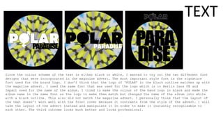
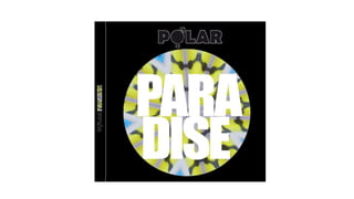
1) The document discusses the creation of a logo and design for a band's digital packaging (digipak) and magazine advertisement.
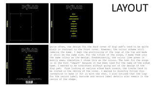
2) The creator recreated the band's original black logo in white and experimented with layouts for the advertisement, trying different styles and sizes for the band name.
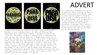
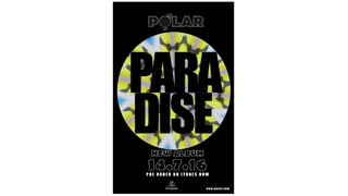
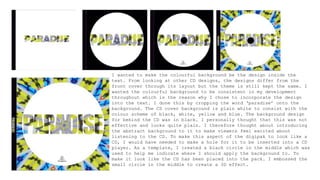
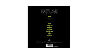
3) For the digipak, the creator applied a colorful background design throughout and tested different layouts and color schemes for the front cover, CD, booklet, and back cover to create a consistent and recognizable style matching the advertisement.