This slideshow accompanied a workshop for the Usability Professionals Association, Boston Chapter at Bentley College. It covers the basic visual design elements used in creating Web sites and Web application designs including typography, grids, color, and icons.
Visual design principles & practices for web and mobile appsTania Schlatter
These slides are from a one-day class designed to help product teams bridge the gap between applications that look great or are highly functional.
This class, given with the Boston UXPA, provides guidelines and examples about how to make visual design decisions that reinforce usability best practices and create interfaces that people value. Participants learn the characteristics of “visually usable” apps to know what to shoot for, and get an introduction to the visual design “tools” for digital apps – layout, type, color, imagery, and controls and affordances – and how to use them to create appealing applications people can easily understand and use.
Department of Journalism And Mass Communication- The Principles of Design
Balance
Rhythm
Proportion
Dominance
Unity
Asymmetrical
Similarity, Proximity and Alignment
Positive and Negative Space
Color and Typography
Modernist Typography and the Swiss grid - Carlo GiannascaFrostSydney
Carlo Giannasca Partner and Head of Environments at Frost* Design shares some of his insights into the basics of modernist typography and the effective use of the Swiss grid system.
http://noteandpoint.com/, http://presportal.ru/, http://presuniversity.com/ Портал Как сделать презентацию, Международная Высшая Школа Презентаций и Коммуникаций. Обучение презентациям. Тренинги по презентациям.
Wireframing Workshop - TiE Women Create-a-ThonKristine Howard
A talk given at the TiE Sydney Create-a-Thon on July 18, 2015 on what wireframing is, the benefits, what fidelity means, and tools and techniques to get started.
Presentation given at Montclair State University's Graphic Design II course on Introduction to Web Design. This presentation was geared towards year two graphic design students with little to no exposure to web design and predominant print backgrounds.
HICap talk is to inform others of the necessary steps in creating a website and understanding the importance of UI (User Interface) + UX (User Experience) design.
These steps may seem tedious, but as you dive into the design or even the development stage, you’ll quickly find out that this process will help to diminish problems that could occur down the road.
These are the UI slides
About Kathryne Sakata
====
Kat received her graphic design degree from the New Media Arts Interface Design Program at Kapiolani Community College. She is currently a Graphic Designer and Web Developer at Design Asylum, Inc. and the Lead UI Designer at Undefeated Games, Inc. Kat enjoys engaging with new people and sharing her enthusiasm for design. She is an active member of AIGA Honolulu, HI-Capacity and Alakai Young Professionals and participates in various events including Startup Weekend, HNL New Tech Meetup, and WetWare Weds.
Event info: http://www.hicapacity.org/2013/05/23/ui-ux/
Slides from my 2013 Breaking Development conference workshop. We explore the tools and techniques behind building your own icon fonts, covering the entire process from sketching icon concepts to properly deploying your font. Topics cover include: designing icons, considerations for designing font glyphs, setting up Illustrator templates, working with Glyphs, exporting fonts, creating web fonts, and using icon fonts semantically.
This presentation was given at the jQuery conference 2010 in Mountain View and featured the first public premiere of a sneak peek video of our upcoming JavaScript game engine.
The video preview can be found here: http://youtu.be/Ol3qQ4CEUTo
Enjoy and follow me at @pbakaus on Twitter!
A UX Designer in Transition: from websites to software (UX Sofia)Georgi Varzonovstev
Slides from my talk at UX Sofia 2011. The main topic was how I switched from designing for web to designing software. And how in this transition i was insipred by the Metro UI
A design talk geared towards designers who are new to the world of web design. I’ll cover items such as: how web design is unique from other kinds of design (such as print), how to leverage research and analytics to create data informed designs, steps to become a proficient web designer and how to choose and work with developers. If there are folks in the room using Illustrator or PSD, I'll show you how to set up Illustrator files for web design and prep files for a developer.
Adapting to Reality [Starbucks Lunch & Learn]Aaron Gustafson
After enjoying more than a decade of relative stability in designing for the 'desktop' web, smartphones had to come along and throw a wrench in the works. It seemed that in an instant, everything changed and nothing was certain any more. The truth is, though, nothing was ever certain.
One of the web’s major strengths is its ability to adapt, to travel anywhere and everywhere in service of its users. All those years we were the ones restraining it with our desire to create a single monolithic experience. But experience is not monolithic. Every person is different, and we all bring our unique perspectives, experiences, and capabilities to the table. A one-size-fits-all approach rarely fits anyone well. When we embrace that, our designs, products, and experiences will be all the better for it.
From concept to cloud a look at modern software developmentSoftware Guru
La computadora HAL 9000 es uno de los personajes centrales de "2001 Odisea del Espacio". Considerando que esta historia fue escrita en 1968, podemos decir que la tecnología ha tenido un tremendo avance desde entonces. Y nuestra habilidad para crear software también ha mejorado un poco. Pero todavía estamos muy lejos de poder construir algo como HAL 9000. En esta conferencia echaremos un vistazo a las principales tendencias en desarrollo de software hacia los próximos años.
Xamarin lets you build native Android, iOS, and Windows apps on a shared C# codebase. Now it's included in every edition of Visual Studio at no extra cost! You can use your existing skills, teams, and code to deliver amazing native apps with no limits. But, where do you start? In this talk, I'll show how easy it is to build apps with Xamarin, and share tools to help you be productive. We will build and debug our first mobile app together. Then we'll see how to build apps faster with Xamarin.Forms. Mobile app development has never been more exciting. Don't miss this one!
Similar to Visual Design for Web Sites and Web Applications (20)
Can AI do good? at 'offtheCanvas' India HCI preludeAlan Dix
Invited talk at 'offtheCanvas' IndiaHCI prelude, 29th June 2024.
https://www.alandix.com/academic/talks/offtheCanvas-IndiaHCI2024/
The world is being changed fundamentally by AI and we are constantly faced with newspaper headlines about its harmful effects. However, there is also the potential to both ameliorate theses harms and use the new abilities of AI to transform society for the good. Can you make the difference?
Transforming Brand Perception and Boosting Profitabilityaaryangarg12
In today's digital era, the dynamics of brand perception, consumer behavior, and profitability have been profoundly reshaped by the synergy of branding, social media, and website design. This research paper investigates the transformative power of these elements in influencing how individuals perceive brands and products and how this transformation can be harnessed to drive sales and profitability for businesses.
Through an exploration of brand psychology and consumer behavior, this study sheds light on the intricate ways in which effective branding strategies, strategic social media engagement, and user-centric website design contribute to altering consumers' perceptions. We delve into the principles that underlie successful brand transformations, examining how visual identity, messaging, and storytelling can captivate and resonate with target audiences.
Methodologically, this research employs a comprehensive approach, combining qualitative and quantitative analyses. Real-world case studies illustrate the impact of branding, social media campaigns, and website redesigns on consumer perception, sales figures, and profitability. We assess the various metrics, including brand awareness, customer engagement, conversion rates, and revenue growth, to measure the effectiveness of these strategies.
The results underscore the pivotal role of cohesive branding, social media influence, and website usability in shaping positive brand perceptions, influencing consumer decisions, and ultimately bolstering sales and profitability. This paper provides actionable insights and strategic recommendations for businesses seeking to leverage branding, social media, and website design as potent tools to enhance their market position and financial success.
Book Formatting: Quality Control Checks for DesignersConfidence Ago
This presentation was made to help designers who work in publishing houses or format books for printing ensure quality.
Quality control is vital to every industry. This is why every department in a company need create a method they use in ensuring quality. This, perhaps, will not only improve the quality of products and bring errors to the barest minimum, but take it to a near perfect finish.
It is beyond a moot point that a good book will somewhat be judged by its cover, but the content of the book remains king. No matter how beautiful the cover, if the quality of writing or presentation is off, that will be a reason for readers not to come back to the book or recommend it.
So, this presentation points designers to some important things that may be missed by an editor that they could eventually discover and call the attention of the editor.
Unleash Your Inner Demon with the "Let's Summon Demons" T-Shirt. Calling all fans of dark humor and edgy fashion! The "Let's Summon Demons" t-shirt is a unique way to express yourself and turn heads.
https://dribbble.com/shots/24253051-Let-s-Summon-Demons-Shirt
Dive into the innovative world of smart garages with our insightful presentation, "Exploring the Future of Smart Garages." This comprehensive guide covers the latest advancements in garage technology, including automated systems, smart security features, energy efficiency solutions, and seamless integration with smart home ecosystems. Learn how these technologies are transforming traditional garages into high-tech, efficient spaces that enhance convenience, safety, and sustainability.
Ideal for homeowners, tech enthusiasts, and industry professionals, this presentation provides valuable insights into the trends, benefits, and future developments in smart garage technology. Stay ahead of the curve with our expert analysis and practical tips on implementing smart garage solutions.
7 Alternatives to Bullet Points in PowerPointAlvis Oh
So you tried all the ways to beautify your bullet points on your pitch deck but it just got way uglier. These points are supposed to be memorable and leave a lasting impression on your audience. With these tips, you'll no longer have to spend so much time thinking how you should present your pointers.
Hello everyone! I am thrilled to present my latest portfolio on LinkedIn, marking the culmination of my architectural journey thus far. Over the span of five years, I've been fortunate to acquire a wealth of knowledge under the guidance of esteemed professors and industry mentors. From rigorous academic pursuits to practical engagements, each experience has contributed to my growth and refinement as an architecture student. This portfolio not only showcases my projects but also underscores my attention to detail and to innovative architecture as a profession.
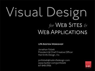
1. Visual Design
for Web
Sites &
Web Applications
UPA Boston Workshop
Jonathan Folle
President & Chief Creative O icer
Hot Knife Design, Inc.
jonfolle @hotknifedesign.com
www.twi er.com/jonfolle
617-848-5956
2. about you
how many people here are:
usability practitioners?
developers?
designers?
project managers?
all of the above?
other?
20. web typography
typesetting considerations
serif or sans serif?
line length (12 words is good)
leading (1.1 - 1.5 em)
le er spacing - lower case, don’t do it!
kerning - the space between individual le ers
color - type vs. white space
21. everything you wanted to know about
Web Safe Fonts
in 2009
OS stats from codestyle.org
22. web typography
Georgia is
gorgeous.
Designed by: Ma hew Carter (1996)
PC: 95.98% Mac 94.06%
A transitional serif that’s easy to read
due to its large x-height.
23. web typography: type specimen via wikipedia
The quick brown fox
jumped over the lazy dog
repeatedly from 1876 -
2009.
25. web typography
Verdana is so darn
easy to read.
Verdana bold is
crazy big.
Designed by: Ma hew Carter (1996)
PC: 98.34% Mac 95.45%
Humanist sans-serif with large
x-height for good legibility.
27. web typography
Lucida is the default of the
Facebook phenomenon.
Use Lucida Grande for
Mac, and Lucida Sans
Unicode for PC.
Designed by: Charles Bigelow & Chris Holmes (1985)
PC: 96.14% Mac 94.46%
28. web typography
Palatino is underused
and underappreciated,
especially the italic.
1234567890 * &
Designed by: Hermann Zapf (1948)
PC: 97.83% Mac 78.81%
29. web typography
Arial is not nearly as fun
as Helvetica, but has a
wicked cool compatriot
Arial Black.
Designed by: Robin Nicholas & Patricia Saunders (1982)
PC: 98.01% Mac 96.83%
31. web typography
Gill Sans
abcdefghijklmnopqrstuvwxyz
ABCDEFGHIJKLMNOPQRSTUVWXYZ
1234567890
Designed by: Eric Gill (1926)
PC: 51.00% Mac 91.11%
Humanist sans-serif
32. web typography
Helvetica Neue
the quick brown fox jumped over
the lazy dog
ABCDEFGHIJKLMNOPQRSTUVWXYZ
1234567890
Designed by: Max Miedinger & Eduard Ho mann (1957)
PC: 1.33% Mac 93.33%
33. web typography
what about non-Web safe fonts?
pixel renderings [image file]
sIFR [flash]
cufon [javascript]
typekit [javascript]
43. what was old is new again
Since the 1930s, graphic designers have used
grid systems for laying out pages. Over the past
5 years, Web site and Web application designers
have shown an increased interest in the
technique as well.
44. why bother with a grid?
consistency
framework for many pages
ease of use
pre-existing structure