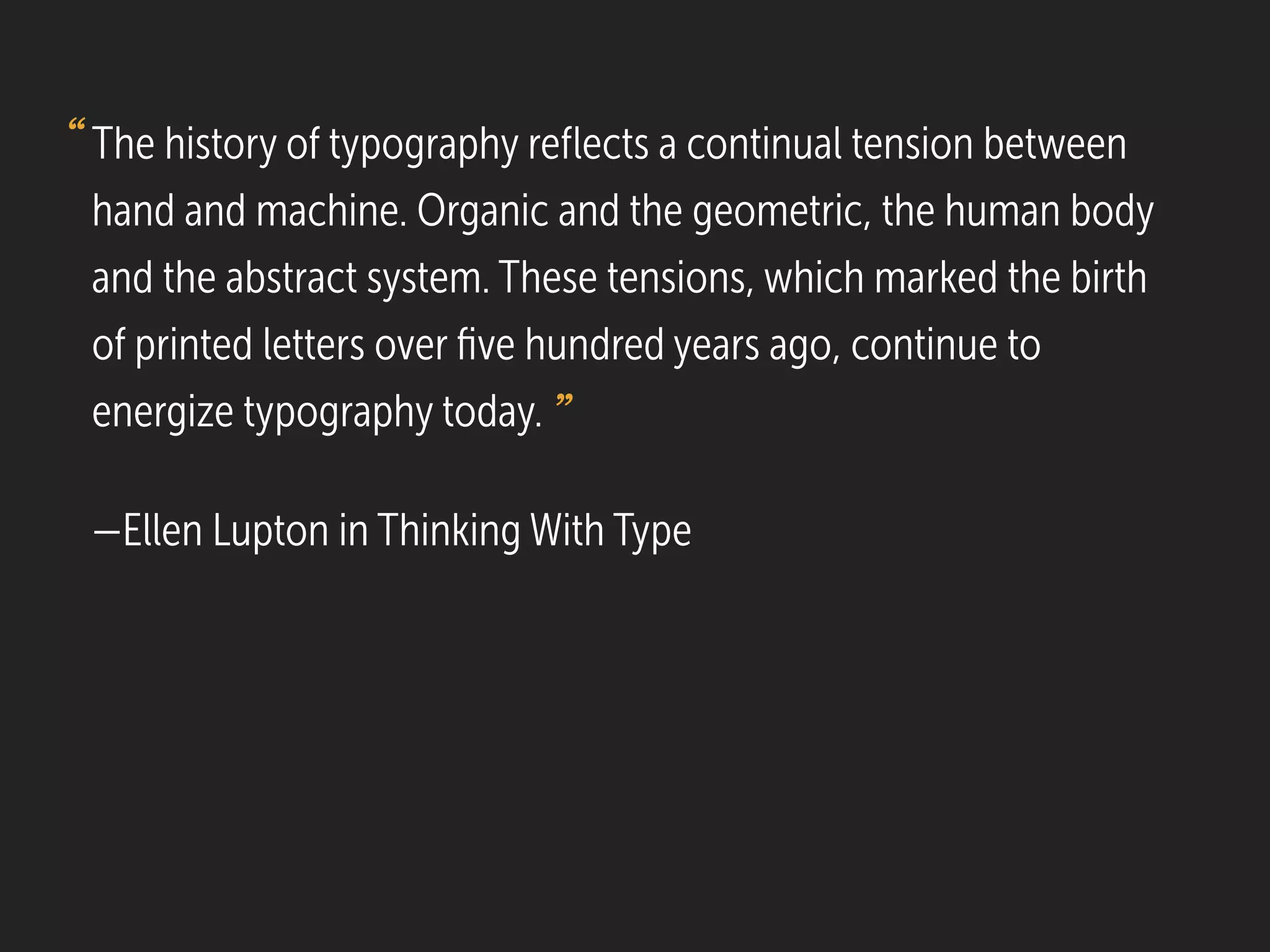
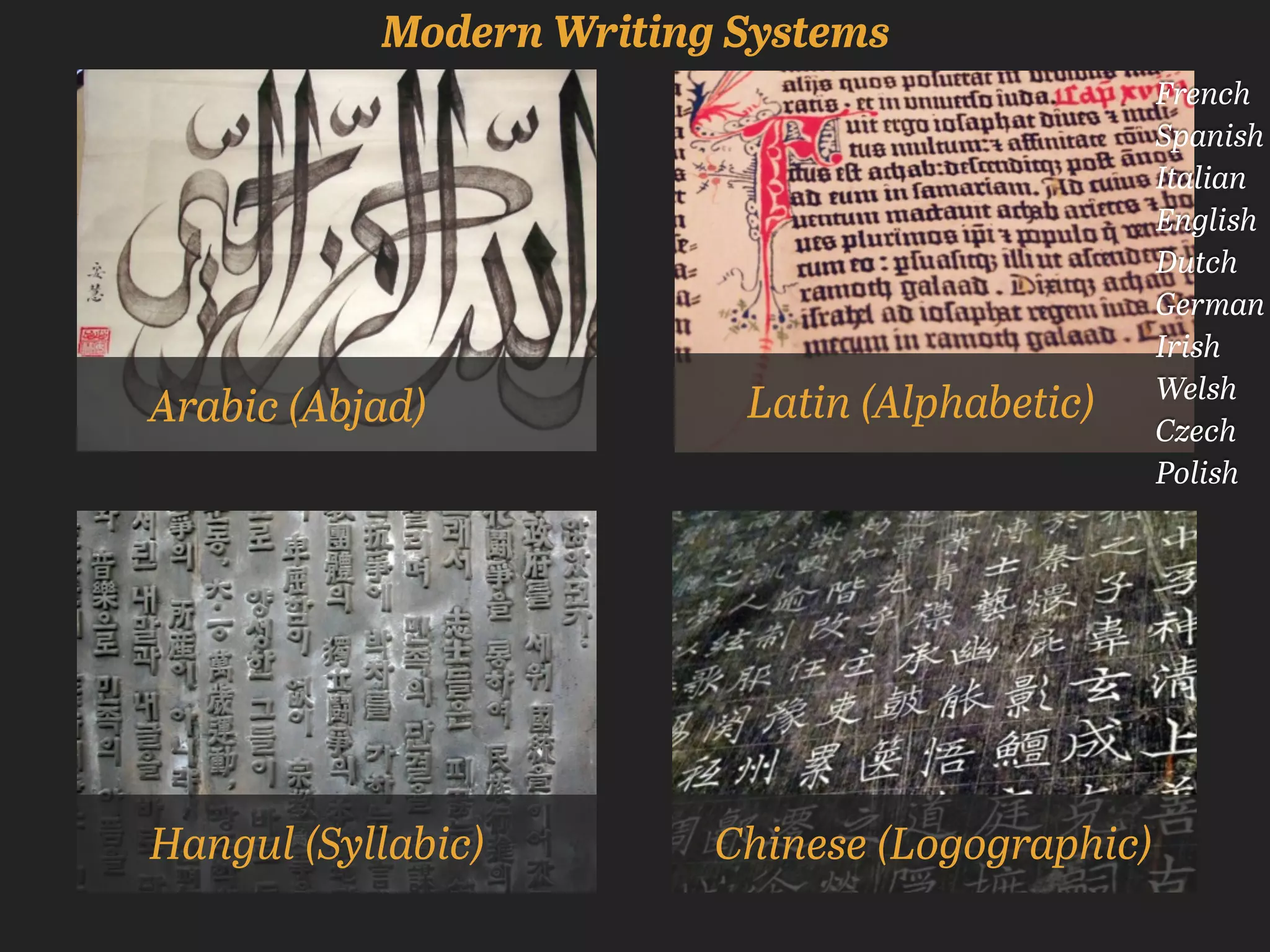
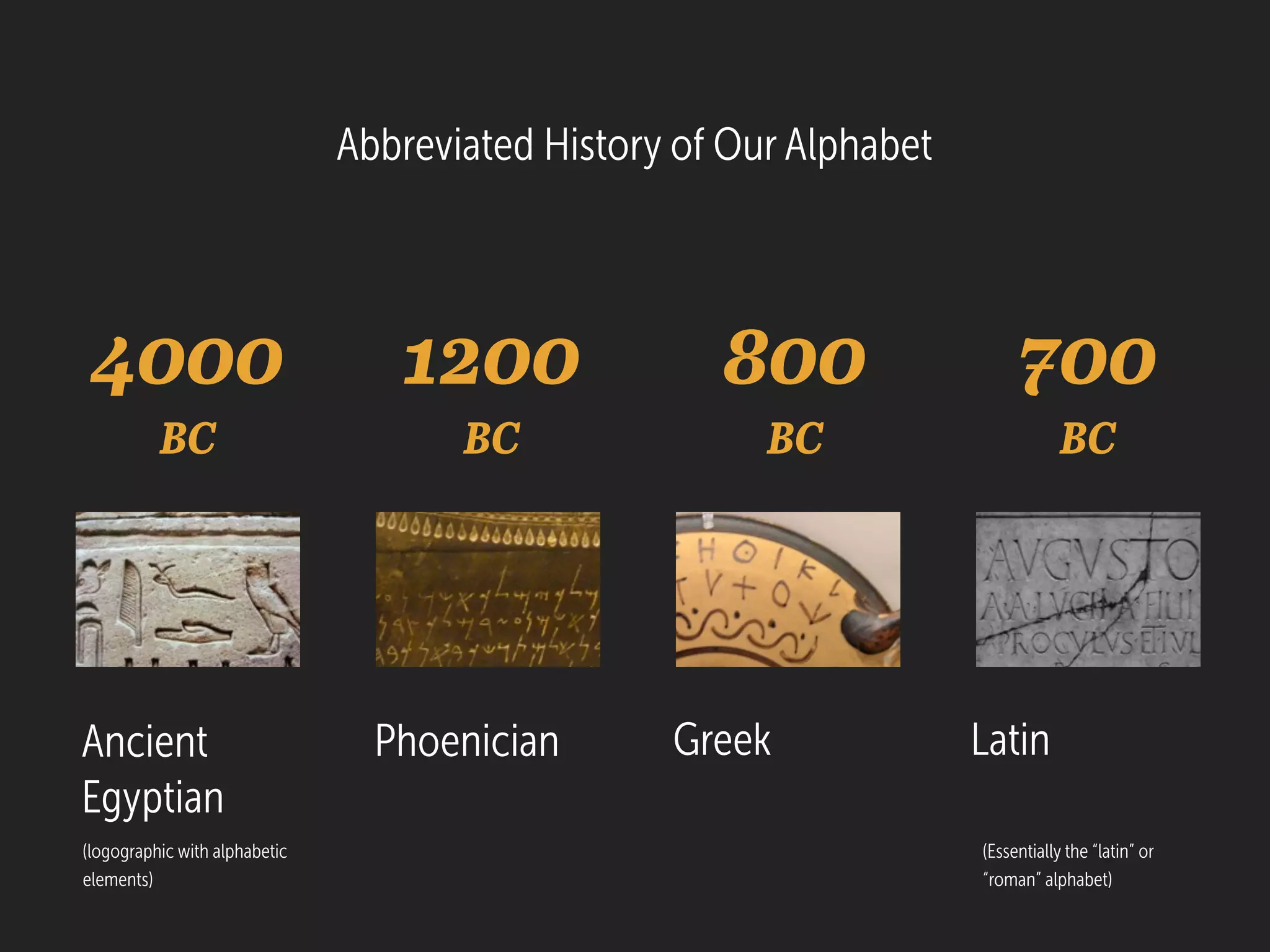
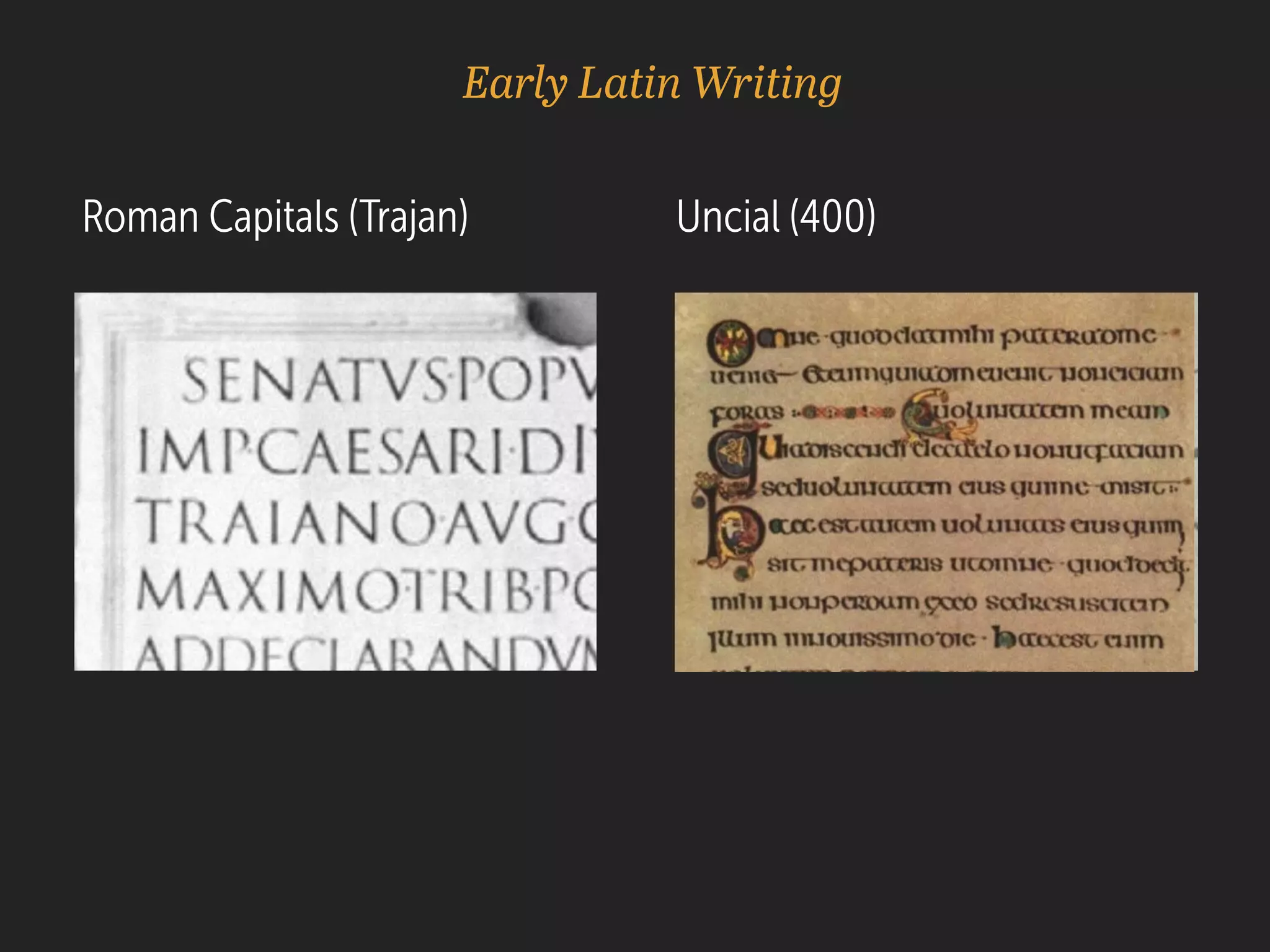
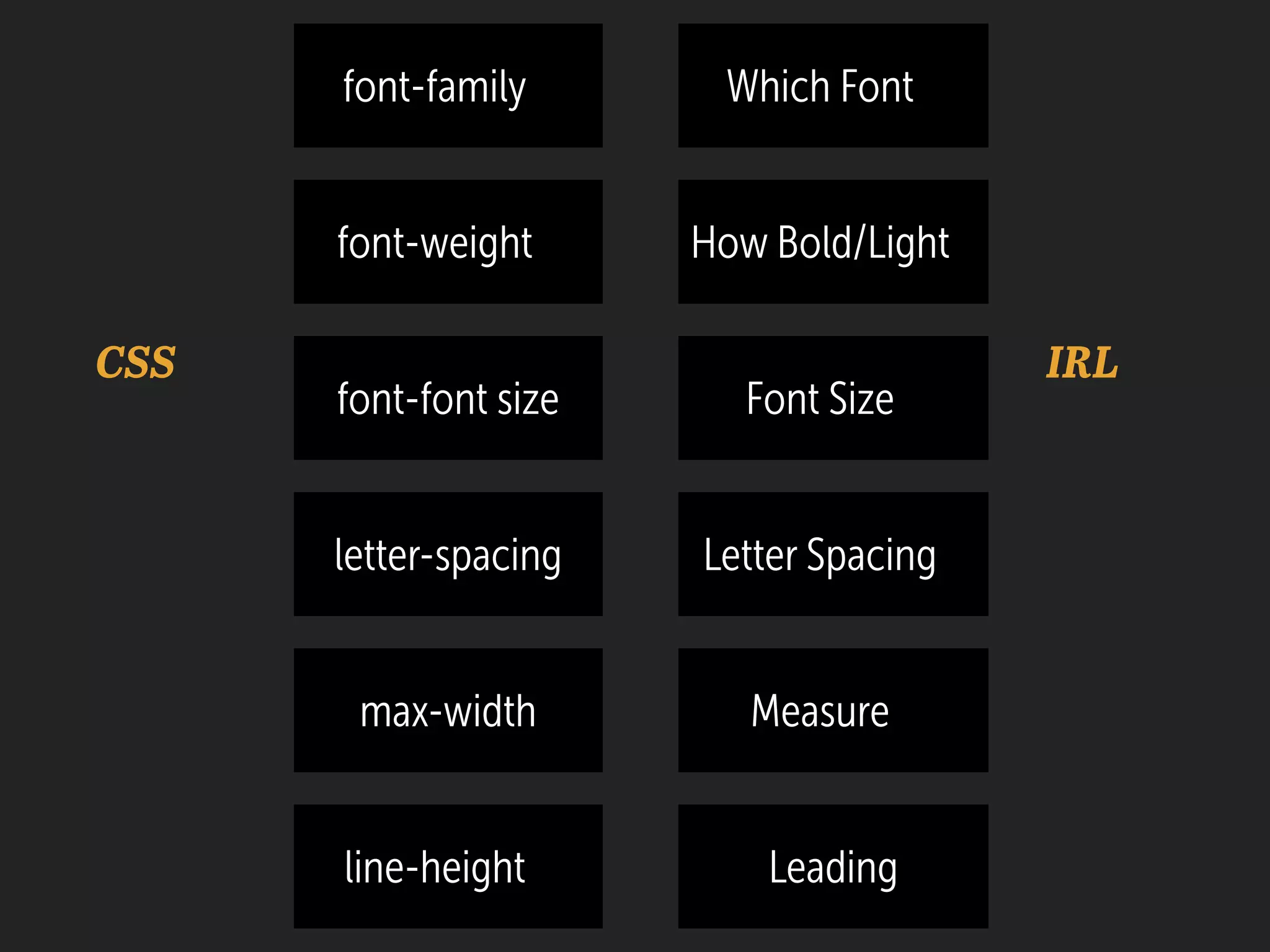
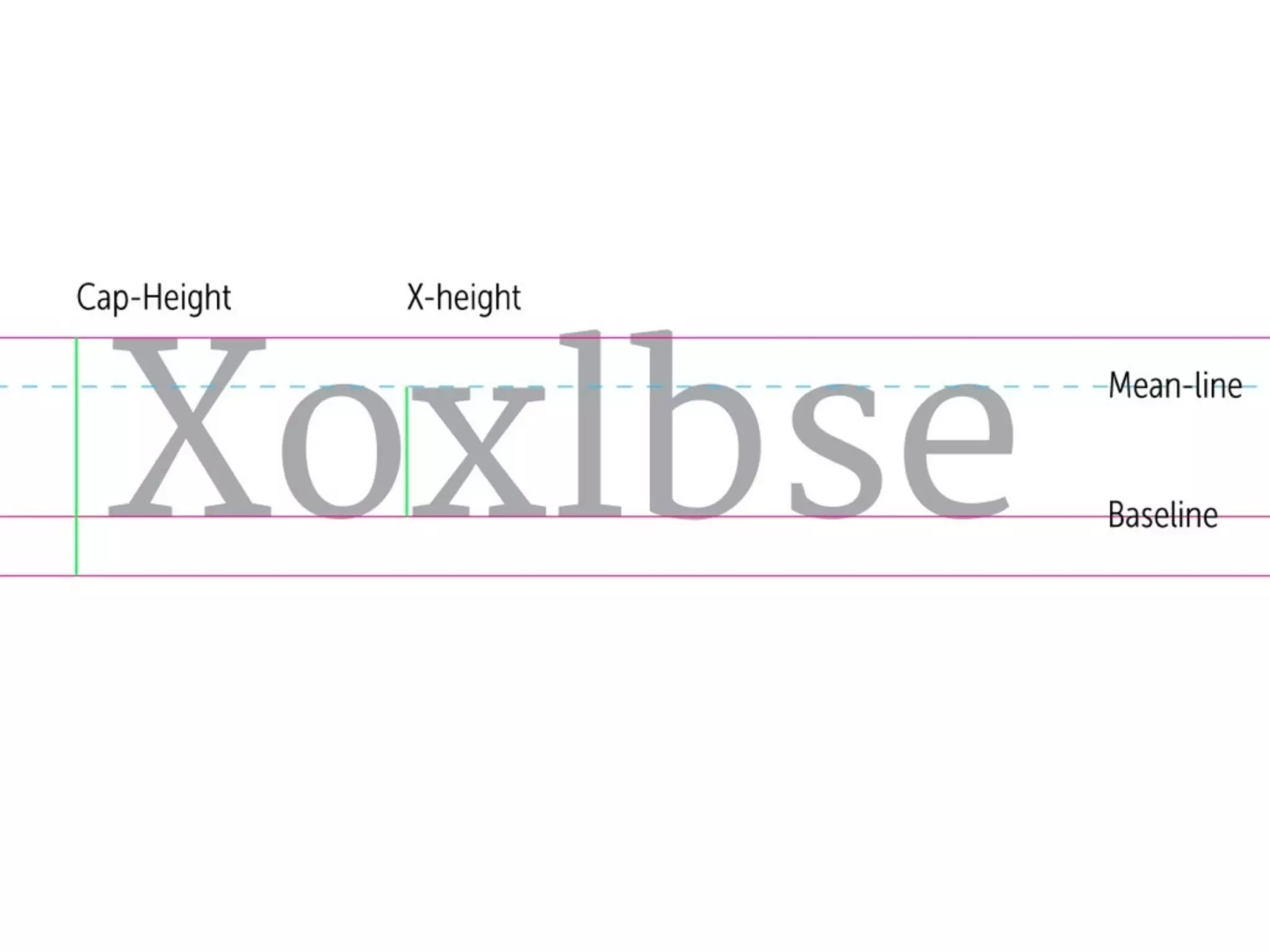
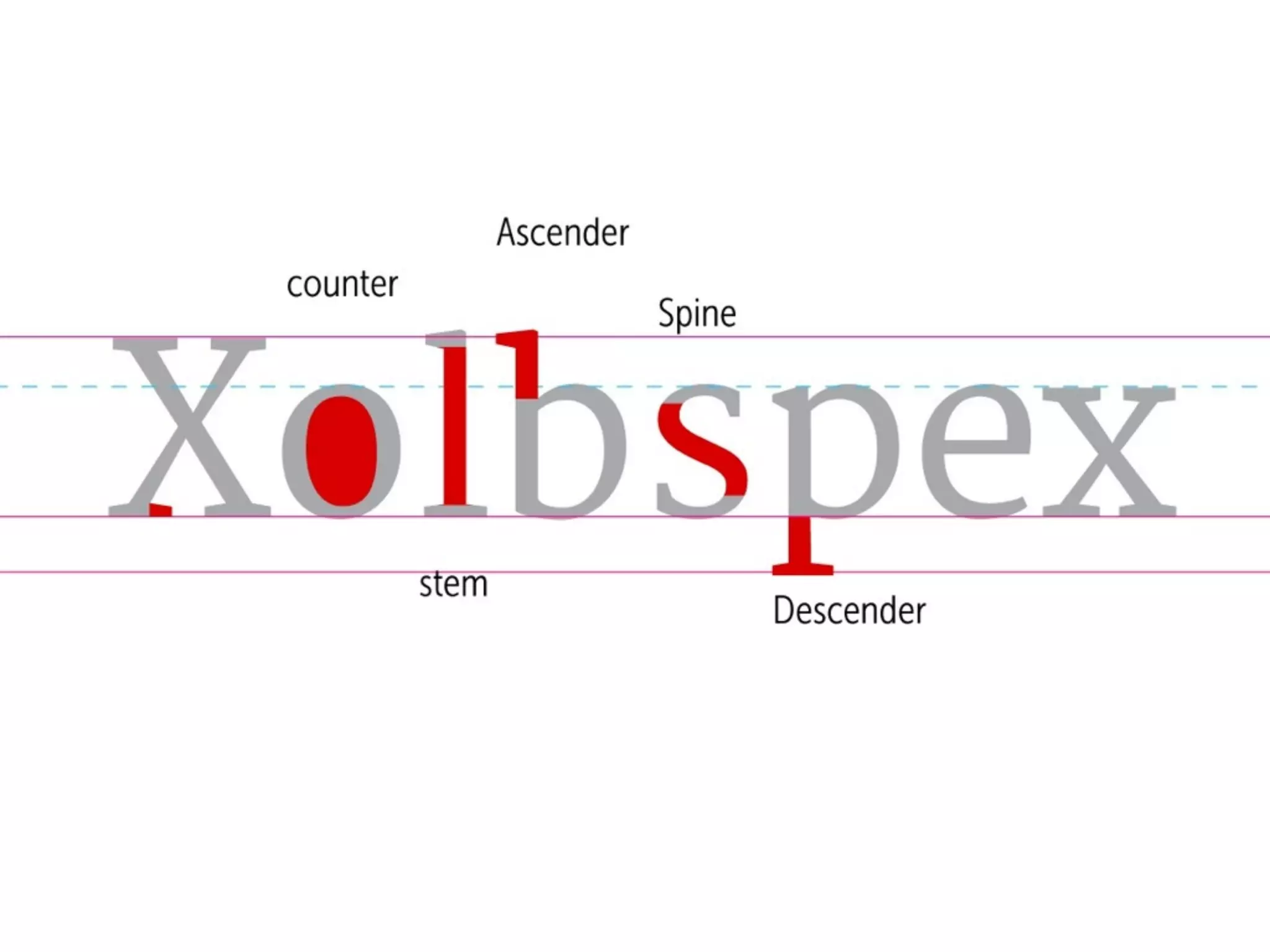
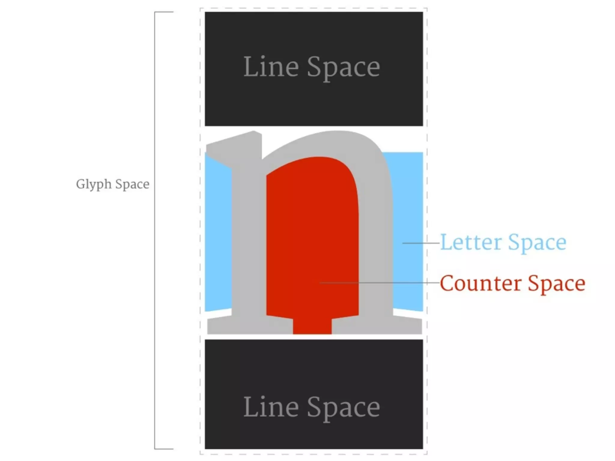
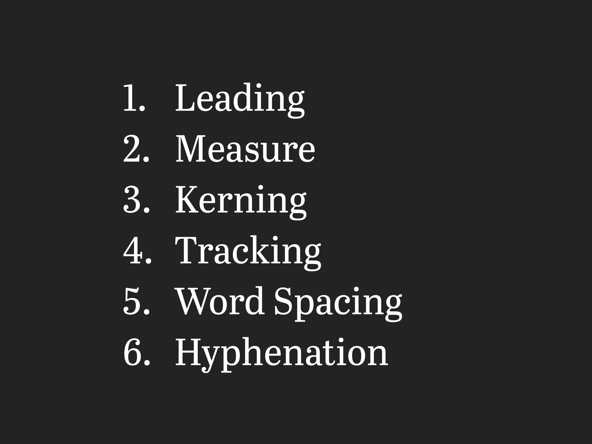
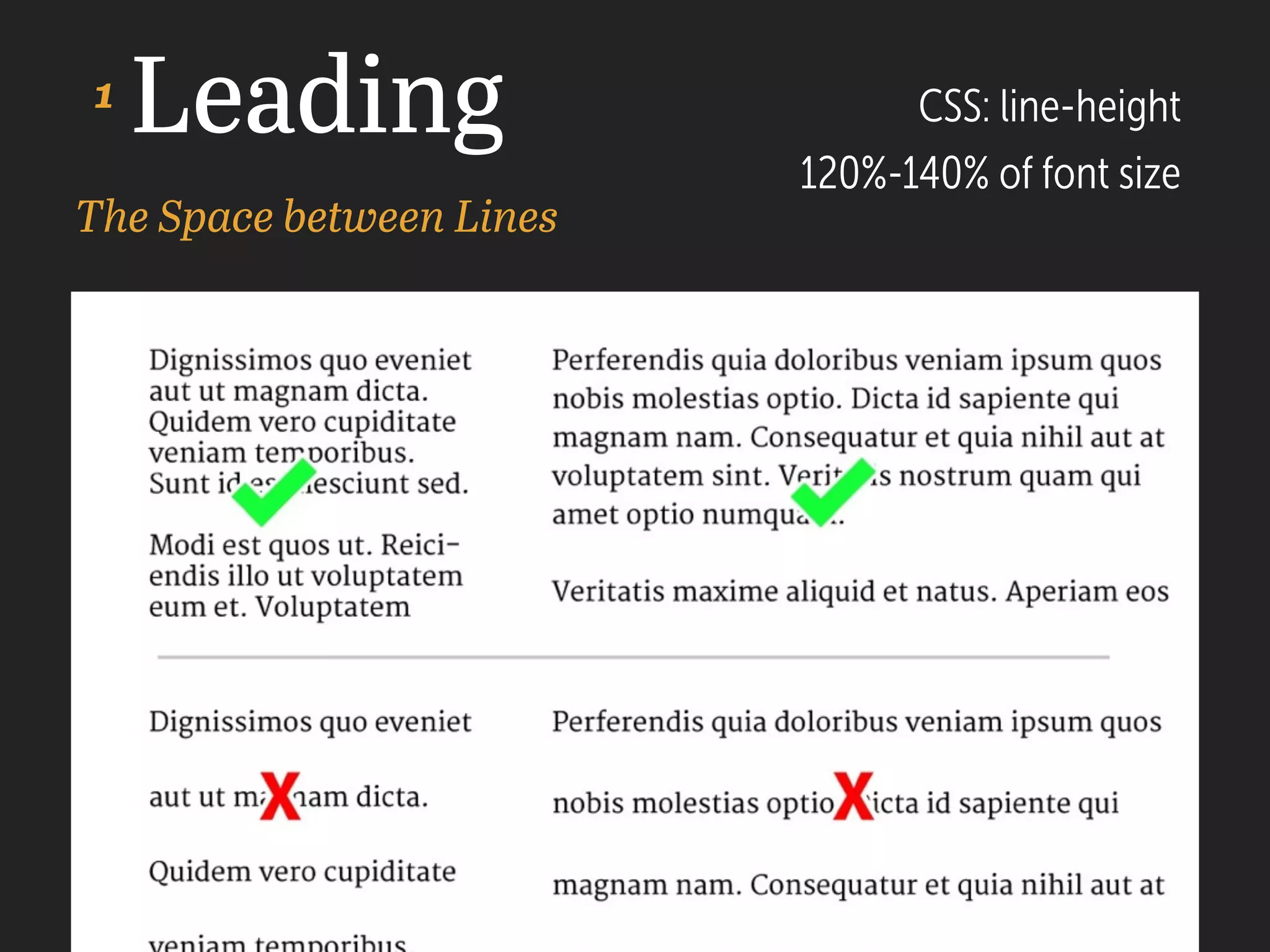
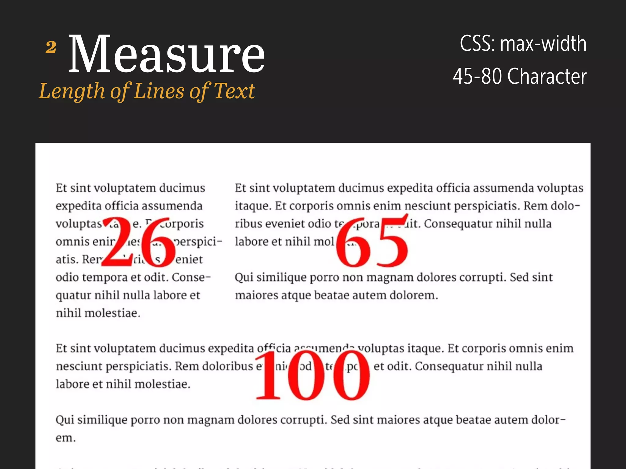
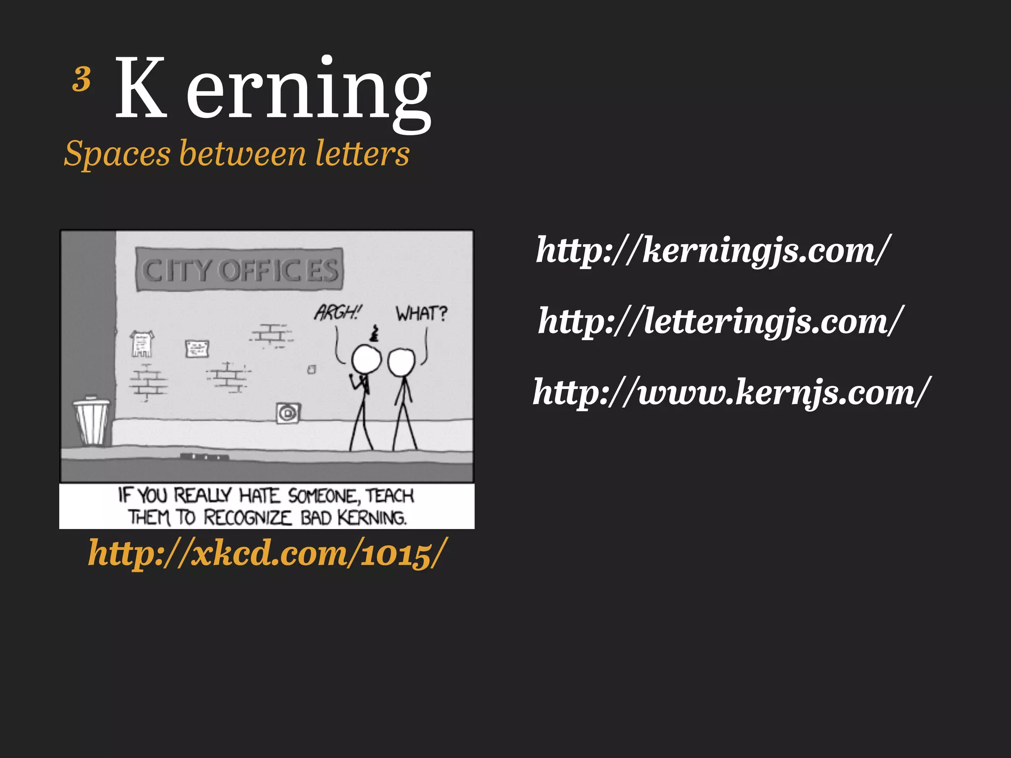
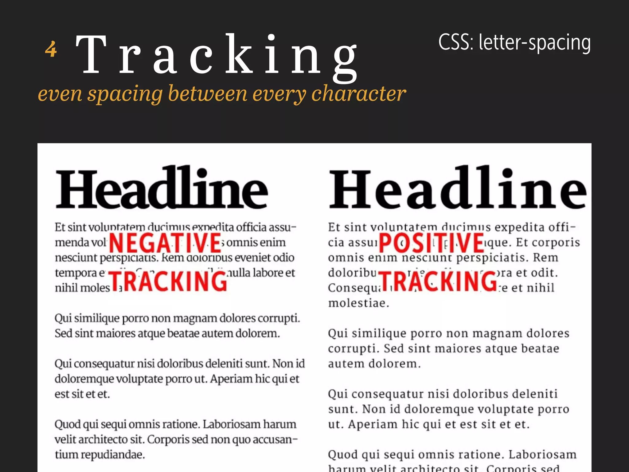
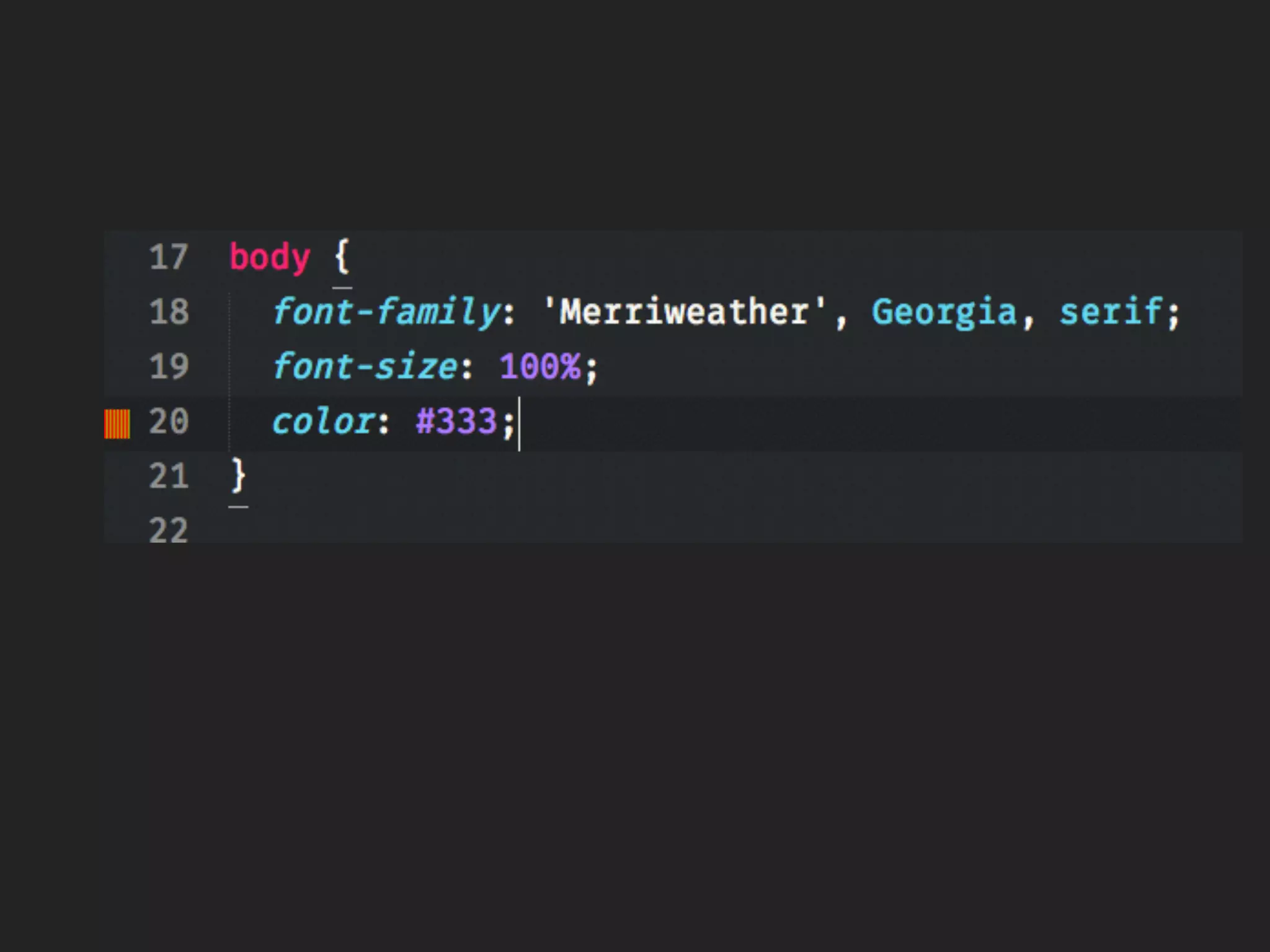
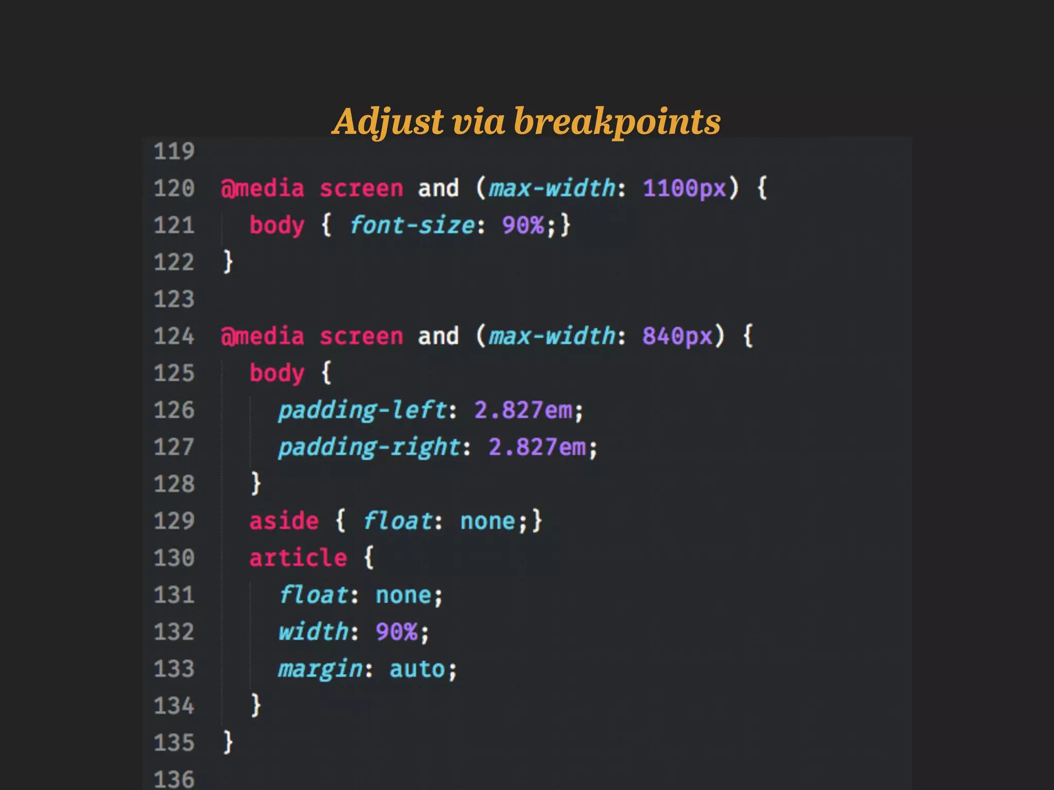
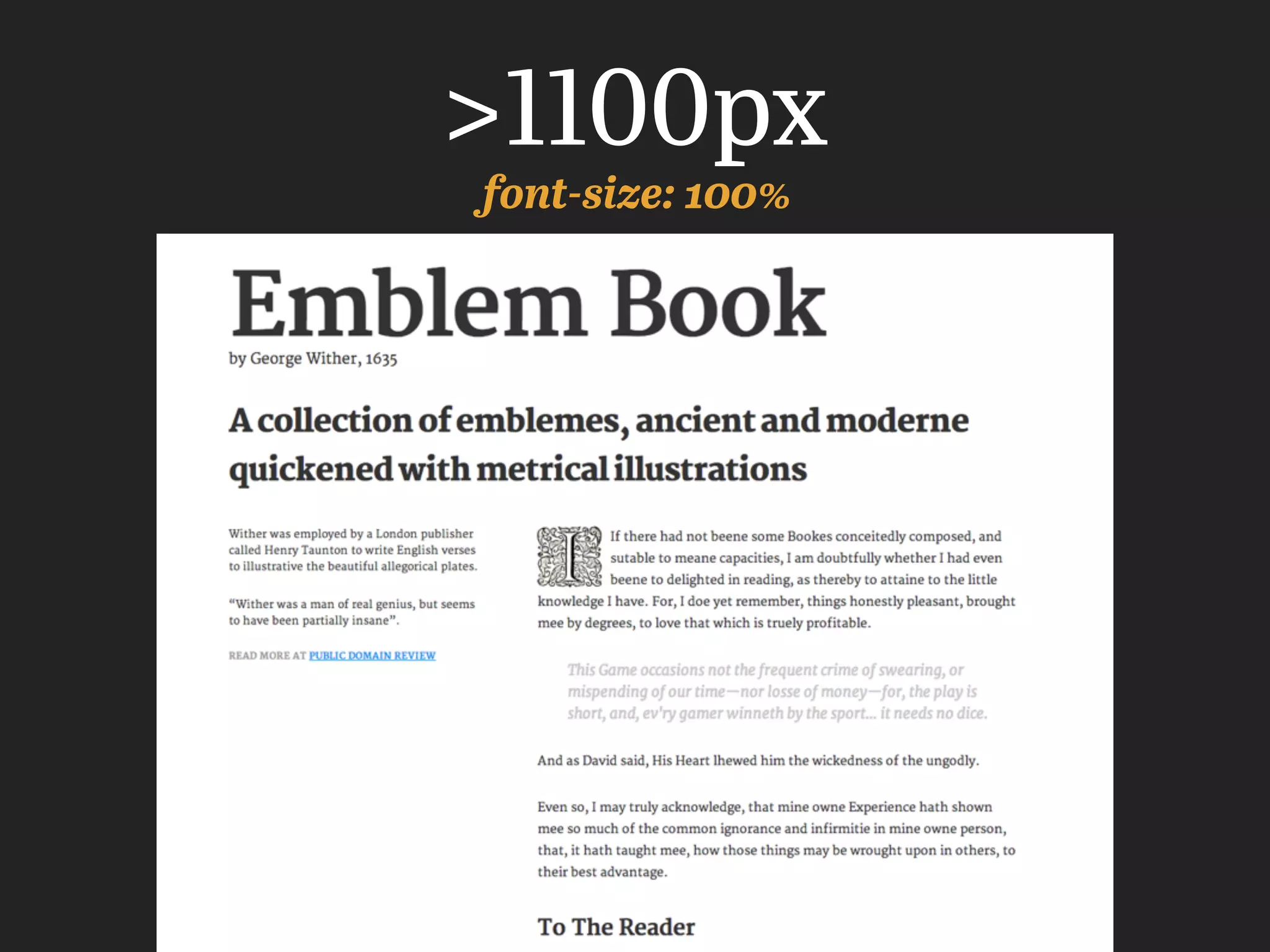
This document summarizes the history of typography and provides practical tips for using typography effectively on the web. It discusses how typography has evolved from ancient writing systems to modern digital fonts. It also covers topics like choosing appropriate typefaces for context, using techniques like leading, kerning and tracking to improve readability, and making typography responsive for different screen sizes with relative units and media queries. The goal is to demonstrate the impact of typography and give practical ways to improve typography skills across multiple platforms.
2010 was the year of web typography—the year new technologies came online that will forever change the way information appears online. As the dust settles from the advances of web fonts and CSS3, a new style of web typography is emerging, one that reflects print origins, but is also experimenting with the unique strengths of online communication. Learn about recent advances in technology through case studies at the boundaries of online typography. See how to use the new web typography to set your work apart from the rest of the herd.
The Typography is an almost six-centuries-old practice, and we’ve came a long way since Gutenberg’s moveable types to the digital documents as we know it. But somewhere in between, the craftsmanship and best practices of printers and engravers were long forgotten by many web developers—who end up relying on the browser, frameworks, and trial-and-error values to properly display a website’s content.
In this talk, we’ll journey through the basic concepts of Typography; how we can use them to improve a content’s identity, architecture, and readability; and how to do it through HTML and CSS.
Given at the Western MA WordPress meetups, 5/30/12. A short presentation on webfonts. The talk featured a brief introduction to webfonts, considerations for picking the right webfont, and integrating webfonts into WordPress.
A very brief look at where certain aspects of typography on the web are today — specifically, methods for replacing OS defaults with other typefaces.
The slides are guides used for a quick (15-20 minute) talk at Refresh Lauderdale, rather than informational, with the exception of the references section at the end, which includes many great resources for typography in general, as well as for setting type on the web in all forms.
20 steps to drive content marketing success with SEOKevin Gibbons
This presentation is about what I feel is the right way to do content marketing. A strategy first approach is essential to making sure you're not just going from campaign to campaign, instead you're building short-term impact into longer success.
The fifth rendition of my Beautiful Web Typography with some updates, additional info, more links and whatnot. A new section has been added focusing on webfonts (font linking and embedding) with the recent developments in that regard.
Kudos should go out to the chaps listed in the end as well as inspirational peeps like Ellen Lupton, whose categorisation of things type into letter, text, grid I’ve used to structure this talk.
Web Safe Fonts are Dead Series | Part 1: Web Typography ReincarnatedExtensis
Thomas Phinney introduces web fonts, covers font selection and combination, and also includes:
• How and why mobile devices and iOS have killed off web safe fonts
• Best practices for picking and combining individual typefaces
• On-screen text rendering differences
• Creative inspiration for designing with web fonts in Adobe® Photoshop®
A talk about how far fonts have come on the web and why this is the beginning of a new age for using beautiful fonts everywhere.
Originally presented by Aaron Stanush (Four Kitchens) and Kevin O'Leary (Acquia) at DrupalCon Chicago 2010.
http://chicago2011.drupal.org/sessions/type-revolutionary-s-cookbook
Let's talk about web typography!
Ever spent countless hours crafting a totally awesome type system for your beautiful design, only to have it lost in translation when it goes to development? Examine type and icon fonts through a developer lens, and learn how designers and front-end developers can work together to get everyone on the same (elegantly designed) page!
White wonder, Work developed by Eva TschoppMansi Shah
White Wonder by Eva Tschopp
A tale about our culture around the use of fertilizers and pesticides visiting small farms around Ahmedabad in Matar and Shilaj.
Hello everyone! I am thrilled to present my latest portfolio on LinkedIn, marking the culmination of my architectural journey thus far. Over the span of five years, I've been fortunate to acquire a wealth of knowledge under the guidance of esteemed professors and industry mentors. From rigorous academic pursuits to practical engagements, each experience has contributed to my growth and refinement as an architecture student. This portfolio not only showcases my projects but also underscores my attention to detail and to innovative architecture as a profession.
Dive into the innovative world of smart garages with our insightful presentation, "Exploring the Future of Smart Garages." This comprehensive guide covers the latest advancements in garage technology, including automated systems, smart security features, energy efficiency solutions, and seamless integration with smart home ecosystems. Learn how these technologies are transforming traditional garages into high-tech, efficient spaces that enhance convenience, safety, and sustainability.
Ideal for homeowners, tech enthusiasts, and industry professionals, this presentation provides valuable insights into the trends, benefits, and future developments in smart garage technology. Stay ahead of the curve with our expert analysis and practical tips on implementing smart garage solutions.
Can AI do good? at 'offtheCanvas' India HCI preludeAlan Dix
Invited talk at 'offtheCanvas' IndiaHCI prelude, 29th June 2024.
https://www.alandix.com/academic/talks/offtheCanvas-IndiaHCI2024/
The world is being changed fundamentally by AI and we are constantly faced with newspaper headlines about its harmful effects. However, there is also the potential to both ameliorate theses harms and use the new abilities of AI to transform society for the good. Can you make the difference?
You could be a professional graphic designer and still make mistakes. There is always the possibility of human error. On the other hand if you’re not a designer, the chances of making some common graphic design mistakes are even higher. Because you don’t know what you don’t know. That’s where this blog comes in. To make your job easier and help you create better designs, we have put together a list of common graphic design mistakes that you need to avoid.
Book Formatting: Quality Control Checks for DesignersConfidence Ago
This presentation was made to help designers who work in publishing houses or format books for printing ensure quality.
Quality control is vital to every industry. This is why every department in a company need create a method they use in ensuring quality. This, perhaps, will not only improve the quality of products and bring errors to the barest minimum, but take it to a near perfect finish.
It is beyond a moot point that a good book will somewhat be judged by its cover, but the content of the book remains king. No matter how beautiful the cover, if the quality of writing or presentation is off, that will be a reason for readers not to come back to the book or recommend it.
So, this presentation points designers to some important things that may be missed by an editor that they could eventually discover and call the attention of the editor.
Between Filth and Fortune- Urban Cattle Foraging Realities by Devi S Nair, An...Mansi Shah
This study examines cattle rearing in urban and rural settings, focusing on milk production and consumption. By exploring a case in Ahmedabad, it highlights the challenges and processes in dairy farming across different environments, emphasising the need for sustainable practices and the essential role of milk in daily consumption.
11. Why I’m personally
interested in typography
Tim Brown’s More Perfect Typography
After watching this I
knew I was supposed to
be a designer.
http://vimeo.com/17079380
12. 3 Goals Today
• Show the impact of typography
• Show where typography is from and where
its’ going
• Give you practical ways to practice (on as
many platforms as possible)
13. Obstacles
• Type is hard
• There are no rules
• There are a lot of variables
14. Worth It
• Happier Users
• Represents Content Better
• Works on more platforms
19. The history of typography reflects a continual tension between
hand and machine. Organic and the geometric, the human body
and the abstract system. These tensions, which marked the birth
of printed letters over five hundred years ago, continue to
energize typography today.
—Ellen Lupton in Thinking With Type
“
”
20. Modern Writing Systems
Arabic (Abjad)
Hangul (Syllabic)
Latin (Alphabetic)
French
Spanish
Italian
English
Dutch
German
Irish
Welsh
Czech
Polish
Chinese (Logographic)
21. Ancient
Egyptian
Abbreviated History of Our Alphabet
Phoenician Greek
(logographic with alphabetic
elements)
4000
BC
Latin
1200
BC
800
BC
700
BC
(Essentially the “latin” or
“roman” alphabet)
26. Gutenberg’s Textura (1450) Garamond (1530)
Old StyleTextura
http://newwebtypography.com/blog/2014/02/towards-a-more-perfect-webfont-type-classification/
27. Transitional
Caslon (1720) Bodoni (1798)
Modern
http://newwebtypography.com/blog/2014/02/towards-a-more-perfect-webfont-type-classification/
28. Humanist Sans
Gill Sans (1926)
Egyptian/Slab Serif
1815
http://newwebtypography.com/blog/2014/02/towards-a-more-perfect-webfont-type-classification/
49. Additional Resources
Pixels vs EM vs REM (and vh, vw)
Mapping Typography to CSS (don’t fear web typography)
HTML/CSS Typography Primer
http://j.eremy.net/confused-about-rem-and-em/
http://adamschwartz.co/magic-of-css/chapters/5-typography/
http://www.dontfeartheinternet.com/css/don%E2%80%99t-fear-web-
typography
http://css-tricks.com/viewport-sized-typography/