Download as PDF, PPTX


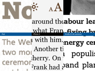


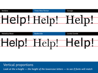
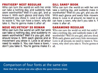


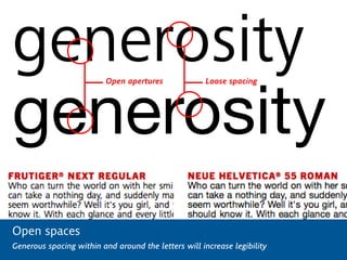


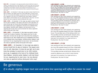
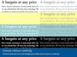


This document discusses best practices for using fonts on screens. It notes that screen typography is still evolving and font rendering can vary across platforms and devices. Different formats and licenses may be required for web fonts versus embedded fonts. When rendering fonts on screens, rasterizers convert vector outlines to pixels in different ways depending on the device. The document provides examples of how LCD and e-ink screens display pixels. It recommends choosing fonts designed for screens that have vertical proportions, shapes, spacing, and weights suitable for small sizes. Adjusting line height and size can improve readability when combining fonts. Font designers are working to optimize existing fonts and design new fonts specifically for legibility on screens.


![Things I Know About Type [Field Guide]](https://cdn.slidesharecdn.com/ss_thumbnails/thingsiknowabouttype-fieldguide-121030022134-phpapp02-thumbnail.jpg?width=640&height=640&fit=bounds)


![[DevDay2019] Spacing and Typography, keys to a professional UI design - By Ng...](https://cdn.slidesharecdn.com/ss_thumbnails/duongnguyen-typographyspacing-190408082945-thumbnail.jpg?width=640&height=640&fit=bounds)


![5G Explained! A High Level Overview [Introduction]](https://cdn.slidesharecdn.com/ss_thumbnails/5gexplainedahighleveloverview-260119165306-cc137a3e-thumbnail.jpg?width=640&height=640&fit=bounds)


