Download as PDF, PPTX

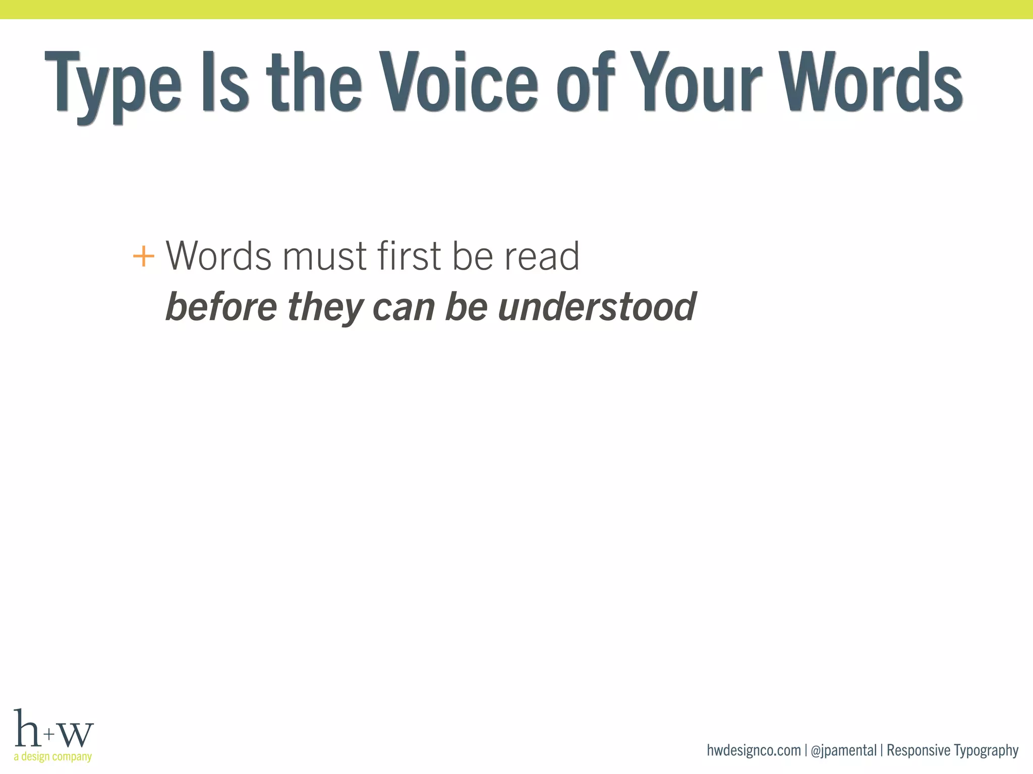
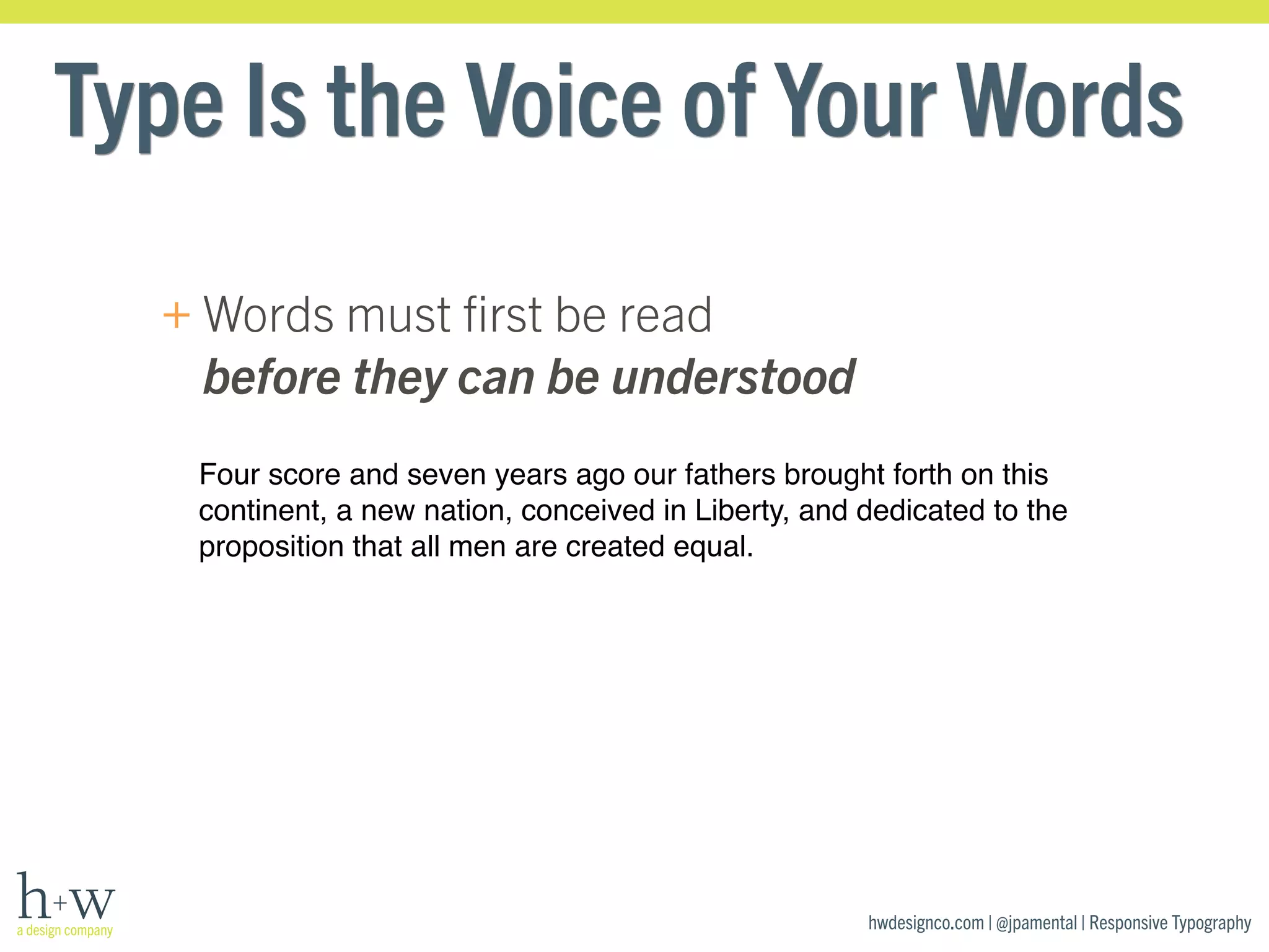
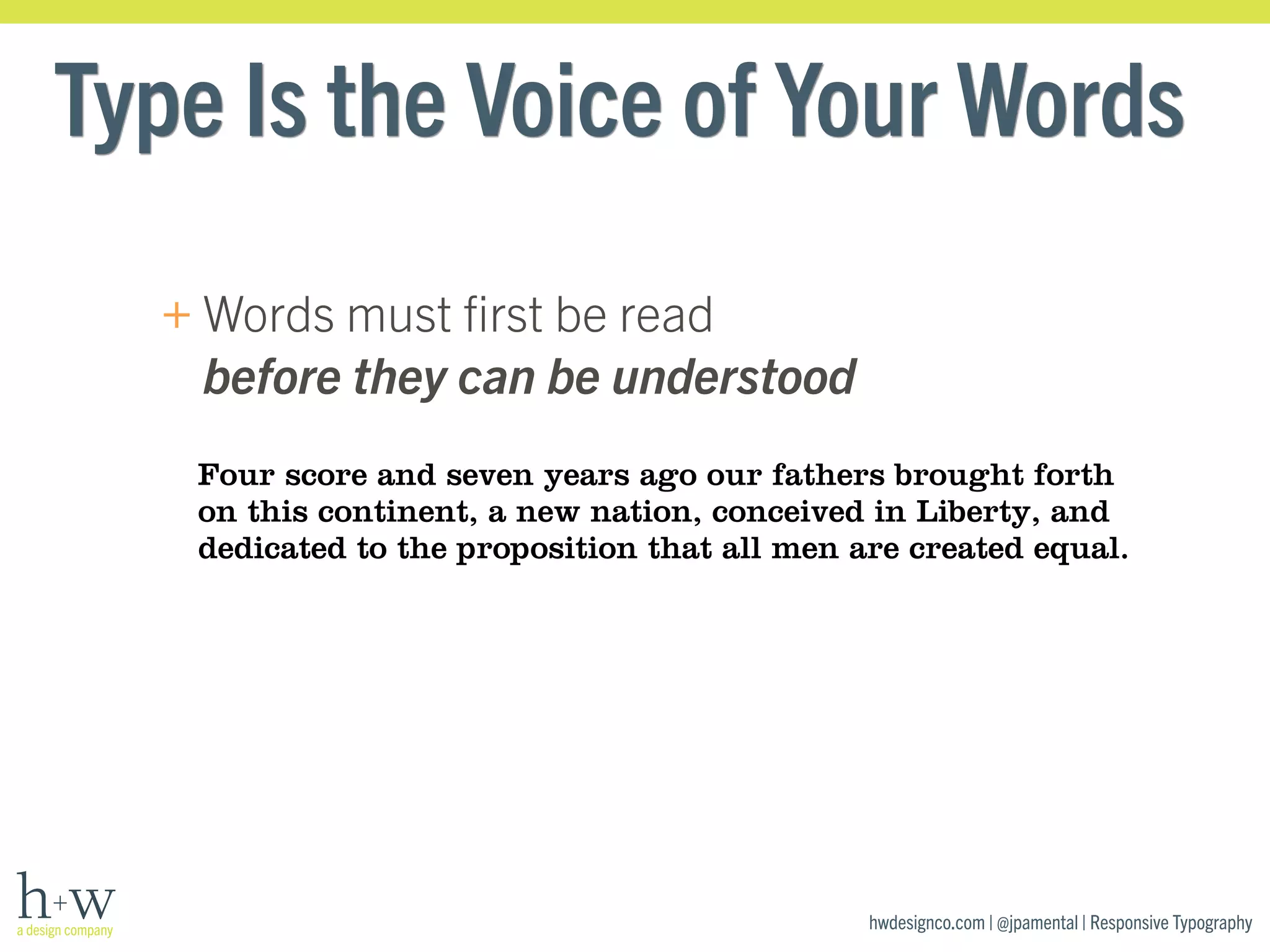
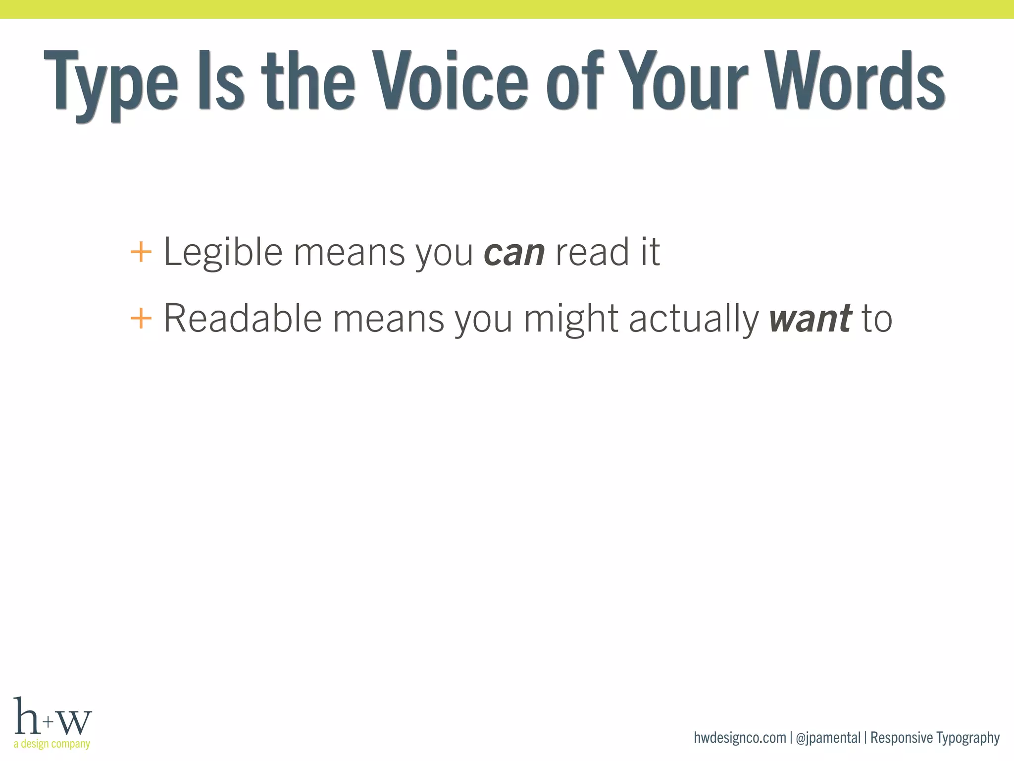
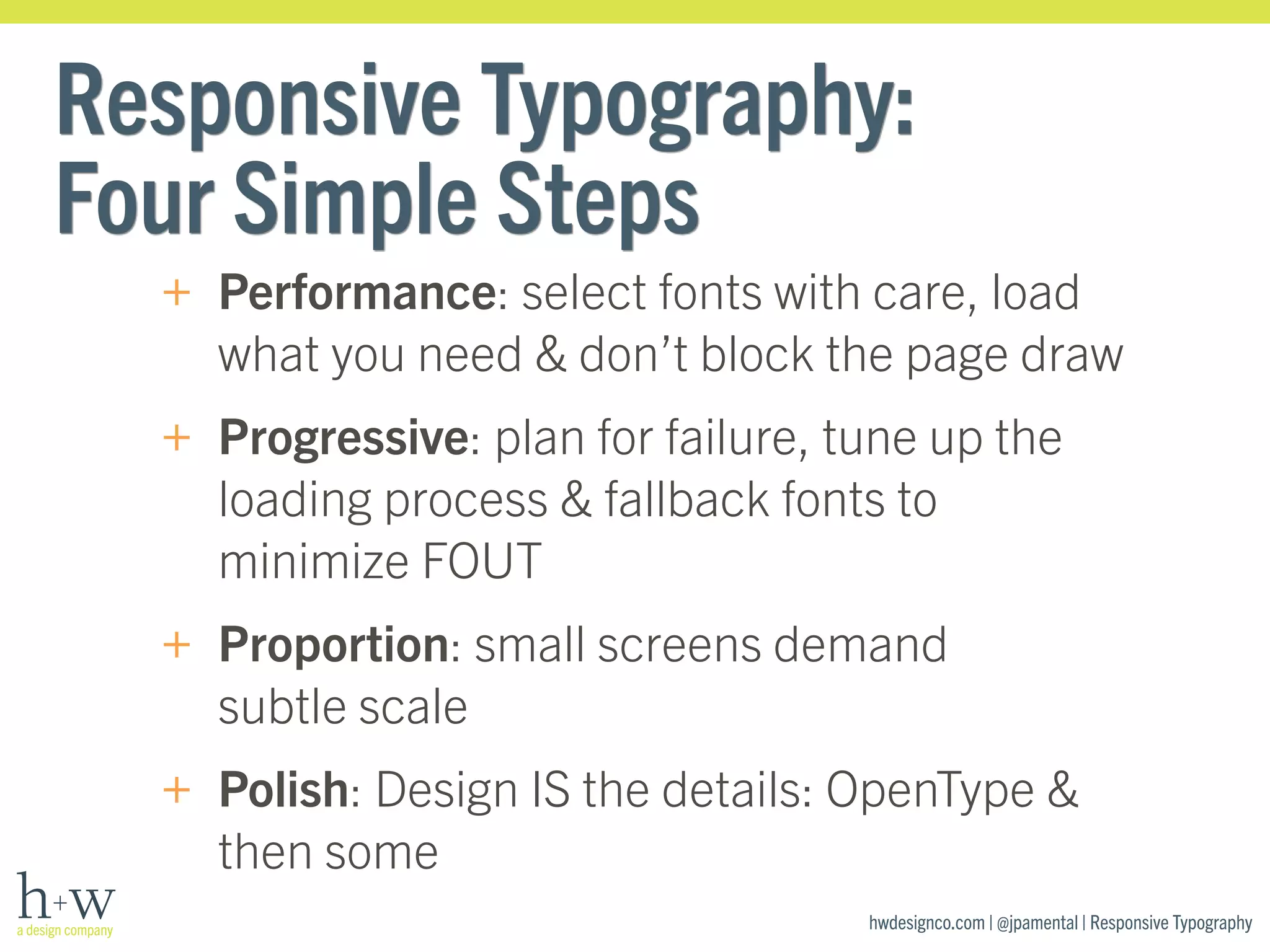
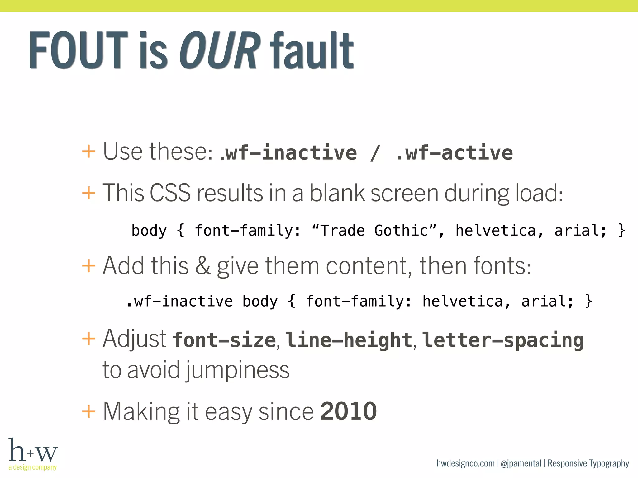
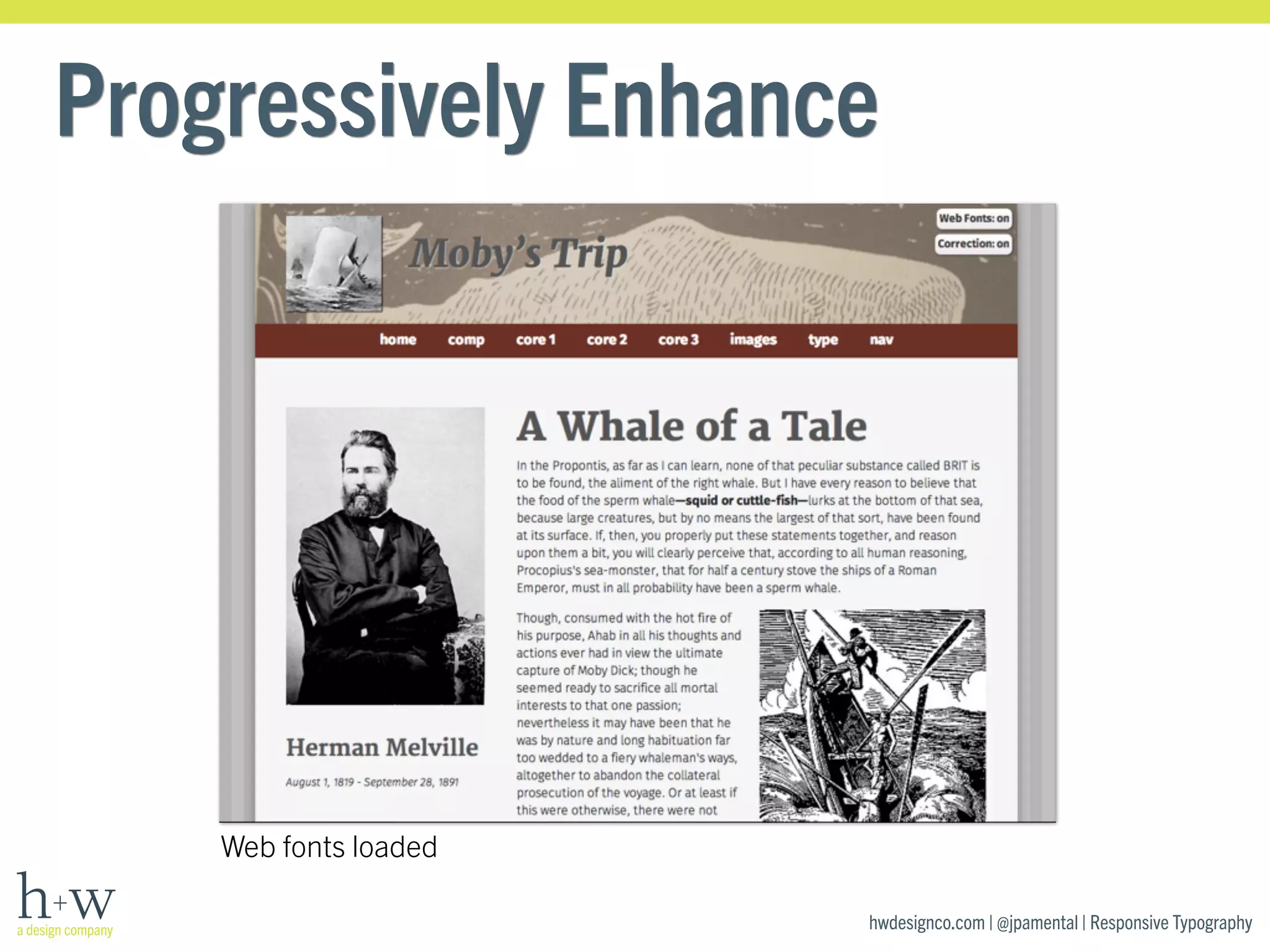
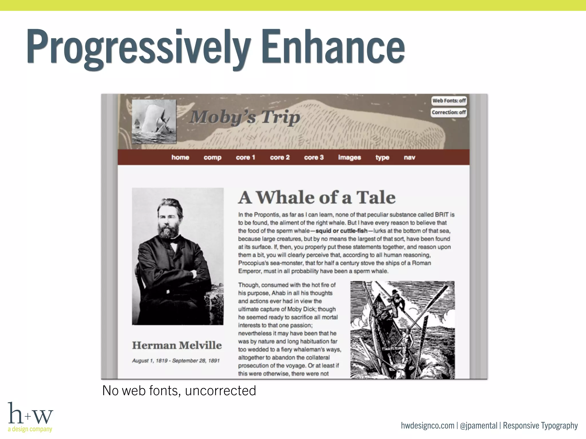
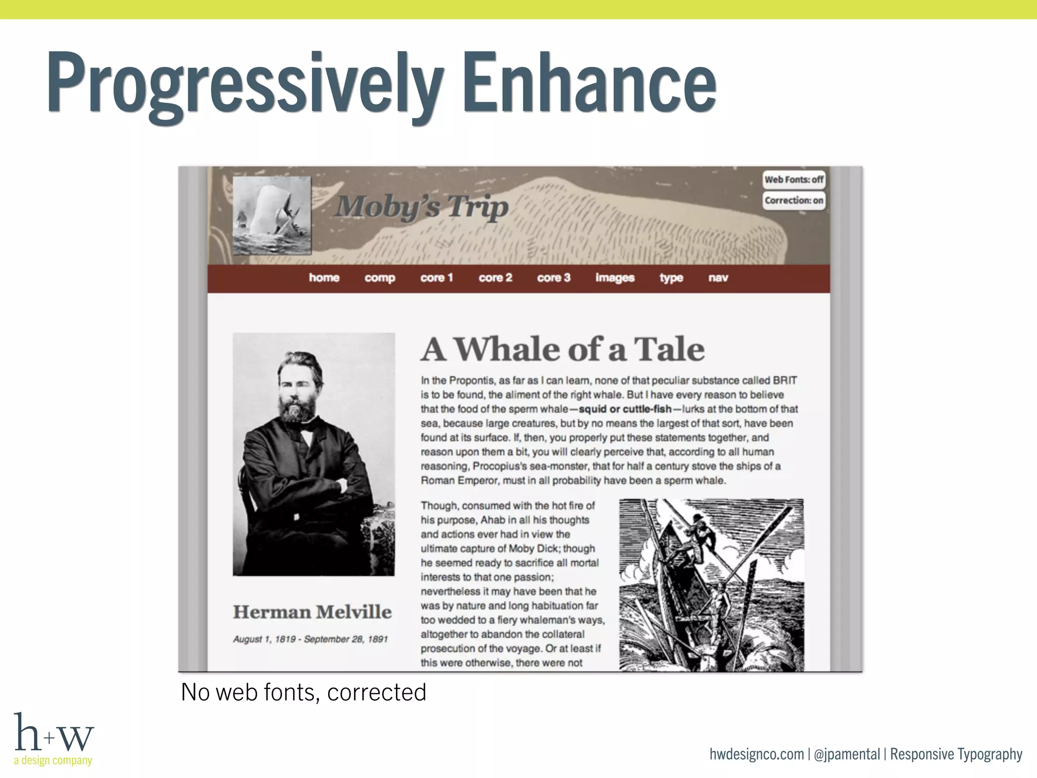

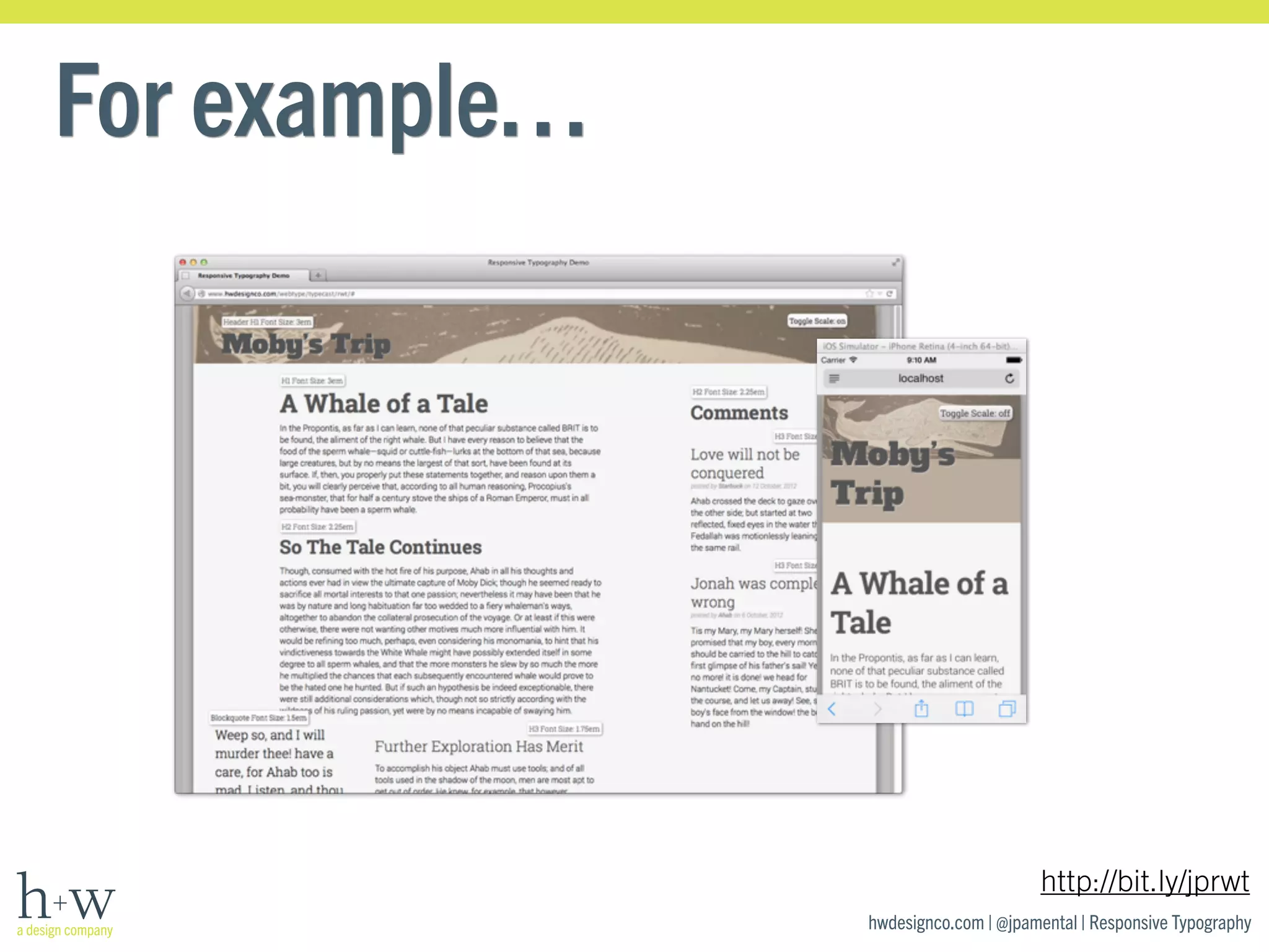
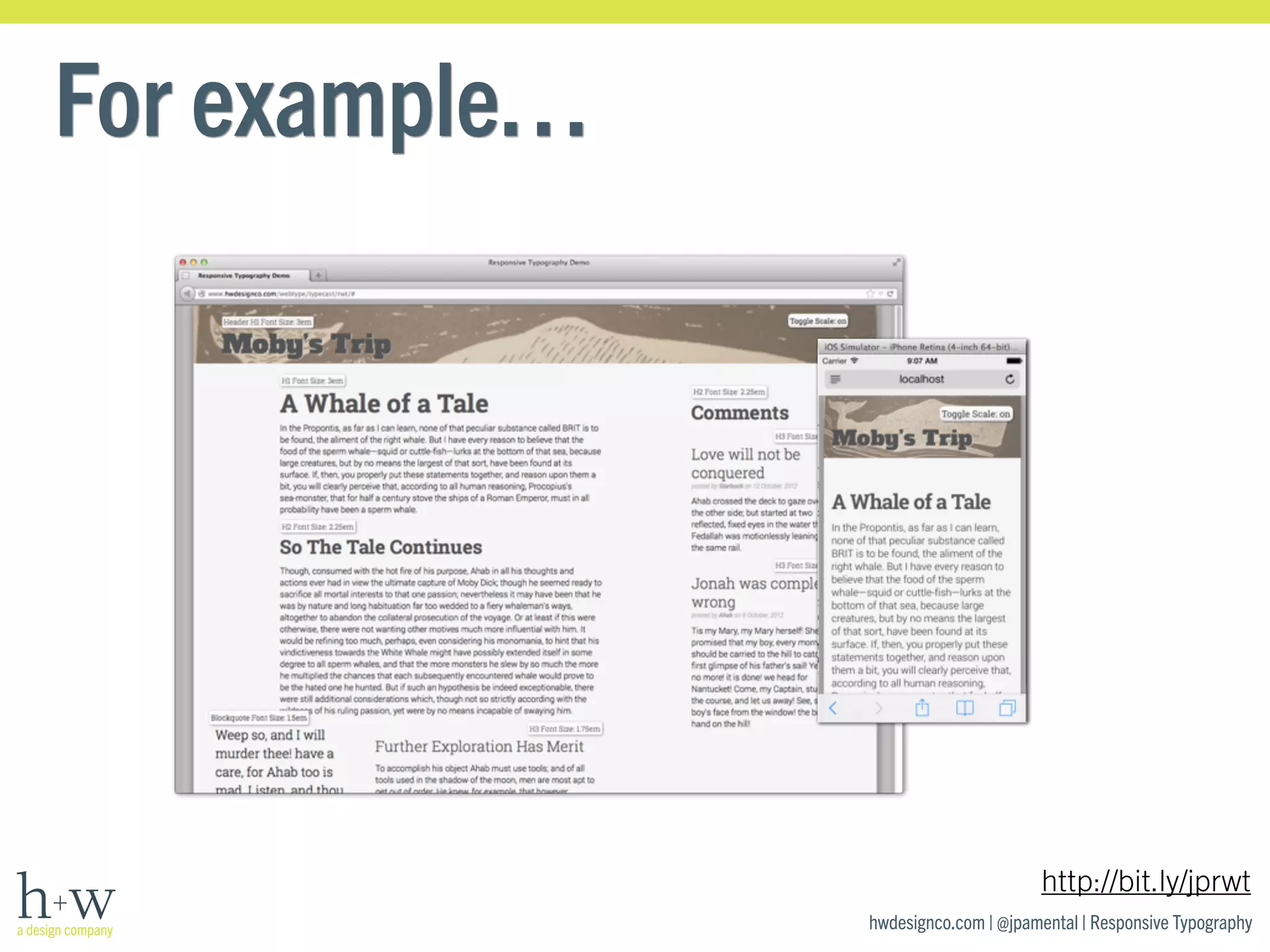
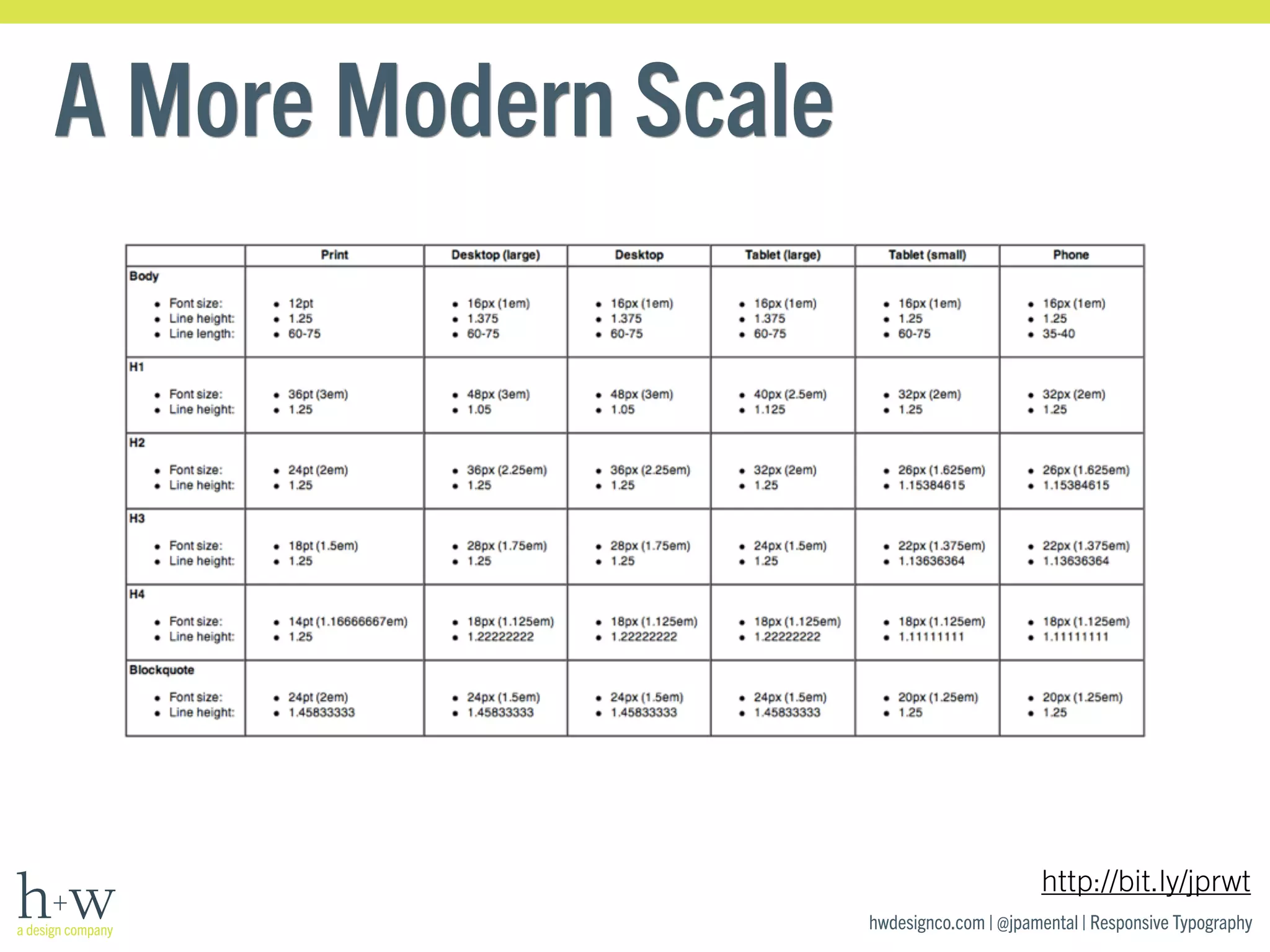
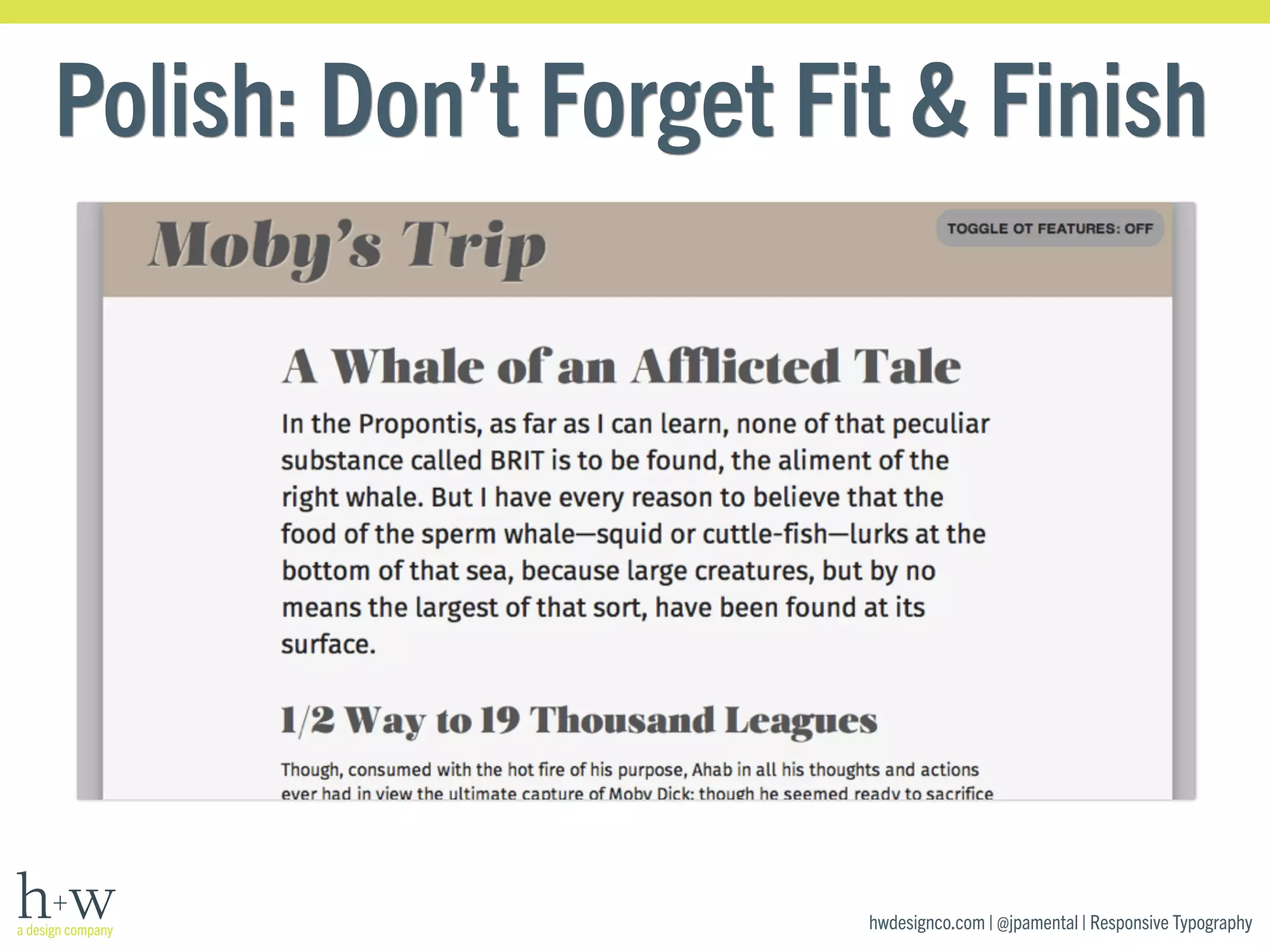
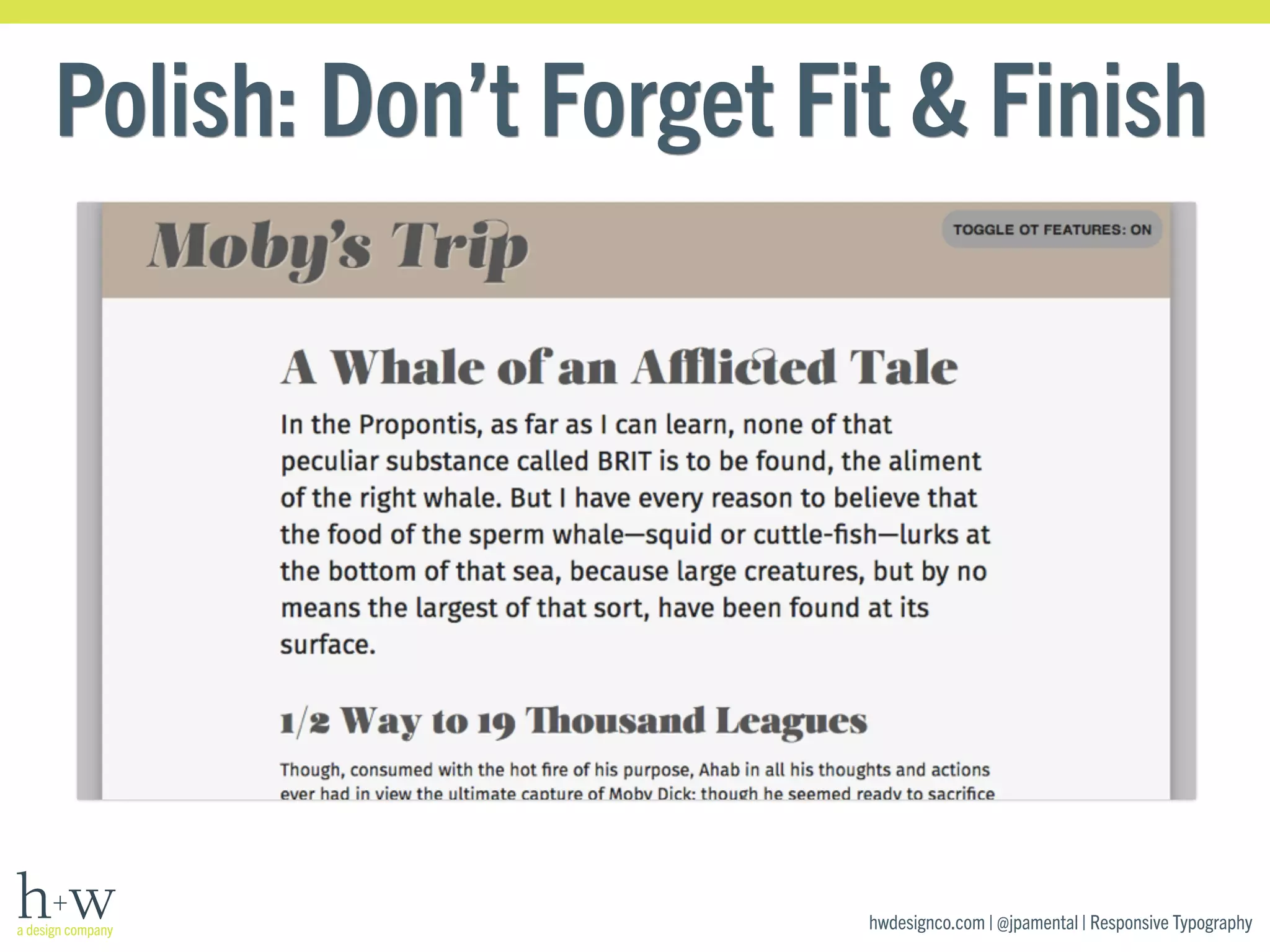
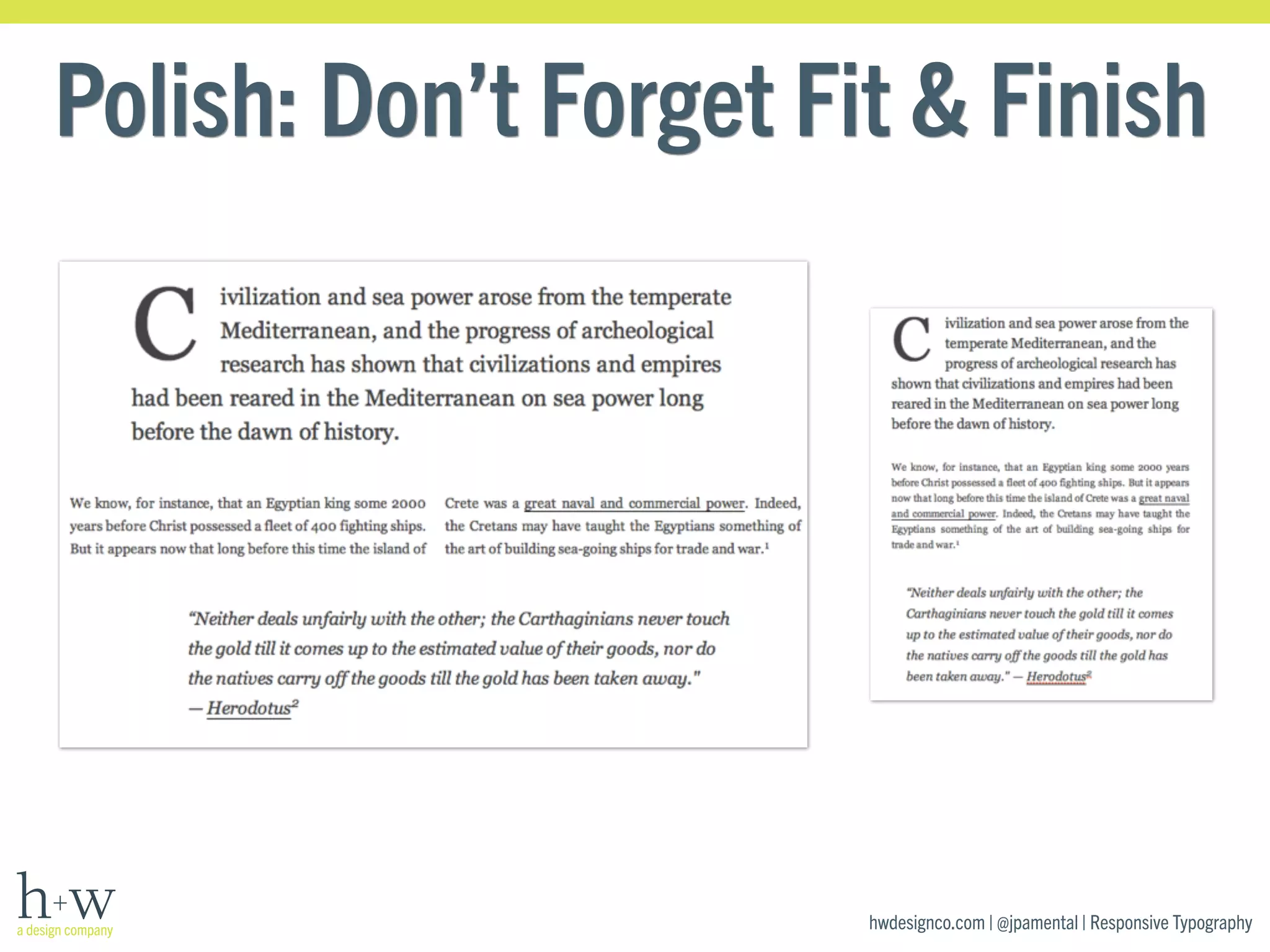
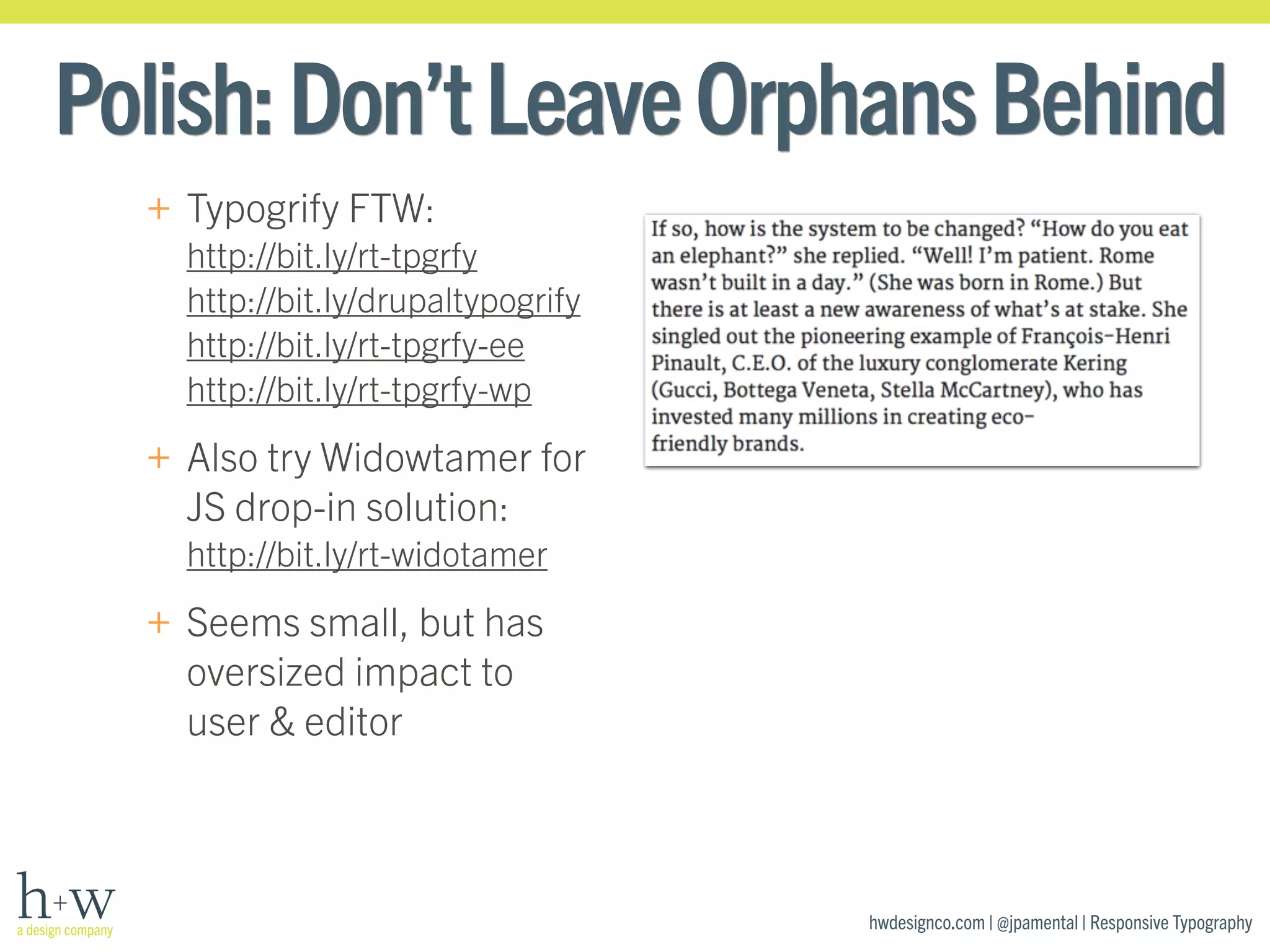

The document discusses the importance and principles of responsive typography, emphasizing that design should focus on meaning rather than screen size. It outlines a four-step process for achieving effective responsive typography, which includes careful font selection, planning for loading performance, adjusting proportions for different screen sizes, and paying attention to design details. Overall, the presentation highlights that great typography is essential for effective communication across various devices and platforms.


![[DevDay2019] Spacing and Typography, keys to a professional UI design - By Ng...](https://cdn.slidesharecdn.com/ss_thumbnails/duongnguyen-typographyspacing-190408082945-thumbnail.jpg?width=640&height=640&fit=bounds)


