This document contains an evaluation of a student's project producing print-based recipe cards with a British/vegetarian theme. It summarizes the design choices made for layout, images, and audience appeal. Feedback was incorporated from peers. While time management was an issue, skills in design, collaboration and presenting were gained. Overall the work shows technical competence but could be improved by choosing a theme with more dish variety.

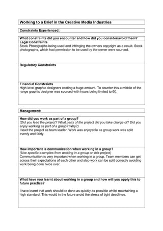
![Representation
Discuss the semiotics and connotations created from the content you have
included.
(What meaning or suggestions are created from the images/colours/designs you
have used?)
I think there are certainly connotations of patriotism in the recipe cards. People who
believe in National Pride and follow the “Good Old Blighty” mantra will probably find
this very appealing as a result. With changing the colours on the flag from it’s
traditional blue, white and red to that of green and white, connotations are given to
whoever my looking at the card to that of vegetarianism. So with this small change,
already the reader can already have a idea of what the theme of the dish is; British
Vegetarian dishes.
Audiences:
Create an audience profile of your chosen demographic
(Age, gender, psychographic, geodemographic, NRS Social Grade, hobbies,
sexuality [if appropriate] etc)
With the target audience primarily being those visiting Britain wanting to taste the
British cuisine, an assumption could be made that they probably are those of a
higher wealth. This would tie in also with the majority of vegetarians. This would
mean someone in the A,B,C1 NRS Social Grade. This person would also be more
likely middle aged to elderly, living abroad and with hobbies including tennis and golf.
How have you constructed your work to appeal to this audience?
Use box below for text or page space to include an annotated copy of an example of
your work to help illustrate how you have done this. You can use a combination of
the two.
Many middle and upper-class families are visibly excited by the sight of a British
Flag, with this in mind, appealing to middle class and upper-class families returning
to Britain with a British flag was an easy decision.](https://image.slidesharecdn.com/evaluationprintbasedmediaandworkingtobrief-1-131113042430-phpapp02/85/Evaluation-print-based-media-and-working-to-brief-1-2-320.jpg)


![Evaluation%20pro%20forma[1]](https://cdn.slidesharecdn.com/ss_thumbnails/evaluation20pro20forma1-140523091128-phpapp01-thumbnail.jpg?width=640&height=640&fit=bounds)


![Evaluation%20pro%20forma[1]](https://cdn.slidesharecdn.com/ss_thumbnails/evaluation20pro20forma1-140523090727-phpapp01-thumbnail.jpg?width=640&height=640&fit=bounds)


