
Recommended
More Related Content
What's hot
What's hot (20)
Viewers also liked
Similar to This is the magazine advert for jay z
Similar to This is the magazine advert for jay z (20)
Recently uploaded
Recently uploaded (20)
This is the magazine advert for jay z
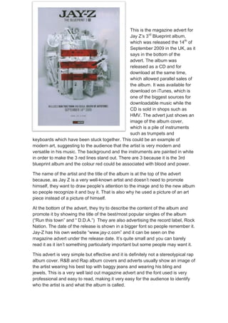
- 1. This is the magazine advert for Jay Z’s 3rd Blueprint album, which was released the 14th of September 2009 in the UK, as it says in the bottom of the advert. The album was released as a CD and for download at the same time, which allowed parallel sales of the album. It was available for download on iTunes, which is one of the biggest sources for downloadable music while the CD is sold in shops such as HMV. The advert just shows an image of the album cover, which is a pile of instruments such as trumpets and keyboards which have been stuck together. This could be an example of modern art, suggesting to the audience that the artist is very modern and versatile in his music. The background and the instruments are painted in white in order to make the 3 red lines stand out. There are 3 because it is the 3rd blueprint album and the colour red could be associated with blood and power. The name of the artist and the title of the album is at the top of the advert because, as Jay Z is a very well-known artist and doesn’t need to promote himself, they want to draw people’s attention to the image and to the new album so people recognize it and buy it. That is also why he used a picture of an art piece instead of a picture of himself. At the bottom of the advert, they try to describe the content of the album and promote it by showing the title of the best/most popular singles of the album (“Run this town” and “ D.D.A.”) They are also advertising the record label, Rock Nation. The date of the release is shown in a bigger font so people remember it. Jay-Z has his own website “www.jay-z.com” and it can be seen on the magazine advert under the release date. It’s quite small and you can barely read it as it isn’t something particularly important but some people may want it. This advert is very simple but effective and it is definitely not a stereotypical rap album cover. R&B and Rap album covers and adverts usually show an image of the artist wearing his best top with baggy jeans and wearing his bling and jewels, This is a very well laid out magazine advert and the font used is very professional and easy to read, making it very easy for the audience to identify who the artist is and what the album is called.