
Recommended
More Related Content
What's hot
What's hot (20)
Similar to Magazine advert analysis
Similar to Magazine advert analysis (20)
More from sajthelad
Recently uploaded
Recently uploaded (20)
Magazine advert analysis
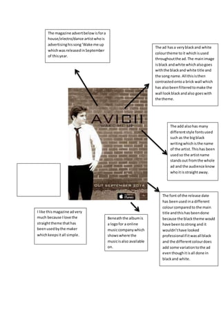
- 1. The magazine advert below is for a house/electro/dance artist who is advertising his song ‘Wake me up which was released in September of this year. The ad has a very black and white colour theme to it which is used throughout the ad. The main image is black and white which also goes with the black and white title and the song name. All this is then contrasted onto a brick wall which has also been filtered to make the wall look black and also goes with the theme. The add also has many different style fonts used such as the big black writing which is the name of the artist. This has been used so the artist name stands out from the whole ad and the audience know who it is straight away. The font of the release date has been used in a different colour compared to the main title and this has been done because the black theme would have been to strong and it wouldn’t have looked professional if it was all black and the different colour does add some variation to the ad even though it is all done in black and white. Beneath the album is a logo for a online music company which shows where the music is also available on. I like this magazine ad very much because I love the straight theme that has been used by the maker which keeps it all simple.
- 2. The ad has different styles of font for each important piece of information on the advert. The name of the artist is large and has a lot of colour (a bit like a rainbow) in it to make it stand out. The album is in the same font as the artist's name but is smaller and is a plain white colour. The same image of the album is used for advert which has a strange theme to it. The main image is of a White (silver-back) Gorilla eating some leaves with stars in the background, this connotes the idea that the album is based around imagination which is enhanced by the colours used in the advert as well. All the key information is written in different types of font, making you look at each specific bit individually. The ad also shows a website for further information of the artist and the label (www.xlrecordings.com) The most important thing is that it draws your attention and is visually very attractive. The only way i think the image relates to the genre, is that house is really funky and fun, with a lot of beats, so the advert shows this with it being vibrant and fun. The magazine advertisement below is for the house/electro artist Basement Jaxx's album 'Rooty'. Beneath the name of the album is the date it is released (June 25) I like this very much because it stands out from all the other adverts and I also like the gorilla because it’s unusual and also catches the audience’s eye.