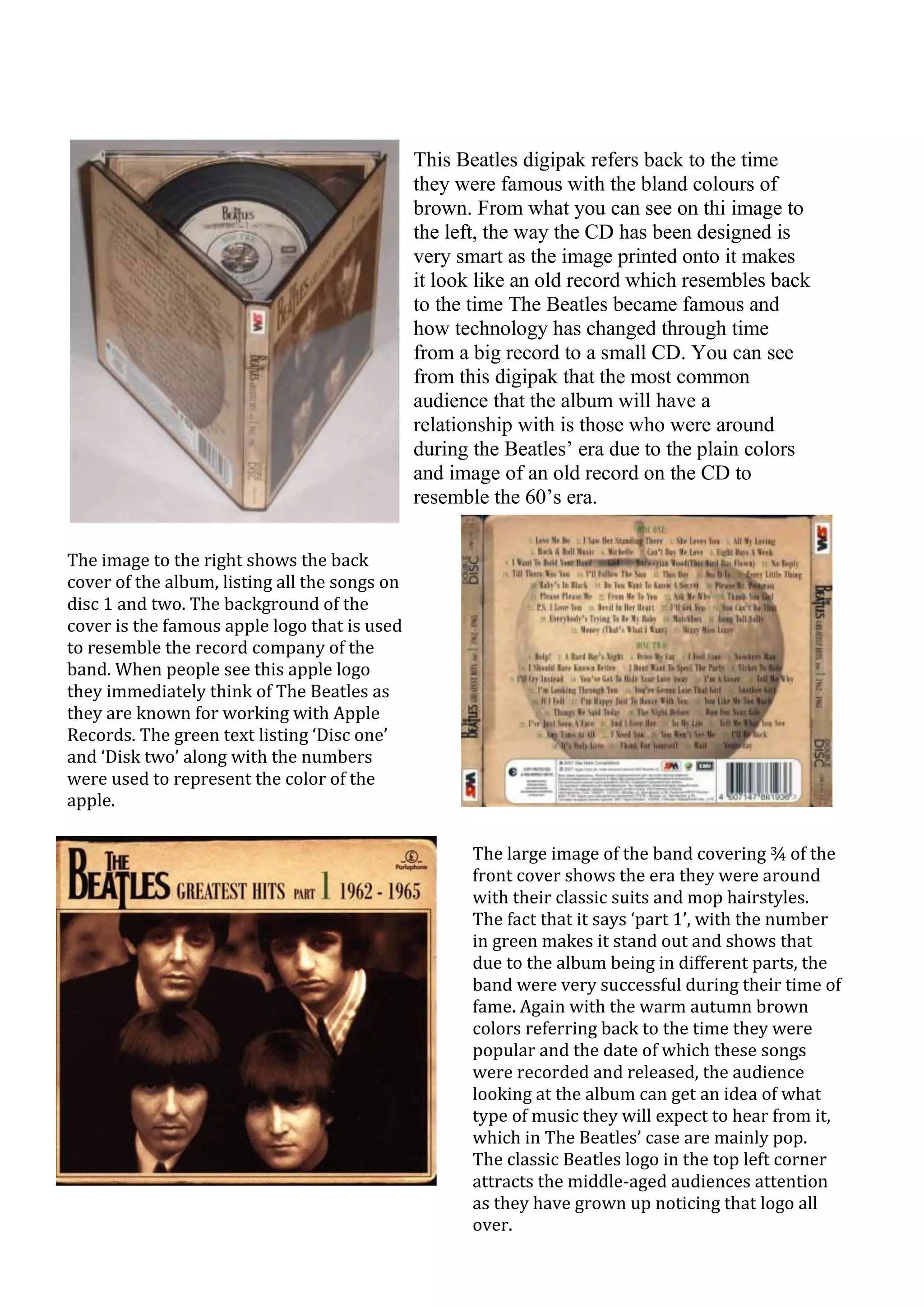
This Beatles digipak refers back to the time
                                               they were famous with the bland colours of
                                               brown. From what you can see on thi image to
                                               the left, the way the CD has been designed is
                                               very smart as the image printed onto it makes
                                               it look like an old record which resembles back
                                               to the time The Beatles became famous and
                                               how technology has changed through time
                                               from a big record to a small CD. You can see
                                               from this digipak that the most common
                                               audience that the album will have a
                                               relationship with is those who were around
                                               during the Beatles’ era due to the plain colors
                                               and image of an old record on the CD to
                                               resemble the 60’s era.

The image to the right shows the back
cover of the album, listing all the songs on
disc 1 and two. The background of the
cover is the famous apple logo that is used
to resemble the record company of the
band. When people see this apple logo
they immediately think of The Beatles as
they are known for working with Apple
Records. The green text listing ‘Disc one’
and ‘Disk two’ along with the numbers
were used to represent the color of the
apple.

                                                      The large image of the band covering ¾ of the
                                                      front cover shows the era they were around
                                                      with their classic suits and mop hairstyles.
                                                      The fact that it says ‘part 1’, with the number
                                                      in green makes it stand out and shows that
                                                      due to the album being in different parts, the
                                                      band were very successful during their time of
                                                      fame. Again with the warm autumn brown
                                                      colors referring back to the time they were
                                                      popular and the date of which these songs
                                                      were recorded and released, the audience
                                                      looking at the album can get an idea of what
                                                      type of music they will expect to hear from it,
                                                      which in The Beatles’ case are mainly pop.
                                                      The classic Beatles logo in the top left corner
                                                      attracts the middle-aged audiences attention
                                                      as they have grown up noticing that logo all
                                                      over.
With the CD resembling an old fashioned
                                                      record, those of the 60’s era can gain a brief
                                                      remembrance of their past times and
                                                      memories they shared along with how time
                                                      has changed since then. Again you can see the
                                                      apple logo in the center back of the label along
                                                      with a small amount of green text, again
                                                      resembling the apple color . One reason the
                                                      apple logo may not have been in color is to
                                                      stick to that old fashioned style of the digipak
                                                      for the 60’s era to relive those memories. The
                                                      small green apple logo which is in color can
                                                      relate to the modern day changes with colour
                                                      images whilst still not going too over the top
                                                      with destroying the idea of the past times
                                                      with the present.


In conclusion of looking at the different sides of the digipak separately, we can see that each layout
is pretty simple with not too much alteration in colours and style to distract the eye and which has
helped stick with the era that this soundtrack is based upon. The large logo of The Beatles
attracting the eye can make it helpful for them to become more popular as the more eyecatching
the band name stands out, the more likely people are of picking it up and at least taking a look. The
apple image being in the center of both the disc and back cover helps make Apple Records more
noticeable and known rather than it just being a small image in the corner which would also make
the digipak look too bland and unattractive. The black and white image of the band along with the
black text helps keep that 60’s era within the pack. The image of the band also helps show you
what type of music genre they play, for example you wouldn’t look at them and think they were in a
rock band. I think the use of an old image of them with the classic dress code and mop hair cuts
helps promote the originality of the band and how they were most popularly seen as which was
mainly at the beginning of their music career when they were younger.

This beatles digipak

  • 1.
    This Beatles digipakrefers back to the time they were famous with the bland colours of brown. From what you can see on thi image to the left, the way the CD has been designed is very smart as the image printed onto it makes it look like an old record which resembles back to the time The Beatles became famous and how technology has changed through time from a big record to a small CD. You can see from this digipak that the most common audience that the album will have a relationship with is those who were around during the Beatles’ era due to the plain colors and image of an old record on the CD to resemble the 60’s era. The image to the right shows the back cover of the album, listing all the songs on disc 1 and two. The background of the cover is the famous apple logo that is used to resemble the record company of the band. When people see this apple logo they immediately think of The Beatles as they are known for working with Apple Records. The green text listing ‘Disc one’ and ‘Disk two’ along with the numbers were used to represent the color of the apple. The large image of the band covering ¾ of the front cover shows the era they were around with their classic suits and mop hairstyles. The fact that it says ‘part 1’, with the number in green makes it stand out and shows that due to the album being in different parts, the band were very successful during their time of fame. Again with the warm autumn brown colors referring back to the time they were popular and the date of which these songs were recorded and released, the audience looking at the album can get an idea of what type of music they will expect to hear from it, which in The Beatles’ case are mainly pop. The classic Beatles logo in the top left corner attracts the middle-aged audiences attention as they have grown up noticing that logo all over.
  • 2.
    With the CDresembling an old fashioned record, those of the 60’s era can gain a brief remembrance of their past times and memories they shared along with how time has changed since then. Again you can see the apple logo in the center back of the label along with a small amount of green text, again resembling the apple color . One reason the apple logo may not have been in color is to stick to that old fashioned style of the digipak for the 60’s era to relive those memories. The small green apple logo which is in color can relate to the modern day changes with colour images whilst still not going too over the top with destroying the idea of the past times with the present. In conclusion of looking at the different sides of the digipak separately, we can see that each layout is pretty simple with not too much alteration in colours and style to distract the eye and which has helped stick with the era that this soundtrack is based upon. The large logo of The Beatles attracting the eye can make it helpful for them to become more popular as the more eyecatching the band name stands out, the more likely people are of picking it up and at least taking a look. The apple image being in the center of both the disc and back cover helps make Apple Records more noticeable and known rather than it just being a small image in the corner which would also make the digipak look too bland and unattractive. The black and white image of the band along with the black text helps keep that 60’s era within the pack. The image of the band also helps show you what type of music genre they play, for example you wouldn’t look at them and think they were in a rock band. I think the use of an old image of them with the classic dress code and mop hair cuts helps promote the originality of the band and how they were most popularly seen as which was mainly at the beginning of their music career when they were younger.