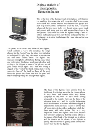
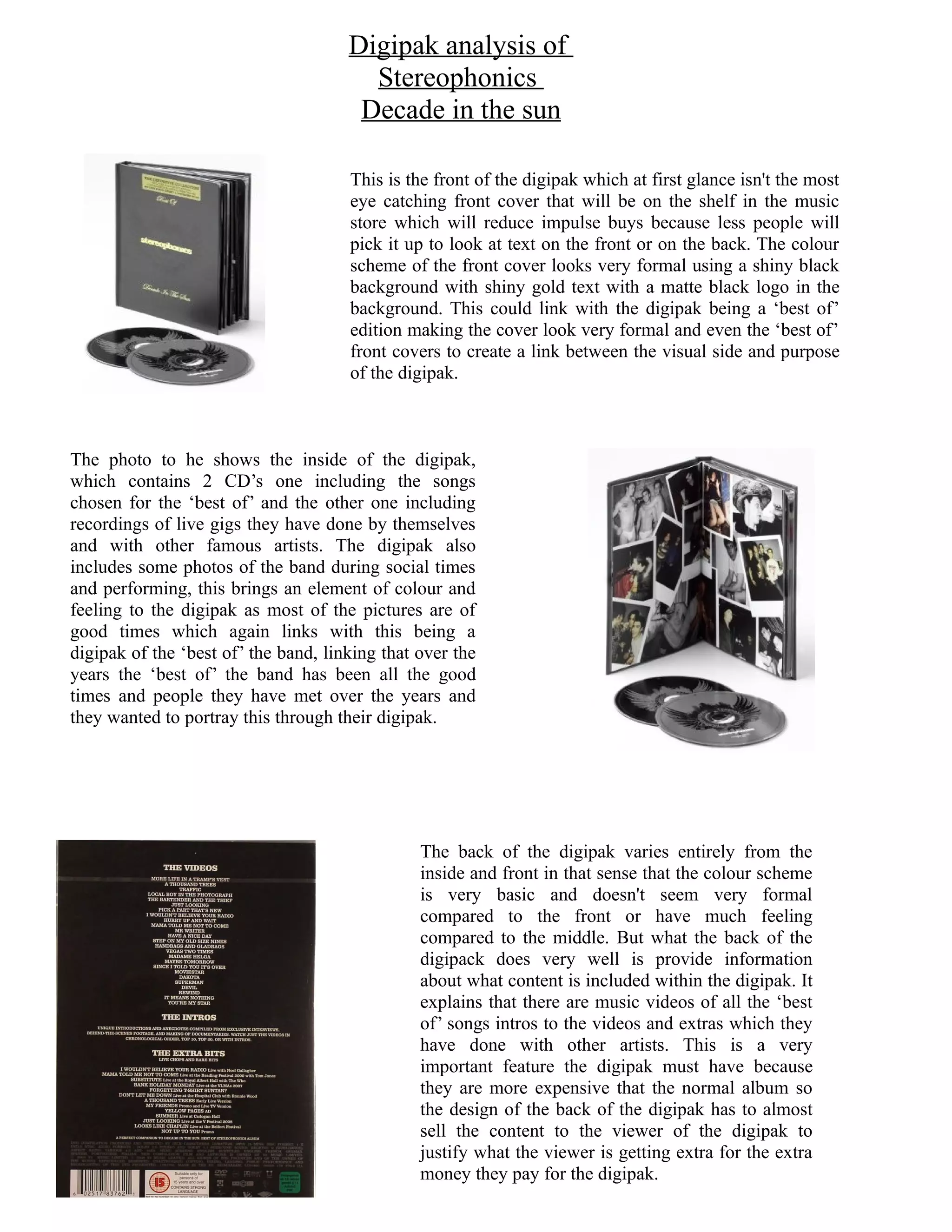
Digipak analysis of
                                        Stereophonics
                                       Decade in the sun

                                      This is the front of the digipak which at first glance isn't the most
                                      eye catching front cover that will be on the shelf in the music
                                      store which will reduce impulse buys because less people will
                                      pick it up to look at text on the front or on the back. The colour
                                      scheme of the front cover looks very formal using a shiny black
                                      background with shiny gold text with a matte black logo in the
                                      background. This could link with the digipak being a ‘best of’
                                      edition making the cover look very formal and even the ‘best of’
                                      front covers to create a link between the visual side and purpose
                                      of the digipak.


The photo to he shows the inside of the digipak,
which contains 2 CD’s one including the songs
chosen for the ‘best of’ and the other one including
recordings of live gigs they have done by themselves
and with other famous artists. The digipak also
includes some photos of the band during social times
and performing, this brings an element of colour and
feeling to the digipak as most of the pictures are of
good times which again links with this being a
digipak of the ‘best of’ the band, linking that over the
years the ‘best of’ the band has been all the good
times and people they have met over the years and
they wanted to portray this through their digipak.


                                                The back of the digipak varies entirely from the
                                                inside and front in that sense that the colour scheme
                                                is very basic and doesn't seem very formal
                                                compared to the front or have much feeling
                                                compared to the middle. But what the back of the
                                                digipack does very well is provide information
                                                about what content is included within the digipak. It
                                                explains that there are music videos of all the ‘best
                                                of’ songs intros to the videos and extras which they
                                                have done with other artists. This is a very
                                                important feature the digipak must have because
                                                they are more expensive that the normal album so
                                                the design of the back of the digipak has to almost
                                                sell the content to the viewer of the digipak to
                                                justify what the viewer is getting extra for the extra
                                                money they pay for the digipak.

Word da

  • 1.
    Digipak analysis of Stereophonics Decade in the sun This is the front of the digipak which at first glance isn't the most eye catching front cover that will be on the shelf in the music store which will reduce impulse buys because less people will pick it up to look at text on the front or on the back. The colour scheme of the front cover looks very formal using a shiny black background with shiny gold text with a matte black logo in the background. This could link with the digipak being a ‘best of’ edition making the cover look very formal and even the ‘best of’ front covers to create a link between the visual side and purpose of the digipak. The photo to he shows the inside of the digipak, which contains 2 CD’s one including the songs chosen for the ‘best of’ and the other one including recordings of live gigs they have done by themselves and with other famous artists. The digipak also includes some photos of the band during social times and performing, this brings an element of colour and feeling to the digipak as most of the pictures are of good times which again links with this being a digipak of the ‘best of’ the band, linking that over the years the ‘best of’ the band has been all the good times and people they have met over the years and they wanted to portray this through their digipak. The back of the digipak varies entirely from the inside and front in that sense that the colour scheme is very basic and doesn't seem very formal compared to the front or have much feeling compared to the middle. But what the back of the digipack does very well is provide information about what content is included within the digipak. It explains that there are music videos of all the ‘best of’ songs intros to the videos and extras which they have done with other artists. This is a very important feature the digipak must have because they are more expensive that the normal album so the design of the back of the digipak has to almost sell the content to the viewer of the digipak to justify what the viewer is getting extra for the extra money they pay for the digipak.