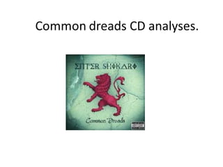
The background colour                                                      The thing I think this CD
scheme uses different shades     The futuristic style of the logo tells    would benefit from would
of green and a bit of white.     us the album has trance elements.         be a brief mention of the
The green is darker in the       The logo is fairly big, as this is what
                                                                           tracks which the artists and
corners to makes it look as      will be the biggest selling point.
                                                                           label think will best sell the
though there is a light being
shone onto the album. This is
                                                                           album.
conventional of the trance
genre ,as trance music is
associated with bright lights.                                             The cartoon yet detailed
                                                                           visual of the main image and
                                                                           background suggests it is
The album name ‘Common                                                     aimed at teenagers.
Dreads’ is written in below
in slightly smaller font to tell                                               The lion image has connotations
us what album it is. The font                                                  of aggression and danger
is interesting yet readable.                                                   common to the rock genre. This
‘Common Dreads’ makes                                                          subtly gives us a clue that the
the album sound like it will                                                   album has rock elements to it.
have deep themes
throughout. This suggests
it’s aimed as a fairly mature The parental adviser tells us the album will have taboo language and/or
audience, so teenagers           themes some may find disturbing, so parents don’t expose their
instead of children.             children to this. This wont decrease the audience by much as this
                                 album is aimed at teenagers.
The front image is
                                     repeated on the back.

                                                                 The website is also
The background is very
                                                                 included so people can
similar to the front cover
                                                                 go on and be updated
as it uses the same
                                                                 with their latest music
colour scheme and has
                                                                 and get information on
the same map like
                                                                 buying tickets and
background .
                                                                 merchandise
                                                                 The Track list is written in the
                                                                 same font as the album name
                                                                 . The font is interesting yet
                                                                 easy to read ,as the track list
The                                                              will also be a good selling
barcode                                                          point.

              Copyright notice- this is important so no one can steal their music and
              claim it as there own. The music is owned by the ‘Enter Shikari’ and
              ‘Ambush Reality’ ,but licenced by ‘Warner Music Limited’. The copyright
              ,also includes the date (which is 2009).

Common dreads cd analyses

  • 2.
    The background colour The thing I think this CD scheme uses different shades The futuristic style of the logo tells would benefit from would of green and a bit of white. us the album has trance elements. be a brief mention of the The green is darker in the The logo is fairly big, as this is what tracks which the artists and corners to makes it look as will be the biggest selling point. label think will best sell the though there is a light being shone onto the album. This is album. conventional of the trance genre ,as trance music is associated with bright lights. The cartoon yet detailed visual of the main image and background suggests it is The album name ‘Common aimed at teenagers. Dreads’ is written in below in slightly smaller font to tell The lion image has connotations us what album it is. The font of aggression and danger is interesting yet readable. common to the rock genre. This ‘Common Dreads’ makes subtly gives us a clue that the the album sound like it will album has rock elements to it. have deep themes throughout. This suggests it’s aimed as a fairly mature The parental adviser tells us the album will have taboo language and/or audience, so teenagers themes some may find disturbing, so parents don’t expose their instead of children. children to this. This wont decrease the audience by much as this album is aimed at teenagers.
  • 3.
    The front imageis repeated on the back. The website is also The background is very included so people can similar to the front cover go on and be updated as it uses the same with their latest music colour scheme and has and get information on the same map like buying tickets and background . merchandise The Track list is written in the same font as the album name . The font is interesting yet easy to read ,as the track list The will also be a good selling barcode point. Copyright notice- this is important so no one can steal their music and claim it as there own. The music is owned by the ‘Enter Shikari’ and ‘Ambush Reality’ ,but licenced by ‘Warner Music Limited’. The copyright ,also includes the date (which is 2009).